It is 10:40 on a Tuesday and the office manager at a dermatology practice is on the phone, asking where last Thursday's biopsy is. Your histotech checks the LIS. The case was grossed Friday, the slides were cut Monday, and they have been sitting in a tray outside a pathologist's office since. Nobody did anything wrong. Nobody could see it either.
That is the problem an AI dashboard for pathology lab operations should solve: not diagnosing anything, but making the state of the lab visible before a client has to call. This guide covers which tiles are worth building first, where each number comes from in a typical LIS export, the three ways to build one (and what each costs), and the privacy rules you have to respect when patient data is in the source.
What the dashboard is for, and what it is not
An AI dashboard for pathology lab management answers operational questions: how many cases came in, how fast they went out, what is stuck, and which clients and payers drive the volume. It is a management tool for the lab director, the operations manager and whoever handles outreach to referring practices.
It is not a diagnostic tool. AI that helps read slides is a separate, regulated category. The first AI software for digital pathology, Paige Prostate, received FDA De Novo authorization in 2021 as an aid to pathologists reviewing prostate biopsy images (FDA announcement). Nothing in this article is about that kind of tool. When we say "AI" here, we mean software that turns your operational exports into charts, summaries and alerts faster than a person with a spreadsheet can.
Keeping that line clear also makes the dashboard easier to build. Operational metrics rarely need patient names, birth dates or results. They need timestamps, case types, client names and counts.
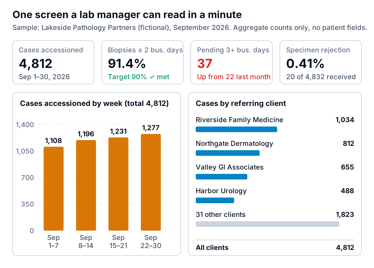
The eight tiles to build first
You could put fifty metrics on a lab dashboard. Start with eight. Each one below maps to a decision someone makes weekly, and each comes from data your LIS already records.
| Tile | How it is calculated | What a bad number tells you |
|---|---|---|
| Cases accessioned | Count of accession numbers in the period, by case type | Volume shifts before revenue does; a drop from one client is an outreach problem |
| Biopsies reported within 2 business days | Share of biopsy cases where report date minus accession date is 2 business days or less | Turnaround is slipping; look at the stage chart next |
| Turnaround by stage | Average hours between each pair of LIS timestamps | Which step is the bottleneck |
| Open cases by age | Unsigned cases grouped by business days since accession | The list of cases that will become phone calls |
| Specimen rejection rate | Rejected specimens ÷ specimens received | Labeling or collection problems at a specific client |
| Corrected reports per 1,000 | Amended or corrected reports ÷ reports issued × 1,000 | A quality issue worth a root-cause review |
| Cases per pathologist per day | Signed cases ÷ pathologist working days | Workload imbalance before it shows up as turnaround |
| Cases and revenue by client and payer | Counts from the LIS, dollars from the billing export | Concentration risk and which payers deny the most |
Two of these have useful outside reference points. A CAP quality measure for biopsies counts the share of final reports where report date minus accession date is no more than two business days, and CAP guidance is commonly summarized as at least 90% of routine surgical pathology cases reported within two days (review in a peer-reviewed journal). For rejection, CAP's own quality indicator guidance shows a median specimen rejection rate of 0.52% across 119 labs in its 2011–2012 Q-TRACKS data, with the 90th percentile at 1.21%. Those figures come from general laboratory specimens and are more than a decade old, so treat them as a sanity check, not a target. Your accreditation checklist and your medical director set the real targets.
Where the numbers come from: timestamps
Almost every useful tile on a pathology dashboard is built from the timestamps your LIS stamps as a case moves: received, accessioned, grossed, processed, slides ready, assigned, signed out, delivered. If you can export those columns with a case type and a client name, you can build most of the list above.
The stage view is the one that changes behaviour. A single turnaround number tells you that you are late. The stage breakdown tells you why.
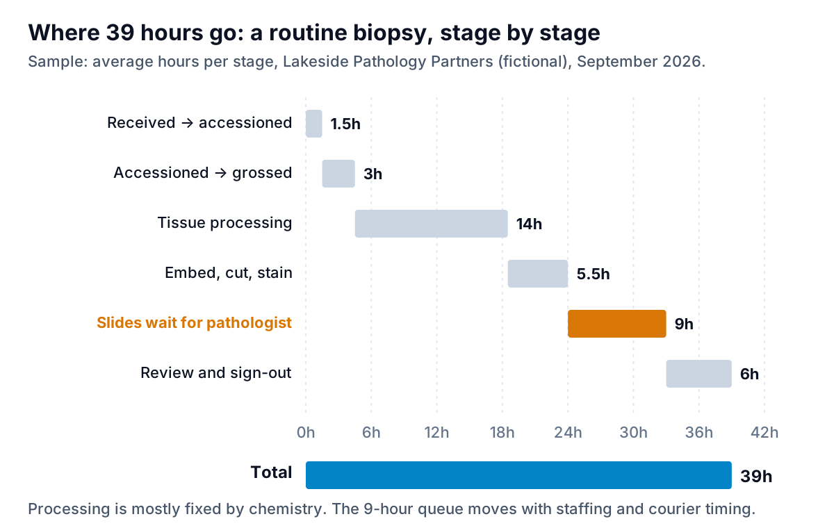
In the example above, the lab's instinct was to look at processing because it is the longest bar. But processing is set by chemistry and the run schedule. The 9 hours that slides wait for a pathologist depend on when slides come off the stainer, how cases are assigned and whether anyone is reading in the afternoon. That is the bar to work on.
Some practical notes on timestamps:
- Missing stamps are data. If 8% of cases have no "slides ready" time, that is a workflow gap, not a rounding error. Show the count of incomplete cases on the dashboard instead of quietly dropping them.
- Business hours matter. A case accessioned at 4:55 pm Friday will look terrible in calendar hours. Decide whether stage times use clock hours or working hours and label it.
- Use averages for the stage chart, medians for the headline. Averages add up across stages, which is why the waterfall works. Medians resist the occasional case that waits a week for special stains.
The open-case list is the tile people actually use
Monthly turnaround percentages are for the quality meeting. The tile that prevents Tuesday's phone call is a live count of unsigned cases by age, with the oldest ones listed by accession number, case type, client and current stage.
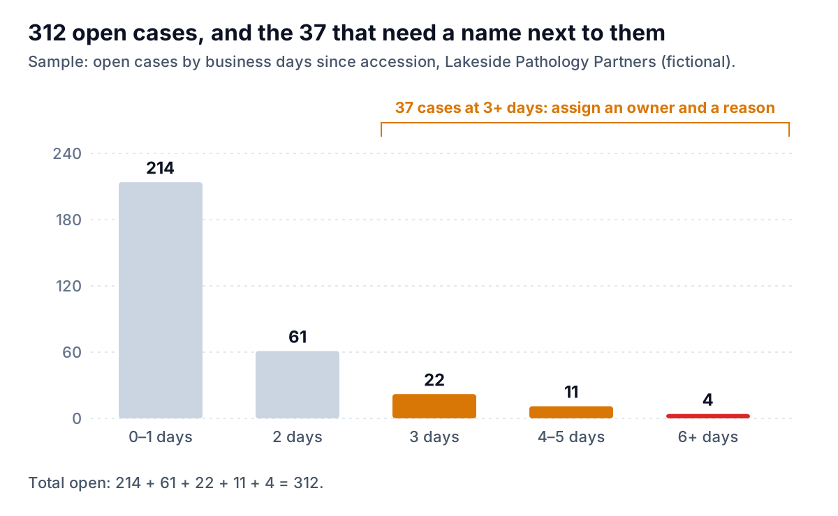
A good rule: every case past your threshold gets a reason code. After a month, the reason codes become their own chart, and you will know whether your late cases are mostly immunostains, outside consults or slides nobody claimed. That is the kind of pattern an AI summary is good at spotting and stating in a sentence: "21 of the 37 cases over 3 days are waiting on immunohistochemistry, up from 9 last month."
Three ways to build an AI dashboard for pathology lab operations
There are three realistic routes for a small or mid-sized lab. They differ mostly in who maintains them and whether patient data leaves your LIS.
1. Your LIS vendor's built-in analytics
Many lab systems now ship dashboards. LigoLab, for example, describes dashboards that show turnaround time by step, pathologist trends, grossing productivity and workload by time of day (LigoLab). The advantage is obvious: the data never leaves the system and the timestamps are already linked. The limits are that you get the vendor's chart types, joining billing or courier data can be hard, and some modules cost extra. Ask your vendor for a demo with your own data before assuming you need anything else.
2. A BI tool fed by scheduled exports
Power BI, Tableau and similar tools can build anything on the list above. Power BI Pro is listed at $14 per user per month, paid yearly (Microsoft). The software is cheap; the build is not. Someone has to write the queries, model the timestamps and fix the dashboard when an export column changes. Labs that go this way usually have an analyst, or pay a consultant for the first build.
3. An AI dashboard builder working from exports
The newest option is to export a file and describe what you want in plain English: "turnaround by stage for biopsies this month, open cases by age, volume by client." The tool writes the queries and the charts. This is the fastest way to a first version and to one-off questions, and the weakest for a live wall display, since it works from the file you give it rather than a live feed.
| LIS built-in | BI tool | AI builder from exports | |
|---|---|---|---|
| Time to first dashboard | Days, if licensed | Weeks | Minutes to an hour |
| Live data | Yes | Scheduled refresh | Per upload |
| Joins billing, courier, staffing | Sometimes | Yes, with work | Yes, if you export them |
| Patient data leaves the LIS | No | Usually, needs a BAA | Avoid: export aggregates |
| Who maintains it | Vendor | Your analyst | You, by re-uploading |
Patient data, BAAs and what to export
If a tool stores or processes protected health information for you, it is a business associate under HIPAA and you need a signed business associate agreement before sending it anything identifiable. HHS is explicit that this applies to cloud services, even ones that only hold encrypted data (HHS guidance on HIPAA and cloud computing). Check the BAA status of every BI or AI tool before connecting it to an LIS feed, and involve your privacy officer.
The simpler path for most dashboard work is to not send patient data at all. Operational metrics can almost always be built from aggregate exports: counts per day by case type and client, average stage hours by week, open cases by age bucket. That is the approach the sample figures above take. If your analysis truly needs case-level rows, read the HHS de-identification guidance first; note that dates of service count as identifiers under the Safe Harbor method, which matters for anything built on timestamps. Our companion piece on AI for lab data analysis walks through preparing such an export.
This is also where we should be plain about our own product. Parity's AI dashboard generator builds a dashboard from a CSV or Excel file you upload, and checks every number and chart against queries on the full dataset before you see it. It is not a HIPAA-covered tool and we do not sign BAAs, so use it only with de-identified or aggregate operational data: case counts, stage averages, volume by client, revenue by payer. Files are sent encrypted, deleted after the report is built, and never used for training.
A 30-day plan for a first version
You do not need a project team to get an AI dashboard for pathology lab operations running. One manager, one LIS administrator and four weeks is enough for version one.
- Week 1: agree definitions. Write one line per tile: what is counted, the start and end of each clock, business or calendar days. Get the medical director to sign off on the turnaround definitions.
- Week 1: find the export. Ask your LIS administrator which report gives accession number, case type, client, and each stage timestamp. Run it for last month.
- Week 2: build the aggregate file. Turn case-level rows into daily counts and stage averages inside your own systems, so no patient fields leave them.
- Week 2: first dashboard. Build the eight tiles with whichever route fits. Compare every total to the LIS's own monthly report. If they differ, fix the definition, not the chart.
- Week 3: add reason codes for cases past threshold, and start the daily open-case review at a fixed time.
- Week 4: share a client view. Your largest referring practices care about their own volume, turnaround and rejected specimens. The follow-on article on AI report generation for diagnostic labs covers turning this into a monthly client report.
Then leave it alone for a month. A dashboard earns trust when people check it against what they already know and it holds up. Adding tiles before that happens just gives them more to doubt.
Upload the CSV, describe the tiles you want, and get a dashboard where every number is checked against the full file. Build a report from your data free