Your biopsy turnaround slipped from 94% within target in June to 88% in September. Nobody changed the processor schedule, staffing looks the same on paper, and the monthly report only says the number went down. You have the data to find out why: every case in the LIS has a received time, a client, a case type and a timestamp for each stage. What you lack is the afternoon it would take to pivot it ten different ways.
That is the honest case for using AI for lab data analysis in a small pathology or diagnostic lab. Not prediction, not diagnosis: fast, checkable answers to operational questions you would otherwise never get around to asking. This guide shows how to prepare an export safely, works through two real-shaped examples, and covers how to tell when an AI's answer is wrong.
AI for lab data analysis starts with a question, not a dataset
The quickest way to waste a morning is to upload everything and ask "what insights are in here?" You will get a tidy list of obvious facts. Start instead with a decision you need to make, and write the question that would settle it.
| Decision | Question to ask the data | Fields needed |
|---|---|---|
| Fix a turnaround slip | Which stage, day or receipt time accounts for most of the late cases? | Stage timestamps, case type |
| Cut rejected specimens | Which reasons and which clients produce most rejections? | Rejection reason, client |
| Change the courier schedule | When do specimens arrive, and how does arrival time affect turnaround? | Received time, report time |
| Balance pathologist workload | How do signed cases and case mix vary by pathologist and weekday? | Sign-out user, case type, sign-out time |
| Plan outreach | Which clients grew or shrank in volume this quarter, and in which case types? | Client, case type, accession date |
| Reduce denials | Which payers and denial reasons account for most denied dollars? | Billing export: payer, status, reason, amount |
Every question on that list is about the lab, not about patients. That matters for the next step.
Preparing the export: what HIPAA means for timestamps
If you send case-level data with patient identifiers to an outside tool, that tool is handling protected health information and needs a business associate agreement with you first (HHS on business associates). Most general-purpose AI and analytics tools do not offer one on standard plans. The practical answer for operational analysis is to remove the patient from the data before it leaves your systems.
Here is the catch that trips labs up. Under the HIPAA Safe Harbor method, de-identified data must not contain "all elements of dates (except year)" directly related to an individual, along with names, record numbers and fifteen other identifier types (45 CFR 164.514(b); plain-language version in the HHS de-identification guidance). Collection and receipt dates on a case-level row count. So a "de-identified" file that still has one row per specimen with its received date and time is not de-identified under Safe Harbor, even with the name removed.
The fix is to aggregate first. Counts of specimens received per weekday and hour, average hours per stage per week, and rejections per reason per client describe the lab without describing any patient.
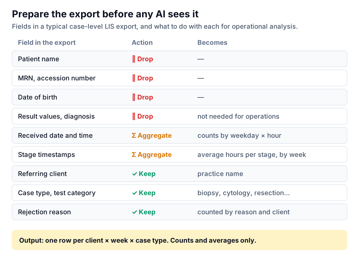
Worked example 1: where rejections come from
A sample lab rejected 61 specimens between July and September. The quality meeting had been treating them as one number. Asking an AI to group them by reason gave this Pareto chart in a few seconds:
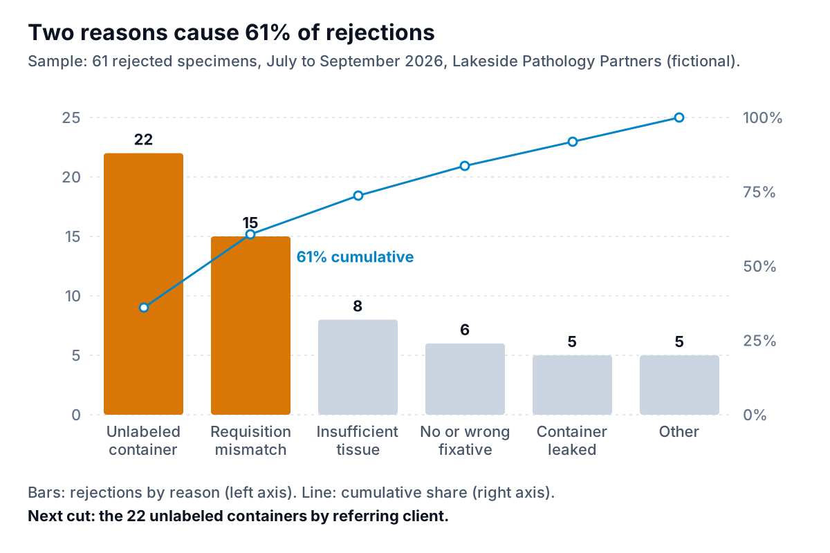
The useful part came next. A follow-up question, "split the unlabeled containers by client," showed that 14 of the 22 came from two practices, one of which had a new medical assistant starting in July. The action was a phone call and a one-page labeling guide, not a lab process change.
This is the pattern that makes AI for lab data analysis worth doing: one question, an answer, a sharper follow-up, a specific action. Each follow-up takes seconds instead of a new pivot table.
Two checks before you act on a chart like this:
- Do the bars add to the total? 22 + 15 + 8 + 6 + 5 + 5 = 61. If an AI's grouping of free-text reasons loses or double-counts rows, the sum is where you see it.
- Is the rate as interesting as the count? A client with 6 rejections out of 120 specimens has a bigger problem than one with 8 out of 1,000. CAP's quality indicator guidance frames indicators as events per opportunity for exactly this reason. Ask for both.
Worked example 2: the Friday afternoon problem
Back to the turnaround slip. The lab aggregated cases by weekday and the hour they were received, and asked: "for routine biopsies, what share was reported within 2 business days, by weekday and receipt time?"
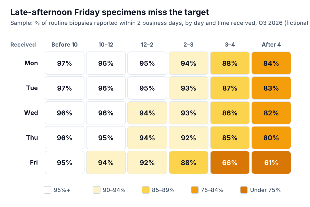
The pattern is plain once you see it. Specimens that arrive after about 3 pm miss the evening processor load and start a day behind. On Friday, that day becomes a weekend. Then the explanation for the slip: in July, the courier route was changed and the last pickup from the two largest clients moved from 1:30 pm to 3:45 pm. More specimens now land in the two right-hand columns.
No single number on the monthly report could have shown that. A cross-tab of two fields did. Possible fixes include an earlier pickup on Fridays, a second processor run or a later cut-off for grossing, and the lab can now model each one against the same table.
Prompts that work on an aggregate lab file
The wording of a question decides most of the quality of the answer. Vague prompts get generic charts; prompts that name the measure, the definition, the grouping and the period get something you can act on. These six are written for an aggregate file with one row per client, week and case type. Copy them and change the names.
- "For routine biopsies only, show the share reported within 2 business days of accession by week for July to September. State how you counted business days." Naming the case type and the clock stops the tool from mixing in resections or counting weekends.
- "Rank clients by rejection rate (rejected ÷ received) for the quarter. Show the count of received specimens next to each rate and exclude clients with fewer than 50." The exclusion keeps one-rejection clinics from topping the list.
- "Which three clients changed most in volume between Q2 and Q3, in absolute cases and in percent? Split by case type." Absolute and percent together stop a tiny client's doubling from hiding a large client's 10% drop.
- "Compare average hours per stage in June and September. Which stage changed most?" This is the stage waterfall, run as a before and after.
- "Group the free-text rejection reasons into no more than six categories. List which original reasons went into each." Asking for the mapping lets you check that "unlabelled" and "no label" landed together.
- "Write three sentences summarising the quarter for the quality meeting. Use only figures from the charts above, and do not explain causes." The last clause is the one that matters.
Keep the prompts that work in a shared document. Next quarter, the same prompts on a new file give you a comparable answer in minutes, which is most of what a standing quality review needs.
How to tell when the AI is wrong
AI tools for analysis fail in predictable ways. Most errors are not arithmetic but definition: the tool answered a slightly different question from the one you meant. Build these habits:
- Reconcile one number to the LIS. Before trusting anything, ask for the total cases in the period and compare it to your LIS's own monthly count. If they differ, stop and find out why.
- Ask how it calculated the figure. "Within 2 business days" could be computed in calendar days, from receipt instead of accession, or with holidays counted. Make the tool state its definition, then correct it.
- Watch for mix shift. If overall turnaround worsened, check whether the case mix changed. A month with more resections and consults can look slower even if every case type held steady.
- Distrust small cells. A heat map cell built on four cases will swing wildly. Ask for the count behind each percentage and grey out anything under about 20.
- Separate what from why. The data can show that late-afternoon specimens miss target. Only someone who knows the courier schedule can say why. Treat any causal sentence in an AI summary as a hypothesis.
Some tools make the first two habits easier by showing the query behind each number or by checking every figure against the full dataset automatically. That is worth asking about when you compare options; see our broader guide to AI tools for data analysis.
Tools, and turning analysis into something you reuse
For a small lab, the practical stack is short. Your LIS's own reporting module gives you the export. A spreadsheet or a saved LIS report does the aggregation inside your network. Then an analysis tool answers questions over the aggregate file: a BI tool if you have an analyst, or an AI tool you can question in plain English if you do not.
Once a question proves useful, stop asking it ad hoc. Turn it into a standing chart. The heat map above belongs on the lab's operations dashboard, and the rejection Pareto by client belongs in the monthly report to each referring practice. Analysis finds the problem; the dashboard and the report keep it fixed.
Parity can do the analysis step with aggregate files. You upload a CSV or Excel file, ask questions or describe a report, and every number and chart is checked against queries on the full dataset before you see it, so the reconciliation habit is built in. Parity is not a HIPAA-covered tool, so use it only with aggregate or de-identified operational data like the examples here. Files are encrypted in transit, stored privately with the report until you delete it, and never used to train AI models. The file itself is kept, not just the charts built from it, so do the aggregation inside your own systems first, as described above.
Upload it, ask in plain English, and get charts where every number is checked against the full file. Build a report from your data free