Data stories

The world, charted from public data.

35 stories, each a graphic built from an open dataset, the data behind it and a long read on what it shows. Download any chart or its data and use it with credit.

53,849 words · sources include the World Bank, NOAA, NASA, BLS, UNHCR and the US Treasury
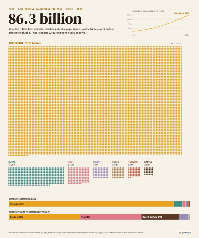
A unit chart on a cream background. A huge block of thousands of yellow dots, each representing 10 million chickens, fills most of the page. Beside it are far smaller blocks for ducks, pigs, sheep, goats, turkeys and cattle; the cattle block is just 30 dots. Two bars below compare each species' share of animals killed with its share of meat produced: chickens are 91 percent of animals but poultry is 39 percent of meat. A small line chart shows chicken numbers rising about twelvefold since 1961.
Food · Charted

86 Billion: Every Land Animal Slaughtered for Meat in a Year, One Dot per 10 Million

October 12, 2026 · 7 min read
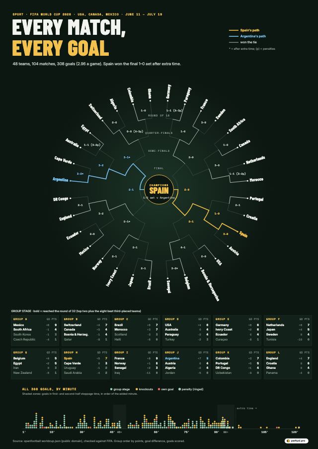
A dark green poster. At its centre, a circular knockout bracket: the 32 teams of the round of 32 sit around the outside, and lines step inward round by round to Spain, the champion, at the centre. Spain's path is gold and Argentina's, the runner-up, light blue, with each match's score at the junction. Below, twelve small group tables list each team's points. Along the bottom, all 308 goals are stacked as dots by the minute they were scored, from the first minute to the 120th.
Sport · Charted

Every Match, Every Goal: The 2026 World Cup in One Chart

October 12, 2026 · 7 min read
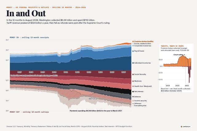
A mirrored stacked area chart from 2016 to August 2026. Above a central line, federal receipts are stacked in blues: individual income tax, payroll taxes, corporate tax, other, and a thin orange band of customs duties on top that swells in 2025. Below the line, outlays are stacked in reds and greys: Social Security, Medicare, health, net interest, defense, income security, veterans and everything else. The spending side is always deeper than the receipts side, and the gap balloons in 2020 and 2021. An inset bar chart shows monthly customs duties jumping in 2025 and then turning negative in mid-2026 as refunds were paid.
Money · Charted

In and Out: A Decade of Federal Money, and the Tariff Surge That Was Refunded

October 12, 2026 · 7 min read
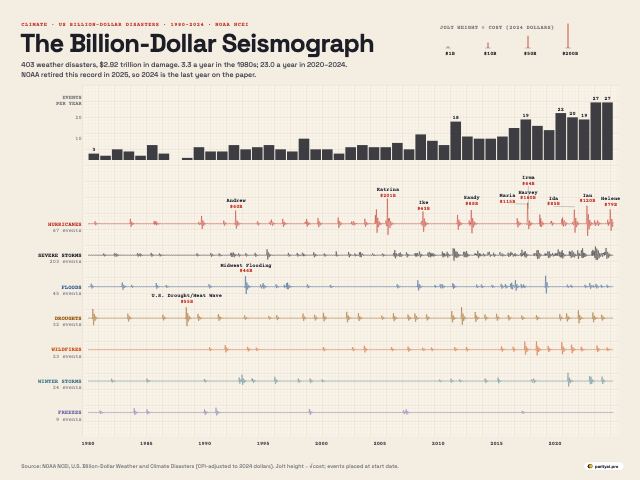
A seismograph-style chart on cream graph paper with seven horizontal traces, one each for hurricanes, severe storms, floods, droughts, wildfires, winter storms and freezes, running from 1980 to 2024. Each billion-dollar disaster makes the trace jolt, with bigger jolts for costlier events. The hurricane trace has huge spikes for Katrina in 2005, Harvey and Maria in 2017, Ian in 2022 and Helene in 2024. The severe-storm trace becomes almost continuous after 2010. Bars along the top show the number of events and total cost each year.
Climate · Charted

The Billion-Dollar Seismograph: Every US Weather Disaster Costing $1 Billion or More, 1980–2024

October 12, 2026 · 7 min read
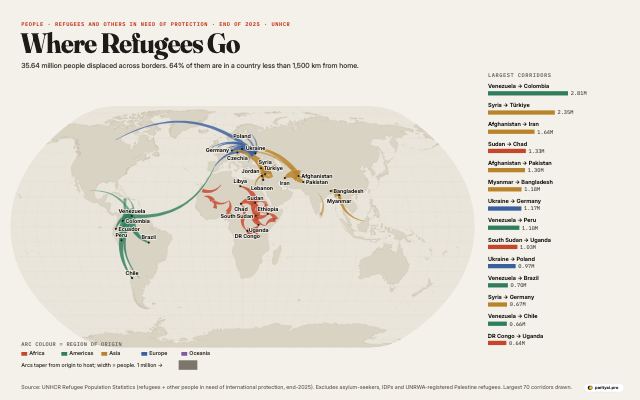
A light world map with curved, tapering arcs drawn from countries refugees fled to the countries hosting them. Arc width shows the number of people. The thickest arcs are short hops between neighbours: Venezuela to Colombia and Peru, Syria to Türkiye, Sudan to Chad, Afghanistan to Iran and Pakistan, Myanmar to Bangladesh, South Sudan to Uganda and Ukraine to Poland and Germany. Long-distance arcs are much thinner. A ranked list on the right shows the largest corridors.
People · Mapped

Where Refugees Go: The World's Largest Displacement Corridors, Mapped

October 12, 2026 · 7 min read
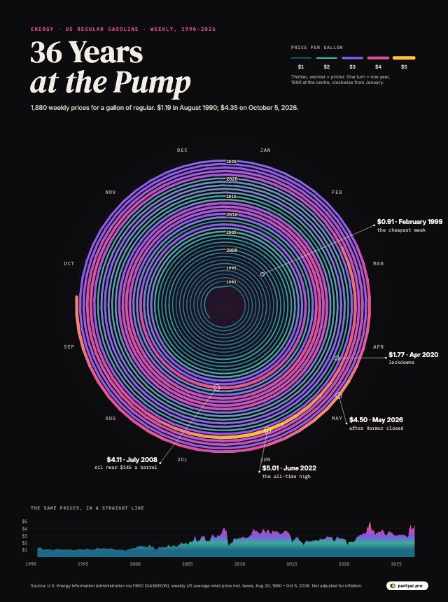
A spiral that starts in 1990 at the centre and winds outward one turn per year to October 2026. Each week is a short segment, thin and teal when gas was cheap and thick and gold when it was expensive. The outer turns are much thicker and warmer than the inner ones, with bright gold bulges in mid-2008, mid-2022 and from March 2026, and a thin dip in spring 2020. A line chart along the bottom shows the same prices in a straight line.
Energy · Charted

36 Years at the Pump: Every Weekly US Gas Price Since 1990, in One Spiral

October 11, 2026 · 8 min read
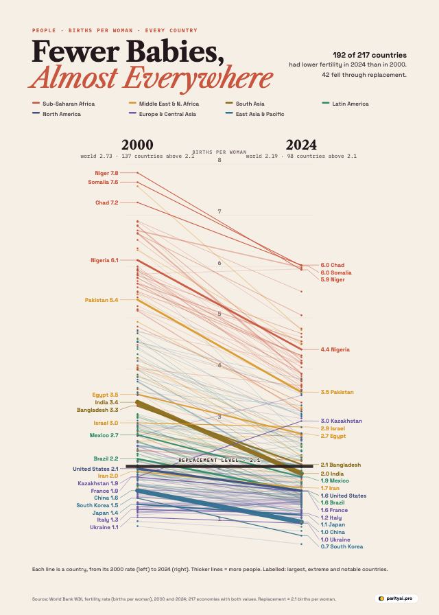
A slope chart with two vertical axes, 2000 on the left and 2024 on the right, both measuring births per woman from 0 to 8. Each of about 200 countries is a line between its two values, coloured by region. Almost all lines slope downward. A shaded band marks the replacement level of 2.1. Sub-Saharan African countries stay at the top, around 4 to 6. East Asian countries such as South Korea, China and Japan end at the very bottom, near 1 or below.
People · Charted

Fewer Babies, Almost Everywhere: Births per Woman in Every Country, 2000 vs 2024

October 11, 2026 · 7 min read
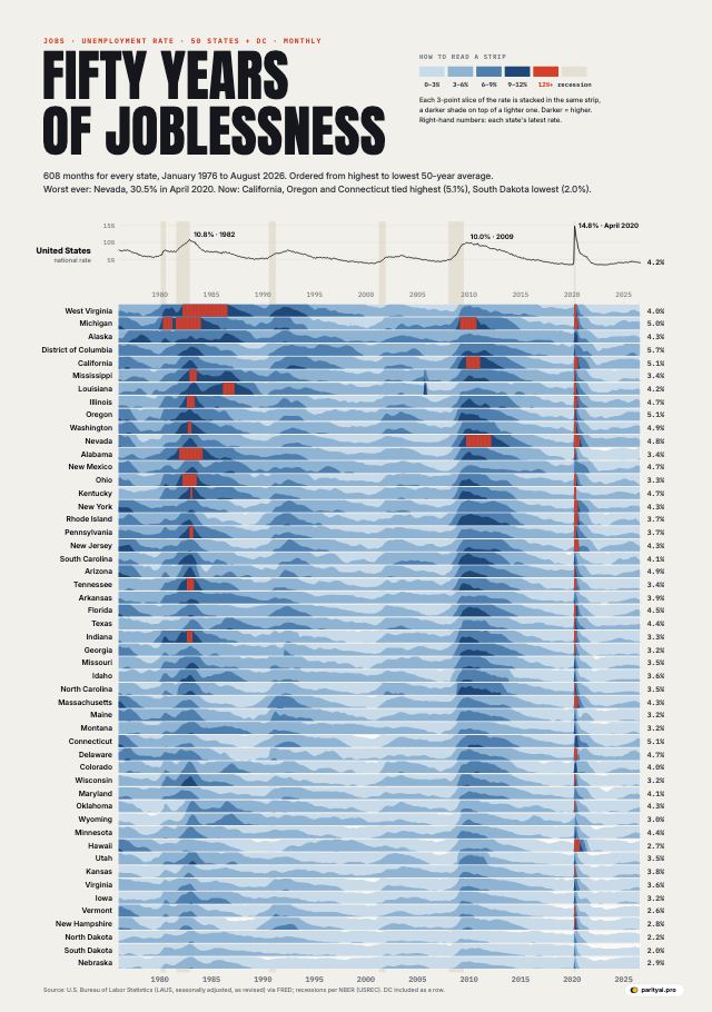
A horizon chart of monthly unemployment rates for the 50 states and Washington, DC, from January 1976 to August 2026. Each state is a thin horizontal strip; higher unemployment is drawn as darker, stacked bands of blue, and rates above 12 percent in red. Dark vertical columns cross all strips in the early 1980s, around 2009 to 2011, and a thin bright red line in April 2020. A line chart at the top shows the national rate with recessions shaded.
Jobs · Charted

Fifty Years of Joblessness: Unemployment in Every US State, Every Month Since 1976

October 11, 2026 · 7 min read
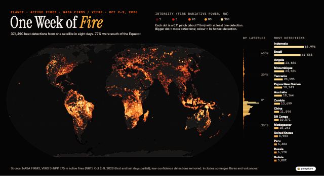
A black world map with every satellite fire detection from October 2 to 9, 2026, drawn as glowing dots from dark red to white-hot depending on the fire's intensity. Southern Africa, from Angola and Zambia to Mozambique, is almost solidly lit. Large clusters also glow across Brazil, Bolivia and Paraguay, northern Australia, Southeast Asia and parts of India, Russia and the United States. A profile on the right shows detections peaking at southern tropical latitudes, and a list ranks the countries with the most detections.
Planet · Mapped

One Week of Fire: Every Blaze a NASA Satellite Spotted, October 2–9, 2026

October 11, 2026 · 7 min read
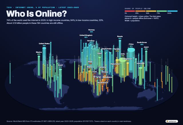
A dark, tilted world map with a cylindrical tower standing on each country. Tower height shows the share of the population using the internet and tower width shows population. Towers in Europe, North America, the Gulf and East Asia are tall and cyan. India and China are wide towers of medium to high height. Many towers across Central and West Africa are short and red or orange, showing that a minority of people there are online.
Tech · Mapped

Who Is Online? Internet Use in Every Country, Drawn as a City of Towers

October 11, 2026 · 7 min read
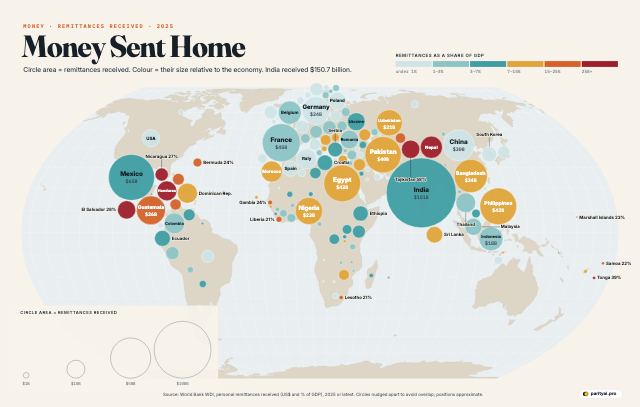
A world map overlaid with circles, one per country, placed near the country and sized by the remittances it received in 2025 or the latest year. India's circle is the largest, followed by Mexico, France, the Philippines and Egypt. Circles are coloured from pale teal for remittances under 1% of GDP to deep red for more than 25%, which applies to Tajikistan, Tonga and Nepal.
Money · Mapped

Money Sent Home: Where Remittances Matter Most

October 10, 2026 · 7 min read
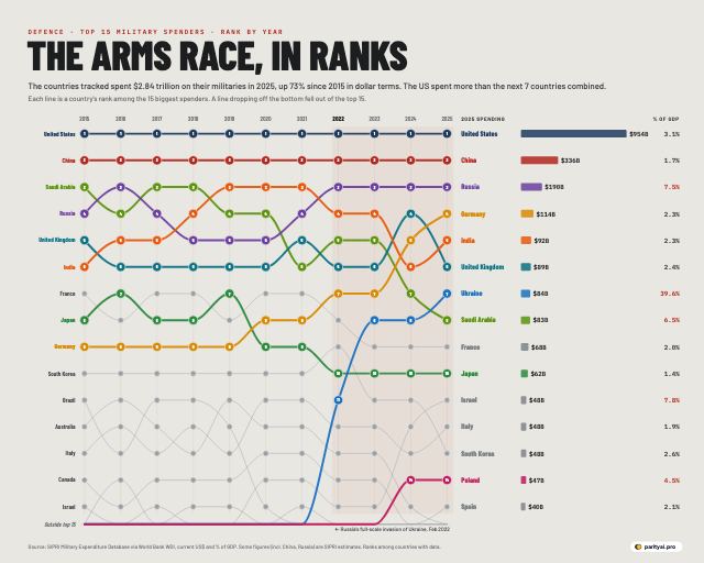
A bump chart with one line per country tracing its rank among the 15 largest military spenders from 2015 to 2025. The United States stays first and China second throughout. Germany, Ukraine and Poland climb steeply after 2022. A column on the right lists 2025 spending in US dollars and as a share of GDP.
Defence · Ranked

The Arms Race in Ranks: Who Moved Up the Military Spending Table, 2015–2025

October 10, 2026 · 7 min read
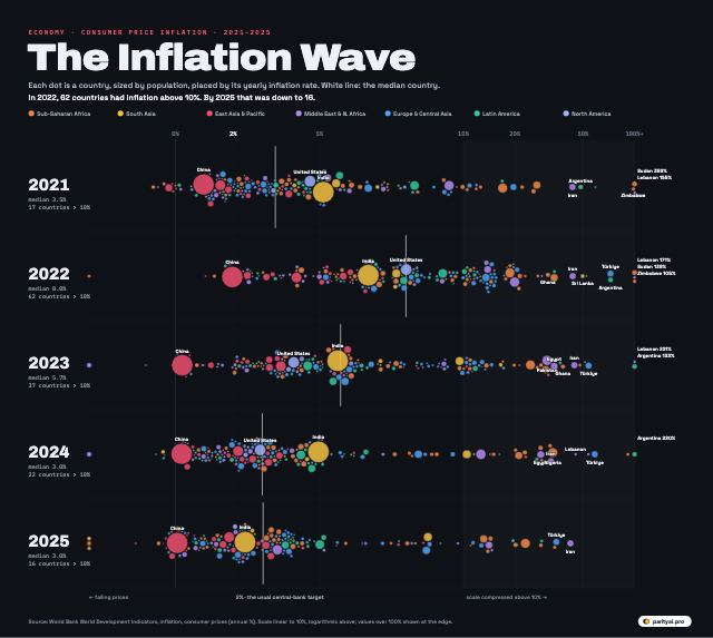
Five horizontal swarms of coloured dots, one for each year from 2021 to 2025, each dot a country placed by its annual consumer price inflation. In 2022 the swarm shifts far to the right as most countries see high inflation; by 2025 it has moved back toward low single digits. Outliers such as Argentina, Türkiye, Lebanon, Iran and Venezuela are labelled.
Economy · Visualized

The Inflation Wave: How Prices Rose and Fell in 170 Countries, 2021–2025

October 10, 2026 · 7 min read
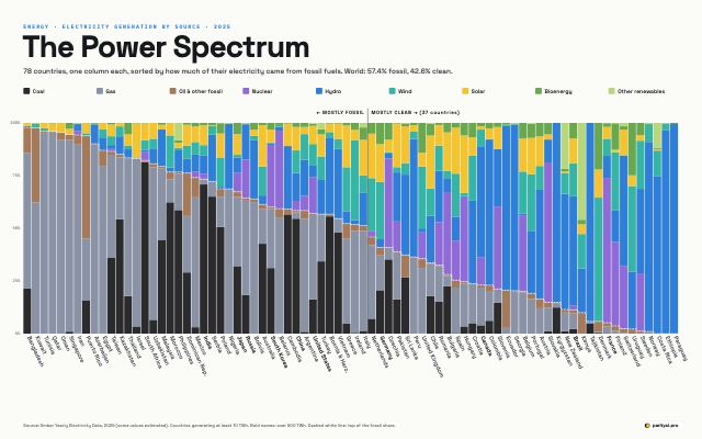
A long row of narrow vertical bars, one per country, each split into coloured segments showing the share of its 2025 electricity from coal, gas, oil, nuclear, hydro, wind, solar and bioenergy. Bars are sorted from nearly all fossil on the left, such as Kuwait and Bangladesh, to almost entirely clean on the right, such as Norway, Paraguay and France.
Energy · Charted

The Power Spectrum: Every Major Country's Electricity Mix in 2025

October 10, 2026 · 7 min read
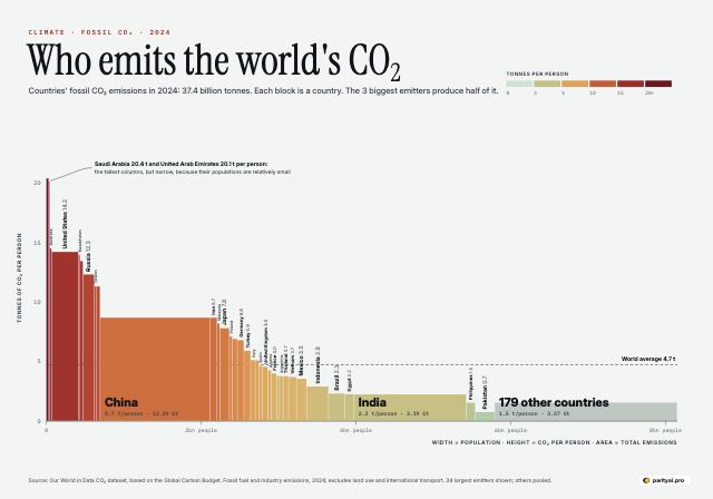
A Marimekko chart. Each country is a column whose width is its population and whose height is fossil CO2 emissions per person in 2024, so the column's area is its total emissions. China and India are the widest columns; China is tall and India short. The United States, Saudi Arabia and Australia are among the tallest. Columns are coloured from pale green for low emissions per person to dark red for high.
Climate · Charted

Who Emits the World's CO₂? Every Major Country, Sized by People and Pollution

October 10, 2026 · 7 min read
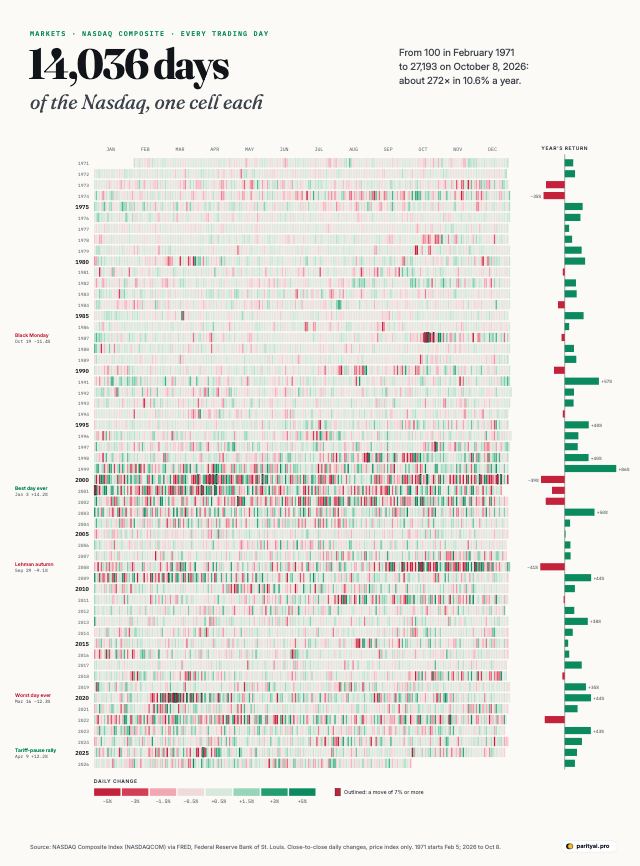
A calendar heatmap with one row per year from 1971 to 2026 and one small cell per trading day, coloured green for gains and red for losses, deeper for bigger moves. Clusters of deep red and green mark 1987, 2000 to 2002, 2008, March 2020 and April 2025. A bar at the end of each row shows that year's total return.
Markets · Visualized

14,500 Days of the Nasdaq: Every Trading Day Since 1971 in One Chart

October 9, 2026 · 7 min read
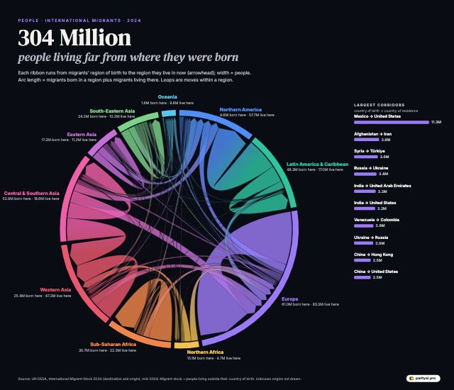
A circular chord diagram of ten world regions. Ribbons connect each region of origin to the region where its migrants live, with widths proportional to the number of people. Thick ribbons run from Latin America to Northern America, within Europe, and from Central and Southern Asia to Western Asia. A list beside the circle shows the ten largest country-to-country corridors, led by Mexico to the United States at 11.3 million.
People · Visualized

304 Million People Live Outside the Country They Were Born In. Here Is Where They Went

October 9, 2026 · 7 min read
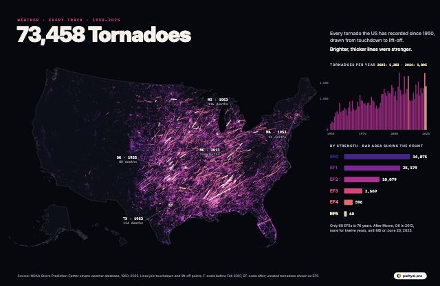
A dark map of the United States covered in glowing lines, one for each of 73,458 tornadoes recorded from 1950 to 2025, densest across the Plains and the South. Stronger tornadoes are brighter and thicker. A side panel shows tornado counts by year and the number at each rating, from 33,000 EF0s to 60 EF5s, and the deadliest tornadoes are labelled.
Weather · Mapped

73,458 Tornadoes: Every Recorded US Tornado Track Since 1950

October 9, 2026 · 7 min read
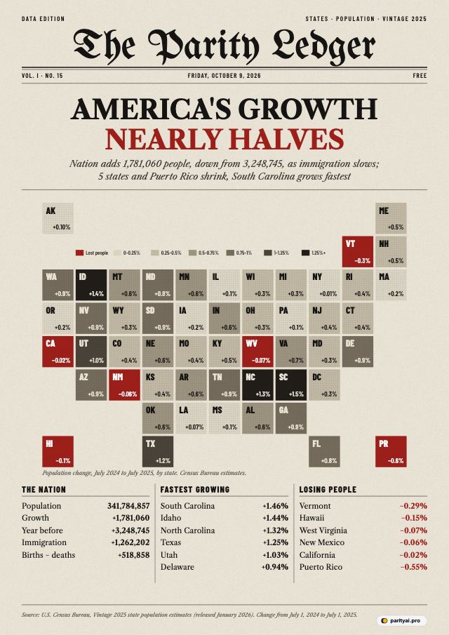
A newspaper front page titled The Parity Ledger with the headline 'America's growth nearly halves'. Its main image is a tile map of the 50 states, DC and Puerto Rico shaded by population change from July 2024 to July 2025: South Carolina, Idaho, North Carolina and Texas darkest, and California, Hawaii, New Mexico, Vermont, West Virginia and Puerto Rico in red for decline. Columns below list the leaders and the losers.
Population · Mapped

America's Growth Nearly Halved in 2025. Here Is Every State

October 9, 2026 · 7 min read
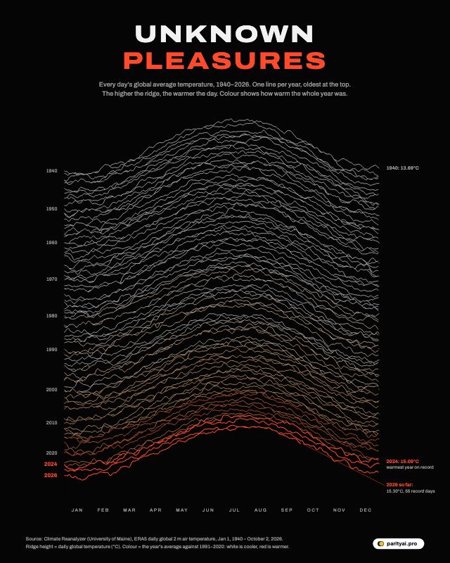
A black poster with 87 stacked white ridgelines, one per year from 1940 at the top to 2026 at the bottom, each tracing that year's daily global average surface air temperature. The lines climb and turn orange and red toward the bottom, where 2023, 2024 and 2025 peak highest.
Climate · Visualized

Eighty-Seven Years of Global Temperature, One Line per Year

October 9, 2026 · 7 min read
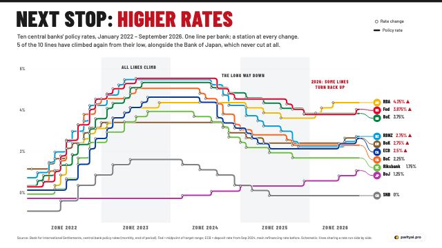
A subway-map style chart with ten coloured lines, one per central bank, running left to right from January 2022 to September 2026. Each line climbs steeply through 2022 and 2023, runs flat at its peak, falls through 2024 and 2025, and several, including the Fed, ECB and Bank of Japan, step back up in 2026. Stations mark each rate change.
Economy · Mapped

Next Stop, Higher Rates: Ten Central Banks on One Transit Map

October 9, 2026 · 7 min read
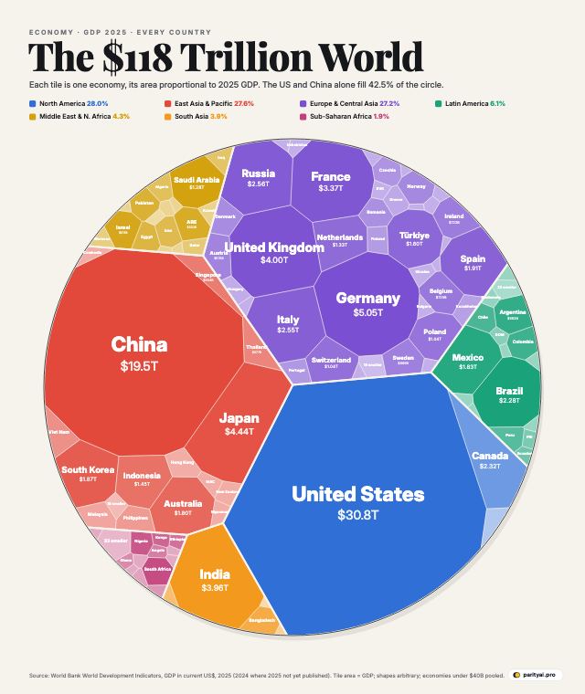
A circle divided into irregular tiles, one per country, each tile's area proportional to its 2025 GDP in US dollars and coloured by world region. The United States and China are the two largest tiles, followed by Germany, Japan, the United Kingdom and India. Hundreds of smaller economies form slivers around the edge.
Economy · Visualized

The $118 Trillion World Economy in One Circle

October 9, 2026 · 7 min read
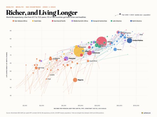
A scatter chart of about 180 countries with GDP per person on a logarithmic horizontal axis and life expectancy on the vertical axis. Each country is a bubble sized by population and coloured by region, with a thin trail back to its position in 2000. Nearly all trails point up and to the right; Sub-Saharan African countries show the longest upward trails. The United States sits below other rich countries.
Health · Visualized

The Health and Wealth of Nations: Every Country's Path From 2000 to 2024

October 9, 2026 · 7 min read
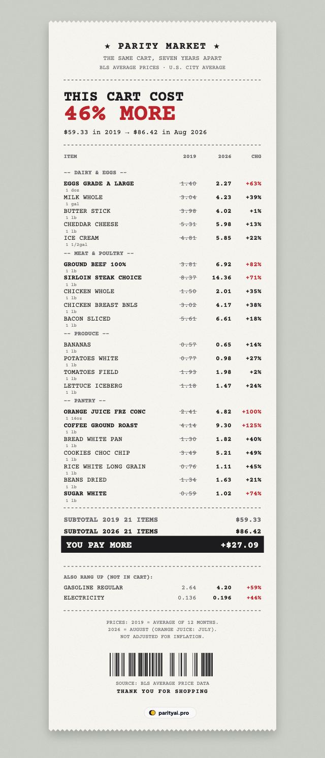
A long supermarket receipt listing 21 grocery items with their 2019 average price, their August 2026 price and the percentage change. Coffee rose about 125%, orange juice about 100% and ground beef about 82%. The cart's total rose from 2019 to 2026, printed at the bottom with a barcode.
Prices · Itemized

The Same Grocery Cart, 2019 vs 2026: Every Item on the Receipt

October 9, 2026 · 7 min read
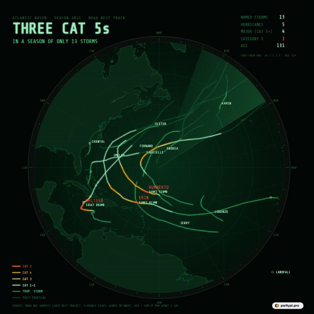
A green radar-scope style map of the Atlantic with the track of every 2025 storm. Three tracks glow red for Category 5 strength: Erin east of the Caribbean in August, Humberto in the central Atlantic in late September, and Melissa in the Caribbean, ending in Jamaica in October. A readout lists 13 storms, 5 hurricanes, 4 major and 3 Category 5.
Weather · Tracked

Three Category 5s: The 2025 Atlantic Hurricane Season on One Radar Screen

October 9, 2026 · 7 min read
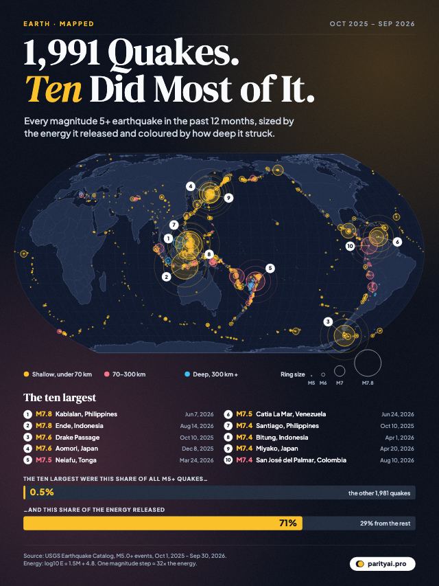
World map centred on the Pacific showing 1,991 magnitude 5+ earthquakes from October 2025 to September 2026 as rings sized by energy, with the ten largest labelled, and bars showing those ten were 0.5% of quakes but 71% of the energy released.
Earth · Mapped

1,991 Earthquakes in a Year, and Ten Released Most of the Energy

October 8, 2026 · 8 min read
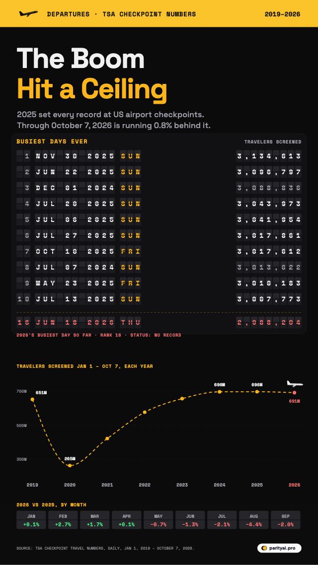
An airport departure board listing the ten busiest days ever at US airport checkpoints, all in 2024 and 2025, led by November 30, 2025 with 3,134,613 travelers. Below, 2026's busiest day so far and a flight path of travelers screened from January 1 to October 7 each year since 2019, which levels off from 2024 to 2026.
Travel · Ranked

No New Records: America's Air Travel Boom Hit a Ceiling in 2026

October 8, 2026 · 7 min read
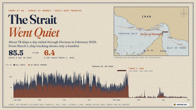
A nautical-chart style graphic. A map of the Strait of Hormuz with a shipping lane, and below it a daily chart of ship transits from January 2025 that falls from around 90 a day to almost zero on March 1, 2026 and stays there through early October.
Shipping · Charted

The Strait Went Quiet: Seven Months of Almost No Ships Through Hormuz

October 8, 2026 · 7 min read
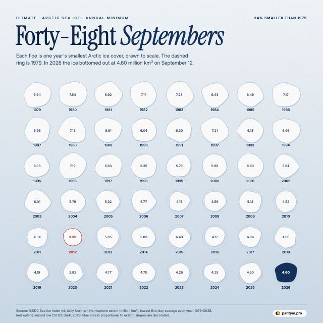
A grid of 48 white ice floes, one per year from 1979 to 2026, each sized by that year's minimum Arctic sea ice extent, with a dashed ring showing the 1979 size for comparison. The floes shrink over time; 2012 is the smallest and 2026 is highlighted.
Climate · Visualized

Forty-Eight Septembers: Every Arctic Sea Ice Minimum Since 1979, Drawn to Scale

October 7, 2026 · 7 min read
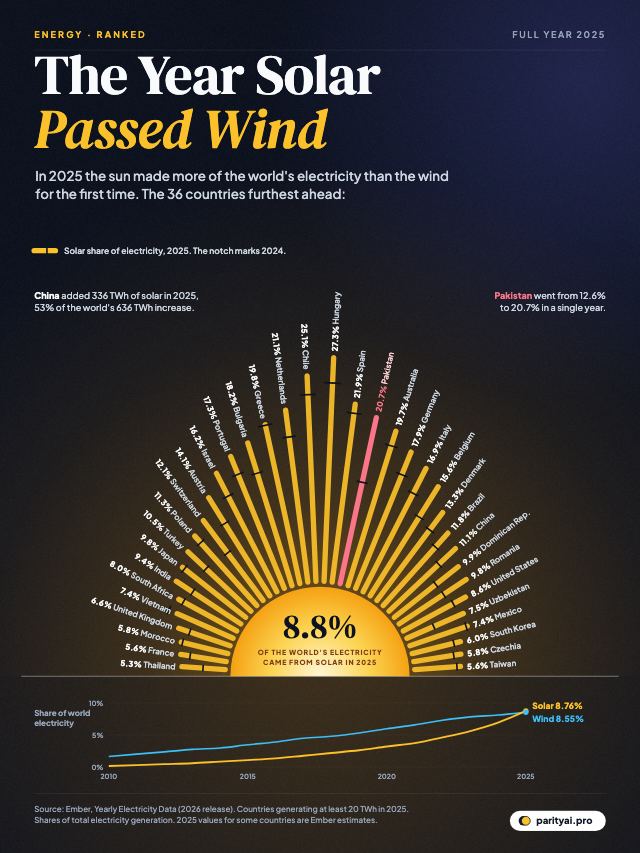
A rising sun with 36 rays, one per country, each as long as that country's solar share of electricity in 2025. Hungary leads at 27%, then Chile, Spain, the Netherlands and Pakistan. Below, world solar and wind shares from 2010 cross in 2025.
Energy · Ranked

Solar Passed Wind in 2025. These Countries Got There First

October 7, 2026 · 7 min read
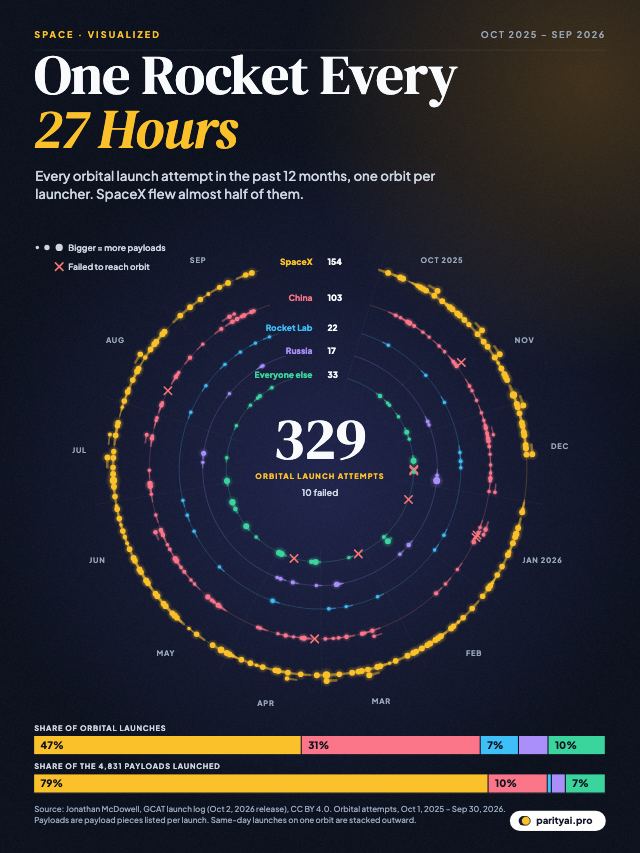
A circular calendar from October 2025 to September 2026 with five orbits: SpaceX, China, Rocket Lab, Russia and everyone else. Each of the 329 orbital launch attempts is a comet on its orbit; failures are marked in red. Bars below compare each group's share of launches and of payloads.
Space · Visualized

One Rocket Every 27 Hours: A Year of Orbital Launches, and Who Flew Them

October 6, 2026 · 7 min read
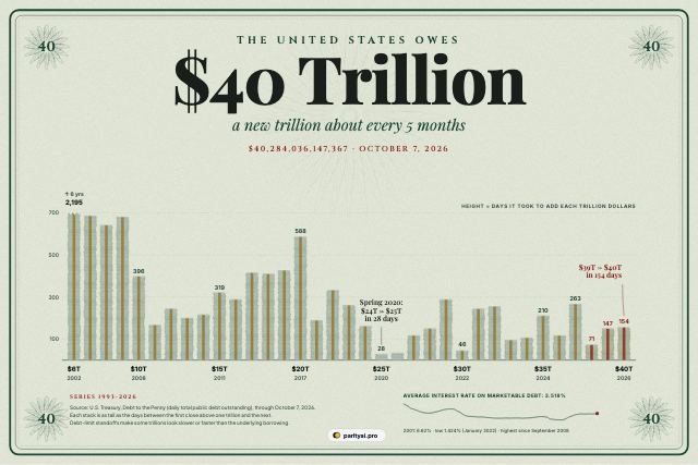
A banknote-style graphic. Thirty-five stacks of banknotes, one for each trillion dollars of US federal debt from $6 trillion to $40 trillion, each as tall as the number of days it took to add that trillion. The first stack, from 1996 to 2002, is broken off at the top at 2,195 days; recent trillions took between one and nine months.
Economy · Visualized

The $40 Trillion Debt, One Trillion at a Time

October 6, 2026 · 7 min read
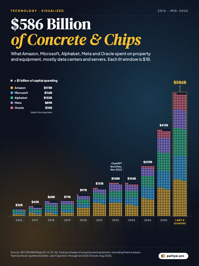
A night skyline of eleven towers, one per year from 2016 to 2025 plus the latest four quarters, built from lit windows where each window is $1 billion of capital spending by Amazon, Microsoft, Alphabet, Meta and Oracle. The towers climb from about $32 billion in 2016 to about $586 billion in the latest four quarters.
Technology · Visualized

The AI Build-Out in One Skyline: Big Tech's Capital Spending, 2016 to 2026

October 5, 2026 · 7 min read
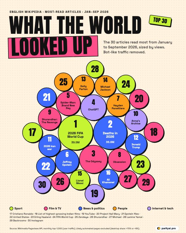
Pop-art bubbles for the 30 most-read English Wikipedia articles of January to September 2026, sized by page views and coloured by category. The 2026 FIFA World Cup is the largest, followed by Deaths in 2026, The Odyssey (2026 film) and ChatGPT.
Culture · Ranked

What the World Looked Up in 2026: Wikipedia's 30 Most-Read Articles So Far

October 5, 2026 · 7 min read
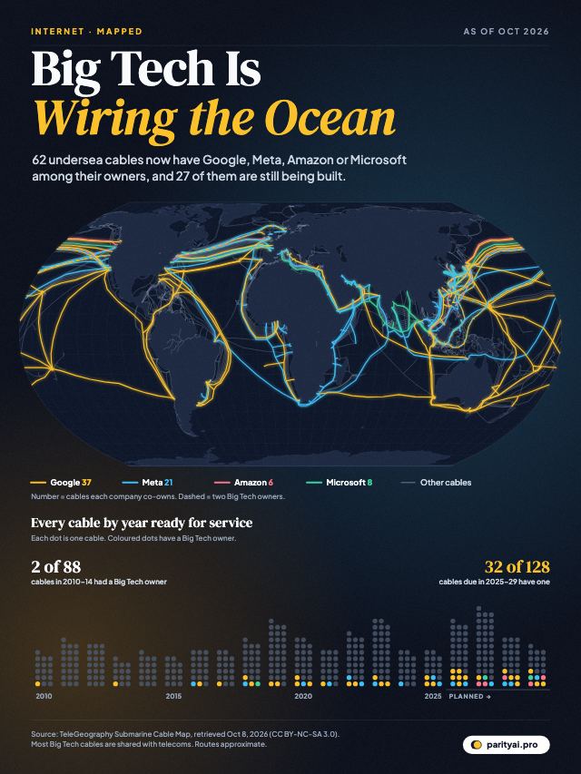
World map of submarine cables. Most are faint grey lines; the ones co-owned by Google, Meta, Amazon or Microsoft glow in colour across the Pacific, Atlantic and around Africa. Below, a bead chart shows cables by year ready for service from 2010 to 2029, with the Big Tech share rising from 2 of 88 in 2010–2014 to 33 of 128 in 2025–2029.
Internet · Mapped

Big Tech Is Wiring the Ocean: The Undersea Cables Owned by Google, Meta, Amazon and Microsoft

October 4, 2026 · 7 min read