The national unemployment rate is one number, released on the first Friday of each month and read as a verdict on the whole economy. In September 2026 it was 4.2%, with employers adding just 29,000 jobs. But no one lives in the national average. A factory worker in Michigan in 1982 and a bank clerk in South Dakota in the same month were living in different economies.
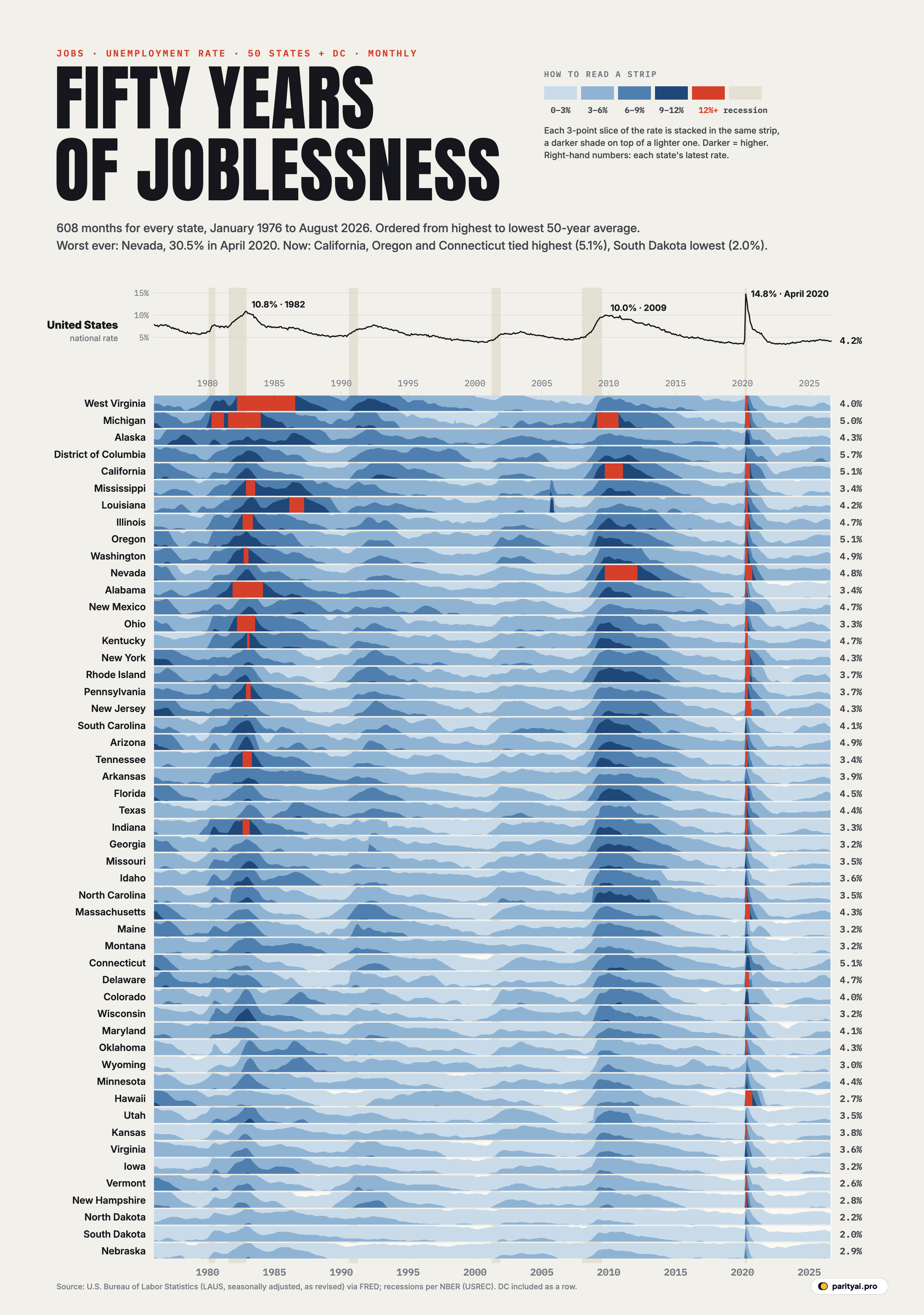
The chart above tries to show all of those economies at once. It holds 608 months of unemployment rates, from January 1976 to August 2026, for each of the 50 states and the District of Columbia: more than 30,957 numbers in total, from the Bureau of Labor Statistics' Local Area Unemployment Statistics program.
It is a horizon chart, a form designed to fit many time series into a small space. Each state gets a thin strip. The unemployment rate is cut into slices of three percentage points. Up to 3% is drawn in the palest blue; the slice from 3% to 6% is laid on top in a slightly darker blue, then 6% to 9%, then 9% to 12% in navy. Anything above 12% turns red. So a pale strip means a state where work was easy to find, and a dark strip, or a red block, means hard times. The rows run from the state with the highest average rate over the fifty years, at the top, to the lowest at the bottom. A line chart of the national rate sits above, with recessions shaded.
Here are the questions the chart answers, and a few it raises.
When was it hardest to find work?
Two moments stand out as vertical stripes running through nearly every row. One is the early 1980s, which shows up as a dark smudge across the left third of the chart. The other is a needle of red in the spring of 2020.
The pandemic needle is the most extreme thing on the page. The national rate jumped to 14.8% in April 2020, as now revised, the highest since the data began. In a single month, millions of jobs in restaurants, hotels, shops and offices disappeared. When the BLS first published state figures for that April, 43 states set series records.
The single worst state-month in fifty years is Nevada in April 2020: 30.5%. When casinos on the Las Vegas Strip closed, nearly a third of the state's workforce was suddenly out of a job. The first published estimate was 28.2%; later revisions pushed it higher. Michigan hit 22.7% and Hawaii, whose economy depends on tourism, 22.5%. Only 3 states went above 20%, but 44 of the 51 rows on the chart, counting DC, reached 10% that year.
What makes 2020 unusual is how quickly it ended. The red needles are barely a few pixels wide. By 2023 the national rate was down to 3.4%, its lowest since the late 1960s.
Which downturns hit the whole country, and which hit a region?
The chart's real strength is that it shows the shape of each recession across the map, not just its depth.
The early 1980s were a regional catastrophe. Look at the top rows: West Virginia went red for years, reaching 18.3% in February 1983. Michigan peaked at 16.5% in December 1982, and Ohio, Illinois, Indiana, Alabama and Pennsylvania all went above 12%. These were states built on steel, coal and cars. The Federal Reserve had pushed interest rates to record highs to break inflation, the dollar soared, and American heavy industry faced a flood of imports. Many of those jobs never came back. Further down the chart, in states such as Massachusetts and New Hampshire, the same years are noticeably paler.
The Great Recession, from late 2007 to mid-2009, looks different. It is a broad, dark column that runs across almost every row, because a housing and financial crash reached everywhere. The national rate peaked at 10.0%. But it lingered far longer than the recession itself: in many states the navy band stretches well into 2011 and 2012. The red blocks this time belong to the states where the housing bubble had been biggest. Nevada peaked at 13.4% in September 2010, and California at 12.4% in January 2010. Michigan, hit by both the housing crash and the near-collapse of General Motors and Chrysler, reached 14.3%.
And then there are the quiet columns. The recessions of the early 1990s and 2001 show up only faintly. In the early 1990s, the darker shading is concentrated in the Northeast and California, where defence cuts and a property slump hit hard. The 2001 downturn, after the dot-com bust, barely registers outside a handful of states.
| Downturn | US peak | States that hit 10%+ | Worst state |
|---|---|---|---|
| Early 1980s | 10.8% | West Virginia, 18.3% (February 1983) | |
| Early 1990s | 7.8% | West Virginia, 11.4% (January 1992) | |
| Dot-com bust | 6.3% | Oregon, 8.3% (May 2003) | |
| Great Recession | 10.0% | Michigan, 14.3% (June 2009) | |
| Pandemic | 14.8% | Nevada, 30.5% (April 2020) |
Counts include DC. A state 'hit 10%+' if any month in the window reached 10 percent.
Which states have always had it harder, and which easier?
Because the rows are sorted by average, the top of the chart is a list of America's chronically difficult labour markets. West Virginia has the highest average rate across the whole period, 7.6%, followed by Michigan (7.5%) and Alaska (7.5%). The District of Columbia sits high too. Alaska is a special case: its economy is seasonal and remote, with oil, fishing and tourism, and its rate stayed high even through national booms.
The bottom of the chart is just as consistent. Nebraska (3.4%), South Dakota (3.5%) and North Dakota (3.6%) have the lowest averages. Their strips are almost entirely the palest blue. These are Great Plains states with small populations, farming and energy economies, and few of the large manufacturing or tourism industries that shed workers in recessions. Even in April 2020, North Dakota peaked at just 8.7% and Nebraska at 8.2%.
The lowest state rate anywhere in the data is 1.7%, in South Dakota in February 2024.
Did any state escape the pandemic spike?
Not quite, but the size of the spike varied enormously, and it is one of the clearest lessons in the chart about how different state economies are.
States that depended on tourism and hospitality were hit hardest: Nevada and Hawaii above all. Big, diverse states with large service sectors, such as Illinois (18.3%), Massachusetts (17.8%), New York (15.7%) and California (16.1%), had large spikes too. Farming and energy states, and states that reopened earlier, had much smaller ones.
There is also a surprise in the record books. For most states, April or May 2020 is now the worst month in the data. Only a few have a worse month from an earlier era. West Virginia's 18.3% in 1983 still beats its 15.8% in 2020, and Alabama's worst month is also in 1982. For those states, the early 1980s remain the defining economic disaster.
| State | Highest rate | When | 1976–2026 | August 2026 | 50-year average |
|---|---|---|---|---|---|
| Nevada | April 2020 | 4.8% | 6.6% | ||
| Michigan | April 2020 | 5.0% | 7.5% | ||
| Hawaii | April 2020 | 2.7% | 4.6% | ||
| West Virginia | February 1983 | 4.0% | 7.6% | ||
| Illinois | April 2020 | 4.7% | 6.7% | ||
| Rhode Island | April 2020 | 3.7% | 6.2% | ||
| Massachusetts | April 2020 | 4.3% | 5.4% | ||
| Washington | April 2020 | 4.9% | 6.6% | ||
| Indiana | April 2020 | 3.3% | 5.8% | ||
| Kentucky | April 2020 | 4.7% | 6.4% | ||
| New York | May 2020 | 4.3% | 6.3% | ||
| Ohio | April 2020 | 3.3% | 6.4% | ||
| California | April 2020 | 5.1% | 7.1% | ||
| Pennsylvania | April 2020 | 3.7% | 6.2% | ||
| New Hampshire | April 2020 | 2.8% | 4.1% | ||
| Tennessee | April 2020 | 3.4% | 6.0% | ||
| Mississippi | April 2020 | 3.4% | 7.1% | ||
| New Jersey | May 2020 | 4.3% | 6.2% | ||
| Alabama | December 1982 | 3.4% | 6.6% | ||
| North Carolina | April 2020 | 3.5% | 5.6% | ||
| Florida | May 2020 | 4.5% | 6.0% | ||
| Wisconsin | April 2020 | 3.2% | 5.1% | ||
| Vermont | April 2020 | 2.6% | 4.3% | ||
| Arizona | April 2020 | 4.9% | 6.1% | ||
| Oregon | April 2020 | 5.1% | 6.7% | ||
| Louisiana | April 2020 | 4.2% | 6.8% | ||
| Delaware | May 2020 | 4.7% | 5.2% | ||
| Texas | April 2020 | 4.4% | 5.8% | ||
| Georgia | April 2020 | 3.2% | 5.7% | ||
| Oklahoma | April 2020 | 4.3% | 4.8% | ||
| Kansas | April 2020 | 3.8% | 4.5% | ||
| Montana | April 2020 | 3.2% | 5.4% | ||
| Connecticut | May 2020 | 5.1% | 5.3% | ||
| Virginia | April 2020 | 3.6% | 4.5% | ||
| Idaho | April 2020 | 3.6% | 5.6% | ||
| Alaska | May 2020 | 4.3% | 7.5% | ||
| South Carolina | November 2009 | 4.1% | 6.1% | ||
| Colorado | May 2020 | 4.0% | 5.2% | ||
| Missouri | April 2020 | 3.5% | 5.6% | ||
| District of Columbia | April 2020 | 5.7% | 7.3% | ||
| Minnesota | May 2020 | 4.4% | 4.7% | ||
| Iowa | April 2020 | 3.2% | 4.4% | ||
| New Mexico | February 1983 | 4.7% | 6.5% | ||
| Arkansas | February 1983 | 3.9% | 6.0% | ||
| Utah | April 2020 | 3.5% | 4.6% | ||
| Maine | May 2020 | 3.2% | 5.4% | ||
| Maryland | April 2020 | 4.1% | 5.1% | ||
| Wyoming | December 1986 | 3.0% | 4.7% | ||
| South Dakota | April 2020 | 2.0% | 3.5% | ||
| North Dakota | April 2020 | 2.2% | 3.6% | ||
| Nebraska | April 2020 | 2.9% | 3.4% |
Seasonally adjusted, BLS LAUS as currently revised. Highlighted: states whose worst month came before 2000, most of them in the early-1980s recession.
What does the chart say about now?
The right-hand edge of the chart is mostly pale. In August 2026, the latest month with state figures, 6 states had unemployment below 3%. South Dakota had the lowest rate in the country, 2.0%, according to the BLS, and North Dakota the next lowest at 2.2%. At the other end, California, Oregon and Connecticut were tied highest among the states at 5.1%, and the District of Columbia was higher still.
The national line has been creeping up. From a low of 3.4% in April 2023, it reached 4.2% in September 2026. That is still low by the standards of this chart; for most of the 1970s, 80s and 90s, a 4% national rate would have been considered a boom. But the right edges of the strips for California, Oregon, Washington, Michigan and Connecticut have started to darken a little, and the national pace of hiring has slowed sharply.
How to read the strips
- Stacked, not stretched. In a horizon chart, height inside a strip does not grow without limit. Once the rate passes 3%, the next slice starts again from the bottom in a darker colour. Read the darkness first, then the height.
- Seasonally adjusted and revised. The figures are the BLS's current estimates, which are revised every year. Some numbers, including Nevada's 2020 peak, differ from what was published at the time.
- Unemployment, not all joblessness. The rate counts people without a job who are actively looking. People who have given up looking, or who work part-time but want full-time work, are not included.
- Different populations. A strip for Wyoming and a strip for California are the same size, but California's labour force is about 60 times larger.
Fifty years in one picture
Stand back and the chart shows something no single month's figures could: that American unemployment comes in two kinds. One is national, a wave that rolls across every strip at once, as in 2008 and 2020. The other is regional, a stain that settles over a group of states for years while the rest of the country carries on, as it did in the industrial Midwest and Appalachia in the early 1980s.
The national kind tends to get the headlines, the emergency rate cuts and the stimulus. The regional kind can be just as deep for the people who live through it, and it can last much longer. The top rows of the chart are a reminder of how long that can be.
Sources and method
- U.S. Bureau of Labor Statistics, Local Area Unemployment Statistics: state unemployment rates (seasonally adjusted), via FRED. Series ALUR … WYUR and DCUR, January 1976 to August 2026, retrieved October 11, 2026
- U.S. Bureau of Labor Statistics, national unemployment rate (UNRATE), via FRED
- NBER-based recession indicator (USREC), via FRED
Monthly, seasonally adjusted unemployment rates for each state and DC from the BLS Local Area Unemployment Statistics program, as currently revised. In a horizon chart, the rate is cut into bands of 3 percentage points that are stacked on top of each other in the same strip, each band darker than the last, so a tall value takes little vertical space; values above 12% are drawn in red. States are ordered from the highest to lowest average rate over the whole period. Grey columns mark US recessions as dated by the NBER.
Charts like this, from your own numbers.
Connect a spreadsheet or the tools you run on, and Parity builds the dashboard and writes the report, with every number checked.
Try Parity free