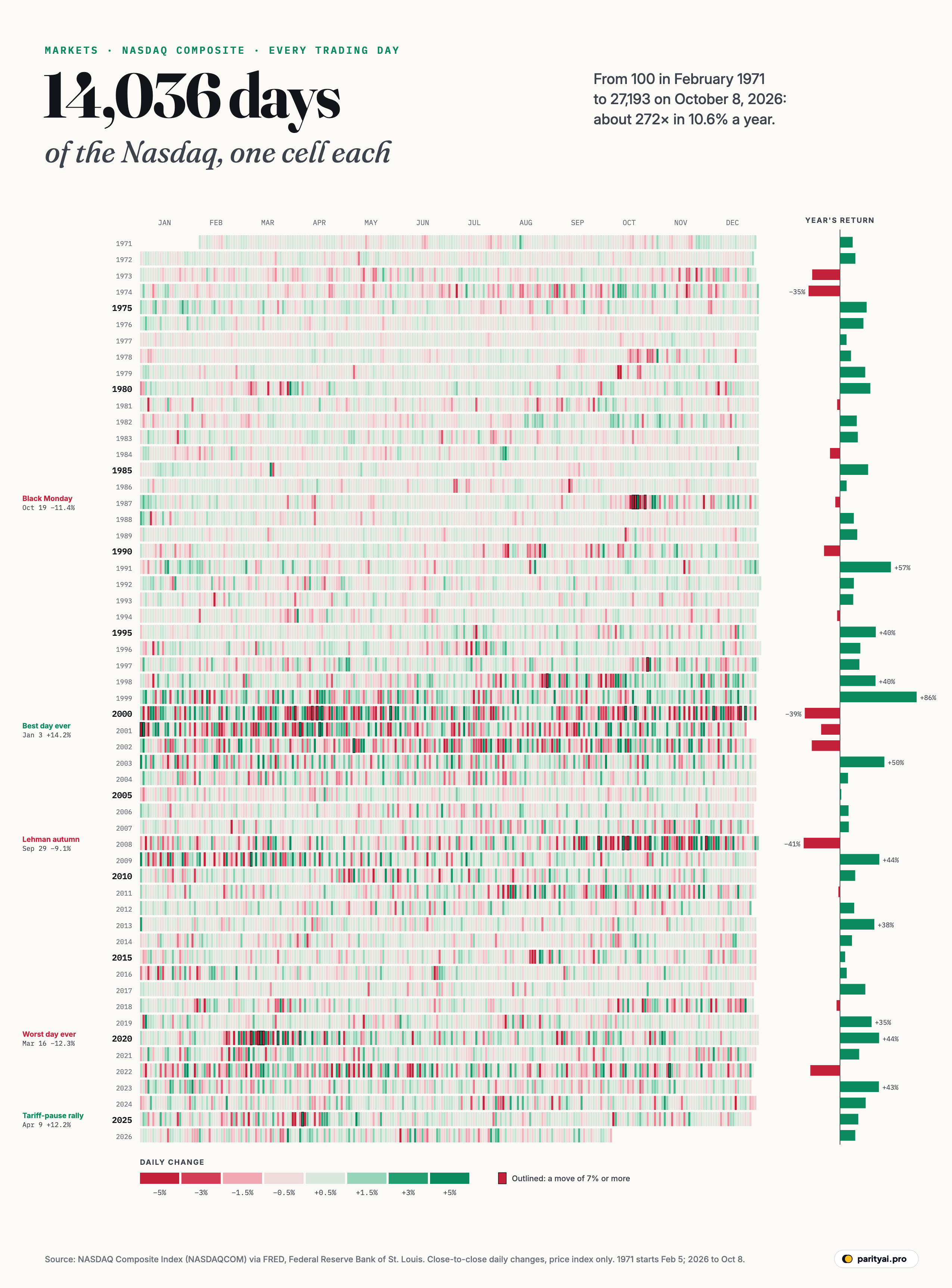
On February 5, 1971, the Nasdaq Composite was set to 100. On October 8, 2026, it closed at 27,193. In between are 14,036 trading days, and every one of them is a small coloured cell in the chart above.
The rows are years, from 1971 at the top to 2026 at the bottom. Within each row, days run left to right from January to December. A cell is green if the index rose that day and red if it fell, with deeper colours for bigger moves. Days when the index moved by 7% or more are outlined in black. At the end of each row, a bar shows how the whole year went.
The data are the daily closing values of the Nasdaq Composite, published by the Federal Reserve Bank of St. Louis. The index covers all the common stocks listed on the Nasdaq exchange, weighted by their market value, according to Nasdaq's methodology. These days that means it is dominated by the giant technology companies. Our figures are price changes only: dividends are not included.
The best way to read a chart like this is from top to bottom, the way you would read a long page of text.
1971–1986: the quiet rows
The first fifteen rows are pale. Days rarely moved the index by more than a percent or two, and the pattern looks almost like noise. The exception is 1973 and 1974, when an oil shock and a recession pushed the index down sharply. 1974's bar is one of the longest red bars in the first half of the chart.
This was a different Nasdaq. It was a young electronic market for small companies that didn't qualify for the New York Stock Exchange. Its daily swings were muted partly because many of its stocks traded thinly.
1987: one dark week
The first violent cluster comes in the autumn of 1987. On October 19, Black Monday, the index fell −11.35%, its second-worst day in the entire record, from 406.3 to 360.2. It fell another −9.00% the next day and −9.00% on October 26, 1987. Yet the row as a whole is not deeply red: the index ended 1987 only slightly lower. A crash can be brutal and still leave little mark on a year's total return.
1990s: the green builds
Through the 1990s the rows slowly grow more colourful. The cells get darker as more days move by more than a percent, and the green increasingly outweighs the red. The personal computer, then the internet, turned Nasdaq companies into the world's most exciting stocks. Annual bars lengthen to the right, peaking at +85.6% in 1999, the best year in the record.
Look closely at 1998. A late-summer cluster of red marks the Russian debt crisis and the collapse of the hedge fund Long-Term Capital Management, with a −8.56% day on August 31, 1998. It was a warning that markets had become much more volatile.
2000–2002: the brightest rows
Then come the three most intense rows on the chart. The index peaked at 5,048.62 on March 10, 2000. Over the next two and a half years it fell −77.9%, to 1,114.11 on October 9, 2002. The dot-com bubble had burst.
The rows for 2000, 2001 and 2002 are saturated with both colours. The year 2000 alone had 75 days with moves of 3% or more in either direction. By comparison, 1993 had 1. Falling markets aren't one long slide: they lurch. The worst day of the bust, April 14, 2000, cost −9.67%. And the best day in the entire record came in the middle of it: on January 3, 2001, after a surprise interest-rate cut by the Federal Reserve, the index jumped +14.17%. Four more of the ten best days ever came in 2000 and 2001.
Recovery took a very long time. The Nasdaq didn't close above its March 2000 peak again until April 23, 2015, as the AP reported then, fifteen years later.
2008: the autumn of red
The next dark band is the autumn of 2008, when the collapse of Lehman Brothers turned a housing downturn into a global financial crisis. On September 29, 2008, after Congress first rejected the bank rescue plan, the index fell −9.14%. Two weeks later, on October 13, 2008, it jumped +11.81%, its third-best day ever. The year 2008 had 47 days of 3% moves. Its bar, −40.5%, is the worst annual return in the record.
2010–2019: the long, calm climb
The decade after the crisis is the calmest stretch of the modern chart. The cells are mostly pale, the bars mostly green. 2017 had 0 days with moves of 3% or more. Interest rates near zero, a steady recovery and the rise of the giant technology companies pushed the index up year after year, with only brief interruptions.
2020: the fastest crash
March 2020 is the darkest few weeks on the whole chart. As the pandemic shut down economies, the index swung wildly almost every day. On March 16, 2020 it fell −12.32%, its worst day ever, a few days after a −9.43% drop on March 12, 2020. In between, on March 13, 2020, it rose +9.35%. Yet 2020 ended up as one of the best years of the decade: the bar shows the index ending the year well ahead as stimulus and remote work boosted technology stocks.
2022 and 2025: rate shock and tariffs
2022 was the worst year since 2008, at −33.1%, as the Federal Reserve raised interest rates at the fastest pace in decades. It wasn't a crash; it was a long grind of red days.
The 2025 row has a single violent knot in early April. After sweeping new tariffs were announced, the index fell into a bear market. By April 4 it was down 22.7% from its December record, according to Reuters. Then, on April 9, 2025, when the tariffs were paused, it jumped +12.16%, its second-best day ever. The year still ended up +20.4%.
2026: so far
The last row is unfinished. It shows a nervous March. After the war in the Persian Gulf began at the end of February, oil prices surged, and by March 26 the Nasdaq had fallen more than 10% below its high, the AP reported. Then the index recovered. It set its first record of the year in April and its latest, 27,600, on October 6, 2026. To October 8, 2026, 2026 is up +17.0%.
| # | Best days | Gain | Worst days | Loss |
|---|---|---|---|---|
| 1 | January 3, 2001 | March 16, 2020 | ||
| 2 | April 9, 2025 | October 19, 1987 | ||
| 3 | October 13, 2008 | April 14, 2000 | ||
| 4 | December 5, 2000 | March 12, 2020 | ||
| 5 | October 28, 2008 | September 29, 2008 | ||
| 6 | March 13, 2020 | October 20, 1987 | ||
| 7 | April 5, 2001 | October 26, 1987 | ||
| 8 | April 18, 2001 | December 1, 2008 | ||
| 9 | March 24, 2020 | August 31, 1998 | ||
| 10 | May 30, 2000 | October 15, 2008 |
Close-to-close changes in the Nasdaq Composite price index, February 1971 to October 8, 2026.
Measuring the colour
The chart's colour intensity has a simple number behind it: the average size of a day's move, up or down. In the 1970s the index moved an average of 0.54% a day. In the 1990s that rose to 0.80%. In the 2000s, the decade of the dot-com bust and the financial crisis, it reached 1.38%, more than twice the 1970s level. The calm 2010s brought it back down to 0.76%, and the 2020s so far have averaged 1.09%.
That pattern says something about the index itself. As the Nasdaq grew from a market for small companies into the home of the world's biggest technology firms, it became more sensitive to the big themes that move markets: interest rates, recessions and investors' hopes for the next technology. A day's move of 1% was once unusual; now it barely registers.
Streaks are rarer than they feel. The longest run of up days in the record is 19 sessions in a row, ending August 31, 1979. The longest run of down days is 16, ending February 9, 1984. Both came in the quiet early decades, when moves were small and steady. In the modern era a long run in either direction is rare, because large moves tend to bring buyers or sellers back in.
How the chart was made
Each cell's colour comes from a single calculation: that day's closing value divided by the previous trading day's close. Weekends and market holidays have no cell, so a full row holds between 248 and 254 trading days. The first row is short because the index only began in February 1971, and the last ends on October 8, 2026. The colour scale tops out at 3.5% in either direction, so any day that moved more than that is drawn at full strength, and days of 7% or more get an outline. That is why the crises jump out: on a quiet day, the cell is nearly white.
What the whole page says
Step back and three things stand out.
Up days barely outnumber down days. The index rose on 56% of trading days. That small edge, compounded over 55 years, turned 100 into 27,193, an average gain of about 10.6% a year, before dividends. Over the 55 complete years in the record, the index rose in 41.
Volatility clusters. The dark cells aren't scattered at random. They bunch together in 1987, 2000–2002, 2008, 2020 and a few weeks of 2025. Calm periods stay calm and turbulent ones stay turbulent, a pattern economists call volatility clustering.
The best and worst days arrive together. Most of the ten best days in the table sit right beside the ten worst, in the same few crisis months. An investor who sold in a panic and missed the rebound would have locked in the losses and missed the gains.
| Year | Return | Daily closes | Up days | Moves of 3%+ | Year-end close |
|---|---|---|---|---|---|
| 2026 (to Oct 8) | ▲ 17.0% | 102 of 193 | 27,193.34 | ||
| 2025 | ▲ 20.4% | 145 of 250 | 23,241.99 | ||
| 2024 | ▲ 28.6% | 147 of 252 | 19,310.79 | ||
| 2023 | ▲ 43.4% | 141 of 250 | 15,011.35 | ||
| 2022 | ▼ 33.1% | 111 of 251 | 10,466.48 | ||
| 2021 | ▲ 21.4% | 141 of 252 | 15,644.97 | ||
| 2020 | ▲ 43.6% | 157 of 253 | 12,888.28 | ||
| 2019 | ▲ 35.2% | 147 of 253 | 8,972.60 | ||
| 2018 | ▼ 3.9% | 134 of 251 | 6,635.28 | ||
| 2017 | ▲ 28.2% | 154 of 251 | 6,903.39 | ||
| 2016 | ▲ 7.5% | 135 of 252 | 5,383.12 | ||
| 2015 | ▲ 5.7% | 130 of 252 | 5,007.41 | ||
| 2014 | ▲ 13.4% | 144 of 252 | 4,736.05 | ||
| 2013 | ▲ 38.3% | 150 of 252 | 4,176.59 | ||
| 2012 | ▲ 15.9% | 129 of 250 | 3,019.51 | ||
| 2011 | ▼ 1.8% | 138 of 252 | 2,605.15 | ||
| 2010 | ▲ 16.9% | 148 of 252 | 2,652.87 | ||
| 2009 | ▲ 43.9% | 143 of 252 | 2,269.15 | ||
| 2008 | ▼ 40.5% | 117 of 253 | 1,577.03 | ||
| 2007 | ▲ 9.8% | 145 of 251 | 2,652.28 | ||
| 2006 | ▲ 9.5% | 134 of 251 | 2,415.29 | ||
| 2005 | ▲ 1.4% | 136 of 252 | 2,205.32 | ||
| 2004 | ▲ 9.0% | 135 of 252 | 2,175.44 | ||
| 2003 | ▲ 49.5% | 140 of 252 | 1,996.62 | ||
| 2002 | ▼ 31.5% | 117 of 252 | 1,335.51 | ||
| 2001 | ▼ 21.1% | 125 of 248 | 1,950.40 | ||
| 2000 | ▼ 39.3% | 122 of 252 | 2,470.52 | ||
| 1999 | ▲ 85.6% | 146 of 252 | 4,069.31 | ||
| 1998 | ▲ 39.6% | 145 of 252 | 2,192.69 | ||
| 1997 | ▲ 21.6% | 145 of 253 | 1,570.35 | ||
| 1996 | ▲ 22.7% | 151 of 254 | 1,291.03 | ||
| 1995 | ▲ 39.9% | 148 of 252 | 1,052.13 | ||
| 1994 | ▼ 3.2% | 132 of 252 | 751.96 | ||
| 1993 | ▲ 14.7% | 155 of 253 | 776.80 | ||
| 1992 | ▲ 15.5% | 133 of 254 | 676.95 | ||
| 1991 | ▲ 56.8% | 149 of 253 | 586.34 | ||
| 1990 | ▼ 17.8% | 132 of 253 | 373.84 | ||
| 1989 | ▲ 19.3% | 157 of 252 | 454.82 | ||
| 1988 | ▲ 15.4% | 150 of 253 | 381.38 | ||
| 1987 | ▼ 5.3% | 147 of 253 | 330.47 | ||
| 1986 | ▲ 7.4% | 155 of 253 | 348.83 | ||
| 1985 | ▲ 31.4% | 149 of 252 | 324.93 | ||
| 1984 | ▼ 11.2% | 109 of 253 | 247.35 | ||
| 1983 | ▲ 19.9% | 147 of 253 | 278.60 | ||
| 1982 | ▲ 18.7% | 130 of 253 | 232.41 | ||
| 1981 | ▼ 3.2% | 145 of 253 | 195.84 | ||
| 1980 | ▲ 33.9% | 162 of 253 | 202.34 | ||
| 1979 | ▲ 28.1% | 167 of 253 | 151.14 | ||
| 1978 | ▲ 12.3% | 165 of 252 | 117.98 | ||
| 1977 | ▲ 7.3% | 143 of 252 | 105.05 | ||
| 1976 | ▲ 26.1% | 151 of 253 | 97.88 | ||
| 1975 | ▲ 29.8% | 140 of 253 | 77.62 | ||
| 1974 | ▼ 35.1% | 113 of 253 | 59.82 | ||
| 1973 | ▼ 31.1% | 119 of 252 | 92.19 | ||
| 1972 | ▲ 17.2% | 146 of 251 | 133.73 | ||
| 1971 (from Feb 5) | ▲ 14.1% | 134 of 228 | 114.12 |
Highlighted years moved more than 40% in either direction. Price returns only; dividends are not included.
None of this predicts what the next row will look like. But it is a reminder that the long green climb was made of thousands of ordinary days, and a handful of extraordinary ones.
Sources and method
- Nasdaq OMX Group, NASDAQ Composite Index (NASDAQCOM), via FRED, Federal Reserve Bank of St. Louis. Daily closes, February 5, 1971 to October 8, 2026, retrieved October 9, 2026
Daily returns are the percentage change from one trading day's close to the next, using FRED's daily closing values (price index, dividends not included). Days with no value (market holidays) are skipped. Annual returns run from the last close of the previous year to the last close of the year; 1971 starts from the index's base of 100 on February 5, and 2026 runs to October 8.
Charts like this, from your own numbers.
Connect a spreadsheet or the tools you run on, and Parity builds the dashboard and writes the report, with every number checked.
Try Parity free