In 1970, a radio astronomer named Harold Craft Jr. made a plot of pulses recorded at the Arecibo telescope from the first pulsar ever discovered, a collapsed star called CP 1919. He stacked successive pulses one above another, each a jagged white line, so the signal looked like a range of mountains. Nine years later the image, by way of an astronomy encyclopedia, became the cover of Joy Division's album Unknown Pleasures, and one of the most famous pieces of data art ever made. Scientific American has told the full story of how a figure from Craft's 1970 thesis ended up as a pop-culture icon.
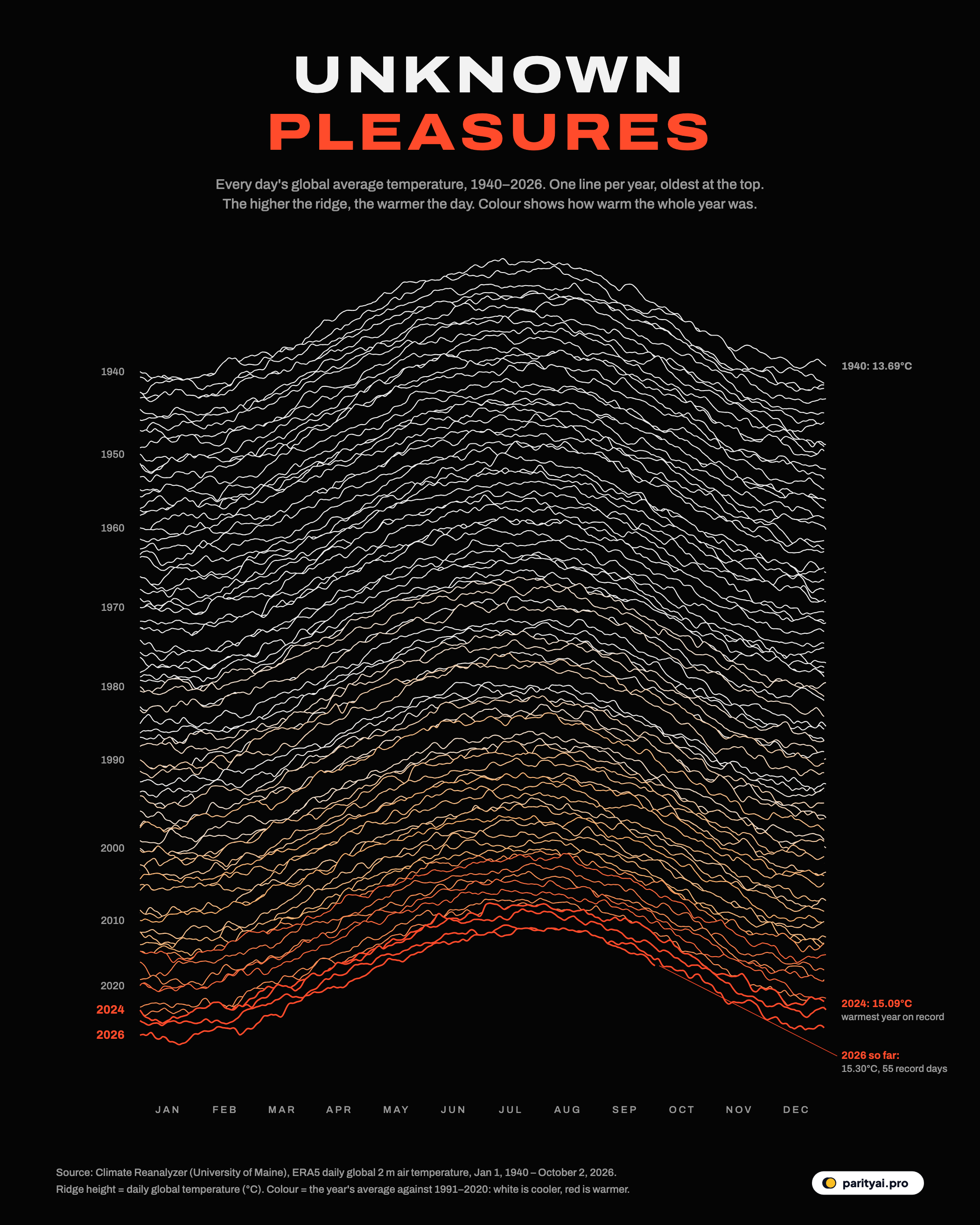
The graphic above borrows that form for a different signal: the temperature of the whole planet, every day since January 1, 1940.
What you're looking at
Each of the 87 lines is one year. The oldest, 1940, is at the top and 2026 is at the bottom. Within a line, time runs left to right from January to December, and the height of the line on any day is the average air temperature across the entire Earth's surface on that day. Each line is drawn over the ones above it, so where a year is warmer than its neighbours, its ridge rises and hides them.
The colour carries the second half of the story. Years with an average temperature below the 1991–2020 norm are white. Years above it shade through orange to red. The bottom of the chart glows.
The numbers come from Climate Reanalyzer at the University of Maine. It publishes daily global averages from ERA5, the reanalysis produced by the European Union's Copernicus Climate Change Service. A reanalysis combines billions of weather observations from satellites, balloons, ships and weather stations with a weather model, producing a consistent picture of the atmosphere every hour since 1940.
Why every ridge peaks in July
The first thing the eye notices is the hump in the middle of every line. That isn't climate change; it's geography. Most of the world's land lies in the Northern Hemisphere, and land heats and cools faster than ocean, so the planet as a whole is warmest during the northern summer. Every year in the record has its highest temperatures somewhere around July and August, and its lowest around the turn of the year. In recent decades the world's average temperature has swung by about 4.2°C between the coolest and warmest days of each year.
That seasonal swing is far larger than the change since 1940, which is why the ridges look so similar at first glance. The warming shows up in two subtler ways: each ridge sits a little higher than its predecessors, and the colours shift from white to red.
The flat decades
The upper half of the chart, from 1940 into the 1970s, is a long stretch of white. The average for the 1950s was 13.71°C, almost exactly the same as 1940's 13.69°C. Temperatures wandered up and down with El Niño and La Niña cycles and the occasional volcanic eruption, but without much of a trend. In 1940, the warmest day of the year reached 15.93°C.
In the record as a whole, the 1980s averaged 14.02°C, still close to that early baseline. In the image, that is where the first faint orange begins to creep in.
The climb
From the 1980s onward, the colours change steadily. The 2000s averaged 14.35°C, the 2010s 14.58°C, and the first six years of the 2020s 14.86°C. Every decade has been warmer than the one before.
Put another way: the ten warmest full years in this record all came in 2016 or later. The World Meteorological Organization, comparing eight separate datasets, found the same pattern: the eleven years from 2015 to 2025 were the eleven warmest on record in all of them.
The warmest year in the ERA5 record is 2024, which averaged 15.09°C, 1.40°C above 1940. Copernicus calculated that 2024 was the first calendar year more than 1.5°C warmer than the pre-industrial period of 1850–1900. That is the threshold at the heart of the Paris Agreement, though the agreement refers to a long-term average, not a single year.
Winter is warming too
It would be easy to assume the warming is all about hotter summers, because the summer peaks catch the eye. The data say otherwise. Compare the first three decades of the record, 1940 to 1969, with the most recent three, 1996 to 2025. The average January, the coolest month for the planet as a whole, warmed from 11.77°C to 12.56°C, a rise of 0.78°C. The average July, the warmest, rose from 15.65°C to 16.35°C, a rise of 0.71°C.
In other words, the whole ridge has lifted, not just its peak. On the chart, that is why recent lines sit higher from end to end, not just in the middle. It matches what climate scientists expect from greenhouse warming. Extra heat is trapped in every season, and some of the fastest warming on Earth is in the Arctic winter, which this global average blends in with everything else.
The rise is also uneven over time. The early decades in this record are almost flat: the global average barely changed between 1940 and the 1970s, partly because sulphate pollution from industry and power plants reflected sunlight and masked some of the warming. As air pollution was cleaned up and greenhouse gases kept accumulating, the climb steepened. Since the 1980s, each decade has been warmer than the one before.
That is the shape the colours show: decades of white, then a steady shift to orange, then the red cluster at the bottom of the page.
Three summers above the rest
Look at the bottom of the chart and three ridges stand out in red: 2023, 2024 and 2025. Their annual averages were 14.98°C, 15.09°C and 14.97°C, the three warmest years on record, with 2024 first, 2023 second and 2025 third.
These years didn't just average warmer. They set records day after day. We count a day as a record if it was warmer than the same date in every earlier year. By that measure, 2023 set 208 records and 2024 set 197. For long stretches of both years, almost every day was the warmest that date had ever been.
The single warmest day in the dataset came in July 2024. Climate Reanalyzer's figures put the peak at 17.15°C on July 23, 2024. Copernicus reported a record 17.16°C on July 22, with July 23 almost identical. The small difference comes from how the two services process the same ERA5 data.
Copernicus ranks 2025 as the third warmest year, 1.47°C above pre-industrial levels. It also found that 2023 to 2025 together averaged more than 1.5°C above pre-industrial. The WMO's average across eight datasets put those three years at 1.48°C, just below the line. Whether the threshold has been crossed depends on which yardstick you use. Either way, the world is now living right at it.
2026 so far
The bottom line on the chart is unfinished, because the year is. Through October 2, 2026, 2026 has averaged 15.30°C. That makes it the 2nd-warmest start to a year in the record, behind only 2024 (15.38°C over the same days) and ahead of 2025 (15.26°C) and 2023 (15.20°C). It has set 55 daily records so far.
Its ridge peaks at 17.05°C on August 14, 2026. That fits Copernicus's finding that August 2026 tied the hottest month ever recorded, at 16.96°C, level with July 2023, and pushed global temperatures back above 1.5°C for the first time since November 2025.
What comes next depends partly on the Pacific. NOAA's Climate Prediction Center says El Niño is strengthening and likely to be strong to very strong through early 2027. El Niño releases heat from the ocean into the atmosphere and tends to push global temperatures to new highs, usually with a lag of a few months. The last strong El Niño contributed to the record heat of 2023 and 2024. If the pattern repeats, 2027's ridge may climb above everything on this chart.
| # | Year | Annual mean (°C) | vs 1940 | Warmest day | Record days |
|---|---|---|---|---|---|
| 1 | 2024 | ▲ 1.40°C | 17.15°C | 197 | |
| 2 | 2023 | ▲ 1.29°C | 17.07°C | 208 | |
| 3 | 2025 | ▲ 1.28°C | 16.86°C | 43 | |
| 4 | 2016 | ▲ 1.12°C | 16.80°C | 259 | |
| 5 | 2020 | ▲ 1.11°C | 16.68°C | 112 | |
| 6 | 2019 | ▲ 1.09°C | 16.76°C | 116 | |
| 7 | 2017 | ▲ 1.03°C | 16.74°C | 73 | |
| 8 | 2022 | ▲ 0.99°C | 16.79°C | 25 | |
| 9 | 2021 | ▲ 0.96°C | 16.66°C | 19 | |
| 10 | 2018 | ▲ 0.95°C | 16.74°C | 26 | |
| 11 | 2015 | ▲ 0.95°C | 16.61°C | 146 | |
| 12 | 2010 | ▲ 0.82°C | 16.40°C | 87 |
Full years only, 1940–2025. Bars start at 13.5°C. 'Record days' are days warmer than the same date in every earlier year. 2026 so far (to October 2, 2026): 15.30°C.
How to read the extremes
A few cautions for anyone reusing this chart. Absolute global temperatures, such as 15.09°C, depend on the dataset. Other products, such as NASA's and NOAA's, report anomalies against a baseline rather than absolute values. The trends, rankings and timing of records agree closely across them, but the absolute numbers do not. Reanalysis data for the most recent days are preliminary and get revised. And a single record day says little on its own; it's the run of them, year after year, that matters. Finally, a global average smooths away the extremes people actually feel. A world that is about 1.4°C warmer on average can still mean heatwaves several degrees hotter than normal in a single city or region.
The original Unknown Pleasures plot showed the steady heartbeat of a dead star, the same pulse arriving again and again. This one shows something that isn't steady. The pulse is still there every July, but each beat now starts from a higher floor.
Sources and method
- Climate Reanalyzer, Climate Change Institute, University of Maine: daily global 2-metre air temperature from ERA5. ERA5 reanalysis from the Copernicus Climate Change Service; daily world means, 1940 to early October 2026, retrieved October 9, 2026
Values are daily global-mean surface air temperatures (2 metres above the ground) from the ERA5 reanalysis, as published by Climate Reanalyzer. Annual means average every available day. Comparisons for 2026 use the same calendar days in earlier years. A day is a 'record' when it was warmer than the same calendar day in every earlier year. Reanalysis values are revised slightly as data are finalised, and other datasets give slightly different absolute temperatures.
Charts like this, from your own numbers.
Connect a spreadsheet or the tools you run on, and Parity builds the dashboard and writes the report, with every number checked.
Try Parity free