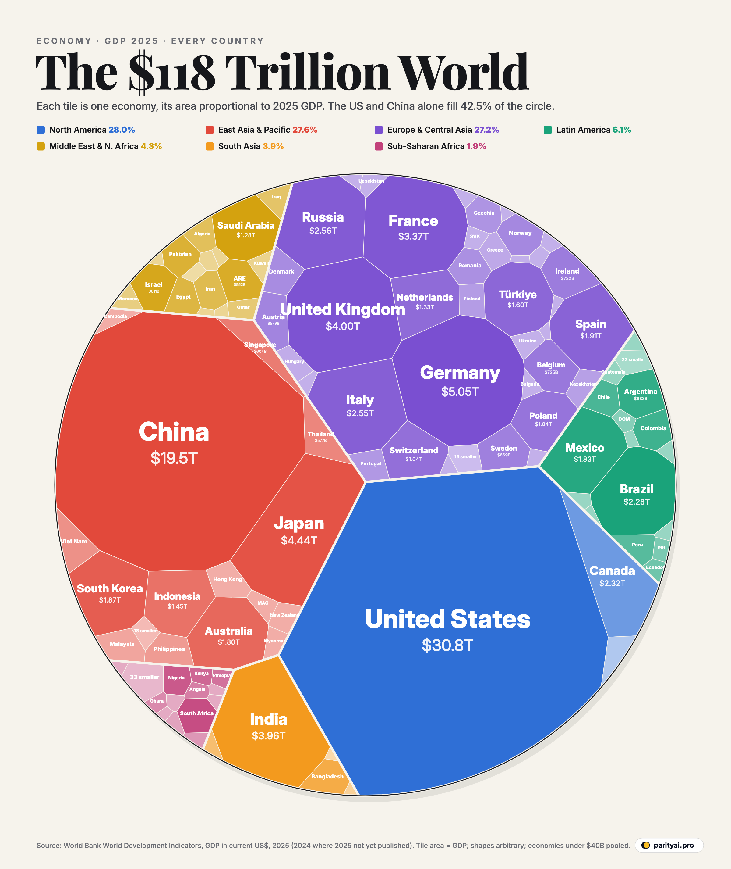
Imagine the entire world economy as a single $100 bill. In 2025, the United States would hold about $26 of it and China about $16. The other 198 economies in the World Bank's data would share what's left.
That is the picture in the circle above. Each tile is one economy, and its area is proportional to its gross domestic product in 2025, the market value of everything it produced, converted to US dollars. Tiles are grouped and coloured by region. The shapes themselves don't mean anything: a computer algorithm draws them so that every tile gets exactly the right area. The figures come from the World Bank's World Development Indicators, which put world output in 2025 at $118.35 trillion.
Here is how that $100 is divided, one slice at a time.
The first $42: two superpowers
The two biggest tiles take up 42.5% of the circle between them. The United States produced $30.77 trillion in 2025, 26.0% of the world total. China produced $19.50 trillion, or 16.5%.
The gap between them has barely changed in a decade. In 2015, China's economy was 62% the size of America's in dollar terms. In 2025 it was 63%. China grew faster in its own currency over that period, but a weaker yuan and slower growth in recent years kept it from catching up in dollars, which is the yardstick this chart uses. In 2015 the two economies were $18.30 trillion and $11.28 trillion.
The next $24: eight big economies
After the two giants comes a group of large, mostly rich economies, each with between 2% and 4% of world output.
Germany ($5.05 trillion) is third, followed by Japan ($4.44 trillion) and the United Kingdom ($4.00 trillion). Japan's tile is a reminder of how much exchange rates matter. Its economy was smaller in dollar terms in 2025 than in 2015 ($4.53 trillion), a change of -2%, because the yen lost much of its value against the dollar over the decade, even though Japan's output in yen grew.
India ($3.96 trillion) is sixth, just behind the UK. It is the fastest-growing big economy on the chart: in dollar terms its GDP rose 88% between 2015 and 2025, from $2.10 trillion, lifting it from 7th place to 6th. Forecasts that India will soon pass Japan keep moving. In its April 2026 outlook, the IMF still placed India behind Japan and the UK in 2026, according to the Indian Express, after a revision to India's GDP figures and a weaker rupee. It now expects India to move up to fourth by 2027.
France ($3.37 trillion), Russia, Italy and Canada complete the top ten. Together, the ten largest economies account for 66.3% of the world total.
A decade of shifting tiles
If we drew the same circle for 2015, the tiles would look surprisingly familiar. The United States had $18.30 trillion then and $30.77 trillion now; China grew from $11.28 trillion to $19.50 trillion. In nominal dollars, both grew by roughly two-thirds, which is why China's tile has hardly gained on America's. The tiles that grew most belonged to fast-growing developing economies: Bangladesh's more than doubled in dollar terms, and Vietnam's and India's nearly did. Japan's tile shrank, and those of Germany, France, Italy and the UK grew more slowly than the world average. Over the same decade, the world economy as a whole grew by 56%, part of it real growth and part of it inflation.
By region
Colour the tiles by region and the circle splits into three nearly equal blocks and a fringe.
- North America — 28.0% of world output, from just 3 economies.
- East Asia & Pacific — 27.6%, from 33.
- Europe & Central Asia — 27.2%, from 53.
Those three regions produce more than four-fifths of the world's output. The remaining fifth is split between Latin America (6.1%), the Middle East & N. Africa (4.3%), South Asia (3.9%) and Sub-Saharan Africa (1.9%).
That last figure is the most striking on the chart. Sub-Saharan Africa is home to more than a seventh of the world's people, but its 46 economies together produced $2201 billion in 2025, less than the output of France alone. Its two largest economies, South Africa ($427 billion) and Nigeria ($291 billion), are visible as small tiles at the edge of the circle. Most of the rest are slivers.
| Region | GDP, 2025 | Share | Economies |
|---|---|---|---|
| North America | 28.0% | 3 | |
| East Asia & Pacific | 27.6% | 33 | |
| Europe & Central Asia | 27.2% | 53 | |
| Latin America | 6.1% | 38 | |
| Middle East & N. Africa | 4.3% | 21 | |
| South Asia | 3.9% | 6 | |
| Sub-Saharan Africa | 1.9% | 46 |
World Bank regions. Shares are of the World Bank's world total.
The last $9: everyone else
The circle hides a long tail. Outside the top 40, there are 160 economies. Together they account for 9.1% of world GDP. On the chart, economies under $40 billion are pooled into a single tile per region, because drawing each one would leave slivers too thin to see.
At the very end of the list is Tuvalu, a Pacific island nation of about 10,000 people, whose GDP was about $57 million in 2025. That is roughly what the US economy produces in a minute.
The same circle, per person
A big tile doesn't mean a rich country. Divide each economy by its population and the ranking changes completely.
The world as a whole produced about $14,400 per person in 2025. Americans produced about $90,000 each, Germans $60,500 and Japanese $36,000. China, the second-biggest tile, comes out at $13,900 per person, just below the world average, because its output is spread across 1.4 billion people. India's $2,700 per person is about a thirty-third of the American figure. Nigeria, Africa's most populous country, produced about $1,200 per person.
So the circle shows economic weight, not living standards. China's tile is large because it has many people producing a moderate amount each. Luxembourg, Ireland or Switzerland are small tiles but among the richest places on Earth per person. Both views matter. Economic weight determines a country's influence on trade, markets and global demand, and how much its slowdown or boom ripples through everyone else. Output per person is closer to what life is like for the people who live there, although even that is only an average and says nothing about how income is shared within a country.
There is also a long list of things GDP doesn't count at all: unpaid work at home, the depletion of forests and fish stocks, pollution, leisure time and health. Economists have proposed many alternatives, and none has replaced it. GDP remains the standard measure because it is consistent, timely and comparable across almost every country on Earth, which is exactly what this circle needs.
Why this circle changes every year
GDP in current US dollars is the most common way to compare economies, but it has two quirks worth knowing about.
Exchange rates move the tiles. Every country's GDP is measured in its own currency and then converted at the market exchange rate. When the dollar weakens, other countries' tiles grow even if their economies don't, and when it strengthens, they shrink. The dollar fell sharply in 2025: the dollar index lost 9.2% over the year, its worst year since 2017. That flattered the dollar value of European and Asian economies in 2025 compared with 2024.
Prices differ between countries. A dollar buys much more in India or Vietnam than in Switzerland. Measured at purchasing power parity, which adjusts for those differences, the World Bank puts China's 2025 economy at $41.3 trillion against America's $30.8 trillion, with India third at $17.2 trillion. Market exchange rates are better for measuring how much an economy can buy on world markets, for example oil, aircraft or foreign debt, which is why this chart uses them.
Taken together, the world economy grew from $75.84 trillion in 2015 to $118.35 trillion in 2025, an increase of 56% in nominal dollars, and from $33.97 trillion in 2000. The IMF expects real global growth to slow to 3.1% in 2026, weighed down by the energy shock from the war in the Persian Gulf.
| # | Country | GDP (US$) | Share of world | 2000–2025 | Since 2015 |
|---|---|---|---|---|---|
| 1 | United States | 26.0% | ▲ 68% | ||
| 2 | China | 16.5% | ▲ 73% | ||
| 3 | Germany | 4.3% | ▲ 47% | ||
| 4 | Japan | 3.7% | ▼ 2% | ||
| 5 | United Kingdom | 3.4% | ▲ 36% | ||
| 6 | India | 3.3% | ▲ 88% | ||
| 7 | France | 2.8% | ▲ 38% | ||
| 8 | Russia | 2.2% | ▲ 88% | ||
| 9 | Italy | 2.2% | ▲ 38% | ||
| 10 | Canada | 2.0% | ▲ 49% | ||
| 11 | Brazil | 1.9% | ▲ 27% | ||
| 12 | Spain | 1.6% | ▲ 58% | ||
| 13 | South Korea | 1.6% | ▲ 22% | ||
| 14 | Mexico | 1.5% | ▲ 51% | ||
| 15 | Australia | 1.5% | ▲ 33% | ||
| 16 | Türkiye | 1.3% | ▲ 85% | ||
| 17 | Indonesia | 1.2% | ▲ 68% | ||
| 18 | Netherlands | 1.1% | ▲ 72% | ||
| 19 | Saudi Arabia | 1.1% | ▲ 84% | ||
| 20 | Switzerland | 0.9% | ▲ 48% | ||
| 21 | Poland | 0.9% | ▲ 116% | ||
| 22 | Belgium | 0.6% | ▲ 57% | ||
| 23 | Ireland | 0.6% | ▲ 139% | ||
| 24 | Argentina | 0.6% | ▲ 15% | ||
| 25 | Sweden | 0.6% | ▲ 33% |
Current US dollars at market exchange rates. * 2024 value; 2025 not yet published. Changes since 2015 are in nominal dollars and include exchange-rate effects.
How the circle is drawn
A Voronoi treemap starts with a circle and a set of points, one per economy. It divides the circle so that every spot belongs to its nearest point, which produces the polygon tiles. It then nudges and weights the points over thousands of rounds until every tile has the area its value calls for. We checked the result: every tile representing more than half a percent of world GDP is within 6% of its exact size, and the largest are within about 1%.
Regions are drawn first, as large blocks, and then divided among their countries. That keeps neighbours together and makes the region totals readable at a glance. Shades within a region go from dark for the largest economy to light for the smallest.
The $100 bill, revisited
So where does the world's $100 go? Roughly $26 to the United States, $16 to China, $27 to Europe and Central Asia, $11 to the rest of East Asia and the Pacific, and the remaining $20 or so to everyone else, including about $2 for all of Sub-Saharan Africa. The bill gets a little more evenly shared each decade, as India and other fast-growing economies take a larger slice. But, as the circle shows, it is still split very unevenly.
Sources and method
- World Bank, World Development Indicators: GDP (current US$), NY.GDP.MKTP.CD. 2025 values, retrieved October 9, 2026
Tile areas are proportional to GDP in current US dollars converted at market exchange rates, as published by the World Bank, for 2025. Where a country's 2025 figure is not yet published, its 2024 figure is used (marked in the data). The world total is the World Bank's own aggregate. Regions follow the World Bank's classification. Tile shapes come from a Voronoi treemap algorithm; only their areas carry meaning.
Charts like this, from your own numbers.
Connect a spreadsheet or the tools you run on, and Parity builds the dashboard and writes the report, with every number checked.
Try Parity free