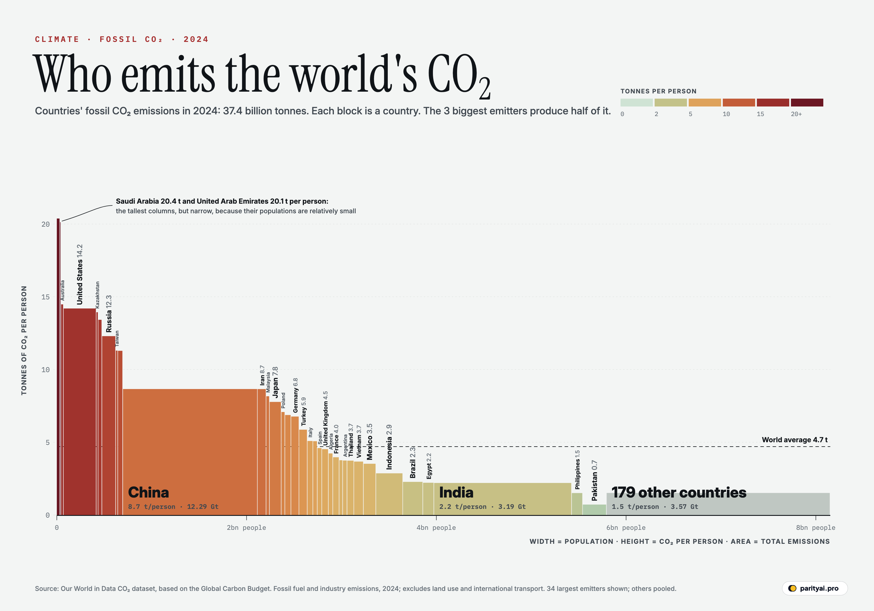
Ask "which country pollutes the most?" and you'll get three different answers depending on how you count. By total emissions, it's China. By emissions per person, it's a small Gulf state. By emissions over all of history, it's the United States. The chart above holds all three answers at once.
Each block is a country. Its width is the country's population and its height is how much carbon dioxide each of its people emitted, on average, in 2024 from burning fossil fuels and making cement. Width times height is the country's total, so the area of each block is its share of the world's emissions. Colour repeats the height: pale green for low emissions per person, deep red for the highest. The figures are from Our World in Data's CO₂ dataset, which is built mainly on the Global Carbon Project's annual Global Carbon Budget.
Here are those three ways of counting, plus a fourth, how the blocks have changed, and what each one shows.
Count 1: total emissions
Countries emitted 37.4 billion tonnes of CO₂ from fossil fuels and industry in 2024. Add international aviation and shipping, which aren't assigned to any country, and the world total was 38.6 billion tonnes.
The biggest block by far is China's: 12.3 billion tonnes, or 32.9% of the countries' total. The United States emitted 4.9 billion tonnes (13.1%), and India 3.2 billion tonnes (8.5%). Those 3 countries alone produced more than half of all national emissions. The ten largest emitters produced 71.1%.
The Global Carbon Project's latest budget, published in November 2025, projected that fossil emissions would rise another 1.1% in 2025 to a new record of 38.1 billion tonnes. It projected small increases for China (0.4%), the US (1.9%) and India (1.4%), and a fall of 2.2% in Japan.
At the far right of the chart, 179 countries are pooled into a single grey block. Together they produced 9.5% of national emissions, at an average of 1.5 tonnes per person.
Count 2: emissions per person
Now look at the heights. Here the ranking almost reverses.
The tallest columns are the oil and gas producers of the Persian Gulf. Among countries with more than a million people, Qatar emitted 41.3 tonnes per person in 2024, Kuwait 26.2 and Bahrain 24.3. Saudi Arabia (20.4 tonnes) and the United Arab Emirates are the tallest blocks wide enough to label. Cheap energy, air-conditioning in extreme heat, desalinated water and energy-hungry oil and gas production all push their numbers up.
Among large economies, Australia (14.5 tonnes per person), the United States (14.2) and Canada (13.4) are the tallest. These are big, spread-out countries with large houses, long drives and heavy industry. Russia (12.3) and South Korea (11.3) follow.
China's block is enormous but only middling in height: 8.7 tonnes per person, lower than America's but now above most of Europe. Germany emitted 6.8 tonnes per person, Japan 7.8, the United Kingdom 4.5 and France 4.0, the last helped by an electricity system that is largely nuclear and hydro.
Then the block flattens. India, nearly as wide as China, is barely taller than the axis: 2.2 tonnes per person. The average American emits about 6 times as much as the average Indian. Pakistan (0.7) and Nigeria (0.6) are lower still. The world average, marked by the dashed line, is 4.7 tonnes.
That gap is at the heart of the argument over climate fairness. Most of the world's people live in countries whose blocks sit below the line. If emissions per person rose to Chinese levels across South Asia and Africa, total emissions would soar, which is why the pace of clean-energy growth in those regions matters so much.
Count 4: the change since 2000
A single year hides the direction of travel. Redraw the chart for 2000, and the blocks would look very different.
The rich world's blocks have shrunk. In 2000, the average American emitted 21.4 tonnes of CO₂; by 2024, 14.2. US emissions peaked in 2005 and have fallen -19% since 2000, as power plants switched from coal to gas and then to wind and solar, and cars became more efficient. The United Kingdom's emissions peaked back in 1971. Since 2000 they have fallen -45%, mostly because the country closed its coal power stations. Germany is down -36%, France -35% and Japan -24%.
Asia's blocks have grown taller. China's emissions per person rose from 2.9 tonnes in 2000 to 8.7 in 2024, and its total grew 237%, from 3.6 billion tonnes to 12.3 billion tonnes, as hundreds of millions of people moved into cities, the country became the world's factory, and coal power stations were built to supply it. India's emissions grew 224% over the same period, from 0.9 tonnes per person to 2.2, but from a much lower starting point.
The net effect is that the world's emissions shifted east. In 2000, the United States emitted more than China. Today China emits more than the US and the EU combined, and India has passed Russia to become the third-largest emitter.
Whether the next decade brings the same shift depends largely on two blocks. China's emissions have barely grown since 2023 as solar and wind have taken over new power demand, and some analysts think they may be close to their peak. India's are still rising quickly, and its emissions per person remain less than half the world average. How fast it can grow its economy on clean power will shape the global total more than any other country's choices.
Count 3: everything since 1750
The chart shows a single year. Carbon dioxide, though, lingers in the atmosphere for centuries, so what drives warming is the total ever emitted. By that measure the picture changes again.
Since 1750, the United States has emitted about 435 billion tonnes of fossil CO₂, more than any other country and about 23.5% of the world's cumulative total, according to Our World in Data. China is second at 285 billion tonnes, most of it emitted since 2000. Russia is third at 123 billion. The United Kingdom, where the Industrial Revolution began, has emitted 80 billion tonnes, and Germany 95 billion tonnes, far more than their small 2024 blocks suggest.
India, despite its size, has emitted 66 billion tonnes in total, less than a quarter of China's. Nigeria's cumulative total is 5 billion tonnes.
| # | Country | CO₂ (million t) | Share | Per person (t) | Population (m) | Since 1750 (bn t) |
|---|---|---|---|---|---|---|
| 1 | China | 32.9% | 8.7 | 1419.3 | 285 | |
| 2 | United States | 13.1% | 14.2 | 345.4 | 435 | |
| 3 | India | 8.5% | 2.2 | 1450.9 | 66 | |
| 4 | Russia | 4.8% | 12.3 | 144.8 | 123 | |
| 5 | Japan | 2.6% | 7.8 | 123.8 | 70 | |
| 6 | Indonesia | 2.2% | 2.9 | 283.5 | 17 | |
| 7 | Iran | 2.1% | 8.7 | 91.6 | 22 | |
| 8 | Saudi Arabia | 1.9% | 20.4 | 34.0 | 19 | |
| 9 | South Korea | 1.6% | 11.3 | 51.7 | 21 | |
| 10 | Germany | 1.5% | 6.8 | 84.6 | 95 | |
| 11 | Canada | 1.4% | 13.4 | 39.7 | 36 | |
| 12 | Turkey | 1.4% | 5.9 | 87.5 | 13 | |
| 13 | Brazil | 1.3% | 2.3 | 212.0 | 18 | |
| 14 | Mexico | 1.2% | 3.5 | 130.9 | 22 | |
| 15 | South Africa | 1.2% | 6.9 | 64.0 | 23 | |
| 16 | Australia | 1.0% | 14.5 | 26.7 | 20 | |
| 17 | Vietnam | 1.0% | 3.7 | 101.0 | 6 | |
| 18 | United Kingdom | 0.8% | 4.5 | 69.1 | 80 | |
| 19 | Italy | 0.8% | 5.1 | 59.3 | 26 | |
| 20 | Malaysia | 0.8% | 8.2 | 35.6 | 7 | |
| 21 | Kazakhstan | 0.8% | 13.9 | 20.6 | 15 | |
| 22 | Poland | 0.7% | 7.1 | 38.5 | 29 | |
| 23 | Thailand | 0.7% | 3.7 | 71.7 | 8 | |
| 24 | France | 0.7% | 4.0 | 66.5 | 40 | |
| 25 | Taiwan | 0.7% | 11.3 | 23.2 | 10 | |
| 26 | Egypt | 0.7% | 2.2 | 116.5 | 7 | |
| 27 | Iraq | 0.6% | 5.1 | 46.0 | 5 | |
| 28 | United Arab Emirates | 0.6% | 20.1 | 11.0 | 6 | |
| 29 | Spain | 0.6% | 4.6 | 47.9 | 16 | |
| 30 | Algeria | 0.5% | 4.2 | 46.8 | 5 | |
| 31 | Pakistan | 0.5% | 0.7 | 251.3 | 6 | |
| 32 | Philippines | 0.5% | 1.5 | 115.8 | 4 | |
| 33 | Argentina | 0.5% | 3.7 | 45.7 | 9 | |
| 34 | Ukraine | 0.4% | 3.8 | 37.9 | 31 |
Fossil fuel and industry CO₂, excluding land use. Cumulative emissions run from 1750. Chip colour matches the chart.
The grey block
The widest single block after China and India is the pooled grey one on the right: 179 smaller emitters, home to more than a quarter of humanity, with emissions averaging 1.5 tonnes per person. It includes most of Africa, much of Latin America and Southeast Asia, and dozens of island states. Nigeria, Africa's most populous country, emits about 0.6 tonnes per person; the average person in Africa's poorest countries emits a fraction of a tonne a year, less than an American emits in a fortnight.
For these countries the climate question is mostly not about cutting emissions. It is about how to grow, get electricity to the hundreds of millions of people who lack it, and adapt to heat, drought and flooding they did little to cause.
What the shapes say
Step back and the Marimekko tells a story that no single ranking can:
- Wide and tall blocks, such as China and the United States, are the countries whose choices move the global total most.
- Narrow and tall blocks, such as the Gulf states and Australia, have very high emissions per person but a small share of the total.
- Wide and short blocks, such as India, Indonesia and Pakistan, are where future growth in emissions will be decided.
- Narrow and short blocks, most of the grey "others", contribute little either way.
The Global Carbon Project estimates that the world's remaining carbon budget for a 50% chance of limiting warming to 1.5°C is about 170 billion tonnes of CO₂, roughly four more years at current emission levels. In the terms of this chart, that's about four more copies of the whole picture.
How to read the chart
A few notes on the method:
- Territorial emissions. These count CO₂ released within a country's borders. They don't count emissions embedded in imported goods. Countries that import a lot of manufactured goods, such as the UK, would look higher on a consumption basis, and big exporters such as China somewhat lower.
- Fossil and industry only. Land use, mainly deforestation, adds several billion tonnes a year and isn't shown. Neither are other greenhouse gases such as methane.
- One year. 2024 is the latest full year of country data. Emissions shift a few percent a year, but the overall shape of the chart changes slowly.
- Small countries are pooled. The 179 countries outside the top 34 are drawn as one block to keep the chart readable. The CSV has every country.
The chart makes one thing clear. There is no single villain and no single fix. The world's emissions come from a few very large blocks and a few very tall ones, and reducing them will require changes in both.
Sources and method
- Our World in Data, CO₂ and greenhouse gas emissions dataset (based on the Global Carbon Budget). 2024 values, retrieved October 10, 2026
Emissions are annual territorial CO₂ emissions from fossil fuels and industry (excluding land-use change), in 2024, as compiled by Our World in Data from the Global Carbon Project. Column width is population and height is emissions per person, so each column's area is proportional to the country's total. The 34 largest emitters are drawn individually; all other countries are pooled into one block whose height is their combined emissions divided by their combined population. International aviation and shipping are not assigned to countries.
Charts like this, from your own numbers.
Connect a spreadsheet or the tools you run on, and Parity builds the dashboard and writes the report, with every number checked.
Try Parity free