In 1975, the demographer Samuel Preston drew a chart that has shaped how economists think about health ever since. He plotted countries' income per person against their life expectancy and found a curve: in poor countries, a little more money goes with a lot more life; in rich ones, extra income adds only a few years. He also noticed something stranger. The whole curve had moved up over time. At any given income, people were living longer than they used to. Economists still call it the Preston curve.
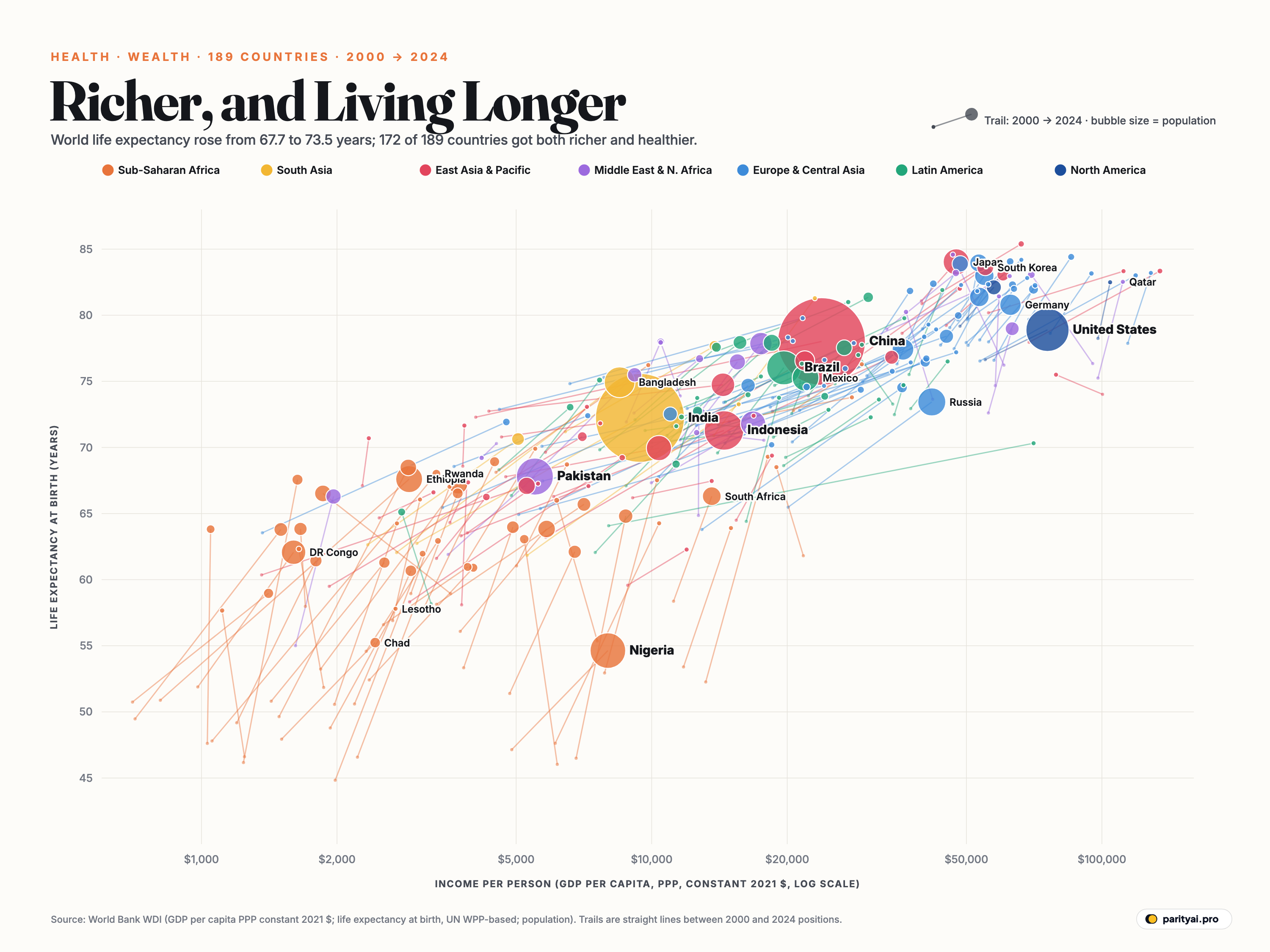
The chart above is a modern version of Preston's. Each bubble is a country, 189 in all. Its horizontal position is income per person in 2024, measured at purchasing power parity so that a dollar buys the same amount everywhere. The scale is logarithmic, so each gridline is a doubling or more. Its vertical position is life expectancy at birth. Bubbles are sized by population and coloured by region. The thin line behind each bubble is a trail back to where the country stood in 2000.
The data come from the World Bank's World Development Indicators, whose life-expectancy figures are based on the UN's population estimates. Here is what four of those trails, and one big exception, say about the last quarter-century.
The trail almost everyone took
Start with the overall pattern, because it is remarkable. Of the 189 countries on the chart, 187 gained life expectancy between 2000 and 2024, and 173 got richer. 172 did both. Almost every trail points up and to the right.
The world as a whole went from 67.7 years of life expectancy to 73.5, a gain of 5.8 years in 24 years. That progress wasn't smooth. COVID-19 pushed global life expectancy down from 72.9 in 2019 to 71.2 in 2021, the biggest setback in decades, before it recovered. But the chart, comparing 2000 and 2024, shows the longer story. Only 2 countries with complete data ended the period with lower life expectancy than they started: West Bank and Gaza, Dominica.
Trail 1: the longest climbs, in Africa
The longest vertical trails on the chart are orange: Sub-Saharan Africa. Every one of the ten countries with the biggest gains in life expectancy is African.
Malawi gained 21.4 years, from 46.2 to 67.6. Rwanda went from 47.8 to 68.0, Zambia from 46.6 to 66.5, Uganda from 49.6 to 68.5. For the region as a whole, life expectancy rose from 51.6 to 62.8 years, a gain of 11.2, almost twice the global improvement.
Much of the gain came without much extra income. Look at those trails: they climb steeply but move only a short way to the right. In 2000, many of these countries were in the depths of the HIV/AIDS epidemic, which had cut life expectancy dramatically. In Botswana, life expectancy fell by a decade, and in Eswatini by two, according to Our World in Data. Antiretroviral drugs, made affordable and widely available in the 2000s, reversed that. AIDS deaths worldwide have halved in the past decade.
Children account for much of the rest. The World Bank's data show Sub-Saharan Africa's under-five mortality rate falling from about 150 deaths per 1,000 births in 2000 to about 71 in 2024. Vaccines, bed nets against malaria, clean water and better treatment of childhood diarrhoea and pneumonia saved millions of young lives. Because life expectancy at birth is an average across all ages, fewer child deaths lift it more than almost anything else.
This is Preston's insight in action. Health improved far more than income alone would predict, because cheap, proven technologies spread faster than wealth.
The comeback from AIDS
Two of the ten biggest gains belong to countries that were hit hardest by HIV. Botswana rose from 52.3 years in 2000 to 69.3 in 2024, and Eswatini from 47.6 to 64.3. In 2000 both were near the bottom of the chart despite middle incomes, an extreme version of the Nigeria puzzle. Botswana, now with income per person of about $18,000, had a life expectancy in 2000 close to that of the world's poorest countries.
Their trails show what happened when treatment arrived. As antiretroviral drugs became widely available, people who would have died in their thirties and forties went on living, and fewer babies were born with the virus. Their bubbles have climbed back toward where their incomes would predict, though both still sit below the curve.
Ethiopia, Africa's second most populous country, made one of the largest gains of all, from 50.9 years to 67.6. Its trail barely moves to the right, a big health gain on a small income. Like much of the region, it gained most from fewer deaths among young children, the kind of progress that cheap, basic health care can deliver even where incomes stay low.
Trail 2: China, richer and longer-lived
China's huge red bubble has one of the longest trails to the right. Its income per person rose from about $4,100 in 2000 to $23,800 in 2024, nearly 5.9 times as much. Life expectancy rose from 72.3 to 78.0 years.
But compare the two gains. China's income soared, yet its life expectancy rose only half as much as many poorer African countries' did. That fits the shape of the Preston curve: China started higher up, where each extra year of life is harder to win and depends more on treating heart disease, stroke and cancer than on preventing infections.
Trail 3: India, steady on both
India's big yellow bubble moved from $3,000 per person to $9,400, and from 62.7 years of life expectancy to 72.2. Its trail is a long diagonal, both richer and healthier, and it carries 1.4 billion people with it. Because the chart sizes bubbles by population, India's and China's trails account for a huge share of all the human progress on the page.
Trail 4: the United States, the outlier
Now look at the far right of the chart. The United States is one of the richest countries in the world, with income of about $75,700 per person. Its life expectancy is 78.9 years. That is up from 76.6 in 2000, and the CDC reports a recovery to 79.0 years in 2024 after the pandemic. But it sits well below its peers.
Among the 21 countries on the chart with incomes over $50,000 and populations over 5 million, the United States ranks 21th, last, for life expectancy. Switzerland reaches 84.4 years, France 83.0, Canada 82.1, the United Kingdom 81.4 and Germany 80.8. Japan, at 84.0, and South Korea, which rose from 75.9 to 83.6, have both overtaken the US despite lower incomes.
Researchers point to several reasons: higher deaths from drug overdoses, gun violence and car crashes, which mostly kill younger people; higher rates of obesity and related disease; and unequal access to health care. Whatever the mix, the US bubble is the clearest example on the chart that income alone does not buy a long life.
| # | Country | Life expectancy | Income per person | Since 2000 |
|---|---|---|---|---|
| 1 | Hong Kong | $66,200 | ▲ 4.5 | |
| 2 | Switzerland | $85,400 | ▲ 4.7 | |
| 3 | Sweden | $62,600 | ▲ 4.4 | |
| 4 | Italy | $53,300 | ▲ 4.2 | |
| 5 | South Korea | $55,100 | ▲ 7.7 | |
| 6 | Singapore | $134,500 | ▲ 5.4 | |
| 7 | Norway | $94,800 | ▲ 4.5 | |
| 8 | United Arab Emirates | $69,700 | ▲ 6.7 | |
| 9 | Australia | $60,300 | ▲ 3.8 | |
| 10 | Ireland | $118,800 | ▲ 6.5 | |
| 11 | France | $54,800 | ▲ 3.9 | |
| 12 | Finland | $55,900 | ▲ 4.9 | |
| 13 | Belgium | $63,300 | ▲ 4.6 | |
| 14 | Denmark | $71,000 | ▲ 5.7 | |
| 15 | Canada | $57,500 | ▲ 2.9 | |
| 16 | Austria | $63,800 | ▲ 3.9 | |
| 17 | Netherlands | $70,500 | ▲ 4.0 | |
| 18 | United Kingdom | $53,400 | ▲ 3.6 | |
| 19 | Germany | $62,700 | ▲ 2.9 | |
| 20 | Saudi Arabia | $63,200 | ▲ 6.4 | |
| 21 | United States | $75,700 | ▲ 2.3 |
Sorted by life expectancy. The United States is highlighted.
The exception at the bottom: Nigeria
The lowest bubble on the chart belongs to Nigeria, with a life expectancy of 54.6 years. Nigeria is Africa's most populous country. Its income per person, about $8,000 at purchasing power parity, is several times that of many African countries that now outlive it, such as Malawi or Rwanda. Our World in Data notes that in 2021 Nigeria's life expectancy was thirty years lower than Japan's.
Nigeria's trail is short and steep compared with its neighbours'. High child and maternal mortality, malaria and weak public health services have held it back. Its position shows that money doesn't automatically become health. It has to be spent on clinics, vaccines and clean water.
The other countries at the bottom of the chart are Chad (55.2 years), the Central African Republic (57.7), Lesotho (57.8) and Somalia (59.0). Lesotho, hit hard by HIV, has gained back much of what it lost, rising from 48.8 years in 2000.
| # | Country | 2000 | 2024 | Years gained | Income 2024 | Income change |
|---|---|---|---|---|---|---|
| 1 | Malawi | 46.2 | 67.6 | $1,600 | ▲ 32% | |
| 2 | Rwanda | 47.8 | 68.0 | $3,300 | ▲ 215% | |
| 3 | Zambia | 46.6 | 66.5 | $3,700 | ▲ 67% | |
| 4 | Uganda | 49.6 | 68.5 | $2,900 | ▲ 94% | |
| 5 | Angola | 46.5 | 64.8 | $8,800 | ▲ 29% | |
| 6 | Sierra Leone | 44.8 | 62.0 | $3,100 | ▲ 56% | |
| 7 | Botswana | 52.3 | 69.3 | $18,100 | ▲ 37% | |
| 8 | Zimbabwe | 46.0 | 63.1 | $5,200 | ▼ 16% | |
| 9 | Ethiopia | 50.9 | 67.6 | $2,900 | ▲ 257% | |
| 10 | Eswatini | 47.6 | 64.3 | $10,400 | ▲ 70% | |
| 11 | Burundi | 47.6 | 63.8 | $1,000 | ▲ 2% | |
| 12 | Namibia | 52.9 | 67.5 | $10,300 | ▲ 31% | |
| 13 | Mozambique | 49.5 | 63.8 | $1,500 | ▲ 111% | |
| 14 | Tanzania | 53.2 | 67.2 | $3,700 | ▲ 102% | |
| 15 | Guinea-Bissau | 50.6 | 64.3 | $2,700 | ▲ 38% |
Life expectancy at birth, years. Income is GDP per person at PPP, constant 2021 international dollars.
At the top
The highest bubbles belong to Hong Kong (85.4 years), Kuwait (84.6), Switzerland (84.4), Andorra (84.2) and Sweden (84.1). A newborn in Hong Kong today can expect to live about three decades longer than one in Nigeria.
How to read the chart
A few cautions:
- Log scale. Moving one gridline to the right means doubling income, not adding a fixed amount. A short horizontal trail at the left of the chart can be a bigger proportional gain than a long one at the right.
- Straight trails. Each trail joins 2000 and 2024 directly. It hides the years in between, including the COVID dip and, for some countries, wars or crises.
- Estimates. Life expectancy in many low-income countries is estimated by the UN from surveys and models, because death registration is incomplete. The figures can be revised.
- Averages. Life expectancy at birth is not how long most adults live. A country with high child mortality has a low average even if adults who survive childhood live into their seventies.
Preston's main finding, that the curve itself keeps rising, still holds. The world of 2024 is healthier at almost every income level than the world of 2000. The countries still near the bottom show how much is left to gain.
Sources and method
- World Bank, World Development Indicators: GDP per capita, PPP (constant 2021 international $) NY.GDP.PCAP.PP.KD; life expectancy at birth SP.DYN.LE00.IN; population SP.POP.TOTL. Retrieved October 9, 2026
Income is GDP per person at purchasing power parity in constant 2021 international dollars, which adjusts for differences in prices between countries and over time. Life expectancy at birth is the World Bank series, based on the UN's World Population Prospects. Countries are shown when both measures exist for 2000 and 2024; bubble area is proportional to 2024 population. Trails join each country's 2000 and 2024 positions in a straight line and do not show the years in between.
Charts like this, from your own numbers.
Connect a spreadsheet or the tools you run on, and Parity builds the dashboard and writes the report, with every number checked.
Try Parity free