Key takeaways
- About 304.0 million people lived outside the country they were born in by mid-2024, according to the UN. That is up 98% since 1990 but still under 4% of the world's population.
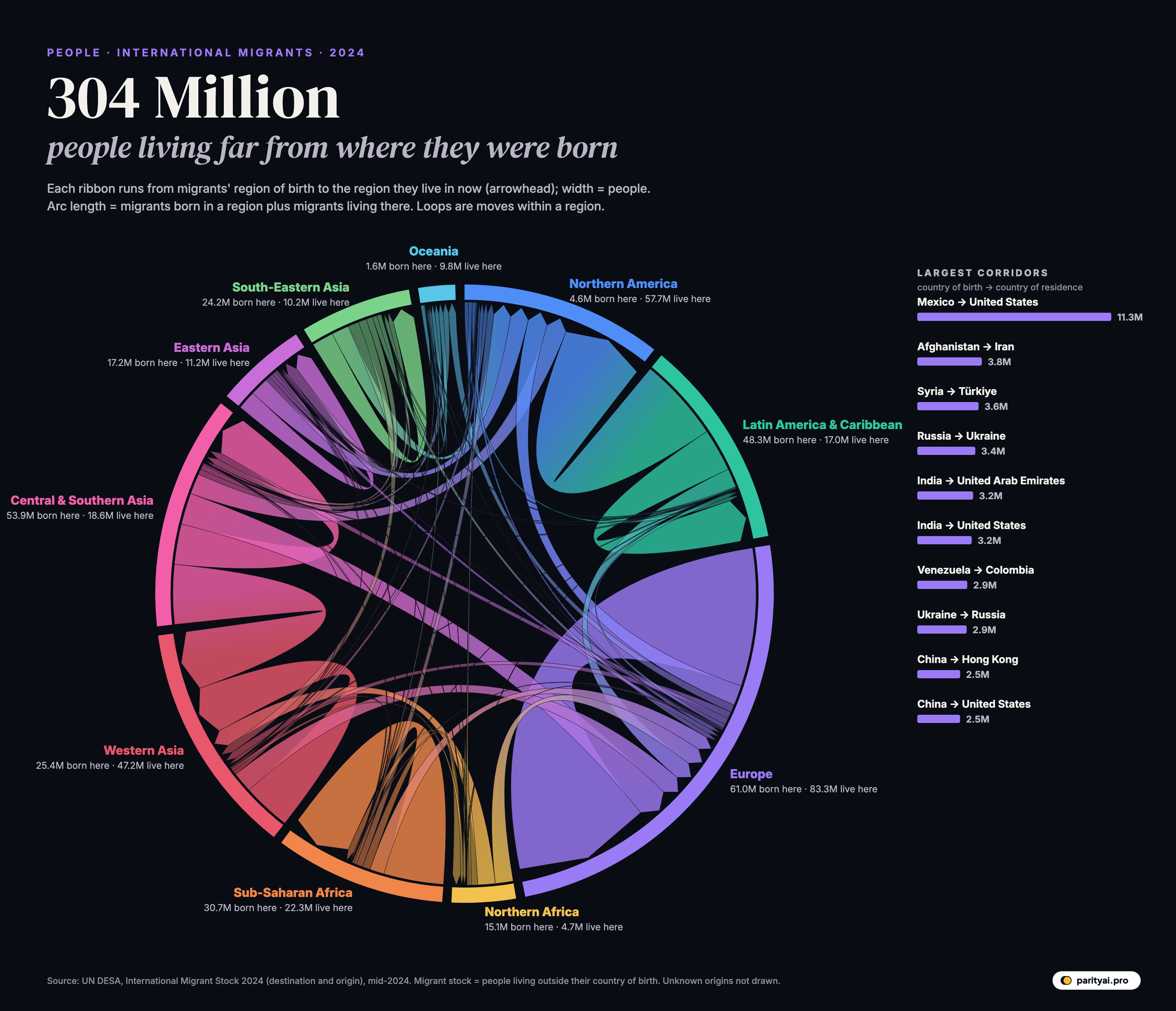
- 44% of the migrants in the diagram live in another country of their own world region. The biggest ribbon of all is Europeans living elsewhere in Europe.
- The largest single corridor runs from Mexico to the United States: 11.3 million people.
Most people live and die in the country they were born in. A small but growing minority don't. By the UN's latest count, 304.0 million people, about 3.7% of humanity, lived outside their country of birth in mid-2024, according to the IOM's Migration Data Portal. In 1990 the figure was 153.9 million.
The chord diagram above shows where they came from and where they live now. The circle is divided into ten world regions. Each ribbon starts at the region where a group of migrants was born and ends, at its arrowhead, in the region where they now live. Its width is the number of people. Ribbons that loop back to the same region are people who moved to another country nearby, a Pole in Germany, say, or a Burkinabè in Côte d'Ivoire. The data come from the UN's International Migrant Stock 2024, which compiles census and survey data from almost every country.
Follow the thickest ribbons and five kinds of journey stand out.
Journey 1: next door
The single most common migration is a short one. Of the migrants whose origin the UN can identify, 44% live in another country in the same world region they were born in.
Europe shows this most clearly. The fat purple loop on the right of the diagram is 45.2 million Europeans living in a European country other than their own. Freedom of movement within the European Union, the breakup of the Soviet Union and Yugoslavia, and decades of labour migration from south to north all contribute. Some of these "migrants" never moved at all: when the Soviet Union dissolved in 1991, millions of people found themselves living in a new country without crossing a border, which is why corridors such as Russia to Ukraine (3.4 million) and Ukraine to Russia (2.9 million) are so large.
Sub-Saharan Africa tells a similar story. Of the region's emigrants, most stay in the region: 19.6 million live in another Sub-Saharan country, against 4.7 million in Europe. The popular image of African migration as a flow to Europe misses the much larger movement within the continent, driven by work, family ties and conflict.
Journey 2: the American magnet
The biggest ribbon crossing the circle runs from Latin America and the Caribbean into Northern America: 27.4 million people. Northern America as a whole is home to 57.7 million migrants. The United States alone has 52.4 million, by far the largest immigrant population of any country.
The largest single corridor on Earth is Mexico to United States, with 11.3 million people, as the IOM's World Migration Report also notes. Two of the other ten biggest corridors also end in the US: India to United States (3.2 million) and China to United States (2.5 million).
The reverse flow is tiny. Only 4.6 million people born in Northern America live elsewhere, one of the thinnest arcs on the diagram. Americans and Canadians rarely emigrate permanently.
Journey 3: to the Gulf
The thick pink ribbons from Central and Southern Asia into Western Asia carry 19.5 million people. These are mostly workers from India, Pakistan, Bangladesh and Nepal living in the oil-rich Gulf states, where they build, clean, drive, nurse and serve. In the United Arab Emirates, home to 8.2 million migrants, people born abroad make up the large majority of residents.
India is the world's largest country of origin, with 18.5 million people living abroad, and its largest single corridor is India to United Arab Emirates (3.2 million). Saudi Arabia, home to 13.7 million migrants, is the third-largest destination country in the world after the United States and Germany. Bangladesh (8.7 million emigrants) sends more of its people to Saudi Arabia than anywhere else.
Many of these migrants are on temporary contracts, without a path to citizenship, and send much of their pay home. That makes the Gulf corridors some of the most important economic links in the world: remittances from them support millions of households across South Asia.
Journey 4: to Europe
Europe is the largest destination region on the diagram, home to 83.3 million migrants. A little over half of them were born elsewhere in Europe. The rest come from every other region: North Africa, the Middle East, South Asia, Sub-Saharan Africa and Latin America. Germany (16.8 million), the United Kingdom (11.8 million), France (9.2 million) and Spain (8.9 million) are four of the six largest destination countries in the world.
Europe is also the largest region of origin, with 61.0 million people born there living abroad. Most of them, as Journey 1 showed, live elsewhere in Europe. Europe is both the most common origin and the most common destination, largely because so many Europeans live in a neighbouring European country.
Journey 5: fleeing
Some of the thickest ribbons aren't economic at all. The second- and third-largest corridors in the world are Afghanistan to Iran (3.8 million) and Syria to Türkiye (3.6 million). These are mostly refugees and their families, displaced by decades of war in Afghanistan and the Syrian civil war. Venezuela to Colombia (2.9 million) reflects the exodus from Venezuela's economic collapse.
Refugees are only part of the migrant stock, but a large one. UNHCR, the UN refugee agency, counted 117.8 million people forcibly displaced worldwide at the end of 2025, the first fall in a decade. Most of them are displaced inside their own country, and so don't appear in these numbers at all. Those who crossed a border mostly stayed in a neighbouring country, which is why so much of the diagram's displacement shows up as loops within a region.
| # | Born in | Living in | Migrants | Since 1990 |
|---|---|---|---|---|
| 1 | Mexico | United States | ▲ 150% | |
| 2 | Afghanistan | Iran | ▼ 6% | |
| 3 | Syria | Türkiye | ▲ 67993% | |
| 4 | Russia | Ukraine | ▼ 33% | |
| 5 | India | United Arab Emirates | ▲ 611% | |
| 6 | India | United States | ▲ 612% | |
| 7 | Venezuela | Colombia | ▲ 6624% | |
| 8 | Ukraine | Russia | ▼ 13% | |
| 9 | China | Hong Kong | ▲ 50% | |
| 10 | China | United States | ▲ 372% | |
| 11 | Palestine | Jordan | ▲ 156% | |
| 12 | Bangladesh | Saudi Arabia | ▲ 866% |
Migrant stock at mid-2024: people born in the first country and living in the second. Some corridors reflect border changes after 1990 (for example, between the former Soviet republics).
How the map has changed since 1990
The diagram is a snapshot of 2024, but the UN series goes back to 1990, and the destinations have shifted a lot since then. These totals include migrants of unknown origin, so they are a little higher than the ribbons in the diagram.
- Western Asia, including the Gulf, grew fastest: from 14.5 million migrants in 1990 to 49.2 million in 2024, about 3.4 times as many.
- Eastern Asia grew from 4.1 million to 11.6 million, from a small base, as Hong Kong, Japan and South Korea drew more foreign workers.
- Northern America more than doubled, from 27.5 million to 61.2 million.
- Europe grew from 51.5 million to 94.1 million, and Sub-Saharan Africa from 13.8 million to 24.3 million.
- Central and Southern Asia is the exception: its migrant population fell from 25.5 million to 20.4 million. In 1990 it hosted millions of Afghan refugees in Pakistan and Iran, both part of this region in the UN's grouping, and people living in the newly independent Central Asian republics who had been born elsewhere in the Soviet Union. Many have since returned, moved on or died.
The broad pattern is that migration has concentrated in a few rich destinations, North America, Europe and the Gulf, while the share of migrants living in poorer regions has fallen.
Stocks, not flows
The diagram counts people, not movements. A migrant stock is the number of people living in a country they weren't born in at a given moment. It includes someone who arrived last year and someone who arrived 50 years ago, as long as they are still alive and still there. It doesn't show how many people moved in 2024, how many returned home, or how many moved on to a third country.
That makes the numbers slow to change. Even a large wave of arrivals or departures shifts the totals by only a few percent a year. The world's migrant stock grew from 174.6 million in 2000 to 275.3 million in 2020 and 304.0 million in 2024. The share of the world's population living abroad rose only slowly over that period, because the world's population grew too.
The UN defines a migrant by country of birth where it can, and by citizenship where birthplace data are missing. About 93% of migrants have a known region of origin, and only those are drawn. That is why the ribbons add up to slightly less than the world total.
| Region | Migrants born here | Migrants living here | Stay within region |
|---|---|---|---|
| Northern America | 27% | ||
| Latin America & Caribbean | 29% | ||
| Europe | 74% | ||
| Northern Africa | 6% | ||
| Sub-Saharan Africa | 64% | ||
| Western Asia | 62% | ||
| Central & Southern Asia | 25% | ||
| Eastern Asia | 36% | ||
| South-Eastern Asia | 29% | ||
| Oceania | 72% |
From the UN's region-by-region totals; migrants with unknown origin are excluded.
Reading the circle
The arc each region gets on the circle is the sum of two numbers: the migrants born there, and the migrants living there. Regions that mostly send people, such as Central and Southern Asia (born there: 53.9 million) and Latin America (48.3 million), have arcs dominated by ribbons leaving them. Regions that mostly receive, such as Northern America and Western Asia (47.2 million living there), have arcs dominated by arrowheads arriving.
Take one last look at the circle. Despite the political attention migration gets, the overwhelming story is of people moving short distances, to the next country or a nearby region, often for work or family, sometimes to escape danger. The long, thin ribbons that cross the whole circle are real, but they are the exception.
Sources and method
- UN DESA Population Division, International Migrant Stock 2024: destination and origin (Table 1). Licensed CC BY 3.0 IGO. Retrieved October 9, 2026
Migrant stock is the number of people living in a country other than the one they were born in (or, where birthplace data are missing, other than their country of citizenship), at mid-year 2024. It counts people, not movements in a given year. Ribbons use the UN's region-by-region totals; migrants whose origin is unknown are not drawn, so ribbons add up to less than the world total. Regions follow the UN's geographic groupings, with Central and Southern Asia combined and Northern Africa shown separately from Sub-Saharan Africa.
Charts like this, from your own numbers.
Connect a spreadsheet or the tools you run on, and Parity builds the dashboard and writes the report, with every number checked.
Try Parity free