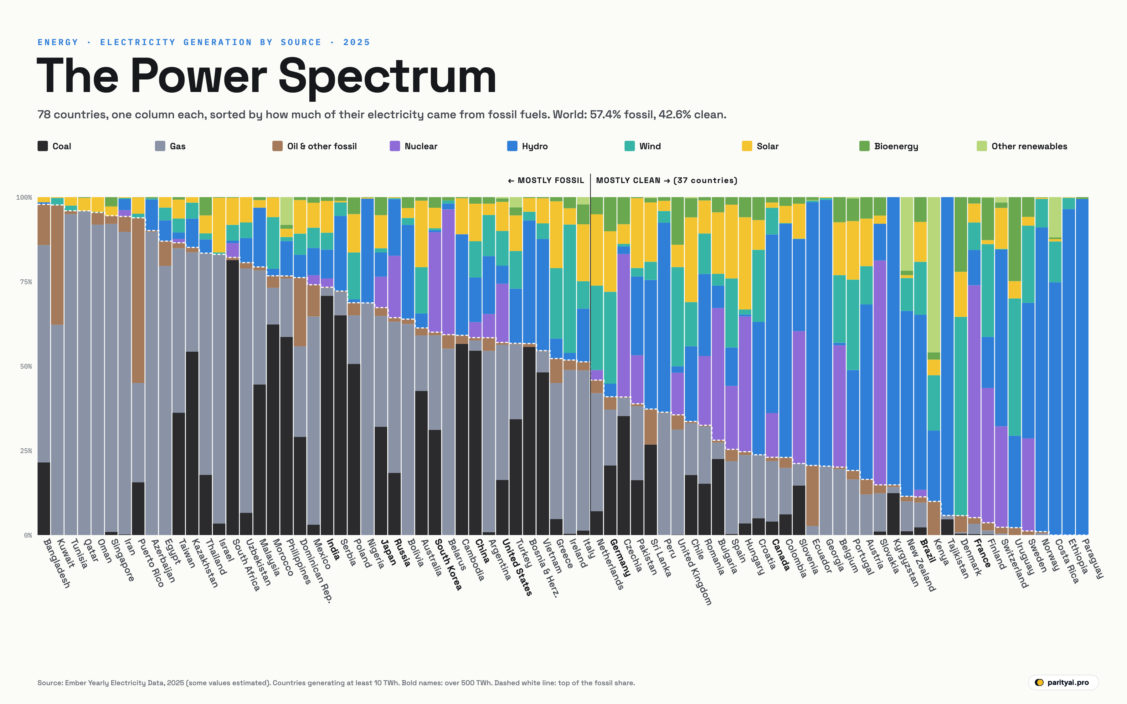
Every country's electricity has a fingerprint: the particular mix of coal, gas, oil, nuclear, hydro, wind, solar and other sources that keeps its lights on. The chart above puts 78 of those fingerprints side by side.
Each column is one country, scaled so that its total electricity production is 100%. The colours stack from the bottom up: black for coal, grey for gas, brown for oil and other fossil fuels, then violet for nuclear, blue for hydro, teal for wind, yellow for solar and green for bioenergy and other renewables. The columns are sorted by how much of each country's electricity came from fossil fuels in 2025, from almost all fossil on the left to almost none on the right. The dashed white line traces the top of the fossil share, and it descends like a staircase across the page. The data come from Ember's yearly electricity data, which covers every country generating at least 10 TWh a year.
For the world as a whole, fossil fuels generated 57.4% of electricity in 2025 and clean sources 42.6%. Ember's Global Electricity Review 2026 found that renewables (33.8%) overtook coal (33.1%) in 2025 for the first time.
Walk across the chart from left to right and you pass through five distinct landscapes.
Landscape 1: the gas and oil states
The far left of the chart is almost solid grey and brown. Bangladesh generated 97.9% of its electricity from fossil fuels in 2025, Kuwait 97.7%, and Tunisia, Qatar, Oman and Singapore are close behind. 9 countries got 90% or more of their power from fossil fuels.
These are mostly countries with their own gas or oil, such as the Gulf states and Algeria, or with few alternatives, such as Singapore, a city-state with little room for wind or solar farms and no rivers to dam. Qatar generated 95.9% of its electricity from gas, the highest gas share on the chart. Bangladesh depends heavily on gas, plus imported oil and coal.
A thin stripe of yellow is starting to appear at the top of several of these columns as solar farms are built, though it is still a small slice of their power.
Landscape 2: the coal belt
Next comes a band of columns with thick black bases. South Africa has the highest coal share of any country, 81.4%. India generated 70.8% of its electricity from coal, China 54.6%, Poland 50.6% and Australia 42.7%.
These countries have large coal reserves and power systems built around them. They are also where the energy transition matters most for the climate, because coal is the most carbon-intensive way to make electricity.
Look closer, though, and the coal belt is changing. China's column has a tall stack of teal and yellow, wind and solar, on top of its coal: 21.8% of its electricity, more than many European countries. India's wind and solar share has reached 14.4%. Australia's is 33.4%, and Poland's 25.2%. According to Ember, fossil generation fell in both China and India in 2025.
Landscape 3: the mixed middle
In the middle of the chart, near the 50% line, the columns become the most colourful. These countries use a bit of everything.
The United States sits here: 57.0% fossil, mostly gas (40.0%) with less coal (16.3%), plus a large nuclear fleet (17.4%) and fast-growing wind and solar (18.9%). Japan (67.3% fossil) and South Korea (60.0%) are similar but rely more on imported coal and liquefied gas, with substantial nuclear power: 29.6% in South Korea.
Germany, just to the right of the halfway line, shows a different path. It closed its last nuclear plants in 2023, so its column has no violet at all. Instead, wind and solar provide 45.1% of its electricity, among the highest shares on the chart, with coal (20.6%) and gas (16.5%) filling the gaps.
The vertical line in the middle of the chart marks the point where fossil fuels fall below half. 37 of the 78 countries are to its right.
Landscape 4: the wind and solar newcomers
Moving right, the teal and yellow bands grow. These countries have built so much wind and solar that it now leads their mix.
Denmark generates 58.7% of its electricity from wind, the highest share of any country. Hungary leads on solar with 27.3%. Spain gets 42.2% of its power from wind and solar combined, the United Kingdom 36.0%, after phasing coal down to 0.1%. Pakistan has an unusually balanced mix, with roughly a fifth each from hydro, gas and wind and solar, plus nuclear (14.4%).
Landscape 5: the hydro and nuclear giants
The right-hand end of the chart is dominated by two colours: blue for hydro and violet for nuclear.
Paraguay is the cleanest country on the chart, with 0.0% fossil. Its share from hydro, 99.5%, comes almost entirely from the vast Itaipú dam it shares with Brazil, and it exports much of that electricity. Norway (90.0% hydro), Ethiopia and Costa Rica are close behind. Brazil (51.8% hydro, 27.5% wind and solar) and Canada (52.8% hydro) are the largest economies in this landscape.
France is the nuclear exception. It generates 68.8% of its electricity from nuclear power, the highest share in the world, and only 5.2% from fossil fuels, according to Ember. That puts it among the cleanest power systems of any large economy.
Two other colours show up at this end: Kenya gets 45.9% of its power from "other renewables", mainly geothermal energy from the Rift Valley, and Uruguay gets 24.9% from bioenergy, the highest share on the chart.
| Country | Fossil share | Coal | Gas | Nuclear | Hydro | Wind + solar | Total (TWh) |
|---|---|---|---|---|---|---|---|
| Bangladesh | 21.5% | 64.3% | 0.0% | 0.6% | 1.5% | 103 | |
| Kuwait | 0.0% | 62.2% | 0.0% | 0.0% | 2.3% | 89 | |
| Tunisia | 0.0% | 94.9% | 0.0% | 0.0% | 4.0% | 22 | |
| Qatar | 0.0% | 95.9% | 0.0% | 0.0% | 3.8% | 56 | |
| Oman | 0.0% | 91.9% | 0.0% | 0.0% | 4.5% | 53 | |
| Singapore | 0.9% | 91.1% | 0.0% | 0.0% | 2.7% | 60 | |
| Iran | 0.2% | 89.5% | 1.9% | 3.3% | 0.5% | 396 | |
| Puerto Rico | 15.6% | 29.4% | 0.0% | 0.1% | 6.0% | 20 | |
| Azerbaijan | 0.0% | 89.7% | 0.0% | 9.2% | 0.3% | 27 | |
| Egypt | 0.0% | 79.6% | 0.0% | 6.1% | 6.9% | 246 | |
| Denmark | 0.4% | 0.4% | 0.0% | 0.1% | 72.1% | 35 | |
| France | 0.3% | 3.0% | 68.8% | 10.4% | 13.8% | 570 | |
| Finland | 0.2% | 1.1% | 39.9% | 15.1% | 28.6% | 82 | |
| Switzerland | 0.0% | 0.4% | 29.9% | 52.3% | 12.3% | 65 | |
| Uruguay | 0.0% | 0.0% | 0.0% | 27.2% | 45.7% | 12 | |
| Sweden | 0.0% | 0.1% | 27.4% | 40.1% | 25.4% | 170 | |
| Norway | 0.0% | 0.6% | 0.0% | 90.0% | 8.8% | 161 | |
| Costa Rica | 0.0% | 0.0% | 0.0% | 74.8% | 12.8% | 13 | |
| Ethiopia | 0.0% | 0.0% | 0.0% | 96.5% | 3.4% | 33 | |
| Paraguay | 0.0% | 0.0% | 0.0% | 99.5% | 0.0% | 45 |
The 10 most fossil-dependent and the 10 cleanest of 78 countries generating at least 10 TWh. Highlighted: cleanest.
The biggest producers
Most of the world's electricity is made by a handful of countries, and their columns sit mostly in the left and middle of the chart. China, the United States and India together generate more than half the world's power. That is why, despite all the clean columns on the right, the world's average is still 57.4% fossil.
| Country | Generation (TWh) | Fossil | Wind + solar | Nuclear | Hydro |
|---|---|---|---|---|---|
| China | 58.4% | 21.8% | 4.6% | 13.2% | |
| United States | 57.0% | 18.9% | 17.4% | 5.4% | |
| India | 73.3% | 14.4% | 2.6% | 8.5% | |
| Russia | 64.3% | 0.6% | 18.3% | 16.7% | |
| Japan | 67.3% | 11.1% | 9.1% | 7.2% | |
| Brazil | 11.3% | 27.5% | 2.1% | 51.8% | |
| Canada | 23.0% | 9.4% | 13.1% | 52.8% | |
| South Korea | 60.0% | 6.6% | 29.6% | 0.6% | |
| France | 5.2% | 13.8% | 68.8% | 10.4% | |
| Germany | 40.9% | 45.1% | 0.0% | 3.9% | |
| Iran | 94.3% | 0.5% | 1.9% | 3.3% | |
| Mexico | 74.1% | 13.4% | 2.8% | 8.0% | |
| Turkey | 56.7% | 21.7% | 0.0% | 16.2% | |
| Vietnam | 54.6% | 12.1% | 0.0% | 33.0% | |
| United Kingdom | 35.6% | 36.0% | 12.4% | 1.9% | |
| Taiwan | 86.5% | 9.7% | 1.1% | 1.9% | |
| Spain | 25.3% | 42.2% | 18.8% | 11.4% | |
| Australia | 61.3% | 33.4% | 0.0% | 4.3% | |
| Italy | 51.3% | 25.0% | 0.0% | 15.7% | |
| Egypt | 87.0% | 6.9% | 0.0% | 6.1% | |
| South Africa | 82.2% | 12.7% | 4.2% | 0.8% | |
| Malaysia | 79.4% | 2.2% | 0.0% | 17.5% |
Countries generating at least 200 TWh in 2025.
Ten years of movement
If we had drawn this chart in 2015, the staircase would have sat much higher. In 2015, fossil fuels made 66.5% of the world's electricity; in 2025, 57.4%. Wind and solar together went from 4.5% to 17.3%.
Almost every big column moved. China's fossil share fell from 73.1% to 58.4%, while wind and solar rose from 3.9% to 21.8%. The United States went from 66.8% fossil to 57.0%, and from 5.6% wind and solar to 18.9%. India fell from 82.5% to 73.3% fossil, with wind and solar up from 3.0% to 14.4%.
Some of the biggest shifts came in former coal strongholds. Poland cut its fossil share from 86.2% to 68.7%, and Australia from 85.9% to 61.3%, both on the back of rapid wind and solar growth. The United Kingdom, which still burned large amounts of coal in 2015, went from 54.6% fossil to 35.6%. Germany fell from 56.2% to 40.9% despite closing its nuclear plants, because wind and solar grew from 18.6% to 45.1% of its power. Japan, slower to change, still went from 84.6% to 67.3%.
In other words, the countries on the left of today's chart were once the norm across most of the world. Each year, a few more columns cross the halfway line.
What the spectrum shows
Four lessons stand out.
Geography still decides a lot. The cleanest grids are mostly countries blessed with big rivers or, in France's case, a decades-old political decision to go nuclear. The dirtiest are mostly countries sitting on oil and gas.
Wind and solar are spreading everywhere. Yellow and teal appear in almost every column, including coal-heavy China and India and gas-rich Gulf states. They are now growing faster than any other source. Ember found that solar alone met three-quarters of the growth in world electricity demand in 2025.
The middle is where the action is. The countries in the mixed middle, the United States, Japan, Germany, South Korea, China, are moving rightward year by year as coal and gas give way to wind, solar and, in some cases, nuclear. Whether the staircase on this chart keeps falling, and how fast, will decide how quickly the world's electricity gets clean.
Nuclear is the other dividing line. Violet appears in only a minority of columns, but where it is large, as in France, South Korea (29.6%), Spain (18.8%) and the United States (17.4%), it provides a steady, low-carbon base that wind and solar don't. Germany, which closed its last reactors in 2023, still burns coal and gas to fill the gaps when the wind drops and the sun goes down.
How to read the chart
- Generation, not consumption. Each column shows electricity made in that country, not used there. Countries that import a lot of power, such as some European countries, or export a lot, such as Paraguay, can look different on a consumption basis.
- Shares, not size. Every column is the same height. A small country and China look the same size here; the tables give total production.
- 2025 estimates. Some of Ember's 2025 figures are estimates built from monthly data and may be revised.
Sources and method
- Ember, Yearly Electricity Data (full release, long format). 2025 generation shares, retrieved October 7, 2026; CC BY 4.0
Shares are each source's percentage of a country's electricity generation in 2025, as published by Ember. Countries are included if they generated at least 10 TWh in 2025 and Ember has published 2025 data for them; some 2025 values are Ember estimates from monthly data. Columns are sorted by the combined share of coal, gas and other fossil fuels. Imports and exports of electricity are not shown.
Charts like this, from your own numbers.
Connect a spreadsheet or the tools you run on, and Parity builds the dashboard and writes the report, with every number checked.
Try Parity free