A convenience store with 6,700 transactions a week logs about 350,000 transactions a year, and several times that many item lines: every item, every void, every no-sale, every coffee rung up with or without a breakfast sandwich. Most owners look at three numbers from it, daily sales, top sellers and cash over or short, and leave the rest in the back office.
AI POS analytics for convenience store owners is mostly about the rest. Not a new system, and not a forecast you have to take on faith, but a way to ask the transaction log plain-English questions and get charts back in minutes: when are we busy, what actually makes us money, which add-on sales are we missing, and where are the exceptions. This guide works through each with a sample store, then covers exports, tools and what to watch for.
Why the transaction log matters more than the sales report
The national numbers explain why owners are digging. According to NACS's 2025 State of the Industry data, inside transactions per store fell 1.6% in 2025 against 2024, while the average basket rose 24 cents. Fewer trips, slightly bigger baskets. In that environment, sales totals hide the important changes. You need to see who comes in when, what they buy together and which categories carry the profit, and only the line-item log has that.
The same NACS data shows how lopsided profit is. Foodservice made up 28.5% of inside sales but 38.9% of inside gross profit in 2025. If your POS reports rank categories by sales, the category that earns the most per dollar can look like the third priority.
Question 1: when is the store actually busy?
Start with a heat map of transactions by weekday and time of day. It takes one question to an AI tool ("count transactions by weekday and two-hour block for last week") and it settles more staffing arguments than any other chart.
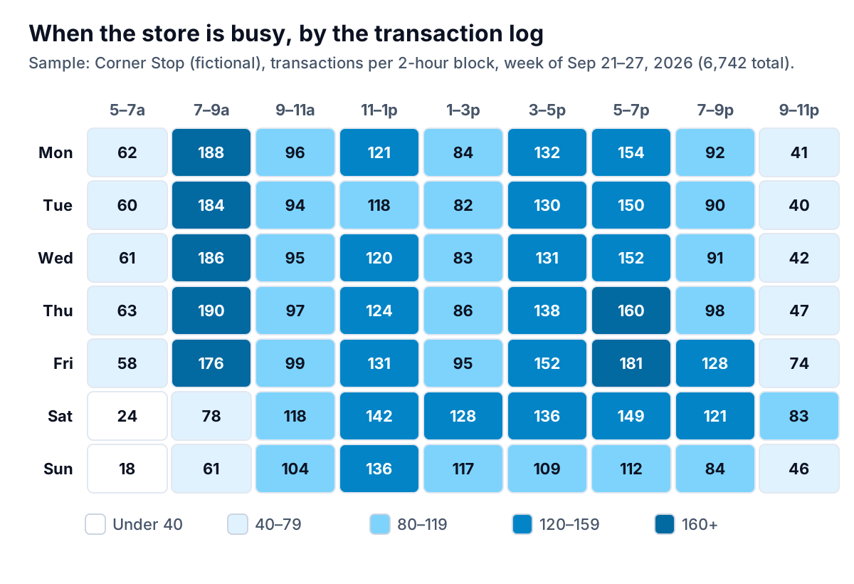
Three things jump out of the sample store's week:
- The weekday morning rush is the busiest block of the week. 176 to 190 transactions between 7 and 9 am is about one every 40 seconds. If one person is on the register while also brewing coffee and restocking the roller grill, the line is where you lose sales.
- Friday evening is different from every other evening. 181 transactions from 5 to 7 pm and 128 from 7 to 9 pm, against 150 to 160 and around 90 the rest of the week. That is a beer, ice and snacks pattern and it needs its own staffing and its own cooler-stocking schedule.
- Weekend mornings are quiet. 78 and 61 transactions from 7 to 9 am. Staffing copied from weekdays is wasted here, and the hours are better spent on the Saturday midday peak.
Ask for the same chart by item category and the patterns sharpen further: coffee concentrated before 9 am, packaged beverages in the afternoon, beer on Friday. Each is a stocking schedule.
Question 2: what actually makes the money?
Rank categories by sales, then by gross profit, and put the two lists side by side. This needs item cost in your POS or back office, which is worth fixing if it is missing.
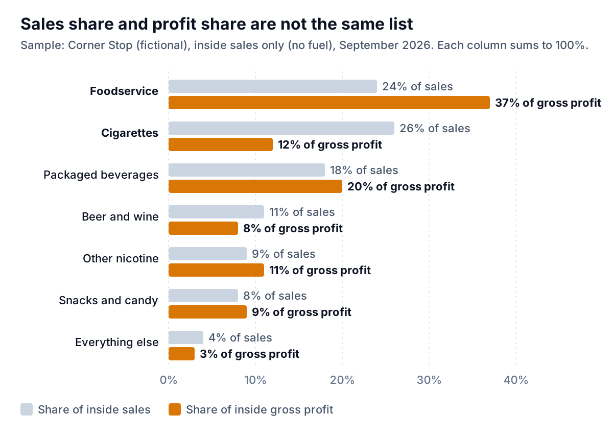
In the sample store, cigarettes are the biggest category by sales at 26% but deliver only 12% of gross profit. Foodservice is 24% of sales and 37% of profit, close to the national pattern. That has practical consequences: the hot case, coffee bar and fountain deserve the best staff attention during the morning rush, and an out-of-stock on breakfast sandwiches at 7:30 am costs more profit than an out-of-stock on a cigarette brand.
A few follow-up questions worth asking once costs are in:
- "Which 20 items lost the most gross profit dollars versus the same four weeks last year?"
- "Which items have a gross margin below 15% and sell fewer than five a week?" These are candidates to drop and give the space to something that earns.
- "What is gross profit per linear foot by category?" if you can map items to shelf sets.
Question 3: which add-on sales are you missing?
Attach rate is the share of transactions containing one item that also contain another. It is the most useful number in convenience retail that most standard POS reports do not show, and it is easy to get from a line-item export: "of transactions with a hot coffee between 6 and 10 am, what share also had a breakfast food item?"
Here is a worked example with illustrative numbers. Say the sample store sells 1,000 morning coffees a week and 180 of those transactions include a breakfast item: an 18% attach rate. You test a coffee-and-sandwich combo price for four weeks and the attach rate rises to 25%. That is 70 more breakfast items a week. At $1.60 of gross profit each, it is about $112 a week, or roughly $5,800 a year, from one combo. Then check the other side: did coffee-only transactions fall, and did the combo discount give away margin on customers who would have bought both anyway? The same log answers both questions.
Other pairs worth measuring: fuel and inside purchase (if your forecourt and inside POS share a transaction log), beer and ice or snacks on Friday evenings, and energy drinks with a food item at lunch.
Question 4: where are the exceptions?
Voids, no-sale drawer opens, refunds and manual price overrides are normal in small numbers. A sudden rise, or one register or one shift with far more than the others, is worth a look. Measuring them per 100 transactions, by cashier or by shift, makes the comparison fair.
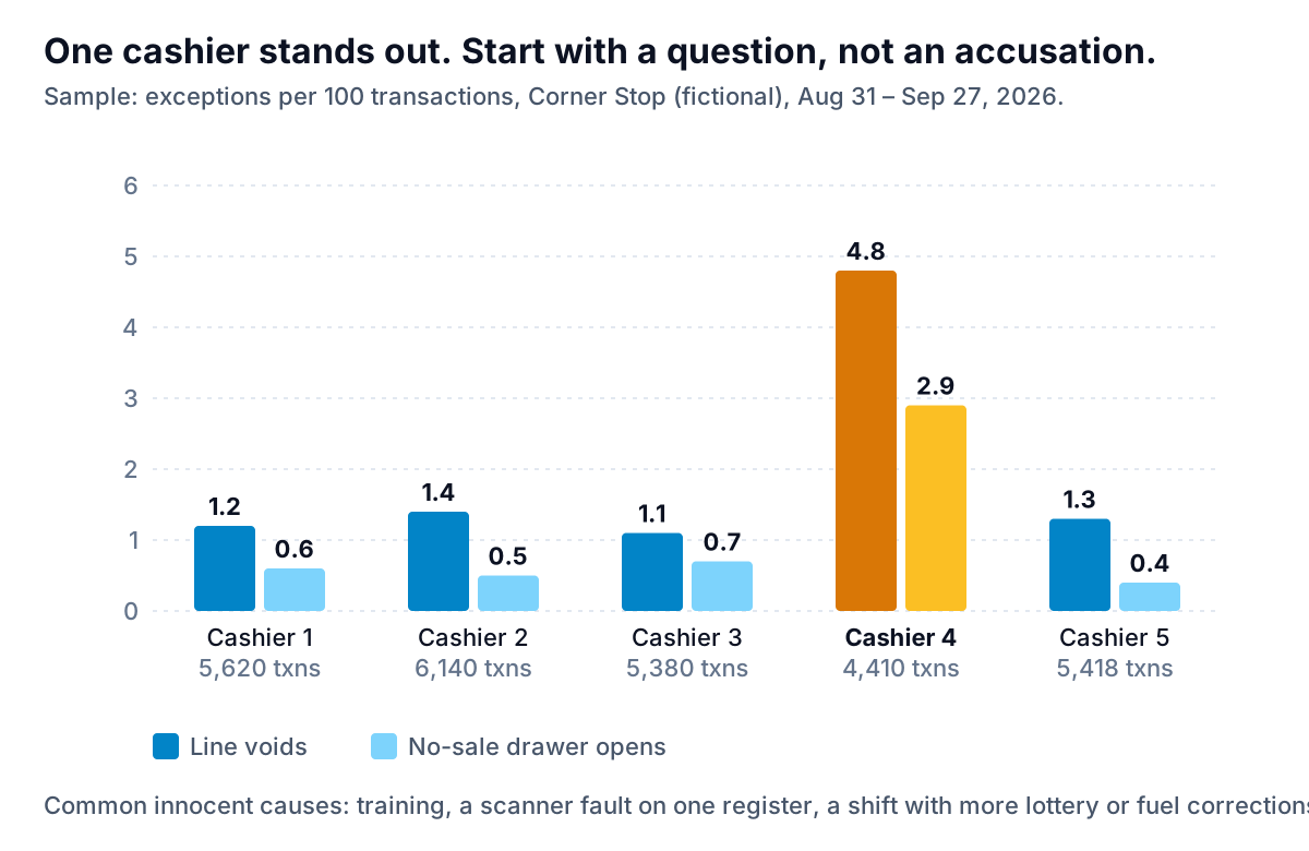
In the sample, one cashier's void rate is roughly four times everyone else's. That is a reason to look at the camera footage for a few of those voids, check whether that person works a register with a faulty scanner, or ask whether they handle the lottery terminal or fuel corrections more often. It is not proof of anything. Handle it as you would any HR matter: privately, with the facts, and with a chance to explain. Check your state's rules and get advice before acting on monitoring data.
Getting the data out, and choosing a tool for AI POS analytics for convenience store use
Convenience stores run a range of systems, from forecourt-integrated POS such as Verifone Commander or Gilbarco Passport to general retail POS such as Square or Clover, often with a separate back-office package on top. The capabilities differ, so check what yours exports. For the analysis above you want two files:
| Export | Columns you need | Answers |
|---|---|---|
| Line-item transaction detail | Transaction ID, date and time, register, cashier ID, item or PLU/UPC, category, quantity, price, cost | Heat maps, attach rates, category profit |
| Exception or journal report | Date and time, register, cashier ID, event type (void, no-sale, refund, override), amount | Exception rates by cashier and shift |
A week of line items for a busy store can run to tens of thousands of rows. That is too big for comfortable spreadsheet work but small for analysis software.
Then pick a route. Your POS or back-office vendor's reports are the first stop: many cover hourly sales and category summaries, and some offer add-on analytics. A BI tool can do everything above if you or a consultant build it. Or an AI analysis tool can take the export, answer the questions in plain English and build the charts, with no setup beyond the upload.
Parity takes the last route. You upload the CSV or Excel export, ask your question or describe the report ("transactions by weekday and hour, category sales versus gross profit, voids per 100 transactions by cashier"), and every number and chart is checked against queries on the full dataset before you see it. You can refine it in chat and export a PDF to share with a manager or a partner. Files are encrypted in transit, deleted after the report is built, and never used for training. For a broader look at turning store data into a weekly view, our grocery dashboard guide covers shrink and department margins, and AI for retail demand forecasting covers ordering.
A monthly routine
Before the routine, four mistakes that make transaction analysis misleading:
- Mixing fuel-only and inside transactions. If pay-at-pump sales land in the same log, they inflate counts and shrink average basket. Filter them out, or analyse them separately.
- Comparing weeks with different calendars. A week with a holiday, a local event or a road closure is not a baseline. Compare like with like, or use four-week periods.
- Missing or stale item costs. Gross profit by category is only as good as the cost file. Items with a zero or year-old cost will look like your best performers.
- Reading too much into small numbers. A cashier who worked two shifts can have an alarming void rate from three voids. Ask for the transaction count behind every rate.
- First Monday of the month: export the last four weeks of line items and exceptions, with personal columns removed.
- Re-run the same four questions: heat map, sales versus profit by category, your two or three key attach rates, exceptions per 100 transactions.
- Compare against last month, not against an ideal. Changes are where the decisions are.
- Pick one change: a staffing shift, a combo test, an item to drop, a register to check. Note it, then measure it next month with the same question.
The value of AI POS analytics for convenience store owners is not a clever model. It is that a question that used to take a Saturday afternoon now takes a minute, so you can actually ask it every month.
Upload it, ask when you are busy and what makes the money, and get charts where every number is checked against the full file. Build a report from your data free