It's the third working day of the month. You have three exports open, a pivot table that broke because someone added a column, and a client expecting their monthly report by Friday. If you build reports like this for one client, it costs you an afternoon. If you build them for eight, it costs you most of a week.
An AI tool for Excel reports can take a big share of that time back. It won't take all of it, and the part it can't take is the part that protects your reputation: checking that the numbers are right. This guide walks through a real monthly report step by step, shows which steps AI speeds up and which it doesn't, and gives you the prompts and checks to use.
What an AI tool for Excel reports actually saves you
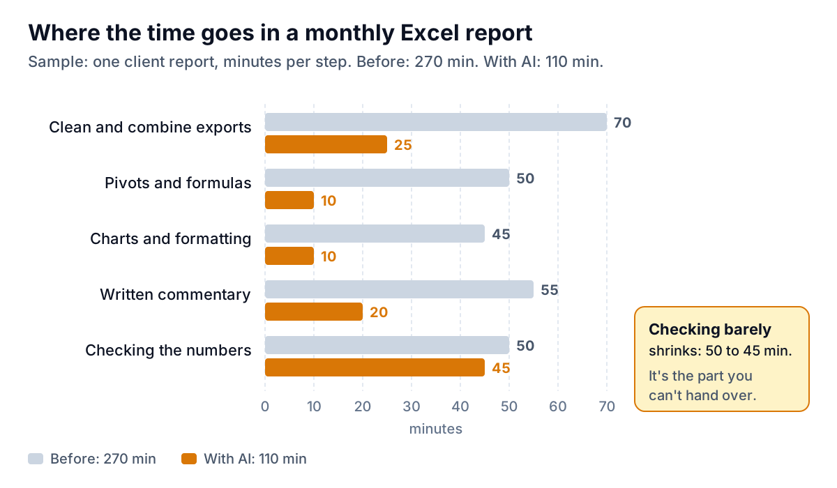
Break a typical monthly report into its steps and time each one. Here is a sample for one fictional client, a plumbing company whose bookkeeper sends them a monthly sales summary. Before AI, it took 270 minutes. With AI handling the mechanical parts, it took 110.
The pattern holds for most reports:
- Pivots, formulas and charts shrink the most. Describing "revenue by month by service, with a column chart" takes seconds. Building it by hand takes much longer, especially when the source layout changed.
- Cleaning and combining shrinks a lot, but not to zero. AI can standardize date formats and spot duplicate client names. You still decide which version of "Acme" is correct.
- Commentary goes from writing to editing. An AI draft of "what changed this month" is a decent start. You add the context it can't know, like the fact that September included two one-off boiler installs.
- Checking barely moves. That's not a flaw in the tools. It's the step where you confirm the report matches reality, and you are the one who knows reality.
If a vendor promises to remove the checking step, be wary. Microsoft's own Copilot in Excel FAQ says to "review, edit, and verify anything Copilot creates before you rely on it".
Step one: make the sheet readable before you ask anything
Most bad AI output in Excel comes from layouts that were built for human eyes: a title row, merged header cells, subtotals between groups, and notes typed into number columns. People read past those. AI tools take them literally.
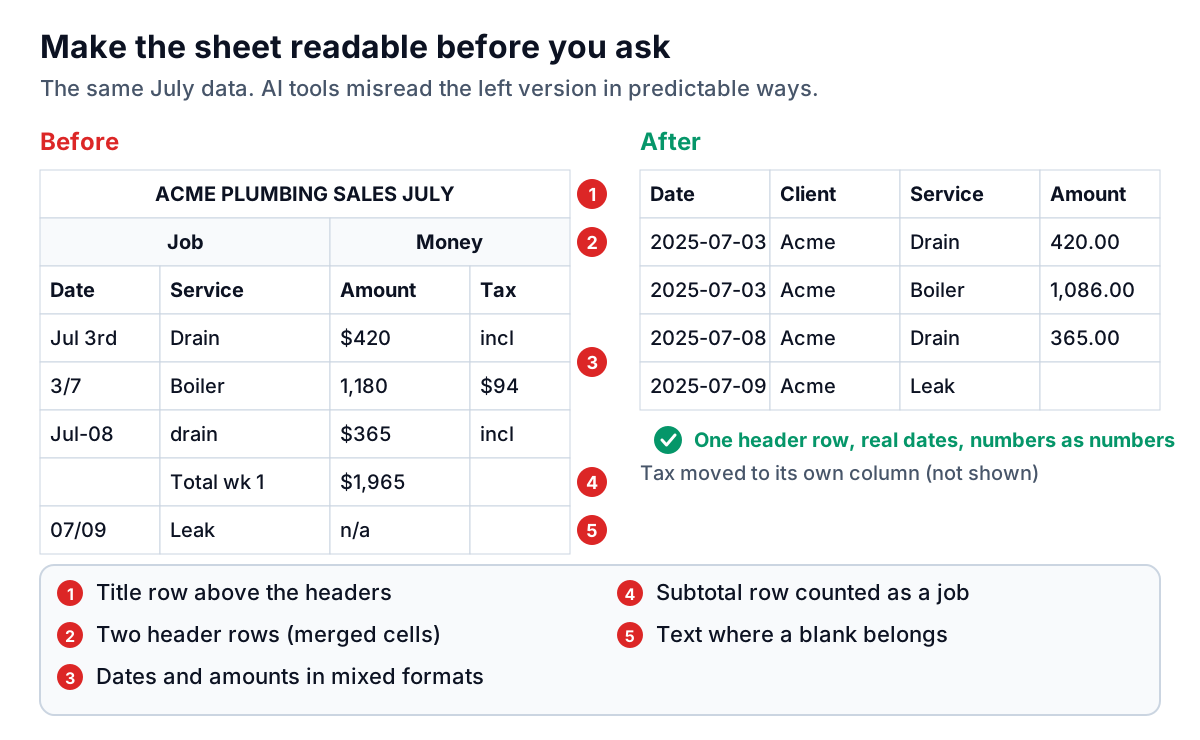
Microsoft's guidance for Excel's Analyze Data feature makes a good checklist for any tool: format the range as a table (Ctrl+T), use "a single row of unique, non-blank labels" as headers, and avoid double-row headers and merged cells. The same page says dates stored as text strings won't be recognized and that Analyze Data doesn't support datasets over 1.5 million cells.
Keep a separate "data" tab that follows those rules, and build your formatted report on another tab or in another file. Then each month you only paste new rows into the data tab, and every AI prompt points at the same clean table. The five fixes that matter most:
- Delete the title row. Put the client name in the file name instead.
- Replace stacked headers with one row: Date, Client, Service, Amount, Tax.
- Delete subtotal rows. Let the pivot table do the totals.
- Convert text dates and text amounts to real dates and numbers.
- Leave blanks blank. "n/a", "TBC" and "-" make a numeric column look like text.
Which tool for which step
You don't need one tool for everything. Most people end up combining what they already have.
| Tool | Good for | Worth knowing |
|---|---|---|
| Analyze Data (built into Excel) | Quick suggested charts and pivots, trends and outliers | Included for Microsoft 365 subscribers; up to 1.5 million cells |
| Copilot in Excel | Formulas, PivotTables, charts, conditional formatting, edits across sheets | Needs an eligible license: a Personal or Family plan with AI credits, Microsoft 365 Premium, or a qualifying business plan |
| Gemini in Google Sheets | The same jobs if your team lives in Sheets | Google notes generated charts don't update when the data changes |
| A chat assistant (ChatGPT, Claude, Gemini) | Combining several exports, one-off questions, first-draft commentary | Upload a copy, not your master file; ask it to show the code it ran |
| An AI report builder | The finished, formatted report to send | Check how it verifies numbers before you trust it |
Prompts that work
Specific prompts get checkable answers. Vague prompts get vague charts. These work in Copilot, Gemini or a chat assistant, pointed at a clean data table:
- "Create a PivotTable of Amount by month (rows) and Service (columns) for July to September 2025. Add a grand total."
- "Add a column that flags any row where Amount is blank or zero."
- "Make a clustered column chart of revenue by month. Label each bar with its value."
- "Compare Q3 to Q2: total revenue, number of jobs and average job value. Show the formulas you used."
- "Write three sentences on what changed between Q2 and Q3, using only the numbers in the summary table. Don't guess at reasons."
The last instruction matters. Left to itself, an AI will explain a dip with a plausible reason ("seasonal slowdown") that may not be true. You know why September was strong. Add the reason yourself.
Make next month faster than this month
The first month with any AI tool for Excel reports is slower than you expect, because you are fixing layouts and learning which prompts work. The second month should be much faster, if you keep what you learned:
- Save your prompts in a "Notes" tab in the workbook. Next month, paste them in the same order. Same prompts on the same layout give you comparable output.
- Keep the export settings identical. Same columns, same order, same date range rules. Most broken monthly reports start with an export that someone changed.
- Keep last month's file. Save each month as a new copy rather than overwriting. When a client asks "why is August different from what you sent last month?", you can answer in minutes.
- Write down the exclusions once. Refunds out, internal test jobs out, tax excluded. Paste that line into every report's source note.
After two or three cycles, the first four steps in the chart above become routine. That leaves your attention for checking and for the commentary, which is where a client sees the value of your work.
What a client-ready report contains
Speed is only useful if the output is something a client will read. The reports clients actually open tend to share a shape: a few headline numbers with a comparison, one chart per point with the point stated in words, a small table for detail, and a line saying where the data came from.
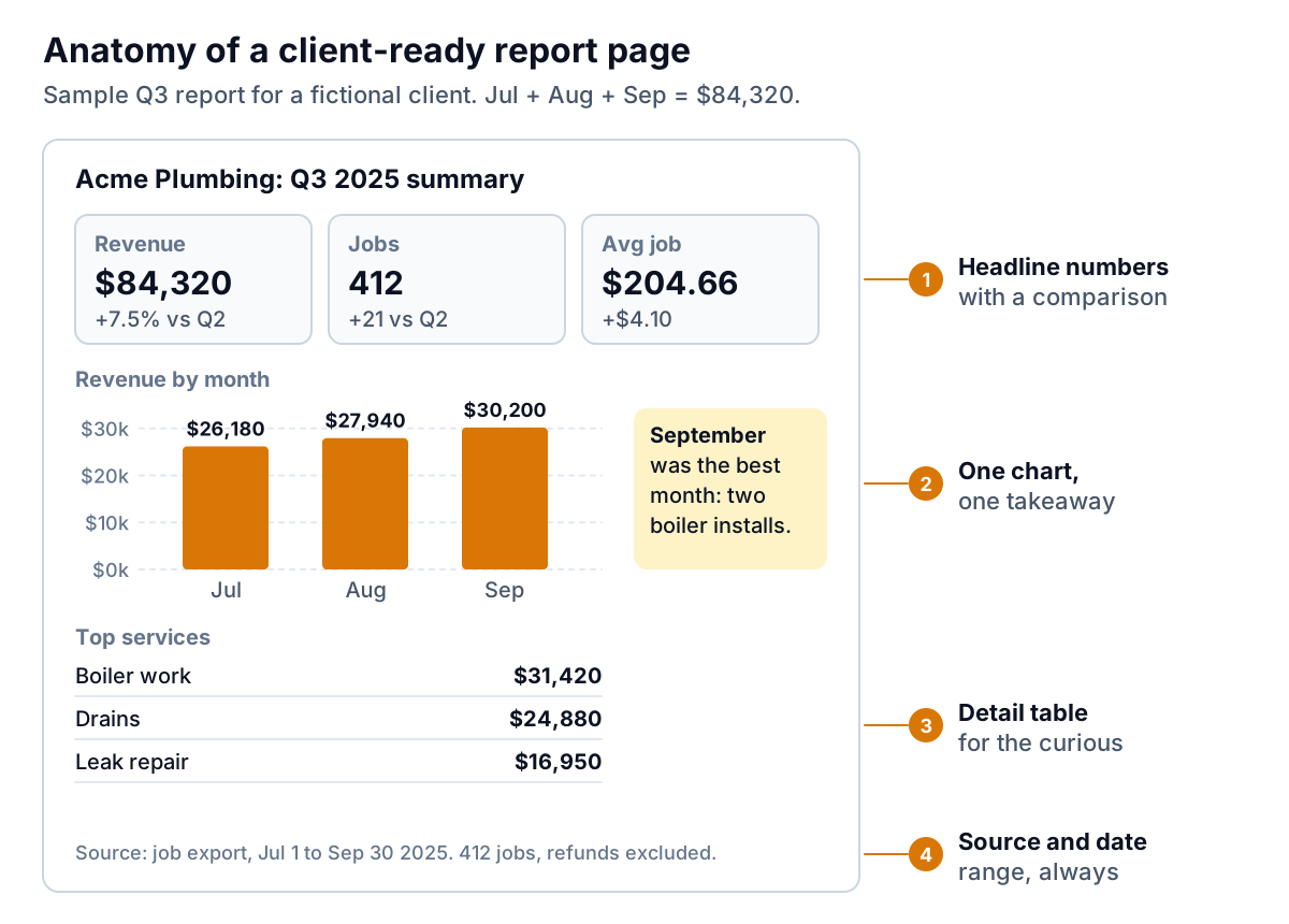
Two habits make the difference. First, write the takeaway next to every chart. "Revenue by month" is a label. "September was the best month, helped by two boiler installs" is a finding. Second, always state the source and date range, including what was excluded. It answers the first question any sharp client asks when a number looks off.
If your clients would rather open a link than a spreadsheet, the same structure works as a dashboard. Our guide to no-code AI dashboard builders covers that route, and agencies doing this at volume may find our post on AI reporting for marketing agencies useful.
The checking routine you shouldn't skip
This is the 45 minutes in the chart above. You can make it faster with practice, but don't drop it. A wrong number in a client report costs far more than the time saved. Run these five checks every month:
- Totals tie out. The report's total revenue matches the total in your accounting or job system for the same dates, to the cent. If it's off, find out why before you look at anything else.
- Row count makes sense. 412 jobs in the report should mean 412 rows in the data tab after filters. A different number usually means a subtotal row crept in or a filter was left on.
- Date range is right. Check the first and last date in the data. Exports often include the first day of the next month or miss the last day of this one.
- One spot check per chart. Pick one bar or point and recompute it by hand with a filter and the status bar sum. It takes a minute per chart.
- Every sentence matches a number. Read the commentary and find the figure behind each claim. Delete any claim you can't trace.
Our article on AI tools for data analysis describes a known-answer test for picking a tool in the first place: ask it questions you already know the answers to and see how it scores. Do that once per tool. Do the five checks above once per report.
Where Parity fits
If your bottleneck is turning the same exports into a finished report every month, that's the job Parity was built for. You upload a CSV or Excel file and describe the report in plain English. An agent analyzes every row and builds a client-ready report or dashboard with KPI tiles, charts, pivot and summary tables, an executive summary and a takeaway under each chart, which is the structure shown above.
The difference that matters for this article is step five of the checking routine, done for you: every number and chart is checked against queries on the full dataset before you see it. You still check the totals against your own system, but you aren't hunting for a pivot that silently dropped rows. You can then refine it in chat ("split by service", "compare to Q2"), with versions and undo, and export a PDF to send. Files are sent encrypted, deleted after the report is built and never used for training. There's more on the Excel to dashboard page.
Upload your Excel export, describe the report your client needs, and get a version where every figure has been checked against the full file. Build a report from your data free
Whatever you use, the order is the same: clean data tab first, specific prompts second, your own judgment on the commentary, and the five checks before anything leaves your inbox. Do that, and an AI tool for Excel reports turns the monthly report from an afternoon into an hour you can trust.