It's the first Monday of October. Saltmarsh Tea, an example online store we'll follow through this guide, sold $38,115 in September, down from $40,320 in August. That's 5.5% lower. Was it traffic? Was the site converting worse? Were people buying less per order? Did the month still make money after ads? A good ecommerce dashboard answers all four questions on one screen, in the time it takes to drink a coffee. A bad one shows twenty charts and leaves you guessing.
This guide covers what to put on an online store dashboard, in what order, and how to read it. It uses one example store throughout, so you can check the arithmetic, and it ends with the mistakes that make store dashboards quietly wrong.
The three rows of a useful ecommerce dashboard
Lay the page out as three rows, each answering one question. Read them top to bottom and stop when you have your answer.
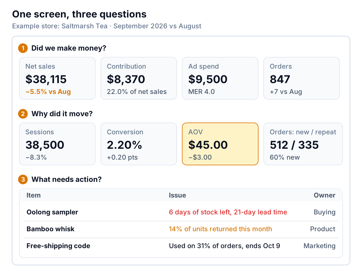
- Did we make money? Net sales, contribution, ad spend and orders.
- Why did it move? Sessions, conversion rate, average order value (AOV), and how many orders came from new versus returning customers.
- What needs action? A short list of specific products, codes or problems, each with an owner.
Most templates you'll find online stop at row 2, or mix the rows together so the important tile sits next to "social followers". The order matters. If row 1 is fine, you can skim the rest. If it isn't, row 2 tells you where to look, and row 3 is where the dashboard turns into a to-do list.
Row 1: did the month make money?
Net sales, not total sales
Your headline revenue figure should be net sales: what customers paid for products, after discounts and returns. Shopify, for example, defines net sales as gross sales minus discounts and sales reversals, while its "total sales" adds taxes, shipping charges and fees on top. Total sales is the bigger number, which is why it ends up on dashboards. It's also the wrong one, because it includes tax you hand to the government.
Contribution: what the month kept
Net sales tells you how busy you were. Contribution tells you whether it was worth it. It's net sales minus every cost that rises with each order: product cost, shipping and packing, payment fees, the cost of handling returns, and advertising.
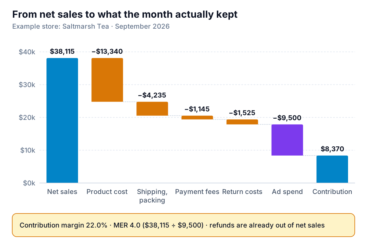
Saltmarsh kept $8,370, or 22.0% of net sales. That's the number to watch month to month, and the one to set a floor for. A simple rule: if contribution margin falls two months in a row, look at the biggest bar that grew, not at revenue.
Ad spend and MER
Put total ad spend on the dashboard as one number across every platform, next to MER (marketing efficiency ratio): net sales divided by total ad spend. Saltmarsh's is $38,115 ÷ $9,500 = 4.0. MER is blunt, but it can't double count. Each ad platform reports its own return on ad spend using its own attribution rules, and if you add them up they often claim more sales than you made. Our marketing dashboard guide covers how to compare channels fairly.
One more number belongs here once you have it: cost per new customer. Saltmarsh had 512 orders from first-time customers, so ad spend per new customer was $9,500 ÷ 512 = $18.55. Before ads, the average order contributed $17,870 ÷ 847 = $21.10. So a new customer's first order only just covers what it cost to win them. The profit is in the second order. That one line tells you to put as much effort into repeat purchases as into ads.
Row 2: why did it move? Take revenue apart
Every online store's revenue is the product of three numbers: sessions × conversion rate × average order value. When revenue moves, one or more of those moved. Find which before you do anything.
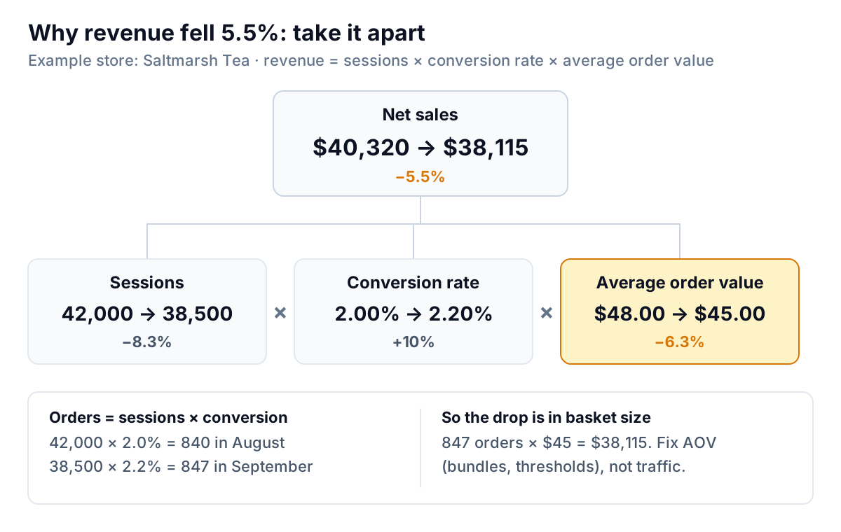
At Saltmarsh, sessions fell 8.3%. That looks like the culprit, and most owners would start spending on ads to fix it. But conversion rose from 2.0% to 2.2%, so orders went up, from 840 to 847. The real drop is in AOV, from $48 to $45. A free-shipping code that ran most of the month is the likely cause: people bought one tin instead of adding a second to reach the shipping threshold. More traffic wouldn't have fixed that.
Decision rules for row 2:
- Sessions down, conversion and AOV steady: a traffic problem. Check which source fell (search, email, paid) before raising ad budgets.
- Conversion down: look at the site and the offer. Did prices, shipping costs, stock or page speed change? Check the funnel step where people leave.
- AOV down: look at the mix. A discount code, a cheap best seller, or a missing bundle usually explains it.
- All three flat but revenue down: your numbers don't reconcile. Fix the data before reading anything else.
Abandoned checkouts often get their own tile. Keep it in perspective: the Baymard Institute's average across 50 studies is a documented cart abandonment rate of 70.22%. A high rate is normal. A rising rate is the signal.
Show new and returning orders side by side, not just a "repeat rate". At Saltmarsh, 512 of 847 orders (60%) came from first-time buyers. If that share jumps during a promotion, check three months later whether those customers came back.
Row 3: the action list
This row is the reason to open the dashboard every week. It's a short table of named problems, each with a reason and an owner. Good candidates for an online store:
- Stock that runs out before the next delivery. Days of stock left = units on hand ÷ average daily units sold. Flag anything below your supplier's lead time. Saltmarsh's oolong sampler has 6 days left and a 21-day lead time.
- Products with unusual return rates. Returns are a normal part of selling online; the National Retail Federation estimated that 19.3% of online sales would be returned in 2025. Your store-wide rate matters less than the outliers. A product returned far more often than its category usually has a description, sizing or quality problem.
- Discount codes doing more than planned. Any code on more than a set share of orders, or past its end date.
- Products selling at a loss after shipping. Cheap, heavy items are the usual suspects.
Keep this list to five or six rows. If everything is flagged, nothing is.
The numbers, defined
Write these definitions down once and keep them with the dashboard. Most arguments about "the numbers" are really arguments about definitions.
| Number | How it's calculated | Saltmarsh, Sept | Check |
|---|---|---|---|
| Net sales | Gross sales − discounts − returns | $38,115 | Weekly |
| Orders | Count of paid orders | 847 | Weekly |
| Sessions | Visits to the store | 38,500 | Weekly |
| Conversion rate | Orders ÷ sessions | 2.20% | Weekly |
| Average order value | Net sales ÷ orders | $45.00 | Weekly |
| New-customer share | First orders ÷ all orders | 60% | Monthly |
| Contribution margin | (Net sales − variable costs − ads) ÷ net sales | 22.0% | Monthly |
| MER | Net sales ÷ total ad spend | 4.0 | Weekly |
| Cost per new customer | Total ad spend ÷ first orders | $18.55 | Monthly |
| Days of stock left | Units on hand ÷ average daily units sold | Per product | Weekly |
Compare each number with the same period last year as well as last month. Online sales are seasonal, and a September that's down on August can still be up on last September.
A five-minute weekly read
Monthly is when you judge the business. Weekly is when you catch problems early enough to fix them inside the month. Here's the routine, in order:
- Look at net sales and orders for the week against the same week last year. Write one word: up, flat or down.
- If it's down, check sessions, conversion and AOV, and name the one that moved most.
- Check MER. If it dropped while spend rose, pause the newest campaign before adding budget to anything.
- Work through the action list. Every row gets a decision: reorder, fix, end or ignore, with a name next to it.
That's it. If the routine takes longer than five minutes, the dashboard has too much on it.
Five mistakes that make a store dashboard wrong
- Headlining total sales. It includes tax and shipping. Your margin, your MER and your comparisons with your accountant's figures all need net sales.
- Adding up platform-reported sales. If Meta, Google and your email tool each claim the same order, your "attributed revenue" can exceed your actual revenue. Use one total ad spend and one revenue figure for the headline.
- Leaving product costs blank. Profit figures only include products with a cost. If a quarter of your catalogue has none, your margin is a guess. Our guide to Shopify reports shows how much that can distort a month.
- Too many tiles. A dashboard with 30 numbers is a report nobody reads. If a tile hasn't changed a decision in three months, take it off.
- Reacting to daily noise. A small store's daily conversion rate jumps around. Read row 2 weekly and act on trends of two or three weeks, not one bad Tuesday.
Building it from your store's data
You have three realistic options. Your platform's own analytics page is free and already connected; Shopify's, for instance, lets you add customizable metric cards for its reports. It covers rows 1 and 2 well, except contribution and cost per new customer, because it doesn't know all your costs. A spreadsheet can hold everything, but someone has to paste in fresh exports every week, and that's the step that stops happening in month three.
The third option is a tool that builds the page from your data. Parity connects to Shopify, Stripe and Square directly, and takes a CSV or Excel export from any other platform, such as an ad spend export. It builds a dashboard with headline numbers and their trends, charts, what explains the changes and a table of what needs attention, and every number is checked against queries on the full dataset before you see it. You refine it by chat ("add cost per new customer", "compare with last September"), with versions and undo, and share a read-only link with a partner. If you'd rather see the store in more depth, the AI for Shopify analytics guide works through a discount analysis end to end.
Connect your store and Parity builds a checked dashboard of sales, contribution and what needs action. Connect your store free
Whatever you build it in, the test of an ecommerce dashboard is simple. On the first Monday of the month, can you say in one sentence whether the month made money, why it moved, and what you're doing about it? Saltmarsh's sentence: "Revenue fell 5.5% because baskets got smaller under the free-shipping code; we kept 22%; reorder the oolong sampler today."