Meta Ads Manager says September was a great month for Oakline Landscaping, an example business we'll use throughout this guide: 96 leads for $1,500, or about $15.63 a lead. Google Ads looks pricier at $33.33 a lead. On those numbers, the owner should move budget to Meta. Then she opens her job list. Meta's leads turned into three paid jobs. Google's turned into twelve. Per job won, Meta cost $500 and Google $200.
That's the whole case for a small business marketing dashboard: one page that starts from money in your own records, not from each platform's account of itself. This guide shows what goes on it, how to read it, and the rules for deciding where next month's budget goes. It's written for a business spending a few hundred to a few thousand dollars a month, not a marketing department with an analyst.
What a small business marketing dashboard should answer
Forget the 30-chart templates. A small business needs a marketing dashboard to answer three questions:
- What did each channel cost, and what did it bring in? Spend, leads, customers and revenue, side by side.
- Where do leads fall out? Lead to quote (or cart) to sale, by channel.
- Are the platforms telling the truth? Their reported results against what actually landed in your CRM, till or order list.
Impressions, reach, click-through rate and follower counts are useful inside an ad account when you're adjusting a campaign. They don't belong on the page where you decide budgets, because none of them is money.
The channel table: one row per channel, money in every column
This table is the heart of the dashboard. If you only build one thing, build this.
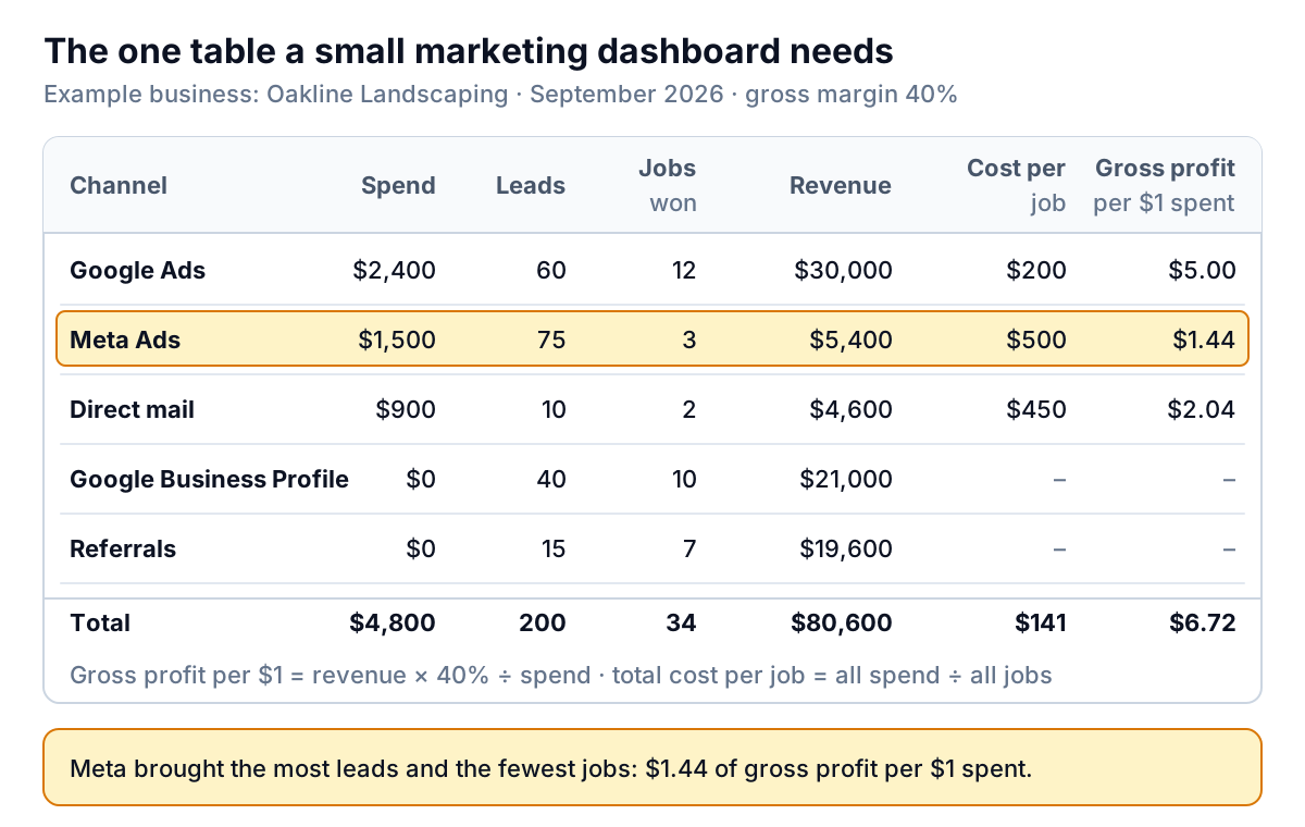
The columns, left to right:
- Spend: what you paid the channel this month. For agencies or freelancers who run a channel, include their fee.
- Leads: enquiries recorded in your own system (CRM, booking tool, inbox log), tagged with where they came from. Not the platform's count.
- Jobs won (or customers, or first orders): the ones that paid.
- Revenue: what those customers paid.
- Cost per job: spend ÷ jobs won. Oakline's blended figure is $4,800 ÷ 34 = $141.
- Gross profit per $1 spent: revenue × your gross margin ÷ spend. Oakline's margin on jobs is about 40%, so Google Ads returns $30,000 × 40% ÷ $2,400 = $5.00 of gross profit per dollar.
The last column is the one most marketing dashboards skip, and it's the one that matters. Revenue per dollar ("ROAS") flatters any business with thin margins. A channel that brings $3 of revenue for every $1 spent loses money if your gross margin is 30%. Use gross profit, and the break-even line is simply $1.
Keep the free channels in the table even though their cost columns are blank. At Oakline, Google Business Profile and referrals brought 17 of the 34 jobs and half the revenue. If you only look at paid channels, you'll keep tuning ads and never ask past customers for a referral.
Add one trend line
Under the table, add a single line chart: blended cost per job (or per new customer) for the last 12 months, with total spend as a second line. One month's table tells you which channel worked. The trend tells you whether marketing as a whole is getting more or less efficient. If cost per job creeps up for three months while spend stays flat, a channel is wearing out, a competitor is bidding against you, or your close rate has slipped. Each of those has a different fix, and the channel table and funnel will tell you which one it is.
The funnel: where leads fall out, by channel
The second block shows how leads move through your sales process. For a service business that's lead, quote, job. For a shop it's visit, cart, order. Show the totals first, then the conversion rate by channel.
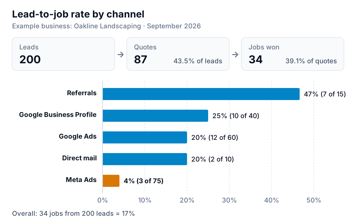
Across all channels, Oakline turned 200 leads into 87 quotes and 34 jobs: 17% of leads became paying customers. The spread by channel is huge. Almost half of referrals became jobs. Meta's form leads converted at 4%. Cheap leads that don't convert aren't cheap, and they cost you time too: someone at Oakline phoned 75 Meta leads to win three jobs.
The funnel also tells you which fix to try. If a channel's leads rarely get to quote, the targeting or the offer is attracting the wrong people. If plenty get to quote but few say yes, look at your pricing, your follow-up speed and your quote itself, because the channel did its job.
Check the platforms against your own records
Every ad platform measures its own results with its own rules, and every one of them is generous to itself. At Oakline, the two ad platforms reported 168 leads between them. Oakline's CRM recorded 135 leads tagged to those two channels.
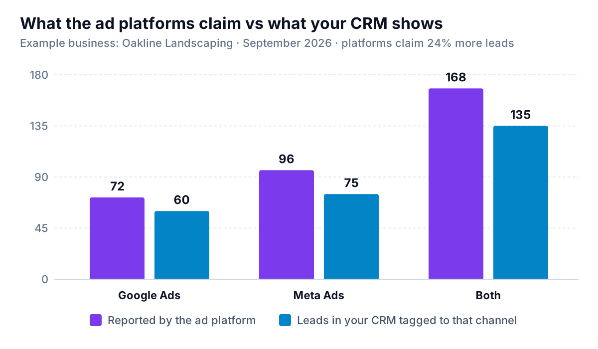
Nobody is lying. The gap comes from how each tool counts. Platforms use attribution windows and models that let them claim a conversion after a click or a view, and two platforms can both claim the same person. Analytics tools differ too. Google Analytics 4 now offers three attribution models: data-driven, paid and organic last click, and Google paid channels last click, after first click, linear and others were retired in November 2023. Shopify's marketing reports use last non-direct click by default, which gives all the credit to the last channel a buyer clicked, ignoring direct visits. Ask three tools which campaign won a sale and you can get three answers.
The practical rule: use the platforms to manage campaigns inside each platform, and use your own records to decide how much each platform gets. Put the comparison on the dashboard as one small chart so the gap stays visible. If it suddenly widens, something has broken: a tracking tag, a form, or a lead source field nobody is filling in. If you report to clients, our guide to AI reporting for marketing agencies goes deeper on reconciling platform numbers.
Decision rules for next month's budget
A marketing dashboard is only useful if it changes what you spend. Here are simple rules based on gross profit per dollar, using the last two or three months rather than one:
| Gross profit per $1 spent | What it means | What to do |
|---|---|---|
| Below $1.00 | The channel loses money on the first sale | Cut it, unless customers reliably buy again; then judge it on repeat profit |
| $1.00 to $2.00 | Covers its cost, not much more | Hold the budget. Fix the funnel step where leads fall out |
| Above $2.00 | Clearly profitable | Raise the budget in steps of 20–30% and check the number holds |
These thresholds are a starting point for an example business, not an industry benchmark. Your overheads decide where your own lines sit. A business with high fixed costs needs more than $2.00 to feel the difference.
Applied to Oakline: Google Ads at $5.00 gets more budget, carefully, because returns usually fall as you spend more on the same searches. Direct mail at $2.04 is borderline profitable on two jobs, too few to judge; run it again before deciding. Meta at $1.44 holds, but the form needs fixing: add a question about budget or job size so the leads that reach the phone are worth calling. And someone should ask the last twenty happy customers for a referral, because that channel converts at 47% and costs nothing.
Setting it up so the numbers hold
The dashboard is only as good as the "source" field on each lead or order. Three habits make it reliable:
- Tag every link you control. Google's guidance is to always use utm_source, utm_medium and utm_campaign together when you add campaign parameters to a URL; leave them out and visits show up as "(not set)". Agree one spelling for each source ("facebook", not "Facebook" in one place and "fb" in another).
- Ask, and record the answer. Add "How did you hear about us?" to your enquiry form and phone script, with a fixed list of answers. It catches referrals and word of mouth that no tracking code will.
- Close the loop. When a lead becomes a job, mark it in the same system, so the lead's source and the job's revenue sit in one row. If your jobs live in an accounting tool and your leads in a CRM, you need a shared ID or customer name to join them.
Then pick a rhythm. Monthly is right for most small businesses: on the first Monday, update the channel table, check the platform gap, and apply the budget rules. Weekly checks are only worth it while a new campaign is running.
Building the dashboard
You can build all of this in a spreadsheet: one tab per source, one summary tab with the channel table. It works, and it's free. It breaks when someone forgets to paste in the new exports, and that usually happens by the third month.
Parity builds the dashboard from your data instead. It connects to HubSpot, Shopify, Stripe and Google Sheets directly, and takes a CSV or Excel export of anything else, such as your ad spend by campaign. It builds a dashboard with the headline numbers and their trends, charts, what explains them and a table of what needs attention, and every number is checked against queries on the full dataset before you see it. You refine it by chat ("add gross profit per dollar at a 40% margin", "count jobs by lead month"), share a read-only link with your business partner, and save it as a template for next month. If you ask, it writes the monthly marketing report from the same data. If your leads live in a CRM, our CRM dashboard guide covers the pipeline side, and for an online store the ecommerce dashboard guide shows where marketing fits among the other numbers.
Bring your leads, jobs and ad spend together and get a checked marketing dashboard, with gross profit per dollar for every channel. Build a report from your data free
However you build it, keep the test simple. At the end of each month, your marketing dashboard should let you finish one sentence: "Next month we'll spend more on ___ and less on ___, because ___ returned $___ of gross profit per dollar and ___ returned $___." If it can't, it has the wrong numbers on it.