Larch Commercial Cleaning, an example business we'll use throughout this guide, had a good September. Revenue was up 5%, 14 new deals came in, and the pipeline showed $241,500 of open work. The owner was ready to hire a second crew. Then two numbers on a new CRM dashboard changed her mind: $55,500 of that pipeline was stale or duplicated, and sales meetings had fallen from six to eight a week to two or three. The good month was already behind her. The next quarter looked thin.
That's what a CRM dashboard is for. Your CRM holds hundreds of records; the dashboard should answer three questions in under a minute: are we filling the pipeline, what's likely to close, and what did last month's work turn into. This guide shows how to build one around those three questions, with a worked example, layouts for different kinds of business, and the cleanup you need to do first.
The three views every CRM dashboard needs
Most CRM dashboard examples online show 12 or 15 charts. For a team of two to ten people, that's too many to read each week, and the charts repeat each other. Group what you track into three views that run in a chain:
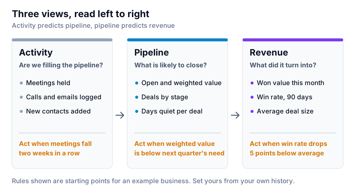
- Activity answers "are we filling the pipeline?" Meetings held, calls and emails logged, new contacts added. It's the earliest warning you get.
- Pipeline answers "what is likely to close?" Open and weighted value, deals by stage, and how long each deal has been quiet.
- Revenue answers "what did it turn into?" Won value this month, win rate over the last 90 days, and average deal size.
The order matters. Revenue is what owners look at first, but it's the last thing to change. By the time won revenue drops, the drop in activity that caused it happened weeks earlier. A CRM dashboard that only shows revenue is a rear-view mirror.
Give each view one rule for when to act, and write it on the dashboard. The rules in the figure are starting points: act when meetings fall two weeks running, when weighted pipeline is below what next quarter needs, or when win rate drops five points below your average. Change the thresholds once you have a few months of your own numbers.
A worked CRM dashboard example
Here is Larch's dashboard after the cleanup described in the next section. Larch is made up for this guide, but the shape is typical of a small service business with a sales process: an inquiry, a site walkthrough, a proposal, some back and forth, then a contract.
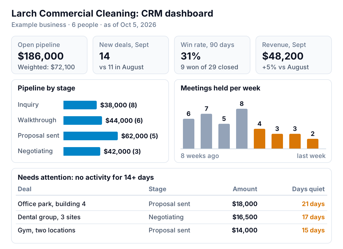
How to read it, top to bottom:
- The four tiles. Open pipeline is $186,000 across 22 deals. Weighted by stage probability (10% for inquiry, 25% walkthrough, 45% proposal sent, 70% negotiating) it's $72,100. Win rate is 31%: 9 won out of 29 deals closed in the last 90 days. September revenue was $48,200, up 5% on August's $45,900.
- The pipeline by stage. $62,000 sits at proposal sent, the largest stage. That's normal for a business that quotes a lot. It's also where deals stall.
- The activity chart. This is the warning. Meetings held fell from 6–8 a week to 2–4 over the last four weeks. Larch's walkthroughs come from those meetings, and its proposals come from walkthroughs. Fewer meetings now means a smaller pipeline in a month and less revenue the month after.
- The attention table. Three deals worth $48,500 together have had no activity for 15 to 21 days. Two are at proposal sent and one is in negotiation. Each gets a call this week.
The decision that came out of it: hold off on the second crew, spend two weeks rebuilding meeting volume, and call the three quiet deals. A revenue-only view would have said "hire".
Clean the CRM before you build anything
A dashboard repeats whatever is in the CRM, mistakes included. Before you build one, spend 30 minutes on these four checks. Larch's cleanup took its open pipeline from $241,500 to $186,000:
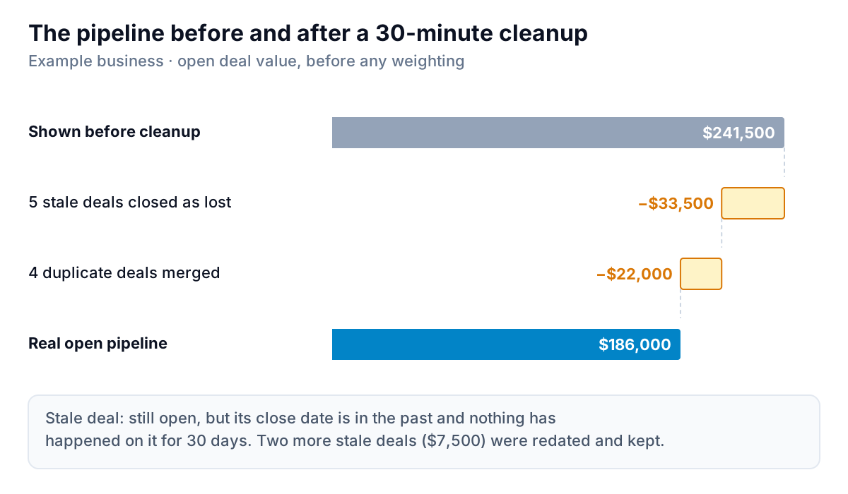
- Open deals with a close date in the past. Sort by close date. For each one, either set a new date with a reason or close it as lost. Larch had seven: five were lost, two were real and redated.
- Duplicates. Two reps logging the same inquiry, or one deal per site for a customer with three sites. Larch merged four.
- Deals with no amount. They add nothing to pipeline value, which makes the pipeline look smaller than it is. Put in a rough estimate and mark it as one.
- Deals with no owner. Nobody follows them up. Assign every one.
Then make the cleanup a habit. Five minutes each Monday on past-dated deals keeps the dashboard honest. Without it, the numbers drift back within a quarter.
What to put on a CRM dashboard by type of business
The three views stay the same; the metrics in each view change with how you sell. Here are three common shapes.
Service business that quotes (trades, cleaning, landscaping, IT support)
- Activity: site visits or walkthroughs booked per week.
- Pipeline: proposals out, their total value, and days since each was sent.
- Revenue: quote-to-win rate and average job size. Watch for a rising average with a falling win rate, which often means you're pricing yourself out of smaller jobs.
Agency or consultancy with retainers
- Activity: discovery calls and proposals sent.
- Pipeline: new business and renewals split. A renewal due in 60 days is a deal; track it like one.
- Revenue: new monthly retainer value won, retainer value lost, and the net of the two. If you report to clients too, our guide to agency reporting covers that side.
B2B product or wholesale with repeat orders
- Activity: accounts contacted this month versus accounts that ordered last quarter.
- Pipeline: new accounts in trial or first order, plus reorders expected.
- Revenue: revenue by account and accounts that haven't ordered in 60 or 90 days. For a business like this, the "needs attention" table is a list of quiet accounts, not quiet deals.
Whatever the type, keep it to one screen: four tiles, two or three charts, one table of what needs attention. If you need a second screen, you've probably mixed in a sales dashboard (what was sold, by rep and product, against target), which is a related but different job.
Where to build it
You have three realistic options.
Inside your CRM. Most CRMs have built-in dashboards. HubSpot's sales analytics suite includes ready-made reports such as deal funnel, time spent in deal stage, deal pipeline waterfall and weighted pipeline forecast, according to HubSpot's knowledge base. You can add reports to a dashboard, but HubSpot says the number of reports per dashboard depends on your subscription. Building inside the CRM is the cheapest choice. The catch is that revenue usually lives in your accounting system, not the CRM, so "won" means signed, not paid.
In a spreadsheet. Export deals and activities weekly and build charts in Excel or Google Sheets. It's flexible and free, but the export and refresh are manual, and formulas break quietly when a column moves. Our guide to AI tools for Excel reports covers ways to cut that work down.
In a dashboard tool that connects to the CRM. This is where you can put CRM data next to accounting or payments data, so the revenue view shows money that actually arrived.
Parity is one option of that kind. It connects to HubSpot, QuickBooks Online, Stripe and others directly, or takes a CSV or Excel export from any CRM. From your data it builds a dashboard with headline numbers and their trends, charts, what explains the changes, and a table of what needs attention, like the quiet deals in Larch's example. Every number and chart is checked against queries on the full dataset before you see it. You refine it by chat ("split pipeline by new business and renewals"), share a read-only link with a partner, and update it with a newer export next month. Ask, and it writes a monthly report from the same data.
Connect HubSpot or upload a CRM export, and get pipeline, activity and revenue on one checked screen. Build your CRM dashboard free
Who reads it, and how often
The three views move at different speeds, so they deserve different rhythms.
- Weekly, owner and sales lead, ten minutes: the activity chart and the attention table. These change fastest and are the easiest to act on. Every deal on the attention table leaves the meeting with a name and a date.
- Monthly, owner: the pipeline by stage and the weighted total against what next quarter needs. If you plan hiring, equipment or cash around future work, this is the number to plan with.
- Quarterly, owner and whoever does the books: win rate, average deal size, and revenue from the CRM compared with revenue in the accounts. If the two drift apart, fix the definitions before the next quarter starts.
Larch's owner now reads the activity chart every Monday before anything else. The drop in meetings that nearly got missed in September would have shown up in the second week.
Mistakes that make CRM dashboards useless
Measuring activity nobody logs
If reps log half their calls, the activity chart measures logging habits, not selling. Pick one or two activities that are logged reliably (meetings booked through a calendar link usually are) and track only those.
Showing totals without a comparison
"$186,000 open pipeline" means nothing on its own. Every tile needs a comparison: last month, the same month last year, or a target. Larch's tiles each carry one.
Counting signed as paid
In most CRMs, "won" means the customer agreed. Cash can arrive weeks later, or not at all. If cash is tight, add a line for won-but-not-yet-invoiced, or pull actual revenue from your accounting system.
Building for the owner, then asking reps to use it
Owners want totals and trends. Reps want their own list of deals to call today. Either build two filtered versions, or make the attention table filterable by owner.
Never removing anything
Every chart you add makes the others harder to read. Once a quarter, ask of each chart: did anyone act on this in the last three months? If not, take it off.
A good CRM dashboard is boring to look at most weeks. That's the point: when the activity line bends or a deal goes quiet, it stands out, and you can act weeks before revenue tells you the same thing.