On the 18th of the month, "how are sales going?" usually gets an answer like "pretty good, about half way there." That answer hides the only thing that matters mid-month: whether there's still time to fix it. A sales dashboard for a small team should answer that one question first. Are we on pace? If not, how much do we need per day from here, and whose numbers explain the gap?
This guide builds that dashboard from scratch, using an example business, a four-person sales team at a made-up wholesale distributor called Ridgeway Supply. It covers the pacing math, a rep scoreboard that points at causes rather than ranking people, the layout, and the mistakes that make sales numbers argue with the accounts.
Start with pacing, not totals
Ridgeway's target for October is $240,000. The month has 22 selling days (weekdays, minus a holiday). After 13 selling days, the team has sold $126,000. Is that good?
A total can't tell you. "53% of target" sounds like it's on track, since the month is a bit over half done. The pacing view does the arithmetic properly:
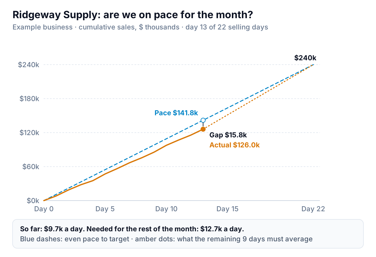
- Pace to date = target × days done ÷ days in month = $240,000 × 13 ÷ 22 = $141,818.
- Gap to pace = $141,818 − $126,000 = $15,818 behind. Actual is 89% of pace.
- Run rate so far = $126,000 ÷ 13 = $9,692 a day.
- Needed per day = ($240,000 − $126,000) ÷ 9 remaining days = $12,667 a day.
That last number is the one to put at the top of the screen. Ridgeway needs to sell 31% more per day than it has all month. That's possible, but not by doing the same things. It means pulling forward orders customers already plan to place, chasing open quotes, or accepting that the month will land around $213,000 if the run rate holds ($9,692 × 22 ≈ $213,200) and planning cash around that.
If your sales are lumpy (a few big orders a month), straight-line pacing will swing a lot. In that case, pace against the pattern of a typical month: if 40% of sales usually land in the last week, your pace line should bend the same way. Start simple and add that once you have a few months of daily data.
A rep scoreboard that points at causes
The pacing chart says the team is $15,818 behind. The next question is where. A sales dashboard that only ranks reps by revenue starts arguments. One that shows the steps behind revenue points at what to fix.
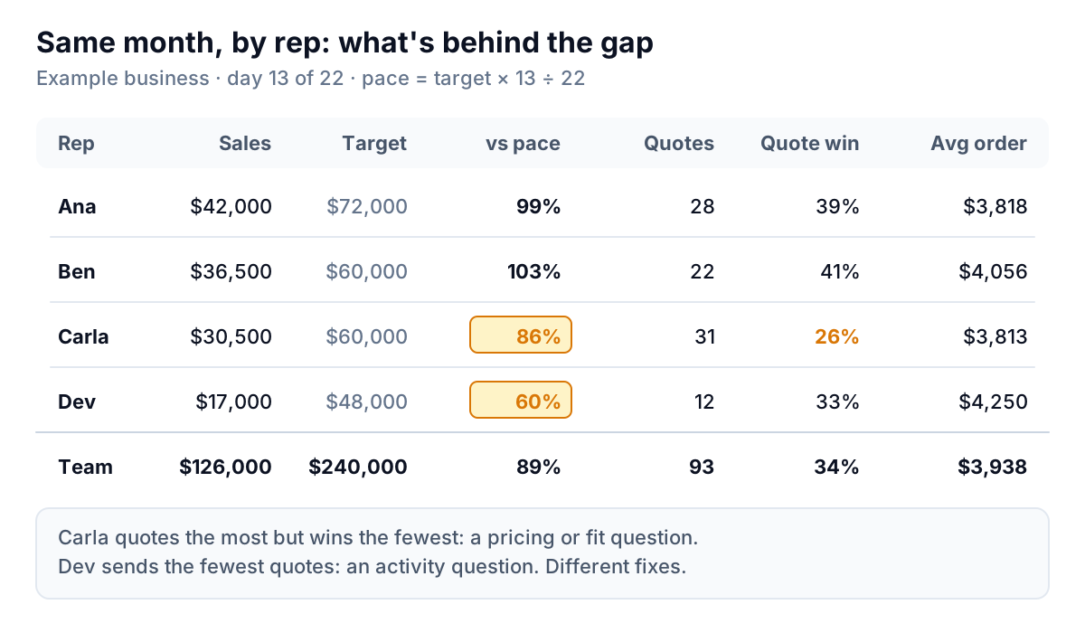
For a business that sells by quote, sales break down into three parts: quotes sent × share of quotes won × average order. Put those three columns next to sales and the reasons show up:
- Ana and Ben are on pace. Ben is slightly ahead at 103%; Ana is at 99%.
- Carla sends the most quotes (31) but wins only 26%, against 34% for the team. Her average order is normal. That points at pricing, the kind of customer she's quoting, or slow follow-up, not effort.
- Dev wins a normal share (33%) with a good average order ($4,250), but sends only 12 quotes. He's at 60% of pace. That's an activity question: a new territory, too much account admin, or too few leads routed to him.
Two reps behind, two different fixes. A revenue-only ranking would have lumped them together.
Each rep's pace uses their own target. Dev's target is $48,000, so his pace on day 13 is $48,000 × 13 ÷ 22 = $28,364, and $17,000 is 60% of it. Targets add up to the team's $240,000, so the rep table and the pacing chart always agree.
Keep the scoreboard to the people who own a number. If you have one salesperson and the owner, a rep table is overkill. Show the three-part breakdown for the business as a whole instead, month on month.
The sales dashboard layout, top to bottom
Everything above fits on one screen. Here's the order that works for most small teams:
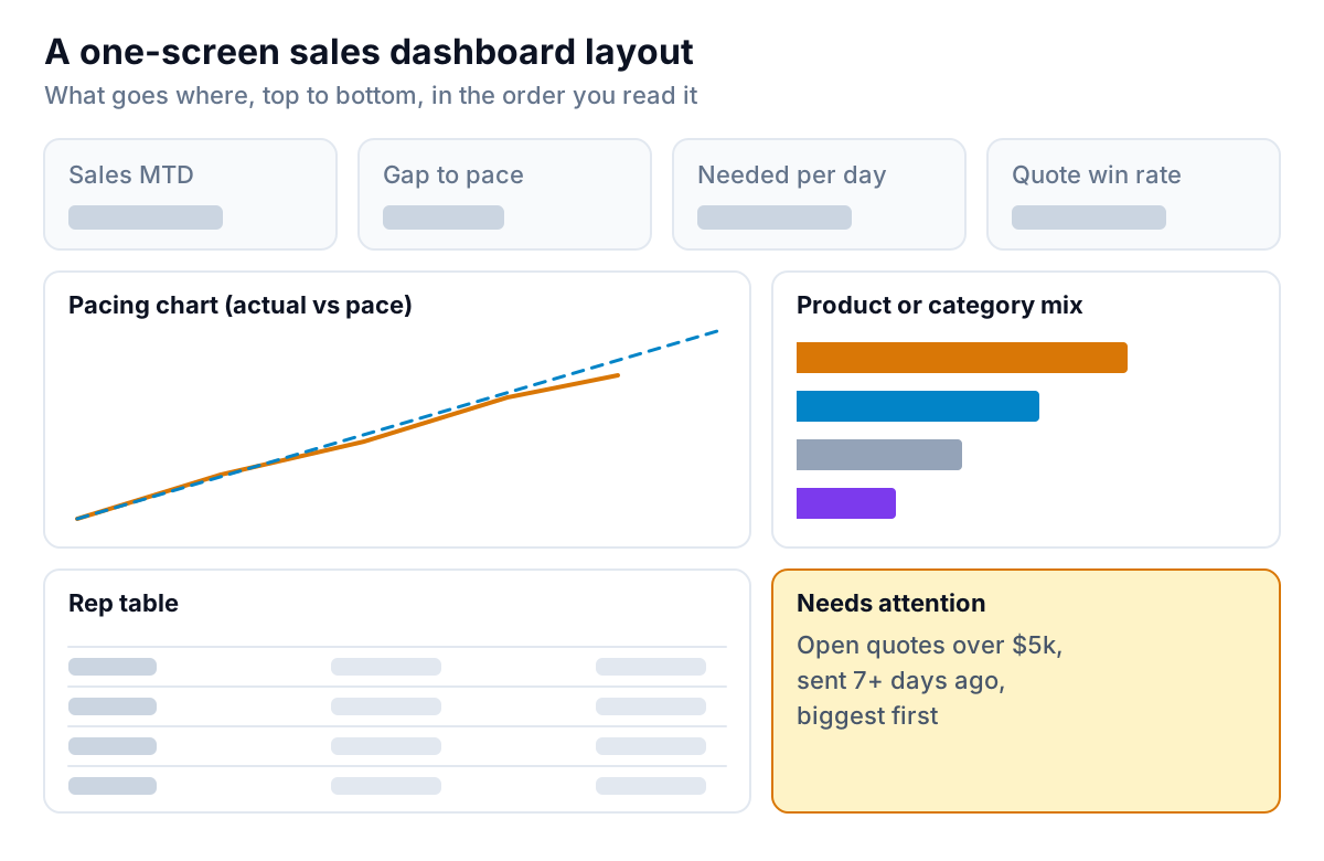
- Four tiles. Sales month to date, gap to pace, needed per day, and quote win rate (or average order value, for a shop). Each with last month's figure beside it.
- The pacing chart. Actual against pace, with the target at the end.
- Product or category mix. Sales by your top four or five categories this month versus last. A shift in mix often explains a gap better than anything else: a big customer moving from one product line to another, or a seasonal line ending.
- The rep table from the section above.
- A "needs attention" list. For Ridgeway: open quotes over $5,000 sent more than seven days ago, biggest first. This turns the dashboard into a to-do list. If the team needs $114,000 in nine days, this list is where most of it will come from.
Not on the screen: marketing traffic, every activity type, last year by week, and anything nobody acts on. If you need those, they belong on a CRM dashboard (activity and pipeline) or a monthly report.
Adapting it to how you sell
The structure stays the same; the parts change.
| Business | Sales breaks into | Needs-attention list | Where the data usually lives |
|---|---|---|---|
| B2B by quote (distributor, trades, agency) | Quotes × win rate × average order | Open quotes over a set size, oldest first | CRM for quotes, accounting system for invoices |
| Shop or café | Transactions × average basket | Products running low, slow days versus the same day last year | Point of sale (Square, Shopify POS) |
| Online store | Sessions × conversion rate × average order | Best sellers out of stock, refunds above normal | Shopify, Stripe |
| Subscription or retainer | New + expansion − churned monthly revenue | Renewals due in the next 60 days | Stripe, accounting system, CRM |
For a pipeline-driven team, the pacing view gets one more line: weighted open pipeline expected to close this month. If needed-per-day × days left is bigger than that number, no amount of effort this month will close the gap, and it's time to have a different conversation. Our guide to setting up a HubSpot pipeline explains how to make that weighted number trustworthy.
Running a 15-minute weekly sales meeting from it
A dashboard nobody discusses changes nothing. Ridgeway's team runs a short Monday meeting with the dashboard on screen, in the same order every week:
- Two minutes on pace. Read the four tiles aloud: sold, gap, needed per day, win rate. No discussion yet.
- Five minutes on the rep table. Each person names one number in their row that moved and why. "My quotes are down because I spent three days on a site issue" is a useful answer. "It's been slow" isn't.
- Five minutes on the needs-attention list. Go down the open quotes, biggest first. Each gets an owner and a next step with a date: a call, a revised price, or a decision to drop it.
- Three minutes on the one change for this week. For Ridgeway on day 13, that was Dev booking ten more customer visits and Carla reviewing her last ten lost quotes with the owner to see whether price was the reason.
Write the one change down and check it first thing next Monday. Over a quarter, that habit does more for the number at the top of the screen than any chart.
Mistakes that make the sales dashboard argue with the accounts
Mixing booked, invoiced and paid
"Sales" can mean an order taken, an invoice sent, or cash received. Each gives a different number for the same month. Pick one for the dashboard (invoiced is the usual choice for B2B, paid for shops) and label it. If the CRM says $126,000 and the accounts say $118,000, that's usually the reason, not an error.
Targets that don't add up
If rep targets sum to $260,000 and the team target is $240,000, the rep table and the pacing chart will tell different stories. Make the parts add up to the whole, even if that means a line for "house accounts".
Counting credits and returns in the wrong month
A $6,000 credit note issued on the 3rd for last month's order makes this month look worse. Decide whether credits hit the month they're issued or the month of the original sale, write it down, and stick to it.
Updating it by hand
A dashboard refreshed every Friday afternoon from an export is a week old by Wednesday, which is the day you needed it. If it's built in a spreadsheet, keep the raw export on one tab and the calculations on another, so a refresh is one paste. Our guide to AI tools for Excel reports covers ways to cut that work down further.
Using it to rank people
A leaderboard gets read as a judgement, and people learn to game it, for example by holding orders back for next month once the target is hit. Show the parts of each rep's number and talk about the parts.
Building it without rebuilding it every month
You can build everything here in a spreadsheet: a daily sales tab, a targets tab, and a few formulas for pace, gap and needed per day. Many small teams do. The cost is the weekly export, and the formulas that break when a column moves.
Parity connects to QuickBooks Online, Shopify, Stripe, Square and HubSpot directly, or takes a CSV or Excel export from anything else. From your data it builds a dashboard with headline numbers and their trends, charts, what explains the changes, and a table of what needs attention. Ask for the pacing view and the rep breakdown in plain words ("sales vs a $240,000 target over 22 selling days, by rep") and refine it by chat. Every number and chart is checked against queries on the full dataset before you see it. Share it with the team as a read-only link, and update it with a newer export when you need to. When the month closes, ask it for a write-up and it produces a monthly report from the same data.
Connect your sales data or upload an export, and Parity builds a checked sales dashboard you can share with your team. Build your sales dashboard free
Whatever you build it in, put the needed-per-day number at the top. It's the one number that turns "pretty good, about half way there" into a plan for the next nine days.