September revenue at Tidewater Plumbing came in at $135,000, down 8% on August. On most monthly KPI reports that number would be coloured red, and the next 20 minutes of the owner's Monday meeting would go on explaining it. On the same report, the callback rate (jobs that needed a second, unpaid visit) went from 4.3% to 7.4%. It would probably be amber, and nobody would mention it.
Tidewater is a fictional example, but that report is common, and it has the priorities backwards. The revenue dip is inside the range Tidewater's revenue moves in every month. The callback jump is not. It's a real change with a cause, and it's costing money now.
This guide shows how to build a monthly KPI report that gets that right: a one-page scorecard, a simple way to tell a real change from normal wobble, commentary that says what you'll do about it, and a calendar so it lands on the same day every month.
The one-page monthly KPI report
A monthly KPI report has two parts. The first is a scorecard: one row per KPI, with enough context in each row to judge it. The second is commentary on the few rows that need it. If it runs past two pages, people stop reading it, and the report becomes a filing exercise.
Here's Tidewater's scorecard for September.
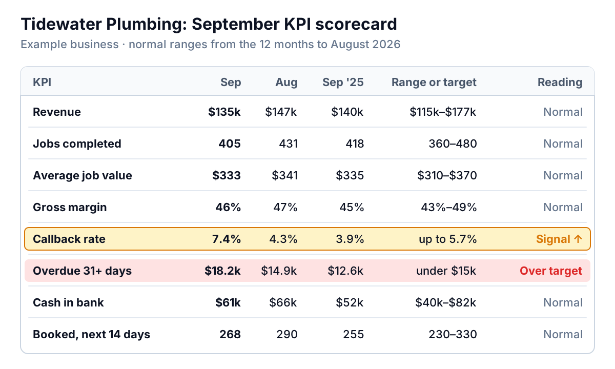
Each column earns its place:
- This month and last month. The obvious pair, and the one most likely to mislead on its own.
- Same month last year. Seasonality. A plumber's September looks different from its January, so compare like with like.
- Normal range or target. The range the KPI usually moves in, worked out from the last 12 months (the next section shows how), or a target where you've set one, like keeping overdue receivables under $15,000.
- Reading. One word: Normal, Signal, or Above/Below target. This replaces the red-amber-green colouring, which is usually based on gut feel.
Keep it to six to ten KPIs. If you're not sure which ones belong, start with how to choose KPIs for a dashboard. The same test applies here: if nobody would do anything differently when the number moves, it's not a KPI, it's trivia.
Is this month's change real?
Every number in a business wobbles. Revenue depends on which week the month ends, a couple of big jobs, the weather. If you react to every wobble, you spend your time explaining noise, and you train your team to write excuses.
The fix comes from quality control in manufacturing, and it's simpler than it sounds. It's called a process behaviour chart (or XmR chart). You plot the KPI month by month, then draw a band around it based on how much it usually moves from one month to the next. Points inside the band are routine variation. Points outside it, or long runs on one side of the average, are signals worth investigating.
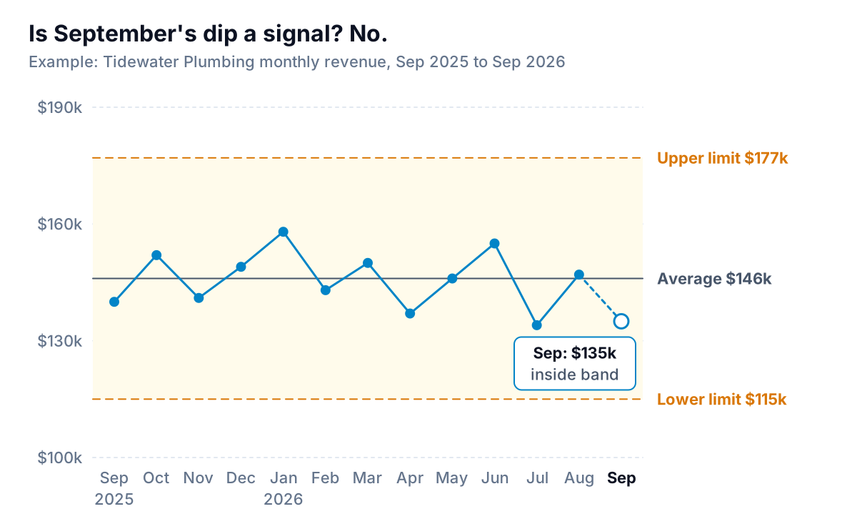
Tidewater's revenue over the 12 months to August averaged $146,000. The average month-to-month move (the "moving range") was $11,500. The limits are the average plus or minus 2.66 times that: $146,000 ± $30,700, or roughly $115,000 to $177,000. September's $135,000 is comfortably inside. The 8% drop is the kind of move this business makes most months.
The callback rate tells a different story. Its 12-month average was 4.1%, and its average monthly move was 0.6 points, so its upper limit is 4.1% + 2.66 × 0.6 = 5.7%. September's 7.4% is well above that. That's the row that deserves the meeting.
How to work out a normal range in a spreadsheet
You can do this in Excel or Google Sheets in about ten minutes per KPI. Put 12 months of values in column B, oldest at the top (B2 to B13).
- Moving ranges. In C3, type
=ABS(B3-B2)and fill down to C13. That's how much the KPI moved each month, ignoring direction. - Average.
=AVERAGE(B2:B13). For Tidewater, $146,000. - Average moving range.
=AVERAGE(C3:C13). For Tidewater, $11,500. - Upper limit. Average + 2.66 × average moving range. For Tidewater, $177,000.
- Lower limit. Average − 2.66 × average moving range, or zero if that comes out negative. For Tidewater, $115,000.
Then each month, check the new value against three rules. The first two come from the Western Electric rules NIST lists for spotting real changes; the third is plain sense.
- One point outside the limits. Something changed. Find out what.
- Eight months in a row on the same side of the average. A slow shift that no single month would show you, like a margin drifting down 0.3 points at a time.
- A known change in how the number is counted. New price list, new service line, a change in what counts as a callback. Start a fresh baseline from that month.
Recalculate the limits once a year, or after a signal that turns out to be a lasting change. And only chart values that are fair to compare month to month. Donald Wheeler, who has written about these charts for decades, puts the first principle as successive values need to be logically comparable. A month with five Mondays and a month with four aren't always comparable for a business that only works weekdays. If that matters for yours, chart revenue per working day instead.
Writing the commentary
The scorecard says what moved. The commentary says why, and what happens next. Write it only for rows that show a signal or miss a target. For everything else, the word "Normal" is the commentary.
Here's the difference, using Tidewater's callback rate.
Weak: Callback rate increased this month due to a number of factors. The team is aware and is working to improve quality going forward.
Useful: Callback rate rose to 7.4% (30 of 405 jobs), above its normal ceiling of 5.7% for the first time in 13 months. 19 of the 30 were water-heater installs, and 14 of those 19 were done by the two technicians who started in July. At about $150 per return visit, September's callbacks cost roughly $4,500 in unbilled time. Action: Dana does ride-alongs on the next five installs with each new technician. Owner: Dana. We'll check the rate again in the October report.
The useful version has five parts, and you can use them as a template for any KPI:
- The number, against its range or target. "7.4%, above its normal ceiling of 5.7%".
- Where it came from. Break it down until one group explains most of it: 19 of 30 were one job type.
- What it costs. In money or hours. This is what makes people act.
- The action and its owner. One name, not "the team".
- When you'll know if it worked. Usually next month's report.
The overdue receivables row gets the same treatment. $18,200 more than 30 days late, against a $15,000 target: who owes it, how late, and who is calling them this week. If you want a structure for that part, reading an aging report in three passes gives you the three numbers to quote.
Finally, put a three-sentence summary at the very top of the report, above the scorecard: the one thing that changed, what it's costing, and what you're doing about it. These executive summary examples show how to write it so a reader can stop there.
A calendar that gets it out on day six
A monthly report that arrives on the 20th describes a month nobody remembers. Fix the dates once and keep them.
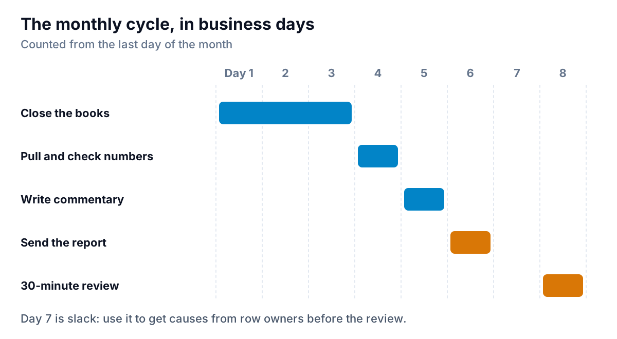
- Days 1 to 3: close the books. Bank reconciled, invoices for the month raised, bills entered. If your bookkeeper needs longer, agree a "flash" version with the numbers that don't depend on the close (jobs, callbacks, bookings) and fill in the money rows later.
- Day 4: pull the numbers. Update the scorecard and check each value against its range.
- Day 5: write the commentary. Only for signals and missed targets. Ask the owner of each row for the cause before you write it, not after.
- Day 6: send it. To everyone who owns a row, and to partners or investors if they get it.
- Day 8: a 30-minute review. Go through the signals only. Every action leaves the room with a name and a date.
Mistakes that make a monthly KPI report useless
- Too many KPIs. Twenty-five rows means nobody reads row 19. If you track more, keep them in a back page or a dashboard, and report on the vital few.
- Colours based on feel. "Red if it's down more than 5%" sounds objective, but it flags normal wobble in noisy numbers and misses real shifts in steady ones. Use the normal range.
- Explaining every movement. A report that has a paragraph for every row teaches readers that all movement matters. Most doesn't.
- Changing definitions quietly. If "active customer" changes from 90 days to 60, say so on the report and restart that KPI's baseline.
- No owner per row. A KPI nobody owns never gets fixed.
- Actions that never come back. Each month's report should open last month's actions and say what happened.
Building the scorecard without the copy-paste
The slow part of a monthly KPI report isn't the writing. It's pulling revenue from the accounting system, jobs from the job tool, receivables from an aging report, and lining them up month by month without a paste error. Parity can take that part. Connect QuickBooks Online, Stripe, Shopify, HubSpot, Square or Google Sheets, or upload a CSV or Excel export from any other tool, and it builds a dashboard: headline numbers with their trends, charts, what explains them, and a table of what needs attention. Ask it to write the monthly report from that data and you get one with an executive summary and a takeaway for each chart, ready to share with a read-only link or export to PDF or Excel. Every number and chart is checked against queries on the full dataset before you see it.
Save the report as a template, and next month update it with the newer file instead of rebuilding it. You still decide which KPIs matter and what to do about a signal. The arithmetic and the layout are the parts worth handing off. If the report is going to a partner or a board, you might also want a live view between reports; our guide to the executive dashboard covers what to put on one.
Connect your tools or upload a spreadsheet, then ask for the monthly report and refine it by chat. Build a report from your data free
Whatever you build it in, the discipline is the same: a short scorecard, a normal range for every KPI, commentary only where something really changed, and the same send date every month. Do that for three months and the report stops being a chore and starts being the one document people wait for.