Ask the owner of a 15-person business what they check first thing on a Monday and you rarely hear "our KPIs". You hear questions. Can we make payroll and rent this month? Are orders holding up? Are we still making money on what we sell? Is there anything I need to deal with personally this week?
An executive dashboard is just those questions, answered on one screen, with numbers that update themselves. Big-company versions have dozens of panels fed from data warehouses. A small business needs about eight tiles and a short list. This guide shows which eight, with a worked executive dashboard example, versions for three kinds of business, and how often to look at each tile.
Four questions an executive dashboard has to answer
The Federal Reserve's Small Business Credit Survey asks thousands of US employer firms each year what went wrong. In the 2026 report on employer firms, 73% named rising costs of goods, services or wages as a financial challenge, 54% named paying operating expenses and 50% named uneven cash flow. The most common operational challenge, at 57%, was reaching customers and growing sales.
Those map neatly onto four questions. If your dashboard answers them, it's doing its job:
- Cash: can we pay what's coming? Not just the bank balance, but how long it lasts.
- Demand: are customers still buying? Orders, bookings or pipeline, whichever comes first in your business.
- Margin: are we making money on it? Rising costs show up here weeks before they show up in profit.
- Attention: what needs me this week? A short list of named problems, not a chart.
Everything else is detail for a department view or the monthly report. Stephen Few, author of Information Dashboard Design, defined a dashboard as the most important information arranged on a single screen so it can be monitored at a glance. For an owner, "most important" means those four questions.
An executive dashboard example, tile by tile
Here's what that looks like for an example business: Fernhill Bakery Supply, a fictional wholesaler delivering flour, butter and packaging to about 140 cafés and bakeries.
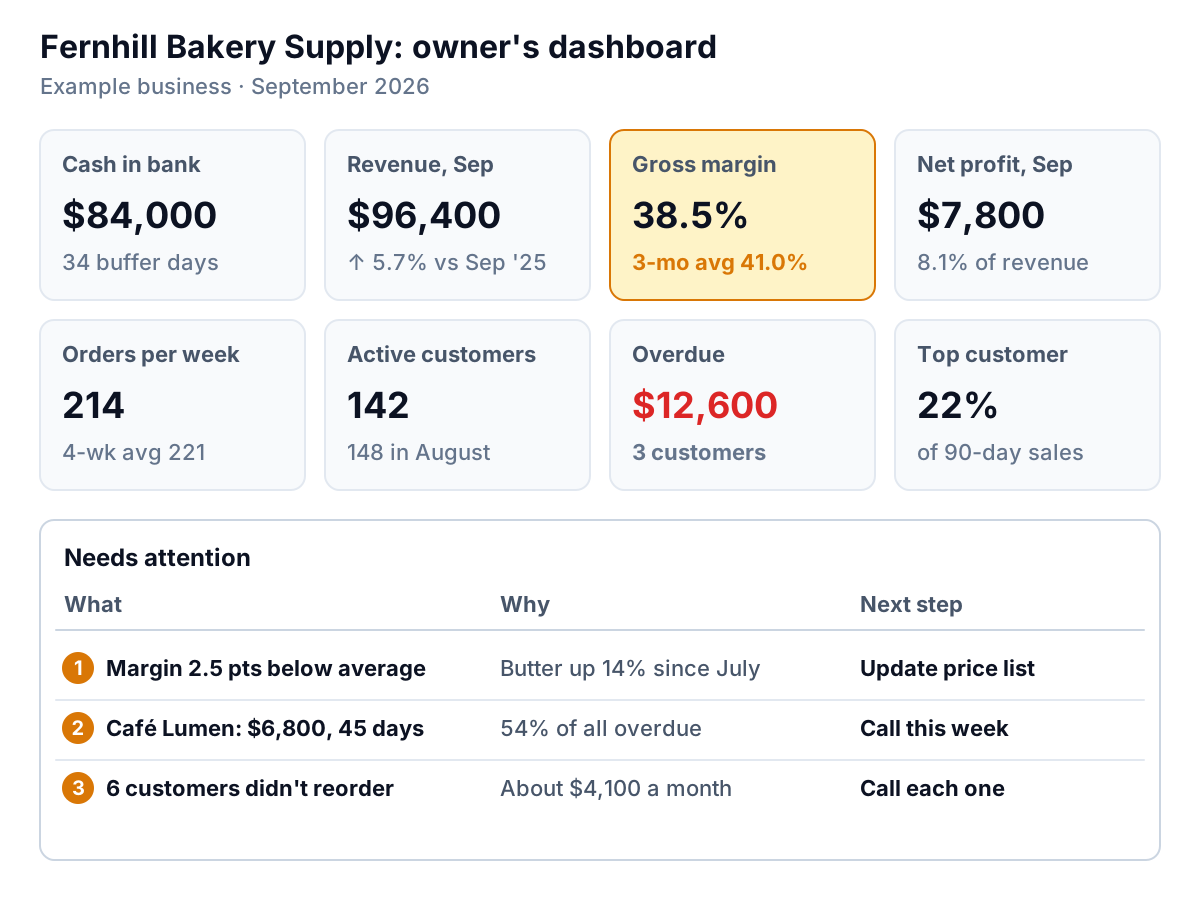
Each tile is there because it answers one of the four questions, and each has a rule for when it stops being background and becomes a job:
| Tile | Question | Act when |
|---|---|---|
| Cash in bank and buffer days | Cash | Buffer days fall below your floor (Fernhill uses 25) |
| Revenue this month vs same month last year | Demand | Two months in a row below last year |
| Orders per week | Demand | Four-week average drops more than 10% |
| Active customers (ordered in last 30 days) | Demand | Falls for two months running |
| Gross margin | Margin | More than two points below the three-month average |
| Net profit last month | Margin | Negative, or margin below plan |
| Overdue receivables | Cash | Any single customer over 30 days late, or total above your target |
| Top customer's share of sales | Attention | Above about a quarter of sales |
The thresholds are Fernhill's, not universal rules. Pick your own, write them down, and put them on the tile so nobody has to remember them. If you want a more rigorous way to separate a real change from monthly noise, the normal-range method in our monthly KPI report guide works on any of these tiles.
This month, three things tripped. Gross margin is 38.5% against a three-month average of 41.0%, because butter has gone up 14% since July and the price list hasn't. Café Lumen owes $6,800 that's 45 days late. And six customers who ordered in August didn't order in September; together they were worth about $4,100 a month. Those three lines are the attention list at the bottom of the screen. Everything else is normal, and the dashboard says so without needing a meeting.
Cash buffer days: the tile most dashboards miss
A bank balance on its own tells you very little. $84,000 is a lot for a business spending $1,000 a day and very little for one spending $10,000 a day. The better tile is cash buffer days: how many days you could keep paying your normal outgoings if no money came in.
Most owners guess this number high. Work it out once and the bank balance starts to mean something; Fernhill's $84,000 turns out to be 34 days, as the steps below show. Our financial dashboard guide shows how that compares with published small-business figures.
The calculation is short:
- Add up everything that went out of the bank in the last 90 days: suppliers, payroll, rent, loan payments, tax. Fernhill's was $225,000.
- Divide by 90 for average daily outflow: $2,500.
- Divide today's cash balance by that: $84,000 ÷ $2,500 = 33.6, call it 34 days.
Fernhill sits above the median, but only by a week. With $12,600 stuck in overdue invoices, collecting it would add five days ($12,600 ÷ $2,500 = 5.04). That's why the overdue tile sits next to cash on the dashboard. They're the same question.
Then set a floor, the number of buffer days below which you stop and act: delay a purchase, chase receivables harder, talk to the bank before you need to. A practical way to choose it is to look at the longest stretch in the last year between your big inflows (a quarterly contract payment, the busy season) and make sure the floor covers it, plus one payroll. Fernhill's customers pay on 30-day terms and payroll runs every two weeks, so it uses 25 days. A business with lumpier income needs a higher floor. Put the floor on the tile itself, so a glance tells you whether 34 days is comfortable or close. For a deeper look at the finance side, our financial dashboard guide covers the tiles your bookkeeper will care about.
Executive dashboard examples for three kinds of business
The four questions don't change between businesses. The tiles that answer them do. Here's how an executive dashboard might look for three other common kinds of small business.
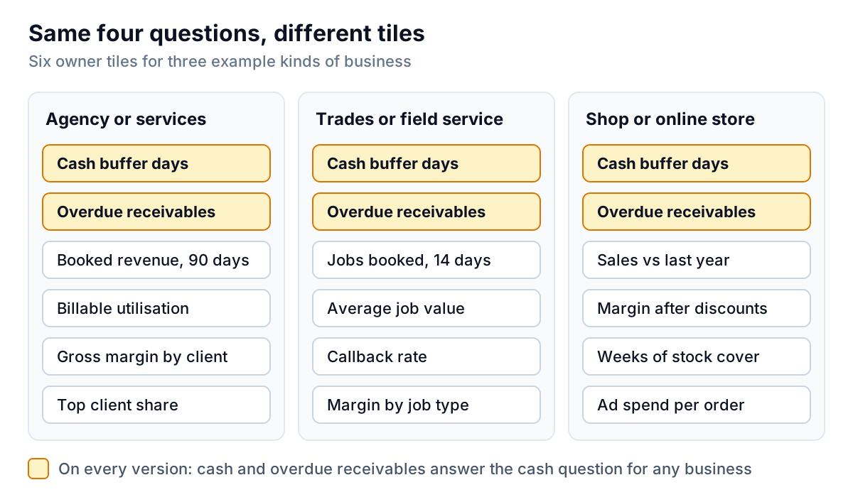
An agency or professional services firm
Demand is the pipeline of signed work, so the key tile is revenue booked for the next 90 days. Margin comes from people's time, so add billable utilisation (billable hours ÷ available hours) and gross margin by client, which catches the client who takes 30% of your time for 15% of your fees. Client concentration matters more here than anywhere: one client leaving can take a quarter of revenue with it.
A trades or field service business
Demand shows up as jobs booked for the next 14 days. Margin depends on average job value and on how often you go back for free, so a callback rate tile earns its place. Gross margin by job type is useful if you do a mix of small repairs and big installs.
A shop or online store
Demand is sales against the same week last year, because retail is seasonal. Margin needs gross margin after discounts, since promotions hide here. Add weeks of stock cover (stock at cost ÷ weekly cost of goods sold), which tells you whether cash is sitting on shelves, and ad spend per order if you sell online.
Notice what's missing from all three: website visits, social followers, email open rates, hours logged. They might matter to someone in the business. They belong on that person's dashboard, not the owner's.
How often to look, and what changes when you do
A tile that updates daily doesn't need to be read daily. Matching each tile to a rhythm keeps the dashboard from becoming either a distraction or something you forget to open.
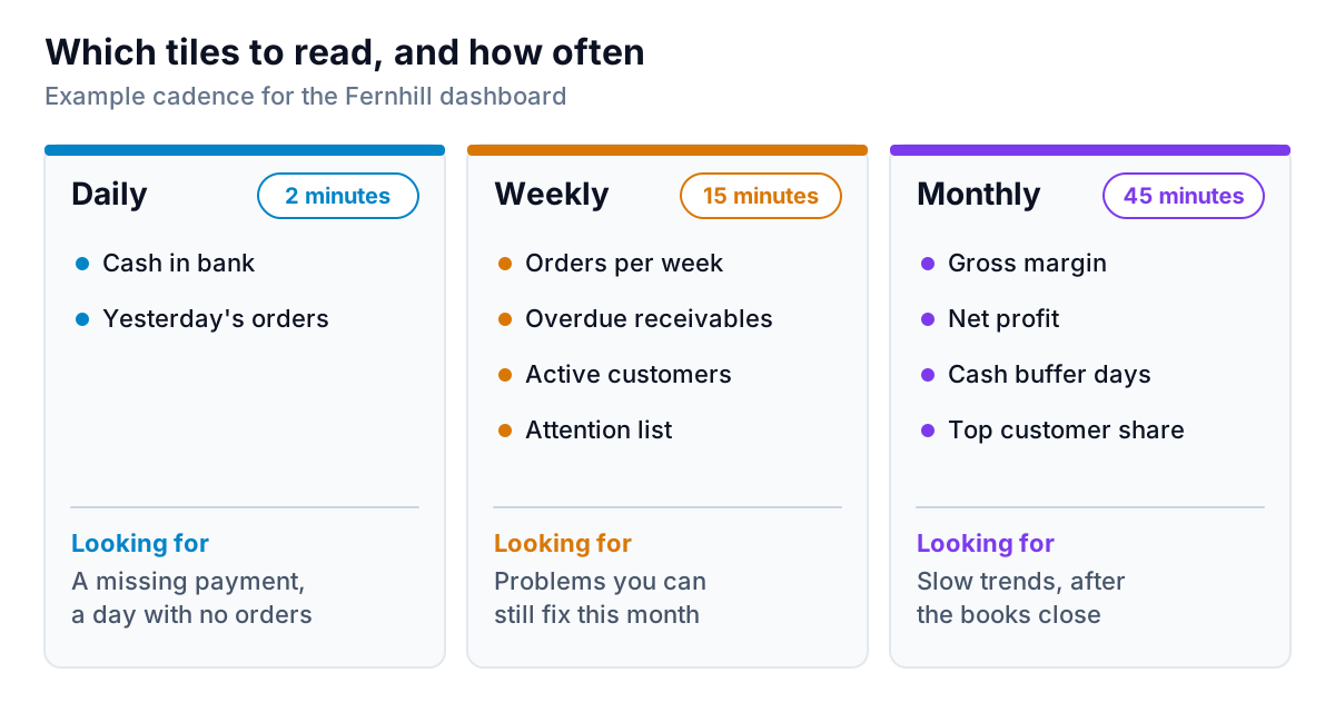
- Daily, two minutes. Cash and yesterday's orders. You're looking for surprises: a big payment that didn't land, a day with no orders.
- Weekly, fifteen minutes. Orders per week, overdue receivables, active customers and the attention list. This is where most action happens, because there's still time to fix the month.
- Monthly, forty-five minutes. Gross margin, net profit, buffer days and top-customer share, once the books are closed. These move slowly and are noisy week to week. This review usually produces the monthly report for a partner, lender or investor.
Five mistakes that make owners stop opening it
- More than one screen. If you have to scroll to see whether anything is wrong, you'll stop scrolling. Move detail to a second page.
- Numbers without comparisons. "Revenue $96,400" means nothing. "Up 5.7% on September last year" means something.
- No attention list. Charts make you work out what's wrong. A list of three named problems tells you.
- Numbers nobody trusts. If the dashboard's revenue doesn't match the accounts, the first conversation about it becomes an argument about the data. Check the totals against your books before you rely on it.
- Tiles nobody acts on. If a tile has been on the screen for three months and never changed a decision, remove it. Our guide to choosing KPIs has a simple test for this.
Building it from the tools you already use
For most small businesses, the data for these eight tiles already exists. It's just in four places: the accounting system has cash, margin and receivables; the payments or point-of-sale system has orders; the CRM has pipeline. The hard part of building an executive dashboard is joining them up and keeping them current.
Parity is built for that. Connect QuickBooks Online, Stripe, Shopify, HubSpot, Square or Google Sheets directly, or upload a CSV or Excel export from any other tool, and it builds a dashboard: headline numbers with their trends, charts, what explains them, and a table of what needs attention. Every number and chart is checked against queries on the full dataset before you see it. You can refine it by chat ("add buffer days next to cash", "show margin by customer"), share it with a partner through a read-only link with an optional password or end date, export it to PDF or Excel, and update it with a newer file next month. When it's time for the monthly review, ask it to write a report from the same data. It won't decide your thresholds or have the conversation with Café Lumen; those stay with you.
Connect your accounting, sales or CRM tool, or upload an export, and get a checked owner's dashboard. Connect your data free
Start small. Put up cash and buffer days, one demand tile, gross margin and an attention list. Look at it every Monday for a month. You'll quickly find which tiles change what you do, and the executive dashboard that's left is the one you'll actually open.