The first KPI dashboard at Greenway Grounds, a fictional nine-person landscaping company, had 38 numbers on it. The owner had exported everything the job software, the accounts and the quoting spreadsheet could produce, and laid it out across three screens. In four months it didn't change a single decision. The second version had six numbers. In its first month, it showed the owner that crews were running 12% over their estimated hours, and that this one overrun explained most of a four-point miss on gross margin.
The difference wasn't the software or the charts. It was which numbers made the cut. This guide is mostly about that choice: four tests for picking KPIs, how to pair them, how to write each one down so it means the same thing every month, and then how to lay out a KPI dashboard people actually use. Examples for different businesses are near the end.
Four tests that turn 38 metrics into six KPIs
A metric is anything you can count. A KPI is a metric you've decided to steer by. Most dashboards fail because they never make that distinction. Run every candidate number through these four tests, in order.
- Would a change make someone act? If the number doubled or halved, would anyone do anything different on Monday? Website sessions, social followers and total invoices raised often fail here. Greenway cut 17 metrics on this test alone.
- Does someone own it? One person who can move it and will be asked about it. "The team" is not an owner. Seven more went, because nobody could actually influence them (the weather was one).
- Does it arrive early enough to matter? Revenue tells you about last month. Quotes sent tells you about next month. Keep a lagging number only if it's essential, and make sure it has a leading partner. Five went here.
- Can you get it reliably, at the right frequency? If it needs two hours of manual work every week, it will stop being updated by week six. Three failed. Crew hours only passed once Greenway started logging hours against each job instead of on paper timesheets.
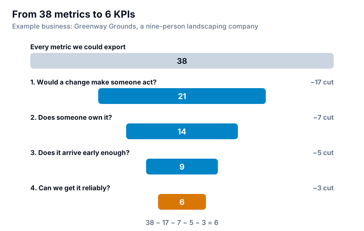
It helps to see what got cut, because the casualties are usually the numbers that feel important. At Greenway, the action test removed things like website sessions, emails sent and the count of invoices raised. The owner test removed rainy days and the diesel price: real costs, but nobody in the business could move them. The timing test removed year-to-date revenue and an annual customer survey score, because by the time they moved, the season was over. And the data test removed a few that needed someone to copy figures from paper job sheets. None of these numbers went in the bin. They moved to a back page for when someone asks.
Six isn't a magic number. A one-person business might need four; a 40-person one might need ten, split across a couple of views. But if you're above a dozen on one screen, some of them are failing test one, and you just haven't admitted it yet.
Pair every lagging KPI with a leading one
Results like revenue, profit and cash are lagging indicators. By the time they move, the cause happened weeks ago. Leading indicators are the activities that drive them, and they're the ones you can still change. The idea isn't new: Kaplan and Norton's 1992 article on the balanced scorecard argued that financial results should sit next to the operational measures that drive future performance.
For a small business, that becomes a simple rule: for every result on the dashboard, put the activity that drives it directly underneath. Greenway's six KPIs ended up as three pairs:
| Result (lagging) | Driver (leading) | Why they belong together |
|---|---|---|
| Revenue | Quote win rate (with quotes sent) | This month's quotes are next month's work |
| Gross margin | Crew hours vs estimate | Labour is the biggest cost on a job; overruns come straight off margin |
| Overdue receivables | Days from job done to invoice | An invoice sent a week late gets paid a week late |
The pairs also protect you from fooling yourself. Revenue can look fine for a month while quotes dry up underneath it. Seeing both on the same screen shows the problem while there's still time to fix it.
Write a one-line spec for each KPI
"Gross margin" can mean three different numbers depending on who calculates it and what they count as cost of sales. A KPI without a written definition will drift, and when it moves you won't know whether the business changed or the formula did. Before a KPI goes on the dashboard, write its spec.
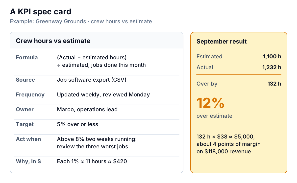
The card has seven lines, and each one prevents a specific argument later:
- Formula. Exactly what's divided by what, and over what period.
- Source. Which system or export it comes from, so two people get the same answer.
- Frequency. How often it updates and how often it's reviewed.
- Owner. The person who explains it when it moves.
- Target. What good looks like.
- Act when. The trigger, ideally with a time element ("two weeks running") so one bad week doesn't cause a panic.
- Why it matters, in money. Greenway's crews logged 1,232 hours against 1,100 estimated in September, 132 hours over. At a loaded labour cost of about $38 an hour, that's roughly $5,000. On $118,000 of revenue, it's about four points of gross margin, which is almost exactly how far margin fell short of target (34% against 38%).
That last line is the one that gets a KPI taken seriously. "Hours are 12% over" is a statistic. "Hours over estimate cost us $5,000 last month" is a problem someone will want to solve.
Lay out the KPI dashboard so the eye lands on results first
People read screens in a predictable way. Nielsen Norman Group's eye-tracking studies found readers often scan in an F-shaped pattern: across the top, then a shorter sweep lower down, then down the left side. On a dashboard, that makes the top row and the left column prime space.
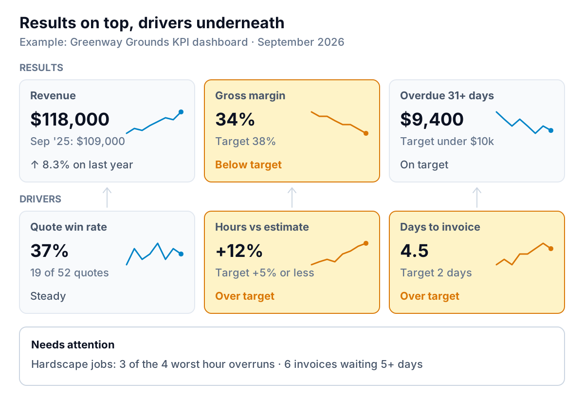
A layout that works for most small businesses:
- Top row: results. Three or four lagging KPIs, the ones an owner or partner asks about first.
- Second row: drivers, each under the result it moves, so cause and effect sit in one column.
- Every tile has four things: the current value, a comparison (last period, last year or target), a small trend line, and a status in words. Colour alone fails for colour-blind readers and on a black-and-white printout.
- Below the tiles: a short table of what needs attention, with names. "Hardscape jobs: 3 of the 4 worst overruns" is more useful than another chart.
- Consistent time periods. If revenue is monthly and win rate is a rolling 30 days, label both. Mixed periods are the most common reason two people read the same dashboard differently.
KPI dashboard examples for other businesses
The pairing approach works anywhere. Here are starting sets for four common kinds of small business. Treat them as candidates to run through the four tests, not a finished list.
| Business | Results | Drivers |
|---|---|---|
| Online store | Revenue vs last year; gross margin after discounts and shipping; cash | Conversion rate; repeat purchase rate; ad spend per new customer |
| Café or restaurant | Weekly sales; food cost %; labour cost % | Covers or transactions per day; average spend per visit; waste logged |
| Subscription business | Monthly recurring revenue; net revenue retention; cash | New trials or sign-ups; trial-to-paid rate; cancellations requested |
| Consultancy or agency | Fees invoiced; gross margin by client; overdue receivables | Billable utilisation; proposals sent and won; revenue booked for next 90 days |
Two KPIs turn up for almost everyone, whatever the business: gross margin and some measure of cash. If your KPI dashboard doesn't have both, look at whether it's measuring activity instead of health. For an owner-level view that sits above all of this, see what to put on an executive dashboard; for a broader set of finance tiles, see the financial dashboard guide.
When a KPI starts lying to you
Once a number is on a dashboard and someone is judged by it, people start managing the number instead of the thing it measures. The idea is known as Goodhart's law, usually quoted in anthropologist Marilyn Strathern's phrasing: "When a measure becomes a target, it ceases to be a good measure."
At Greenway, it would be easy to raise the quote win rate by only quoting the easy jobs, or to hit the hours target by padding estimates. Three habits keep that in check:
- Keep the pairs together. Win rate next to quotes sent shows if volume dropped to flatter the rate. Hours against estimate next to gross margin shows if estimates got padded and prices went up with them.
- Look at the spec when a KPI improves suddenly, not only when it gets worse. Ask what changed.
- Review the list every quarter. Retire any KPI that hasn't triggered an action in three months, and promote a metric that keeps coming up in conversation. A KPI dashboard is a living document, and the monthly report built from it should change with it. Our monthly KPI report guide shows how to tell a real move from normal noise before you react.
Building the dashboard from your own data
Once you know your six, the work is getting them onto one screen without rebuilding it by hand every week. That usually means pulling from two or three tools (accounts, quoting or CRM, a job or time-tracking system) and matching up periods.
Parity is one way to do that. Connect QuickBooks Online, Stripe, Shopify, HubSpot, Square or Google Sheets, or upload a CSV or Excel export from any other tool (Greenway's job software would come in as an export), and it builds a dashboard: headline numbers with their trends, charts, what explains them, and a table of what needs attention. Every number and chart is checked against queries on the full dataset before you see it. Describe your KPIs and their definitions, refine the layout by chat ("put crew hours under gross margin"), save it as a template, and update it with a newer export each week. You can share it with a read-only link or export it to PDF or Excel. Choosing the KPIs and acting on them is still your job; the guide above is for that part.
Connect your tools or upload an export, describe the KPIs you chose, and refine the dashboard by chat. Build a report from your data free
Start with the four tests on a sheet of paper. Most owners find their real KPIs in an afternoon, and most of the work after that is having the discipline to leave the other 32 numbers off the screen.