Here is a test for any financial dashboard. Open it on a Monday morning and set a timer for sixty seconds. Before the timer runs out, you should be able to answer five questions: How much cash do we have? Is that more or less than last month, and why? Are we making money on what we sell? Who owes us, and how late are they? What do we have to pay soon? If your dashboard can't answer those in a minute, it is a report collection, not a dashboard.
Most small business finance screens fail this test in one of two ways. Either they show everything the accounting software can produce, or they show three big numbers with no comparison, so you can't tell good from bad. This guide gives you ten tiles that pass the test, the formula behind each one, which report it comes from, and what should make you pick up the phone. We'll build it for an example business so you can see real numbers.
The five questions decide the tiles
Every tile on a small business financial dashboard should exist to answer one of those five questions. If a number doesn't, it belongs in a report you open when you need it, not on the screen you check every week.
The questions also tell you why cash gets more space than profit. In the Federal Reserve's 2026 Report on Employer Firms, 54% of small employer firms said paying operating expenses was a financial challenge in the prior 12 months, and 50% named uneven cash flow (which the survey says includes collecting receivables). Rising costs topped the list at 73%. Those are cash problems first and profit problems second, so the dashboard should lead with cash.
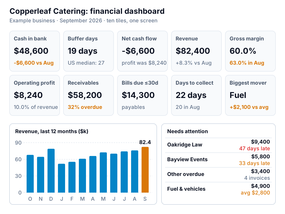
Our example is Copperleaf Catering, a made-up caterer with corporate clients on 30-day terms and a busy September. Here is the whole screen.
The ten tiles, and what each one is for
The tiles fall into three groups: cash (four tiles), profit (three) and money in motion (three). The order matters. Your eye lands top left, so put cash there.
Cash
- Cash in bank. The total across operating accounts today, with the change since the same day last month. Copperleaf has $48,600, down $6,600. Pull it from the bank balance, not the balance sheet, if your books lag by a week or more.
- Cash buffer days. Cash divided by average daily cash out over the last three months. Copperleaf spends about $78,000 a month, or $2,600 a day, so $48,600 covers about 19 days. This one tile replaces a lot of worry, because it turns a balance into time.
- Net cash flow this month. Cash in minus cash out. When it disagrees with profit (and at Copperleaf it does), the dashboard should say why. More on that below.
- Bills due in the next 30 days. Your accounts payable that fall due inside a month: $14,300 for Copperleaf. Set it next to cash and you know what's spoken for.
Profit
- Revenue this month, compared with last month and with the same month last year. Copperleaf's $82,400 is up 8.3% on August and 15.2% on September 2025 ($71,500). The year-on-year figure matters for any seasonal business; a caterer's December always beats its February.
- Gross margin. Revenue minus direct costs (food, event staff, rentals), as a percentage of revenue. Copperleaf's slipped from 63.0% to 60.0%. Three points on $82,400 is about $2,500 a month. That's the tile that tells you prices or food costs need a look.
- Operating profit and margin. Gross profit minus overheads: $8,240, or 10.0% of revenue. Show the margin as well as the dollars, because dollars rise with sales even when the business gets less efficient.
Money in motion
- Receivables, with the share overdue. Copperleaf is owed $58,200, and 32% ($18,600) is past due. The share overdue moves before cash does, so it's an early warning. Our guide to reading an aging report covers what to do with each bucket.
- Days to collect. Receivables divided by average daily revenue over the last 90 days (often called DSO). Copperleaf billed $232,800 from July to September, about $2,587 a day, so $58,200 is 22.5 days of sales, rounded to 22. It was 20 in August. A rising number with flat sales means customers are paying slower.
- Biggest expense mover. The one cost line that moved most against its three-month average. For Copperleaf it's fuel and vehicles: $4,900 against an average of $2,800. One line, named, beats a pie chart of every expense.
Under the tiles, two things earn their space: a 12-month revenue chart, so the month sits in context, and a short "needs attention" list. Copperleaf's has its two most overdue clients by name and the fuel line. That list is what you act on; the tiles are what you glance at.
| Tile | Formula | Where it comes from | Look closer when |
|---|---|---|---|
| Cash in bank | Sum of operating account balances | Bank feed or balance sheet | Down two months running |
| Buffer days | Cash ÷ (last 90 days cash out ÷ 90) | Bank transactions | Under about 20 days |
| Net cash flow | Cash in − cash out, this month | Bank transactions or statement of cash flows | Negative while profit is positive |
| Bills due ≤30 days | Open bills with a due date in the next 30 days | Accounts payable aging | More than half of cash |
| Revenue | Income for the month | Profit and loss | Down on the same month last year |
| Gross margin | (Revenue − direct costs) ÷ revenue | Profit and loss | Down 2+ points from your usual |
| Operating profit | Gross profit − overheads | Profit and loss | Margin falling while revenue rises |
| Receivables, % overdue | Open invoices; share past due | Accounts receivable aging | Overdue share above about 25% |
| Days to collect | Receivables ÷ (last 90 days revenue ÷ 90) | Aging + profit and loss | Up 5+ days on your terms |
| Biggest mover | Line with the largest change vs its 3-month average | Profit and loss by month | Any move over about $1,000 you can't explain |
The thresholds in the last column are starting points, not rules from a textbook. Change them to fit your business after a few months of watching your own numbers.
When profit and cash disagree, show the bridge
Copperleaf made $8,240 in September and ended the month with $6,600 less cash. An owner who sees only the cash tile assumes a bad month. An owner who sees only the profit tile assumes a good one. Both are half right, and a good financial dashboard reconciles them on the screen.
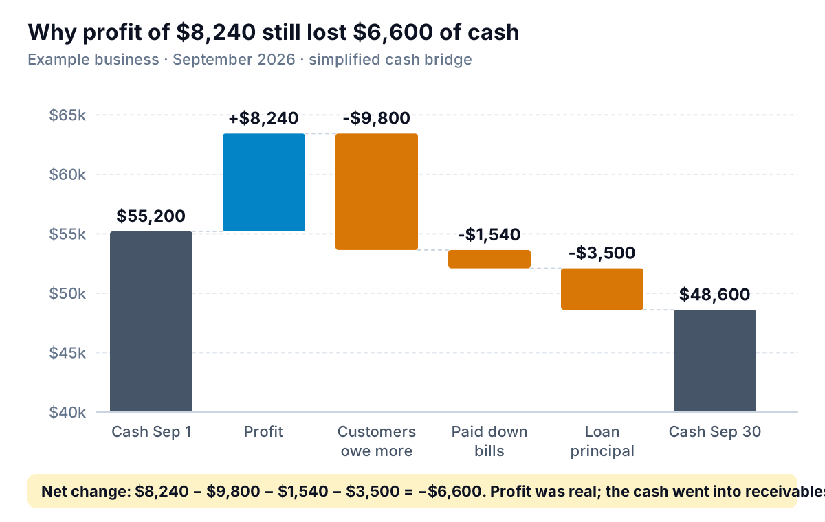
Read it left to right. Profit added $8,240. Customers owed $9,800 more at the end of the month than at the start (receivables went from $48,400 to $58,200), so that profit is sitting in their bank accounts, not Copperleaf's. Copperleaf also paid suppliers $1,540 more than it took on in new bills, and paid $3,500 of loan principal, which never shows on the profit and loss because it isn't an expense. Add it up: $8,240 − $9,800 − $1,540 − $3,500 = −$6,600.
You don't need a full statement of cash flows to do this every month. Four bars are enough: profit, change in receivables, change in payables, and anything that moves cash without touching profit (loan payments, equipment purchases, owner draws). If the bridge shows the gap is receivables, the needs-attention list already tells you who to call. For a forward-looking view of the same idea, see our guide to building a cash flow forecast.
How much buffer is enough?
Buffer days is the tile owners ask about most, because it needs context. There is a useful reference point. The JPMorgan Chase Institute studied the bank transactions of 597,000 US small businesses and found the median held enough cash to cover 27 days of typical outflows. A quarter held 13 days or fewer, a quarter held 62 or more, and restaurants had the thinnest cushion at a median of 16 days.
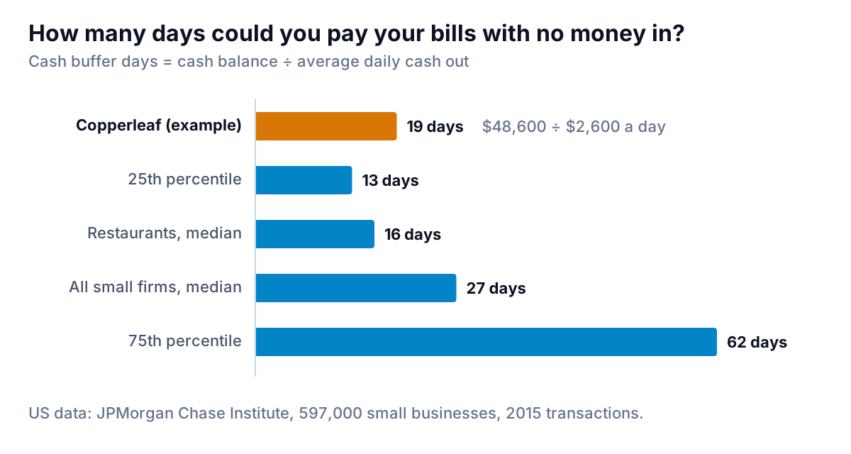
That data is from 2015, so don't treat it as a target. Use it to sense-check your own number. Copperleaf's 19 days is below the median and close to the restaurant figure, which fits a food business. The decision rule we'd suggest: know the number of days it takes for your slowest regular payment to arrive. If your buffer is shorter than that, one late client can push you into a cash gap. Copperleaf's corporate clients pay in about 22 days, and its buffer is 19. That's thin, and it's why the overdue list matters this month.
Build the financial dashboard from QuickBooks or a spreadsheet
Every tile above comes from four or five standard reports, so you can build this from almost any accounting system.
From QuickBooks Online
- Profit and loss, by month, for revenue, gross margin, operating profit and the biggest mover. Run it for the last 13 months so you have the same month last year.
- Balance sheet for cash, receivables and payables totals.
- Accounts receivable aging summary for the overdue share. Intuit's help article on running A/R aging reports covers the summary and detail versions.
- Accounts payable aging for bills due in the next 30 days.
- Bank transactions (or the register for each bank account) for cash out by day, which you need for buffer days.
If you track a budget in QuickBooks, you can add a budget column to the revenue and profit tiles. Intuit's help page says budgets are available in Plus and Advanced; our budget vs actual guide covers how to read the gaps.
From Google Sheets or Excel
Put each export on its own tab and keep a fifth tab for the tiles. Use one cell per tile and one cell per comparison, and reference the export tabs by formula, never by typing numbers in. When next month's exports arrive, paste them over the old ones and every tile updates. Two habits keep a spreadsheet dashboard honest: date-stamp the exports in the tab name, and keep last month's tiles in a column next to this month's so the comparison is always there.
Five ways a finance dashboard goes wrong
- Numbers without comparisons. "$82,400" means nothing alone. Every tile needs last month, last year or a target beside it.
- Too many tiles. Past about ten, people stop reading and start scanning for colour. If you need more, make a second dashboard for a different question (sales, marketing, a single location) rather than a longer one.
- Year-to-date totals on the front page. They grow every month whatever happens, so they look good until December. Use the month and a trend.
- Stale books. A dashboard built on books that are three weeks behind shows last month's business with this month's date. Reconcile the bank before you trust the tiles.
- Nobody owns the needs-attention list. The tiles tell you something is off. Put a name next to each item on the list, or the same overdue client shows up for three months.
Once a month, add a short note with the dashboard: two or three sentences on what changed and why. "Cash down $6,600 because two corporate clients paid late; gross margin down three points on higher food costs; calling Oakridge Law this week." That note is the part a partner or lender reads first.
Let Parity build the first version
If you'd rather not wire up the exports, Parity connects directly to QuickBooks Online (and Google Sheets, Stripe, Square, Shopify or HubSpot), or takes a CSV or Excel export from anything else. It builds a dashboard with headline numbers and their trends, charts, what explains them, and a table of what needs attention, and every number is checked against queries on the full dataset before you see it. You can ask for changes in chat ("add buffer days", "compare with the same month last year"), share a read-only link with your bookkeeper or partner, and export to PDF or Excel. If you also want the monthly write-up, ask it to write a report from the same data.
Connect QuickBooks Online and Parity builds a checked financial dashboard you can refine by chat. Connect QuickBooks free
Whatever you build it with, go back to the sixty-second test. If you can answer the five questions before the timer runs out, your financial dashboard is doing its job. If you can't, take a tile off before you add one.