A café owner reads her KPI report on Monday morning with a coffee. An agency's partners read theirs at a monthly lunch. A bank's relationship manager reads a manufacturer's once a quarter, looking for one thing: can this business keep paying the loan? Same kind of document, three very different jobs. That's why copying a generic KPI report example rarely works: the right report depends on who reads it, how often, and what they can change.
Below are six example KPI reports for six different small businesses. Each KPI report example is a made-up business with numbers that add up, and each comes with who reads it, the actual report, what it gets right, and the idea worth stealing. If you want the method behind them (picking KPIs, working out normal ranges, writing commentary), our monthly KPI report guide covers it. This page is the gallery.
What all six have in common
They differ in almost everything except four habits. Each one:
- Fits on one screen. Five to eight KPIs. Anything more goes in an appendix nobody opens.
- Gives every number a comparison. Last period, a rolling average or a target. A number on its own can't be judged.
- Puts the commentary next to the numbers. One or two sentences per KPI that moved, saying why and what happens next.
- Measures money in a way the reader can act on. Prime cost instead of food cost alone, contribution per order instead of revenue, booked work instead of last month's fees.
Weekly: a café that steers by prime cost
The business: Harbour Street Café, a 40-seat café with a small bakery. Who reads it: the owner and the head chef, every Monday. Why weekly: food and labour costs move week to week, and a bad month is four bad weeks nobody caught.
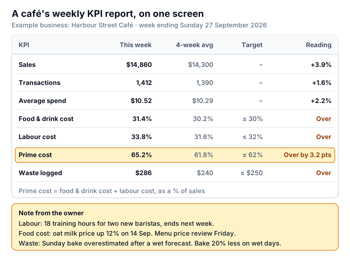
What it gets right: it leads to one number, prime cost: food and drink cost plus labour, as a share of sales. Restaurant software firm Restaurant365 defines prime cost as cost of goods sold plus total labour, including payroll taxes and benefits, and notes that quick-service concepts often run closer to 60% or lower. Harbour Street's own target is 62%. This week it hit 65.2%, which on $14,860 of sales is about $475 more than the target allows.
Sales were up 3.9% on the four-week average, so a sales-first report would have looked like a good week. Prime cost shows it wasn't, and the notes say why: training hours for two new baristas, a supplier price rise and an over-bake on a rainy Sunday. Two of the three have an end date. The third gets a decision on Friday.
Steal this: compare with a four-week average, not last week. One week is too noisy to compare with another, and a holiday week throws the comparison off for two reports in a row.
Monthly for the owner: an online store and a field service company
Example 2: an online store that reports profit per order
The business: Fieldnote Paper Co., a stationery shop on Shopify. Who reads it: the two founders, on the third working day of the month.
| KPI, September 2026 | This month | August | Comment |
|---|---|---|---|
| Revenue | $48,200 | $44,900 | Up 7%, all from more orders |
| Orders | 1,060 | 962 | Free-shipping threshold cut from $50 to $35 on 1 Sep |
| Average order value | $45.47 | $46.67 | Smaller baskets, as expected |
| Contribution per order | $9.80 | $12.40 | Shipping now costs us $7.60 an order. Review the threshold |
| Returning customers' share of orders | 31% | 33% | Normal range |
| Ad spend per new customer | $11.98 | $12.60 | 731 new customers on $8,756 |
| Refund rate | 2.1% | 1.9% | Normal range |
What it gets right: contribution per order is what's left from each order after product cost, shipping and packing, payment fees and advertising. At Fieldnote: $45.47 − $18.19 product − $7.60 shipping − $1.62 fees − $8.26 ads = $9.80. Revenue went up 7%, but total contribution fell from $11,929 (962 × $12.40) to $10,388 (1,060 × $9.80). The free-shipping change bought more orders and less profit, and only this row shows it.
Steal this: define "returning" the way your platform does, and say so. Shopify's customer reports count a returning customer as one whose order history already includes at least one order. If you change the definition halfway through the year, the trend is meaningless.
Example 3: a heating and cooling company that tracks the second visit
The business: Copperline Heating & Air, 14 technicians. Who reads it: the owner and the service manager, monthly.
- Jobs completed: 318. Average ticket: $612. Revenue: $194,616.
- First-time fix rate: 84%, against a target of 88%. These are jobs finished on the first visit, without a return trip for parts or a second technician.
- Callbacks: 3.1% of jobs, where the customer called back within 30 days about the same problem.
- Backlog: 2.4 weeks of booked work.
- Maintenance agreements: 1,140, up 22 net (41 new, 19 lapsed).
What it gets right: it treats the second visit as the expensive event it is. At 84%, about 51 of the 318 jobs needed a return trip, each one a technician's half-day with no new revenue. The commentary links it to a cause the owner can fix: "Two thirds of return trips were for parts not on the van. Restock list for the top 20 parts agreed with the warehouse."
Steal this: report the size of the recurring base (maintenance agreements) as new minus lapsed, not just the total. A total that grows by 22 can hide 19 customers walking away.
Monthly for partners: an agency and a membership studio
Example 4: an agency that reports the next 90 days
The business: Northgate Studio, a nine-person design agency. Who reads it: the three partners, at a monthly lunch.
The backward-looking part is short. September fees invoiced were $96,500 from 818 client hours, an effective rate of $118 an hour. Utilisation was 71% (818 of 1,152 available hours) against a 75% target. Receivables more than 30 days overdue: $18,400.
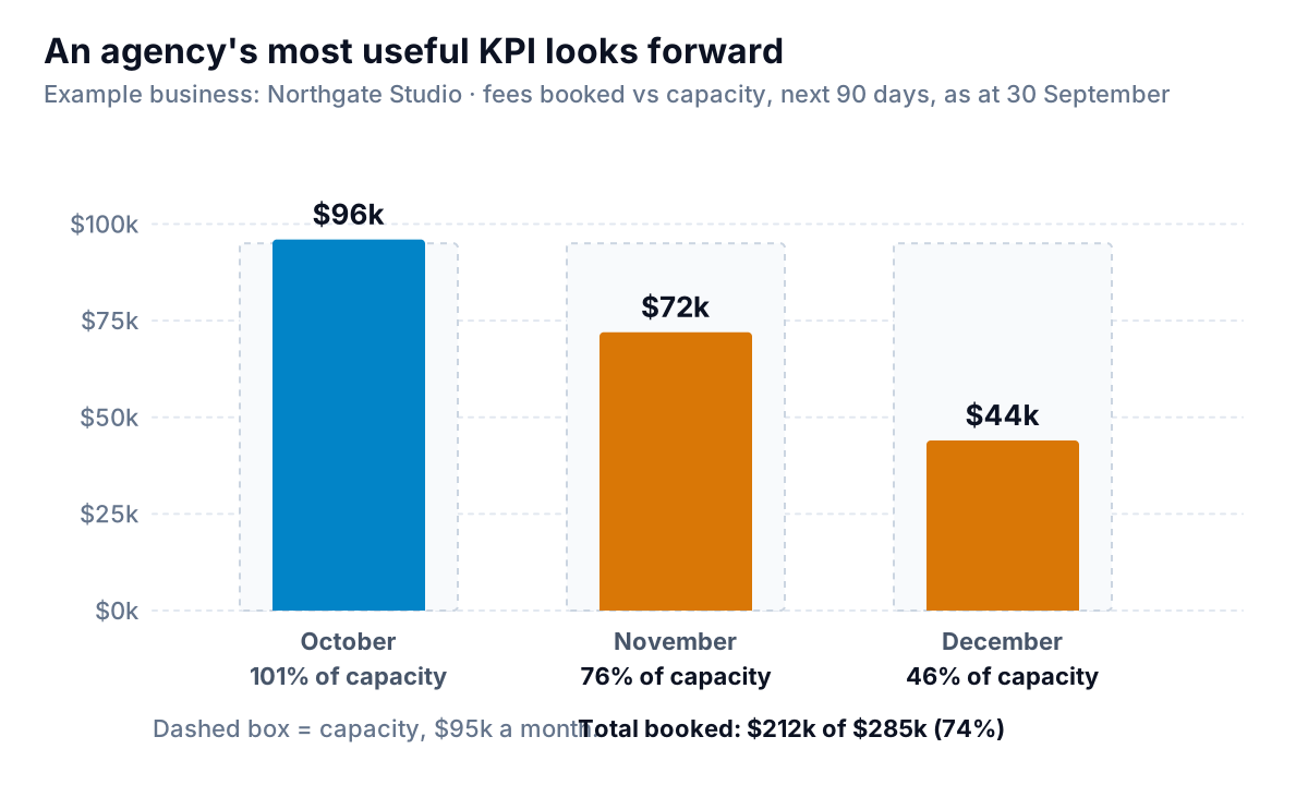
What it gets right: the headline is booked work against capacity for the next three months, not last month's fees. Last month can't be changed. December can: at 46% booked, the partners have ten weeks to fill about $51,000 of capacity. The action in the report is specific: "Each partner to send three proposals from the pipeline by 15 October."
Steal this: show the effective hourly rate next to utilisation. A team can hit 75% utilisation on underpriced fixed-fee work and still lose money. The rate tells you whether the hours were worth doing.
Example 5: a membership studio that explains every dollar of change
The business: Tidepool Pilates, a studio with monthly memberships billed through Stripe. Who reads it: the owner and her investor partner.
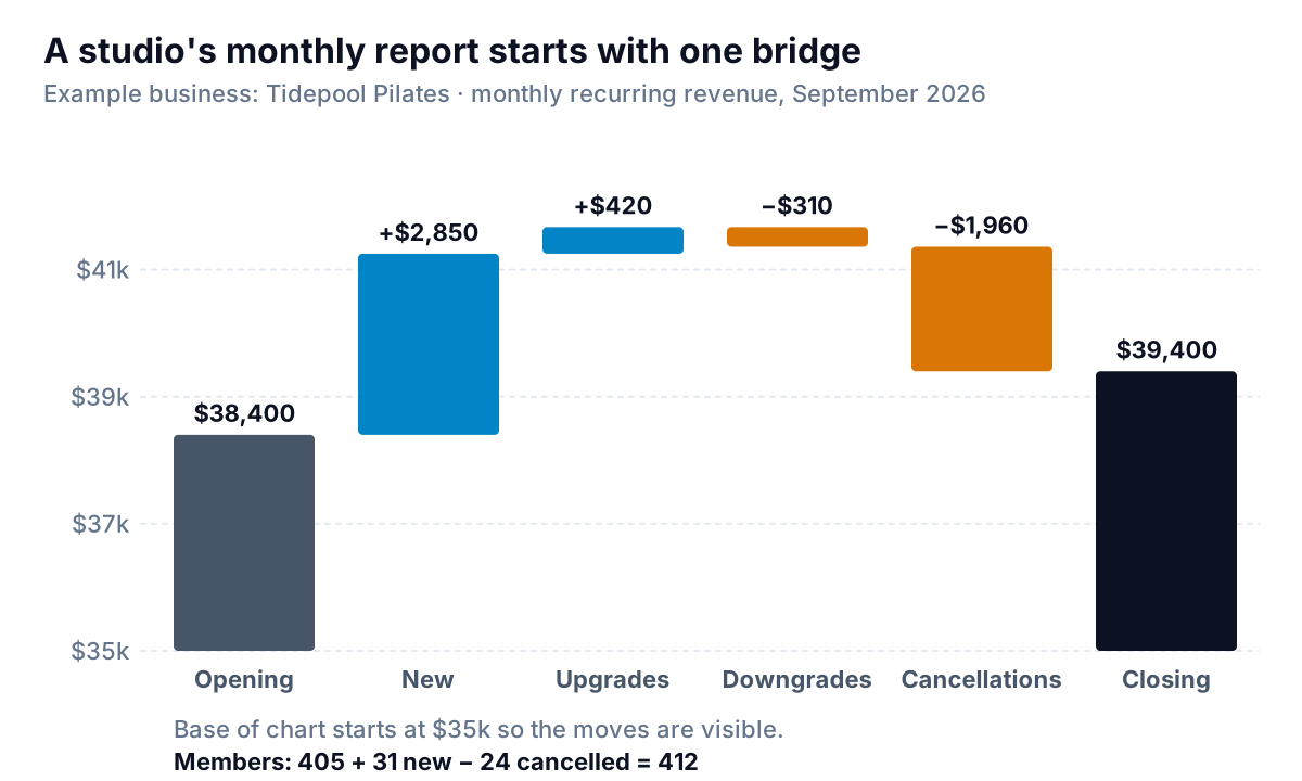
What it gets right: instead of "MRR up 2.6%", the report shows where the $1,000 came from. Stripe describes MRR growth the same way: opening MRR plus new and expansion, minus contraction and churn. New members brought in $2,850; cancellations took away $1,960. The rest of the report follows from that split:
- Members: 405 at the start, 31 joined, 24 cancelled, 412 at the end.
- Cancellation rate: 5.5%. Stripe's subscriber churn rate divides cancellations by members at the start plus new members, so 24 ÷ (405 + 31). Say which definition you use, because 24 ÷ 405 gives 5.9%.
- Average revenue per member: $95.63 ($39,400 ÷ 412).
- Class fill rate: 78% of bookable spots taken.
Steal this: the bridge works for any business with repeat revenue: retainers, service contracts, wholesale accounts. Opening, plus new, plus more from existing, minus less from existing, minus lost, equals closing.
Quarterly for a lender: a small manufacturer
The business: Ridgeway Soap Works, which makes soap for gift shops and two regional grocery chains. Who reads it: the owner, her accountant and the bank that provides a $100,000 line of credit, every quarter.
| KPI, Q3 2026 | Q3 | Q2 | What the bank sees |
|---|---|---|---|
| Revenue | $386,000 | $352,000 | Growing |
| Gross margin | 41.2% | 42.0% | Stable |
| Orders on time and in full | 91% (375 of 412 lines) | 94% | Explained: one oil supplier late in August |
| Inventory days | 74 | 61 | Built up ahead of the holiday season |
| Cash at quarter end | $86,000 | $104,000 | Went into stock, see above |
| Line of credit drawn | $40,000 of $100,000 | $25,000 | Expected to be repaid by January |
What it gets right: it answers the lender's question in the order the lender asks it. Cash fell and borrowing rose, and the report explains both before anyone has to ask: the business turned cash into stock for its busiest season. Inventory days here are stock at quarter end ÷ cost of goods sold for the quarter × 92 days: $182,600 ÷ $226,968 × 92 = 74.
Steal this: for an outside reader, put the explanation in the same row as the number. A lender who has to hunt for why cash fell assumes the worst.
How to pick the right KPI report example to copy
Match on the reader and the rhythm first, the industry second. A wholesale bakery has more in common with Ridgeway than with Harbour Street.
| If your reader is… | and they can act… | copy | lead with |
|---|---|---|---|
| You and a manager | Every week | The café | The one cost ratio that eats your margin |
| You, or you and a co-founder | Monthly | The online store or field service company | Profit per unit of work, and the second-visit cost |
| Partners or an investor | Monthly | The agency or the studio | What's coming (booked work) or why it changed (the bridge) |
| A bank or board | Quarterly | The manufacturer | Cash, borrowing and the reason they moved |
Then cut. Whatever KPI report example you start from, if a row hasn't changed a decision in three months, drop it. For the full list of candidate KPIs by business type, see our KPI dashboard guide. To track the numbers month to month with targets and normal ranges before they go into a report, use the free KPI tracking template.
Building the report without the copy and paste
All six reports have the same problem behind them: the numbers live in different places. The café's sales are in the till, its labour in the payroll export. The studio's MRR is in Stripe, its class bookings in a booking app. Most of the time spent on a KPI report goes on collecting and checking, not on deciding.
Parity connects QuickBooks Online, Stripe, Shopify, HubSpot, Square and Google Sheets directly, or takes a CSV or Excel export from anything else. It builds a dashboard with the headline numbers and their trends, charts, what explains them and a table of what needs attention. Ask it to write a report from the same data, and it writes the client-ready version: the monthly report for your partners, investor or bank, with commentary. Every number is checked against queries on the full dataset before you see it. You refine it by chat, share a read-only link or export to PDF, and save it as a template so next month starts from the same layout.
Connect your tools or upload an export, and get a checked dashboard you can turn into a one-page report for whoever reads it. Build a report from your data free
Whichever KPI report example you copy, test it the same way: after reading it, does someone know what to do this week? If the answer is yes, the report is doing its job. If they just know the numbers, it isn't yet.