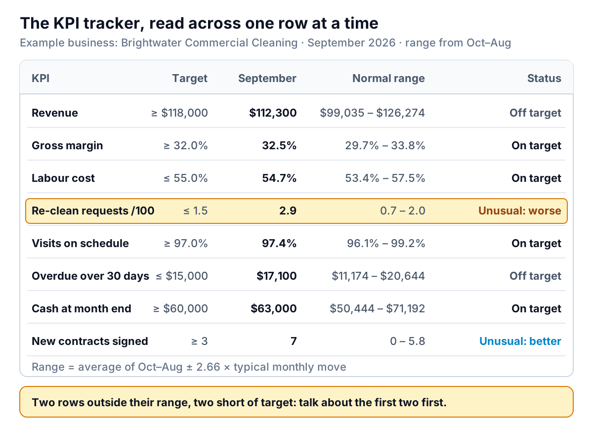
Brightwater Commercial Cleaning, a made-up 30-person cleaning company, tracks eight numbers a month in the KPI tracking template on this page. In September, revenue came in at $112,300 against a target of $118,000. Re-clean requests, where a client asks for a repeat visit because the first one wasn't good enough, rose from 1.4 to 2.9 per 100 visits. On a typical red-amber-green sheet, revenue goes red and the meeting starts there.
It shouldn't. Revenue has missed $118,000 in eleven of the last twelve months, so September tells the owner nothing new. The re-clean rate has never been above 1.6 in a year. That's the number that changed, and it's costing money now.
A KPI tracker earns its place by telling those two situations apart. This KPI tracking template gives every row a target and a normal range worked out from its own history, then a status that says which kind of problem you have. Download the KPI tracking template (.xlsx). It opens in Excel, Google Sheets and Numbers, with no macros, a filled-in example and a blank tracker with the same formulas.
What's in the KPI tracking template
Three sheets. How to use explains the setup and the statuses. Example tracker holds Brightwater's twelve months, October 2025 to September 2026. Your tracker is the same sheet with the data cleared, room for 15 KPIs.
Each KPI is one row. Yellow cells are yours to type in; everything else is a formula.
| Columns | What goes there |
|---|---|
| A–F (you type) | KPI name, how it's measured, owner, unit, whether higher or lower is better, target |
| G–R (you type) | One value per month, twelve months. Headers fill in from the first month you enter in C4 |
| S–U | Latest month, the month before, and the change |
| V–Y | Normal level, typical monthly move, and the low and high ends of the normal range |
| Z–AA | Months on target so far, and the status |
| AB (you type) | A note: what you'll do about it, and who |
Below the table, a dropdown lets you pick any KPI and see it charted with its normal range and target, which is the quickest way to explain a status to someone else.
The left side: define each KPI once
Most KPI trackers fail before the first formula, because nobody wrote down what the number means. Six short columns fix that.
- KPI and how it's measured. Write the calculation and the source in words: "Client requests for a repeat clean, per 100 visits", not "Quality". If two people would calculate it differently, the definition isn't finished. Our KPI dashboard guide has four tests for choosing which numbers deserve a row at all.
- Owner. One person who can move the number and will be asked about it.
- Unit. $, %, count or "per 100". Enter percentages as percentages (32%, not 32), so the formulas compare like with like.
- Better when. Higher or Lower, from a dropdown. The status needs it: a jump in cash is good news, a jump in overdue invoices isn't.
- Target. The level you're aiming for. More on setting it below.
Then type one value per month across columns G to R, and put the latest month's number (1 to 12) in cell C5. That one cell drives the whole sheet: change it to 11 and the tracker shows you August as it looked at the time.
The calculated columns, one formula at a time
Every formula in the template is standard and readable. Here's what each column does, using row 12 (re-clean requests) as the example.
Latest, month before, change
=INDEX($G12:$R12,$C$5) picks the value in the latest month's column, here 2.9. The month before uses $C$5-1 (1.4), and the change is the difference (+1.5). INDEX works the same way in all three spreadsheet apps.
Normal level and typical move
The normal level is the average of every month before the latest one. A small row of month numbers above the table (1 to 12) lets AVERAGEIFS take just those months:
=AVERAGEIFS($G12:$R12, $G$7:$R$7, "<"&$C$5)
For re-cleans that's 1.35. The typical monthly move is the average of how far the KPI moved from one month to the next, ignoring direction. A helper block to the right of the table works out each move with =ABS(H12-G12), and the tracker averages the ones inside the baseline. For re-cleans, 0.24.
The normal range
Low end: normal level minus 2.66 times the typical move, never below zero. High end: normal level plus 2.66 times the typical move. For re-cleans, 0.72 to 1.99. This is the individuals chart from quality control; the NIST engineering statistics handbook gives the limits as the average plus or minus 3 × average moving range ÷ 1.128, and 3 ÷ 1.128 is 2.66. Our monthly KPI report guide explains the method and its rules for spotting slow drifts; the tracker just does the arithmetic for you.
The range needs at least three earlier months to mean anything, so until C5 reaches 4 the range columns stay blank and the status compares with target only.
Months on target
A COUNTIFS counts the months, up to the latest, that met the target, using ≥ or ≤ depending on the Better-when column. It's the column that tells you whether a target is realistic. Brightwater's revenue: 1 month out of 12.
Status
One nested IF, in this order:
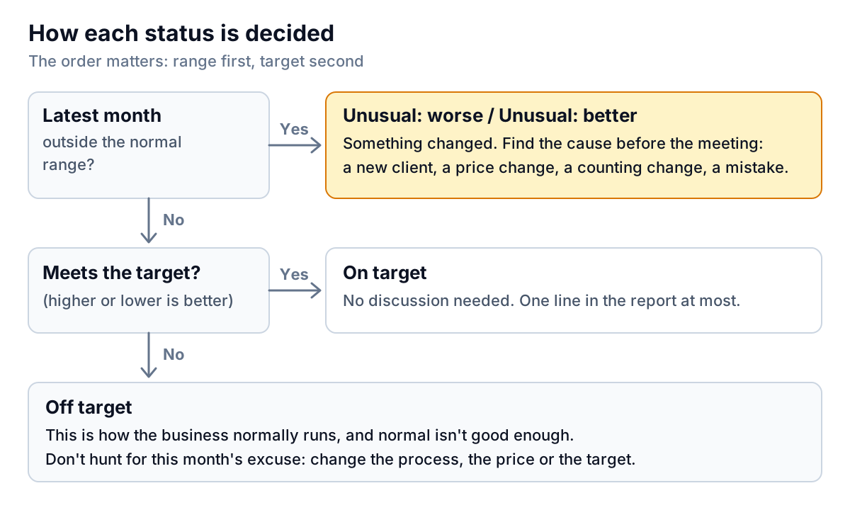
- Unusual: worse or Unusual: better. The latest month is outside its normal range. Something changed, and you should know what before the meeting.
- On target. Inside the range and meeting the target.
- Off target. Inside the range but short of target. The business is running as it normally does, and normal isn't good enough.
- No target if you left the target blank: the row still gets the unusual check.
Conditional formatting shades the unusual-worse rows amber and the unusual-better rows blue, so the sheet sorts itself by importance at a glance.
Reading Brightwater's September
Here's how the owner would read the example tracker, in the order the statuses suggest.
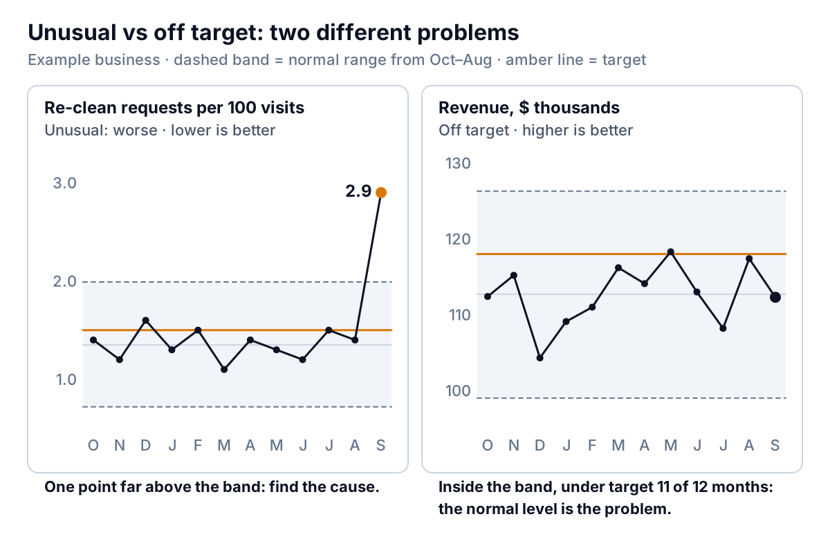
- Re-clean requests, Unusual: worse. 2.9 per 100 visits, against a high end of 2.0. This needs a cause, and the row two below suggests one.
- New contracts signed, Unusual: better. Seven new contracts against a normal 2 or so a month. Good news, and the likely cause of the first: new sites, new cleaners, checklists nobody has learned yet. The note column says what happens next: "Six of the 7 new sites started mid-month; check their checklists with the supervisors."
- Revenue, Off target. $112,300, well inside its normal range of $99,035 to $126,274. It's met $118,000 once in twelve months. Explaining September's shortfall would waste the meeting. Either the target needs a plan behind it (seven new contracts may well be that plan) or it should come down to something the business can actually reach.
- Overdue over 30 days, Off target. $17,100 against a $15,000 limit, normal for Brightwater and met in only 3 of 12 months. The note names the action: "Two clients over 45 days; owner to call both this week."
The other four rows are on target and get no discussion. That's the point: eight numbers, two conversations.
Setting targets the tracker can judge
A target that the business hits every month is decoration. One it never hits gets ignored. The months-on-target column shows which you have. Three rules of thumb:
- Start from the normal level. If revenue averages $112,700, a $118,000 target is a 5% lift. Fine, if you can say what will produce it: more contracts, a price rise, fewer cancelled visits.
- Keep the target inside the normal range at first. Brightwater's revenue target sits inside the band, so it's reachable in a good month. A target above the high end can only be met if the business changes how it works, and the tracker should say so honestly by showing Off target month after month.
- Reset the baseline after a real change. When a big client leaves or prices change, the old months stop describing the business. Start a new tracker from that month, or the normal range will be too wide to catch anything.
The ten-minute monthly routine
- Within five working days of month end, type each KPI's value into the next month's column.
- Add 1 to C5.
- Sort your attention, not the sheet: unusual rows first, then off target.
- For each unusual row, find the cause and write it in the note with an owner and a date.
- After twelve months, copy the sheet, move C4 forward a month, and paste the last twelve months in.
The note column is the part people skip and the part that matters. A KPI tracking template full of numbers with no actions is a record, not a management tool.
From typing numbers to pulling them
Typing eight numbers a month is fine. Finding them is the slow part: revenue from the accounts, re-clean requests from the job system, overdue invoices from an aging report. If that takes you an afternoon, Parity can do the collecting. Connect QuickBooks Online, Square, Stripe, Shopify, HubSpot or Google Sheets directly, or upload a CSV or Excel export from anything else, and it builds a dashboard with the headline numbers and their trends, charts, what explains them and a table of what needs attention. Every number is checked against queries on the full dataset before you see it. You can ask it to show each KPI against your target, save the result as a template, and update it with next month's file. If you need to send a write-up, our KPI report examples show six ways to present numbers like these, and if you'd rather keep everything in a spreadsheet, the Excel dashboard template pairs well with this tracker.
Connect the tools your KPIs come from and get a checked dashboard with each number, its trend and what needs attention. Build a report from your data free
Whatever fills the cells, keep the order: unusual first, off target second, on target last. That one habit makes a KPI tracker worth the ten minutes it takes each month.