Most Excel dashboard templates you can download are pictures of a dashboard with some formulas behind them. They look finished because the sample data was typed to fit. Paste in your own export and the trouble starts: a chart that stops at row 200, a headline number that's really a typed value, a "slicer" tied to a PivotTable nobody remembers to refresh. You find out a month later, when the total doesn't match your accounts.
So this page gives you one working template instead of a gallery of fifty, and a ten-minute test you can run on any other template before you trust it. Download the Excel dashboard template (.xlsx). It opens in Excel, Google Sheets and Numbers, has no macros and no links to other files, and comes with a filled-in example business and a blank copy with the same formulas.
What's in the workbook
The template is seven sheets. One explains itself, three hold a made-up business so you can see every number working, and three are the same sheets empty, ready for your data.
| Sheet | What it holds | Do you type on it? |
|---|---|---|
| How to use | Setup steps, the monthly routine and the limits | No |
| Example Dashboard / Your Dashboard | Four input cells, five headline tiles, three charts, a needs-attention list and two check lines | Only the four yellow cells |
| Example Calc / Your Calc | Twelve months of totals, plus the chosen month by channel and by category | Only the channel and category names |
| Example Data / Your Data | One row per order: Date, Order ID, Channel, Category, Revenue, Cost | Paste only |
The example is Kestrel Print Studio, a fictional print shop that sells through a walk-in counter, an online store and trade accounts. Its data sheet has 1,016 orders from October 2025 to September 2026, worth $380,014 in revenue. Every figure on this page comes from that sheet, recalculated outside Excel to check the formulas give the same answers.
The Data sheet: paste, don't type
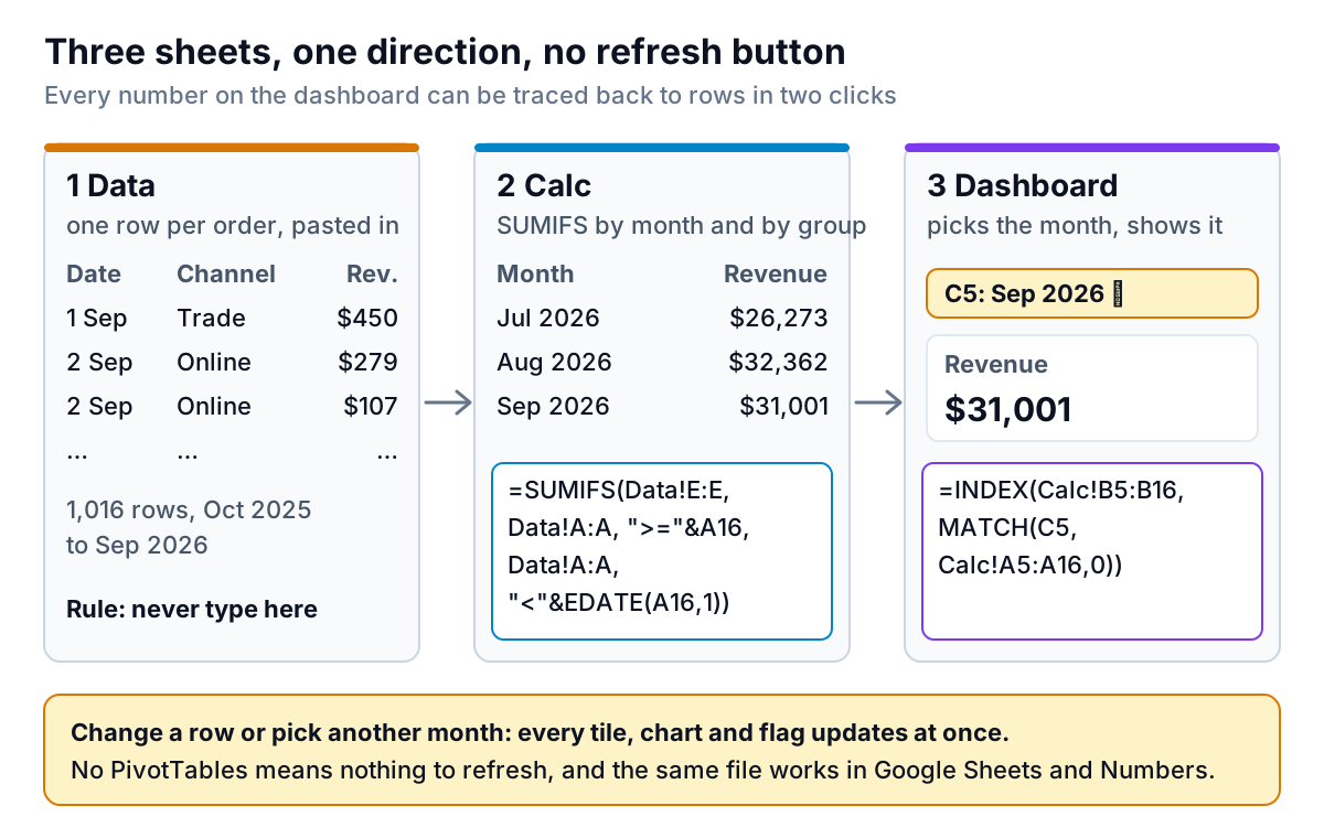
Everything downstream depends on this sheet being boring. One row per order (or per sale, or per invoice), six columns, headers in row 1:
- Date: a real date, not text. If your export gives "2026-09-02 14:31", Excel usually converts it; if it stays left-aligned, it's text, and the month totals will miss it.
- Order ID: not used in any formula, but keep it. It's how you trace a strange number back to a real order.
- Channel and Category: spelled exactly as you'll type them on the Calc sheet. "Online" and "online shop" are two different channels to a formula.
- Revenue and Cost: plain numbers, before sales tax. Cost is what the order cost you to make or buy. If your system doesn't export it, put 0 and ignore the margin tiles.
Each month you paste the new rows under the old ones. That's the whole update. The formulas read rows 2 to 5,001, so the template holds about 5,000 orders. Kestrel uses about a fifth of that in a year.
If your export has one row per line item rather than per order, it still works for revenue, cost and margin. The Orders tile will count lines, so rename it "Lines sold" or work out orders separately.
The Calc sheet: SUMIFS instead of PivotTables
Our step-by-step Excel dashboard guide builds its summaries with PivotTables, and for large exports that's the right call. This template uses SUMIFS and COUNTIFS instead, for three reasons that matter in a downloadable file:
- Nothing to refresh. A PivotTable doesn't update until someone refreshes it. A formula updates the moment a row changes. The most common dashboard error is a stale pivot, and this removes it.
- It travels. The same formulas work in Google Sheets and Numbers. PivotTables from Excel don't always survive the trip.
- You can read it. Click any number and the formula tells you exactly which rows it adds up.
The monthly table
Rows 5 to 16 hold twelve months. The first month comes from the dashboard's "First month of data" cell, and each month after it is =EDATE(A5,1), one month later. Revenue for a month adds every order dated on or after the first of that month and before the first of the next:
=SUMIFS(Data!$E$2:$E$5001, Data!$A$2:$A$5001, ">="&$A5, Data!$A$2:$A$5001, "<"&EDATE($A5,1))
Cost uses the same formula on column F. Gross profit is revenue minus cost, gross margin is gross profit divided by revenue, orders is a COUNTIFS with the same two date conditions, and average order value is revenue divided by orders.
Under the table, cell C18 compares the twelve-month total ($380,014 for Kestrel) with the total of every row on the Data sheet. If they differ, some orders fall outside your twelve months, and the dashboard is quietly ignoring them.
The month-shown blocks
To the right sit two small tables for the month you've chosen: one row per channel and one per category. Each row has revenue, the month before, the change, gross profit, gross margin, orders and a flag. The SUMIFS just adds a third condition, the channel or category name in column I. The flag reads:
=IF(N6<Dashboard!$C$6,"Margin below target",IF(L6<-Dashboard!$C$7,"Revenue down",""))
Column N is the row's gross margin, column L its change on the month before, C6 your target margin and C7 your drop limit. (The file wraps each formula in a check for blank rows; the logic is the same.)
Under each block, a check line adds the channels (or categories) up and compares them with the month's total. If someone types "online shop" in the data, the channels no longer add up and the check line says so. That's the cheapest error trap there is, and most templates skip it.
The Dashboard sheet: four inputs, everything else calculated
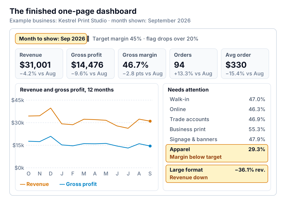
Only four cells on the dashboard take typing, all yellow: the first month of data, the month to show (a dropdown of the twelve months), your target gross margin, and how big a revenue drop should be flagged. Kestrel uses 45% and 20%.
The five tiles each look up the chosen month in the monthly table with INDEX and MATCH, and compare it with the month before. September at Kestrel reads like this:
- Revenue $31,001, down 4.2% on August's $32,362. On its own, nothing to worry about.
- Gross margin 46.7%, down 2.8 points. Still above the 45% target, but it's the biggest move on the page.
- Orders 94, up 13.3%, while the average order fell 15.4% to $330. More, smaller jobs.
The needs-attention list explains the margin. Apparel made a 29.3% gross margin in September, far below target, on $6,267 of revenue. Kestrel's fictional owner would know why straight away: blank garment prices went up and the price list didn't. Large format revenue fell 36.1%, from $5,250 to $3,357. With only 11 orders, that may be one missing job rather than a trend, which is exactly the conversation a flag should start.
The three charts read the Calc sheet. One shows revenue and gross profit for twelve months, one shows revenue by channel and one shows gross margin by category for the chosen month. Change the month in C5 and all three move with the tiles. If you want to restyle them, Microsoft's chart guide covers the formatting options. Don't change their data ranges.
How to judge other Excel dashboard templates
You may still want a different design, and there are plenty of Excel dashboard templates around. Before you build on one, give it ten minutes and your own data. A template that fails any of these will fail you later, usually on the day you need it.
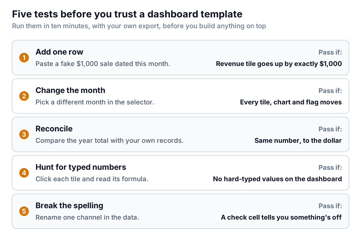
- Add one row. Paste a made-up $1,000 sale dated this month at the bottom of the data. The revenue tile should rise by exactly $1,000. If it doesn't move, the formulas stop at a fixed row above yours, or the data range is a frozen PivotTable cache.
- Change the month. Pick a different period. Every tile, every chart and every flag should change. Templates often wire the headline tiles to the selector but leave a chart pointing at fixed cells.
- Reconcile. Compare the year's revenue with a number you trust, such as the sales total from your accounting system for the same dates. A gap means rows are being dropped, double-counted or read as text.
- Hunt for typed numbers. Click each tile and read the formula bar. A plain number in a dashboard cell is a sample value someone forgot to replace.
- Break the spelling. Change one channel name in the data. A good template tells you the totals no longer add up. A poor one just shows a smaller number.
Two more things worth a glance. If the template uses Excel Table structured references such as Sales[Revenue], that's a good sign: the ranges grow as you add rows. If it has macros (an .xlsm file) from a site you don't know, don't enable them. For layouts worth copying, our Excel dashboard examples show eight small dashboards and the one decision each gets right.
What this template can't do
Every one of the Excel dashboard templates you'll find has limits. Here are this one's:
- Twelve months at a time. For a longer view, move the first month forward each month or copy the Calc table for a second year.
- Three channels and four categories as built. Adding one means inserting a row inside the block on the Calc sheet, copying the formulas down, and extending the needs-attention list the same way. It's five minutes of work, but it's work.
- About 5,000 rows. Past that, change the row limit in the formulas with Find and Replace, or move the summaries to PivotTables as in our Excel dashboard guide.
- One data source. It reads one export. Combining sales from your till with costs from your accounts means building that join yourself, before the data reaches this sheet.
- Charts vary by app. Google Sheets opens Excel files directly and Numbers imports them, and the numbers come out the same, but chart styling may shift. If you live in Google Sheets, our Google Sheets dashboard guide builds the same thing natively with QUERY and slicers.
And it only shows what happened. It won't tell you that Apparel's margin fell because garment costs rose; it tells you where to look, and you supply the why.
When the monthly paste gets old
For a business with one export and one person updating it, this template can run for years. It starts to strain when the numbers come from three places, when the person who set it up leaves, or when someone asks a question the twelve-month table wasn't built for, like "which trade customers ordered less this quarter?"
That's the point where Parity can save you the rebuild. You upload the same export (CSV or Excel), or connect QuickBooks Online, Shopify, Square, Stripe or Google Sheets directly, and it builds the dashboard: headline numbers with their trends, charts, what explains them, and a table of what needs attention. Every number is checked against queries on the full dataset before you see it. You refine it by chat, export the result to Excel or PDF, and update it with next month's file. If you'd rather track a handful of KPIs against targets than build a full dashboard, the KPI tracking template is the lighter option.
Upload the export you'd paste into this template and get a checked dashboard with the same tiles, charts and flags. Build a report from your data free
Whichever route you take, and whichever of the many Excel dashboard templates you start from, run the five tests first. A dashboard is only worth opening if its numbers survive next month's data, and you can find that out in ten minutes.