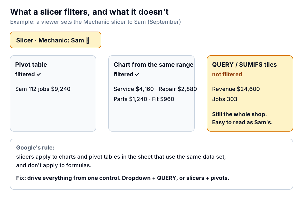
Here's a Google Sheets dashboard bug that no formula checker will catch. You build a tidy one-page dashboard: three headline numbers, a chart by job type, a pivot table by staff member, and a slicer so your business partner can filter it. She opens it, sets the slicer to one mechanic, and reads the headline: $24,600 of revenue, 303 jobs. Those are the whole shop's numbers. The slicer filtered the pivot table and the chart, but not the formulas behind the headline tiles, and nothing on the screen says so.
That's documented behaviour. Google's help page on slicers says plainly that they don't apply to formulas in a sheet. Most tutorials mix the two anyway. This guide builds a dashboard in Google Sheets the other way round: decide first how people will filter it, then build everything to answer to that one control. The example is Ridgeback Bike Workshop, a made-up bike repair shop with a jobs log of dates, job types, mechanics and revenue.
First decision: a dropdown or slicers?
A Google Sheets dashboard can be filtered in two ways, and they don't mix well.
| Dropdown cell + QUERY formulas | Slicers + pivot tables | |
|---|---|---|
| What it filters | Anything that refers to the cell: formulas, tiles, charts built from them | Charts and pivot tables on that tab that use the same data range. Not formulas |
| Who can change it | Only people who can edit the sheet | Anyone who can open it, viewers included; their choice is private unless an editor sets it as the default |
| Headline tiles | Ordinary formulas, any layout | Must be small pivot tables, or they won't follow the slicer |
| Best for | A dashboard you update and others read | A dashboard others explore |
The slicer details come from Google's slicer help page: everyone can adjust a slicer's filter, the change is private to them unless an editor uses "Set current filters as default", and slicers apply to "all charts and pivot tables in a sheet that use the same data set". People with view-only access can't type in cells, so a dropdown is a control for editors only.
For most small businesses, where one person keeps the numbers and others read them, the dropdown version is simpler and harder to misread. That's what Ridgeback uses, and what the first four steps build. Step 5 covers the slicer version for when viewers need to explore.
Step 1: one tab of raw rows, turned into a table
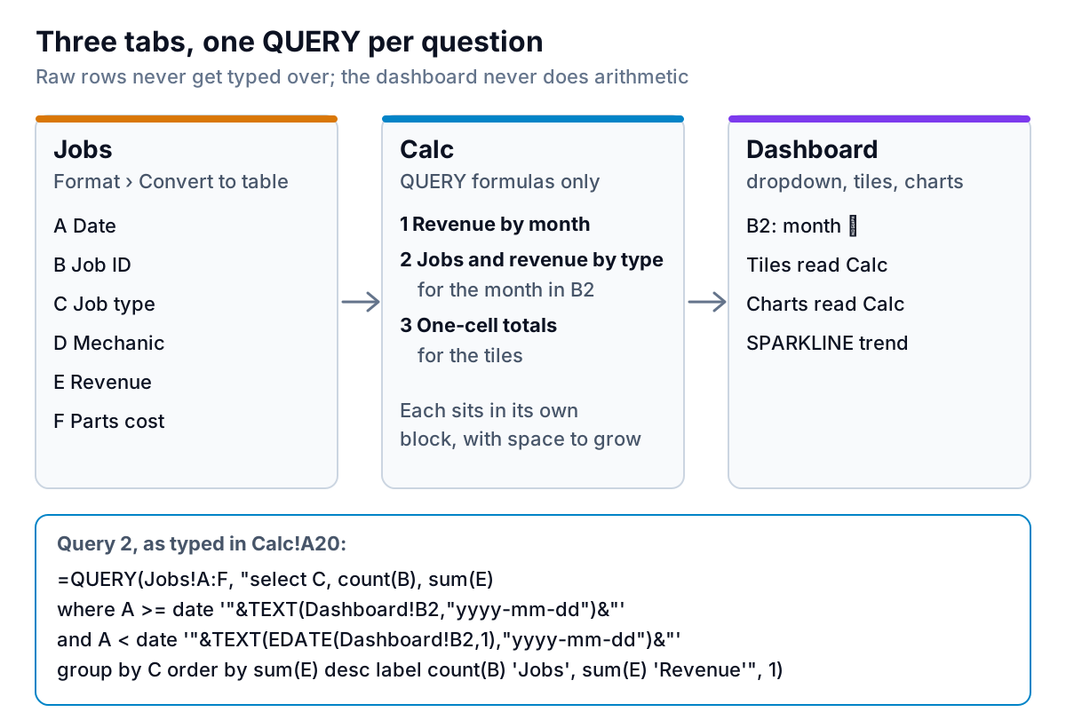
Name the first tab Jobs. One row per job, headers in row 1, nothing else on the tab: no totals underneath, no notes in column H. Ridgeback's columns are:
- A Date, B Job ID, C Job type (Service, Repair, Parts sale, Bike fit), D Mechanic, E Revenue, F Parts cost.
Select the data and use Format › Convert to table. Google's tables help page explains that you then set a type for each column (date, number, dropdown and so on), which stops a stray text value from turning up in the revenue column. Table references also update as you add or remove rows.
If the rows live in another spreadsheet, say your booking system's export sheet, pull them across with IMPORTRANGE: =IMPORTRANGE("spreadsheet URL","Export!A:F"). The first time, Sheets asks you to allow access. Google caps it at 10MB of received data per request, which is plenty for a small business's jobs log.
Size isn't usually a worry: Google allows up to 20 million cells in a spreadsheet. Speed is. A tab with tens of thousands of rows and dozens of QUERY formulas gets sluggish long before it hits any limit.
Step 2: a Calc tab with one QUERY per question
The QUERY function runs a small database query over a range: QUERY(data, query, [headers]). It's the heart of a good Google Sheets dashboard, because one formula can filter, group, sum and sort, and spill the result into as many rows as it needs.
Make a second tab called Calc. Give each question its own block, with empty rows below so results can grow. Ridgeback needs three.
Query 1: revenue by month
=QUERY(Jobs!A:F, "select year(A), month(A)+1, sum(E), count(B) where A is not null group by year(A), month(A)+1 order by year(A), month(A)+1 label year(A) 'Year', month(A)+1 'Month', sum(E) 'Revenue', count(B) 'Jobs'", 1)
Note the +1. In the query language Google uses, month() returns 0 for January. Forget it and your September totals sit next to the label 8.
Query 2: jobs and revenue by type, for the chosen month
This one reads the month from the dashboard's dropdown (cell B2, holding the first day of a month):
=QUERY(Jobs!A:F, "select C, count(B), sum(E) where A >= date '"&TEXT(Dashboard!B2,"yyyy-mm-dd")&"' and A < date '"&TEXT(EDATE(Dashboard!B2,1),"yyyy-mm-dd")&"' group by C order by sum(E) desc label count(B) 'Jobs', sum(E) 'Revenue'", 1)
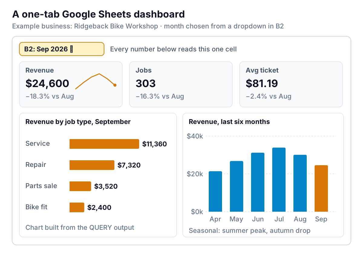
Dates inside a query must be written as date 'yyyy-mm-dd', so TEXT turns the cell's date into that format and the & joins it into the query string. For September 2026 at Ridgeback, the result is four rows: Service 142 jobs and $11,360, Repair 61 and $7,320, Parts sale 88 and $3,520, Bike fit 12 and $2,400. They add up to 303 jobs and $24,600.
Query 3: one-cell totals for the tiles
A tile needs a single number, not a table with a header. Ask for one value and give it an empty label:
=QUERY(Jobs!A:F, "select sum(E) where A >= date '…' and A < date '…' label sum(E) ''", 1)
Use the same date conditions as Query 2. A plain SUMIFS works just as well here; pick one style and use it everywhere, so whoever inherits the sheet only has to learn one.
Step 3: the dashboard tab
Make a third tab called Dashboard. Everything on it either is the dropdown or points at Calc.
The dropdown
In B2, use Insert › Dropdown, and under Criteria choose "Dropdown from a range", pointing at a list of month-start dates. Google's dropdown help page notes that the options update when the source range changes, so if the list comes from Query 1, a new month appears in the dropdown on its own. Format the cell as a date such as "Sep 2026" so it reads naturally.
The tiles
Each tile is a label, a big number from Calc, and a comparison. Ridgeback's September revenue was $24,600, down 18.3% on August's $30,100. Jobs fell 16.3% from 362 to 303, and the average ticket slipped 2.4% to $81.19. For the comparison, run Query 3 a second time with EDATE(Dashboard!B2,-1) for last month, and divide.
Add a trend inside the revenue tile with SPARKLINE, which draws a tiny chart in one cell: =SPARKLINE(Calc!C2:C7) for the last six months of revenue from Query 1. It shows Ridgeback's summer peak of $33,900 in July and the autumn drop at a glance, which stops anyone panicking about an 18% fall that happens every September.
The charts
Select a Calc block and use Insert › Chart. Google's chart help page covers the two tabs of the chart editor: Setup for the chart type and data range, Customize for colours, gridlines and fonts. Two charts are enough for Ridgeback: a bar chart of revenue by job type from Query 2, and a column chart of monthly revenue from Query 1. Set each chart's range a few rows longer than today's result so a new job type or month doesn't fall off the end.
Highlights
Use Format › Conditional formatting with a custom formula to colour a tile when it crosses a line you care about, such as the average ticket dropping below $75. One or two colours, each with a meaning. Our dashboard design guide has rules for which chart to use and when colour helps.
Step 4: share it so the numbers stay put
- Protect Jobs and Calc. Under Data › Protect sheets and ranges, limit who can edit them. Most broken dashboards were broken by a helpful edit.
- Share the file as view-only with anyone who just reads it. In the dropdown version they'll see the month you last chose, so pick the latest month before you send the link.
- Add a "data to" line under the title:
="Data to "&TEXT(MAX(Jobs!A:A),"d mmm yyyy"). It answers the first question anyone asks about a dashboard.
Step 5: the slicer version, for dashboards people explore
If your partner or a manager needs to filter by mechanic or job type themselves, build the interactive parts from pivot tables instead, and accept that formulas can't join in.
- Select the Jobs data and use Insert › Pivot table. Google's pivot table guide walks through adding Rows, Columns and Values, and notes that a pivot table refreshes whenever its source data changes. Place it on the Dashboard tab, because slicers only reach pivot tables and charts on their own tab.
- Build headline tiles as tiny pivot tables too: Values only, no rows. They'll follow the slicer, where a formula won't.
- Build charts from the same Jobs range, or from the pivot tables.
- Click a chart or pivot table and use Data › Add a slicer, then choose the column to filter by. One slicer per column; add a second for a second column.
- Pick sensible starting filters and use Set current filters as default, so everyone opens the dashboard in the same state.
Then test it the way a viewer would: open the link in a private window, change a slicer, and check that every number on the screen moved. If one didn't, it's a formula, and it needs to become a pivot table or leave the tab.
When a Google Sheets dashboard stops being enough
A Google Sheets dashboard like Ridgeback's can run for years on one jobs log. The signs it's reaching its limit are practical. The data comes from three or four places, and every month someone pastes exports into Jobs by hand. Someone asks a question the Calc tab wasn't built for. Or the file takes long enough to recalculate that people stop opening it.
If the issue is mainly charts and sharing, Looker Studio reads Google Sheets directly and gives viewers filter controls built for exploring. If you'd rather work in Excel, the Excel dashboard template uses the same one-way structure with SUMIFS, and opens in Sheets too.
Or skip the build. Parity connects to Google Sheets directly, as well as QuickBooks Online, Stripe, Shopify, HubSpot and Square, and takes a CSV or Excel export of anything else. It builds the dashboard for you: headline numbers with their trends, charts, what explains them, and a table of what needs attention. Every number is checked against queries on the full dataset before you see it. You refine it by chat ("split revenue by mechanic", "compare with last September"), share a read-only link with an optional password or end date, and export to PDF or Excel.
Connect the sheet your jobs or sales already live in and get a checked dashboard without writing a single QUERY. Build a report from your data free
Whichever way you build it, keep the opening's lesson: one control, and every number on the page answering to it. A dashboard where the tiles and the charts can disagree will eventually be read wrong, by the person you most wanted to read it right.