Most guides to building a Looker Studio dashboard assume your data lives in Google Analytics and Google Ads. That's fine for a marketer. A small business owner usually wants something else on the screen: revenue from Shopify or Square, cash and profit from QuickBooks, subscriptions from Stripe, and perhaps ad spend next to it. Getting that data in, joining it without breaking the totals, and sharing it safely is where most first attempts stall.
This guide covers that part. It explains how your data gets in, a one-page layout that works, the blending rule that quietly drops revenue, the sharing setting worth checking twice, and what "free" really costs. It ends with a straight answer on when Looker Studio is the right tool and when it isn't.
First, the name: Looker Studio is now Data Studio
If the screens look different from the tutorial you're following, this is why. Google's release notes say that on April 16, 2026, it rebranded Looker Studio as Data Studio. Google's announcement calls it a return of the earlier name: Looker Studio Pro became Data Studio Pro, and existing reports carried over without any action from users. The old lookerstudio.google.com address now redirects to the new one. Everyone still searches for "Looker Studio", so this guide uses both names, but the menus and help pages now say Data Studio.
Pricing didn't change shape. Google's product page says Data Studio is available at no charge for creators and viewers, and lists Data Studio Pro at $9 per user per project per month. According to Google's Pro subscription overview, only people who create, edit or manage content in Pro workspaces need a licence; viewers don't.
How your data gets into a Looker Studio dashboard
This is the step that decides how much work the dashboard will be every month.
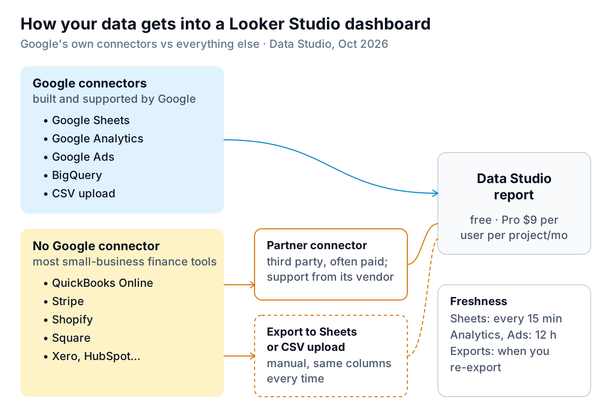
Google's list of its own connectors covers Google products (Sheets, Analytics, Ads, Search Console, YouTube and others), databases such as BigQuery, MySQL and PostgreSQL, and files: Excel, CSV upload and extracted data. QuickBooks, Stripe, Shopify, Square, Xero and HubSpot are not on it. You have two ways to bring them in.
Option 1: a partner connector
Third-party companies publish connectors in the Data Studio gallery. Google's requirements for partner connectors ask each publisher to provide its own terms, privacy policy and support link, and to declare whether it charges. In practice, many of the finance connectors are paid subscriptions, and when something breaks you contact the connector's vendor, not Google. Before you pick one, check three things: the monthly price, which fields it exposes (does it include invoice due dates, or only totals?), and how often it refreshes.
Option 2: export into Google Sheets or upload a CSV
Export a report from your tool each week or month and paste it into a Google Sheet that the dashboard reads. It's free and you control the columns. Google's Sheets connector guide asks for data in a simple table: one header row, and the same type of data in every cell of a column. A "Total" row at the bottom or a merged title cell above the headers will cause errors or double counting.
If you use the CSV upload connector instead, Google's CSV upload page sets limits of 100MB per dataset and 2GB per user, and new files are appended to the dataset, so each one needs exactly the same columns in the same order. Rename one column in your export and next month's upload fails.
Build a one-page dashboard an owner will read
A dashboard an owner opens every Monday has one page, one date control and no more than six charts. Here's a layout for an example shop, Larkfield Goods, using Data Studio's standard parts:
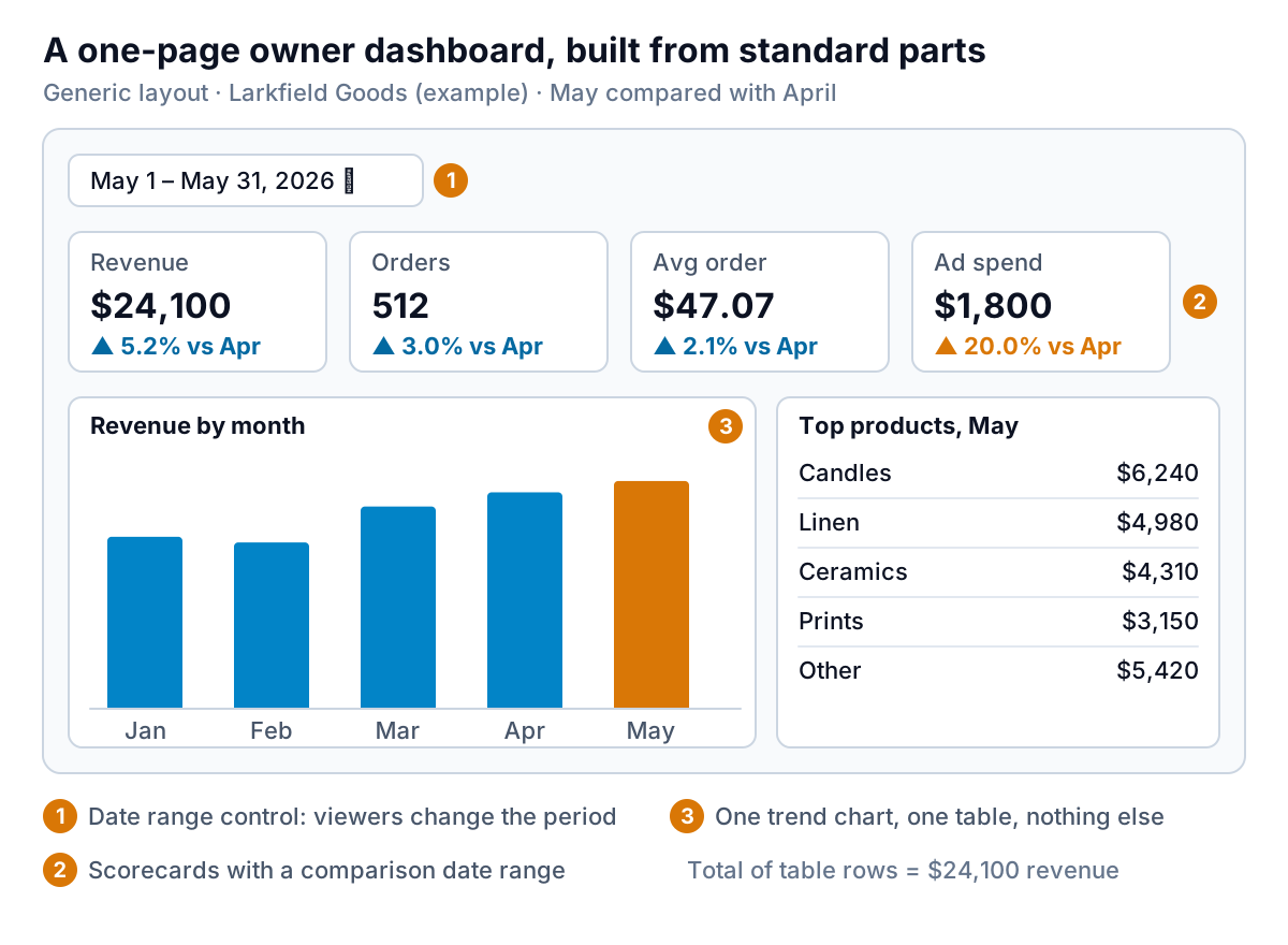
- Add a date range control. Google's date range guide explains that editors set the report's default range and viewers can change it with the control. Default to last month, not "last 28 days", so the numbers match your books.
- Add four scorecards with comparisons. Google's scorecard reference lets you compare against a previous period, another metric or a fixed target, and show progress toward a target as a bar. Use the previous period for trends and a target for anything you've budgeted. Larkfield's ad spend is up 20.0% while revenue is up 5.2%, which is the story of the month.
- Add one trend chart. Revenue by month for the year so far. If you add a second line, use the same unit.
- Add one table of whatever needs action: top products, largest overdue invoices, or lowest-margin jobs. Sort it by the column you'd act on.
- Write calculated fields carefully. Google's calculated fields guide notes that a formula can't mix unaggregated dimensions with aggregated metrics. Build average order value as
SUM(Revenue) / SUM(Orders), not as an average of each row's ratio, or a few small orders will skew it. - Check one number against the source. Before you share, compare the revenue scorecard with the same month in your sales tool. If they differ, find out why now, not after someone asks.
If you want ideas for which tiles to choose, our guide to choosing KPIs for a dashboard goes further.
Blending data without losing revenue
Blending is where a Looker Studio dashboard most often goes wrong without anyone noticing. It's how you put two sources in one chart, such as revenue from one sheet and ad spend from another. Google's blending documentation sets the rules: up to five data sources per blend, five join types (inner, left outer, right outer, full outer and cross), and join conditions that can only be equalities, such as Month = Month. The join type you pick decides which rows survive, and that's where totals go wrong.
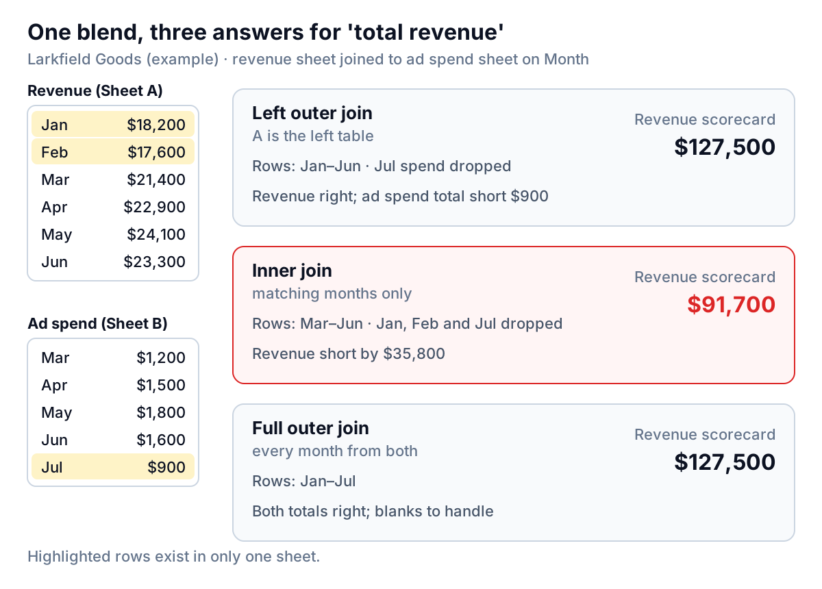
Larkfield's revenue sheet runs January to June. The ad spend sheet starts in March, when ads began, and already has July's spend. Joined on Month:
- Inner join keeps only months in both sheets. Revenue shows $91,700 instead of $127,500. Nothing warns you.
- Left outer join with revenue on the left keeps every revenue month. Revenue is right; July's $900 of ad spend disappears.
- Full outer join keeps every month from both. Both totals are right, and you handle the blanks.
The rule: put the table whose total matters most on the left, and use a full outer join whenever both totals matter. Then compare each blended total with the unblended source.
There's a second trap. Google explains that before joining, each table is grouped by the dimensions you've chosen, and if those dimensions don't include a unique identifier for each record, identical rows are collapsed. For example, two $40 orders for the same product on the same day can merge into one row if order number isn't among the dimensions. Google's fix is to add a unique ID, such as an order number, to each table's dimensions. If you count rows or average per order after a blend, do that.
Sharing, scheduling and the credentials setting
Sharing works like Google Docs: viewers or editors, specific people, your whole organisation or anyone with the link, per Google's sharing guide. The setting that deserves a second look is on the data source, not the report.
Google's data credentials page describes two main options. Owner's credentials let viewers see the data through the owner's access, so they don't need their own. Viewer's credentials require each viewer to have their own access to the underlying data. Google's own advice on owner's credentials is to be sure you trust the people you share with. With owner's credentials, everyone you share with sees whatever the data source exposes, through your access. So connect dashboards to a separate, stripped-down sheet that holds only what the dashboard needs, not the workbook with customer details or payroll in it.
For regular delivery, Google's scheduling guide says the free version emails the report as a PDF with a preview and a link. Without Pro, each report can have only one schedule, and the most frequent option is once a day. Pro adds more schedules, hourly sends and delivery to Google Chat and Slack. For a monthly owner's pack, the free schedule is plenty.
What a free dashboard really costs
| Cost | Amount | Who pays it |
|---|---|---|
| Data Studio | $0 | Everyone |
| Data Studio Pro (team workspaces, organisation-owned content, more scheduling, support) | $9 per user per project per month | Only editors who need Pro features |
| Partner connectors for QuickBooks, Stripe, Shopify and similar | Set by each vendor, often a monthly subscription | Anyone not using exports |
| Your time | Setup, then monthly exports and checks | You |
For many small businesses the last line is the biggest. A dashboard fed by four manual exports is a monthly job, and the numbers are only as good as the last paste.
When Looker Studio is the right tool, and when it isn't
Use Data Studio (Looker Studio) when most of your data is already in Google products or Sheets, you want a dashboard you'll lay out yourself, you're happy to maintain it, and the price matters. It's flexible, free, and for marketing data it connects without any extra tools.
It's a weaker fit when your important numbers live in QuickBooks, Stripe, Shopify or Square, when you want the dashboard to tell you why a number moved rather than just show it, or when nobody has time to maintain exports and blends.
That second case is what Parity is for. It connects QuickBooks Online, Stripe, Shopify, HubSpot, Square and Google Sheets directly, or takes a CSV or Excel export from anything else, and builds the dashboard for you: headline numbers with their trends, charts, what explains each change, and a table of what needs attention. Every number and chart is checked against queries on the full dataset before you see it, which covers the "does the blend match the source?" step above. You refine it by chat rather than by dragging charts, share a read-only link with an optional password or end date, and update it with a newer file. When you ask, it writes a client-ready monthly report from the same data. The trade-offs are real: Data Studio gives you full control over the layout and a free tier, while Parity builds one dashboard or report per request and decides the first layout itself. If you've outgrown spreadsheets, our comparison of no-code dashboard builders and what to put on a small business dashboard are good next reads.
Connect QuickBooks, Stripe, Shopify, Square or a spreadsheet, and Parity builds a checked dashboard with the changes explained. Build your dashboard free
Whichever tool you use, the test of a Looker Studio dashboard is the same as any other: one page, numbers that match the source, and a reason to open it every Monday.