Imagine you get ten minutes every Monday morning and one screen. No reports to open, no exports to run. What has to be on that screen for you to know the business is all right, or to spot early that it isn't?
That's the whole brief for a small business dashboard. Not a wall of charts for a board meeting, and not every number your software can produce. One screen, five numbers and a short list, read by the owner, once a week. This guide covers what goes in each slot, how the fifth slot changes with the kind of business you run, where each number comes from, and what to leave off.
What goes on a small business dashboard: five questions
Almost every owner, whatever they sell, is asking the same five questions on a Monday. Each one gets a tile, and each tile gets a comparison so you can tell good from bad at a glance.
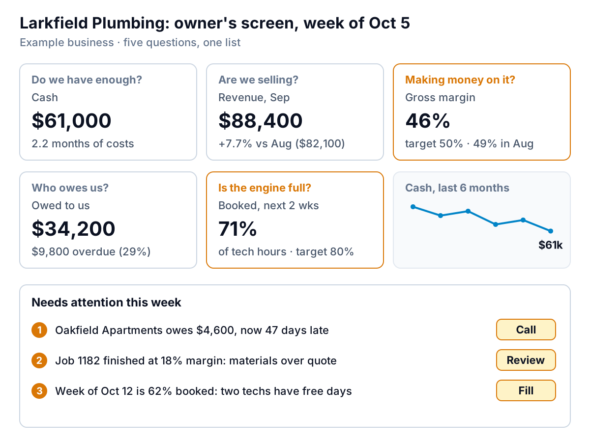
1. Do we have enough cash? Show it as time.
A bank balance on its own doesn't tell you much. $61,000 is comfortable for a two-person studio and alarming for a 15-person plumbing firm. Divide it by your average monthly costs and show months of cover: Larkfield Plumbing (an example) has $61,000 against about $27,700 a month, or 2.2 months.
Most owners know their bank balance and have no idea how many weeks it covers. A runway tile with a trend line beneath it tells you which way you're heading before the balance gets tight. If you want to see how your figure compares with other small businesses, the financial dashboard guide has the benchmark.
2. Are we selling? Compare like with like.
Revenue for the last complete period, against the same kind of period: last month, or the same month last year if you're seasonal. Larkfield's September was $88,400 against $82,100 in August, up 7.7%. Show the comparison figure, not just the percentage, so you can check the arithmetic.
3. Are we making money on it? Gross margin.
Sales can rise while profit falls, if discounts, materials or subcontractors eat the difference. Gross margin (sales minus the direct cost of those sales, as a percentage of sales) catches it. Larkfield's slipped from 49% to 46%, below its 50% target, so the tile is flagged. The attention list points to one job that finished at 18%.
4. Who owes us? Overdue, not just outstanding.
Total receivables of $34,200 is normal for a business that invoices. The number that matters is the overdue part, $9,800, or 29%. Late payment is common: in the 2026 QuickBooks Small Business Late Payments Report, 59% of US small businesses said some invoices were 30 or more days overdue. If yours sell on account, our guide to the accounts receivable aging report explains how to read the detail behind this tile.
5. Is the engine running? The one driver for your business.
The first four tiles are the same for nearly everyone. The fifth is the operating number that, for your kind of business, moves before revenue does. For Larkfield, it's how full the technicians' diaries are for the next two weeks: 71% against an 80% target. Empty diary slots today are missing revenue in a fortnight. The next section gives the fifth tile for other business types.
And a short list: what needs attention
Under the tiles, three to five named items, each with an action: the customer to call, the job to review, the week to fill. Numbers tell you something's wrong; the list tells you what to do on Monday. If an item doesn't have an action, it doesn't belong on the list.
The fifth tile, by type of business
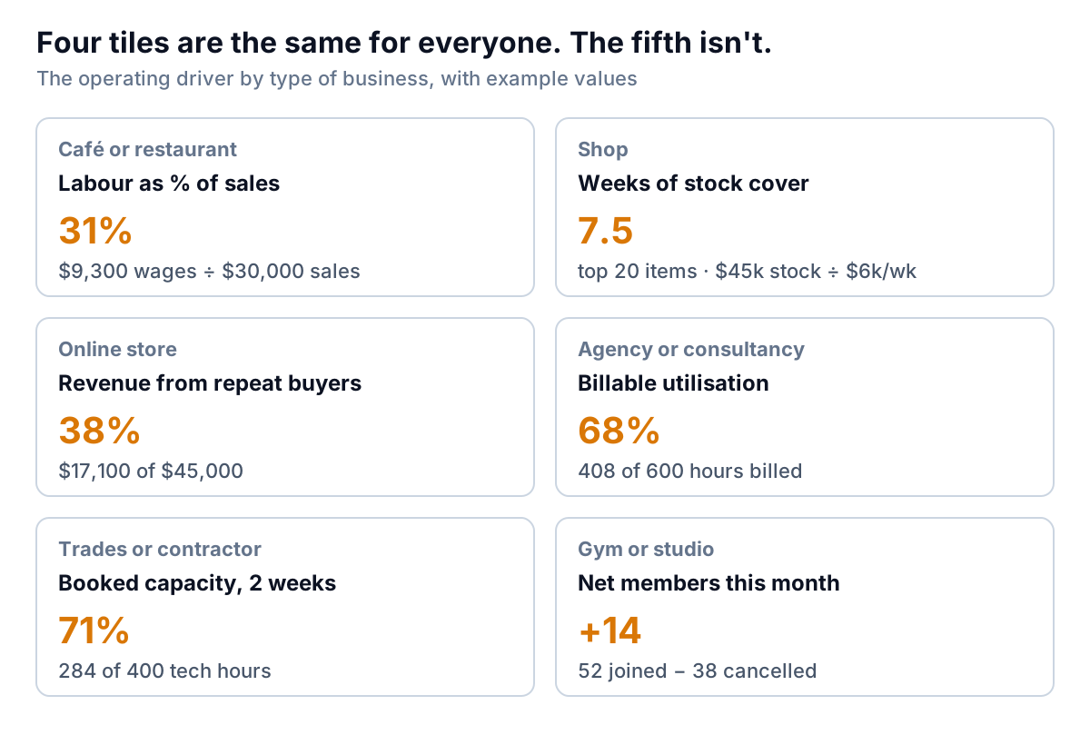
Pick the driver that's closest to the thing you'd change this week if it moved. The table gives the reasoning and where the data usually lives.
| Business | Fifth tile | Why it leads revenue | Where the data lives |
|---|---|---|---|
| Café or restaurant | Labour as % of sales, by week | Wages are the cost you can adjust fastest, through the rota | Payroll or scheduling tool, plus till sales |
| Shop | Weeks of stock cover on top sellers | Running out of best sellers loses sales; too much ties up cash | Point of sale stock report |
| Online store | Share of revenue from repeat buyers | Shows whether buyers come back, which a rise in new orders can hide | Shopify or your store's order export |
| Agency or consultancy | Billable utilisation | Unbilled hours are cost with no revenue against them | Timesheet tool |
| Trades or contractor | Booked capacity, next two weeks | An empty diary now is missing revenue in a fortnight | Job management tool or a shared sheet |
| Gym, studio or membership | Net members (joins minus cancellations) | Recurring revenue next month is set by this month's net change | Membership or booking system |
Set your own target for the fifth tile from your own history, not from an industry average you read somewhere. Your rent, prices and team set what "good" looks like. Three months of your own numbers is a better benchmark than any national figure.
Where each number comes from
Most owners' dashboards draw on three or four systems. That's fine, as long as every tile uses the same period and the same cut-off date. If revenue runs to September 30 and cash to October 5, the tiles will disagree and you'll spend Monday reconciling instead of deciding.
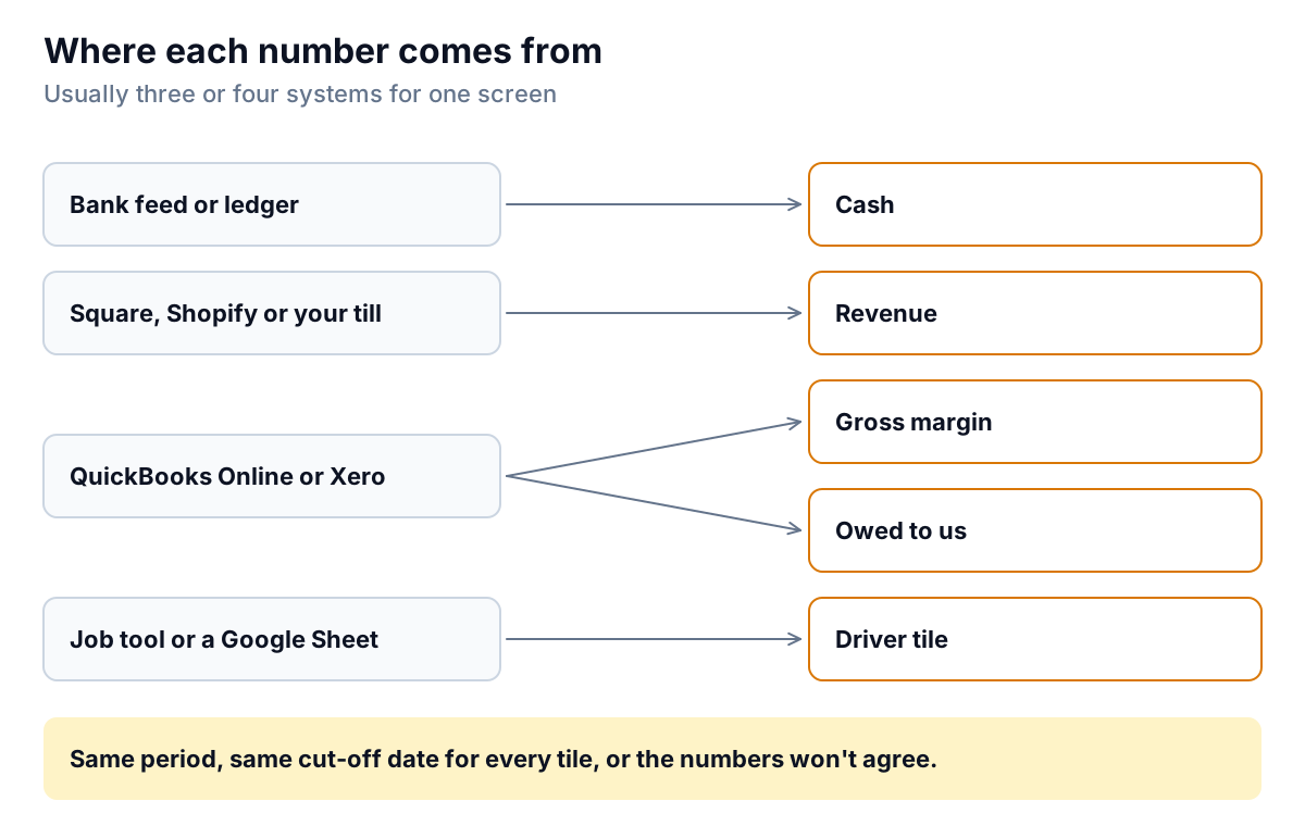
A few practical points:
- Cash and profit are different numbers. A profitable month can still drain cash if customers pay late or you bought stock. Keep cash and margin as separate tiles. The SBA's guide to managing your finances explains cash versus accrual bookkeeping, which decides when a sale shows up as revenue in your books. Ask your bookkeeper which method yours use.
- Take margin from the accounts, not the till. The till knows prices; the accounting system knows costs. If your cost of goods is only booked at month end, update the margin tile monthly, not weekly.
- The driver tile is often a spreadsheet. Booked hours or member counts may live in a tool with no export. A simple shared Google Sheet, updated each Friday, is good enough.
What to leave off
An owner's screen gets worse with every tile added. These are the usual suspects to move elsewhere or drop:
- Vanity numbers. Social followers, website visits and email list size feel like progress but rarely change a Monday decision. If marketing matters to you, give it its own screen and look at it monthly.
- Year-to-date totals with nothing beside them. "$712,000 YTD" can't be judged without last year's figure or a budget beside it. Either add the comparison or drop it.
- The full P&L. Twenty expense lines belong in the monthly report, not the weekly screen. The margin tile and cash runway catch most problems first.
- Numbers you can't act on this week. Annual customer satisfaction scores or market share might matter, but not on Monday.
- Anything nobody updates. A stale tile is worse than none, because it trains you to ignore the screen.
If you're also reporting to a partner, a lender or an investor, they'll want more than this, monthly and with commentary. That's a different document, usually a fuller financial dashboard plus a written monthly report. The owner's Monday screen should stay small.
The ten-minute Monday routine
A dashboard you don't look at is a hobby. Here's a routine that fits with a coffee:
- Minute 1: read the tiles left to right. Which ones are off target or moving the wrong way? Larkfield's: margin and booked capacity.
- Minutes 2–4: ask why for each flagged tile. Margin down: which jobs? Booked capacity low: which week, which people?
- Minutes 5–7: work the attention list. Give each item one owner and one action with a day: call Oakfield Apartments Tuesday, review job 1182 with the estimator Wednesday, offer a maintenance discount to fill the week of the 12th.
- Minutes 8–9: glance at the cash trend. Is runway shrinking three weeks running? If so, that's the first item next Monday, or the trigger for a proper cash forecast.
- Minute 10: write one sentence. "Margin slipping on materials; diary thin for the 12th." Over a quarter, those sentences become the story of the business.
Building it without losing your weekends
You can build this small business dashboard in Excel. Our step-by-step Excel dashboard guide sets up the Table, PivotTables and slicers, and our Excel dashboard examples include a cash runway tile and a receivables chart you can copy. For layout, colour and how to make the numbers believable, see our dashboard design rules. The catch with doing it by hand is the weekly update across four systems, which is where most owner dashboards quietly stop being updated.
Parity is built for this kind of screen. Connect QuickBooks Online, Square, Shopify, Stripe, HubSpot or Google Sheets, or upload a CSV or Excel export from anything else, and Parity builds a dashboard with your headline numbers and their trends, charts, what explains them, and a table of what needs attention. Every number and chart is checked against queries on the full dataset before you see it. You refine it by chat ("add months of cash cover", "flag margin under 50%"), and update it with newer data each week. When a partner or lender wants the monthly version, ask Parity to write a client-ready report from the same data.
Connect your accounting, sales or booking data and Parity builds a checked owner's dashboard you can refine by chat. Connect your data free
Whichever way you build your small business dashboard, keep the brief: five tiles, each with a comparison, one short list with actions, read every Monday. A small dashboard you actually read beats a big one you meant to.