Most homemade Excel dashboards break in their third month. The charts were fine. What broke was the plumbing: someone pasted September's sales under August's, a chart range stopped at row 9,000, and a headline number still pointed at a cell that now held something else. Nobody noticed until a partner asked why revenue hadn't changed in six weeks.
This guide builds an Excel dashboard that survives being updated. It uses four features that ship with every current version of Excel: Tables, PivotTables, slicers and PivotCharts. It walks through one example from raw export to finished screen, then gives you a short test for the day you should stop adding tabs and use something else.
The shape of an Excel dashboard that lasts
Before you open a blank workbook, fix the structure. Three sheets, and data only ever flows one way:
- Data: the raw rows, exactly as exported, in one Excel Table. You never type on this sheet except to paste or refresh.
- Calc: PivotTables that summarise the Table, one per question. Nobody looks at this sheet but you.
- Dashboard: the screen people read. Every number on it is a formula pointing at a PivotTable, and every chart is a PivotChart. Nothing is typed.
Our example is Fernhill Garden Supply, a made-up garden centre with a shop and a small online store. Its point-of-sale system exports one row per line sold: date, order ID, product, category, channel, quantity, revenue and cost. Six months of that is 14,820 rows.
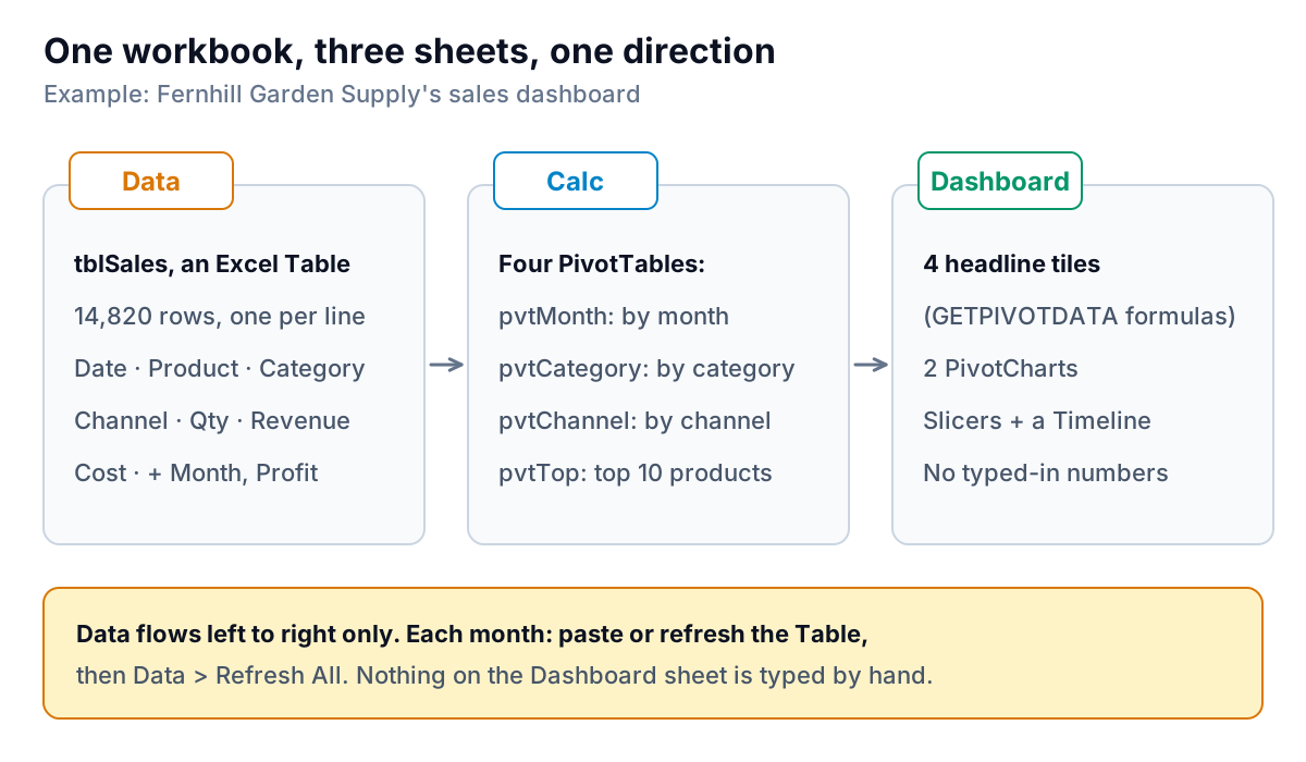
The one-way rule matters more than any chart choice. If a number on the dashboard is typed in, it goes stale. If a chart reads a hand-picked cell range, it misses new rows. If everything reads from PivotTables that read from one Table, a refresh updates the lot.
Step 1: Turn the export into a Table
Paste the export onto the Data sheet with headers in row 1, click any cell in it and press Ctrl+T. Microsoft's keyboard shortcut list gives Ctrl+T as the shortcut for the Create Table dialog; Home > Format as Table does the same thing. Tick "My table has headers" and click OK.
Then do three things most people skip:
- Name it. On the Table Design tab, change the name from Table1 to
tblSales. Formulas like=SUM(tblSales[Revenue])read like English and never point at the wrong rows. Microsoft calls these structured references. - Add helper columns inside the Table. Type a header in the first empty column and a formula below it; the Table fills it down. Fernhill adds
Monthwith=TEXT([@Date],"yyyy-mm")andProfitwith=[@Revenue]-[@Cost]. A text month like "2026-09" sorts correctly and is easy to look up later. - Check the types. Dates must be real dates and amounts real numbers. If a column is left-aligned, Excel is probably treating it as text, and it will sum to zero.
Step 2: One PivotTable per question
Write down the four or five questions the dashboard must answer, in plain words. Fernhill's are: How did this month compare with last month? Which categories made the money? Is online growing? What are the best sellers?
Each question gets its own PivotTable on the Calc sheet. Click inside tblSales, choose Insert > PivotTable, and put it on the Calc sheet. Because the source is a Table, Microsoft notes that rows added to the Table are included when you refresh, so you never edit a source range again.
| PivotTable name | Rows | Values | Answers |
|---|---|---|---|
| pvtMonth | Month | Sum of Revenue, Sum of Profit, Distinct Count of Order ID | This month vs last; the trend |
| pvtCategory | Category | Sum of Revenue | Where the money came from |
| pvtChannel | Month, Channel | Sum of Revenue | Is online growing? |
| pvtTop | Product (Top 10 filter) | Sum of Revenue, Sum of Qty | Best sellers |
Name each one on the PivotTable Analyze tab. Names make the next step readable.
One snag: an export with one row per line item has several rows per order, so a plain Count of Order ID overstates orders. Tick Add this data to the Data Model when you create pvtMonth, then set the value to Distinct Count. Microsoft's page on summary functions notes that Distinct Count only works with the Data Model.
Step 3: Headline numbers that point at pivots
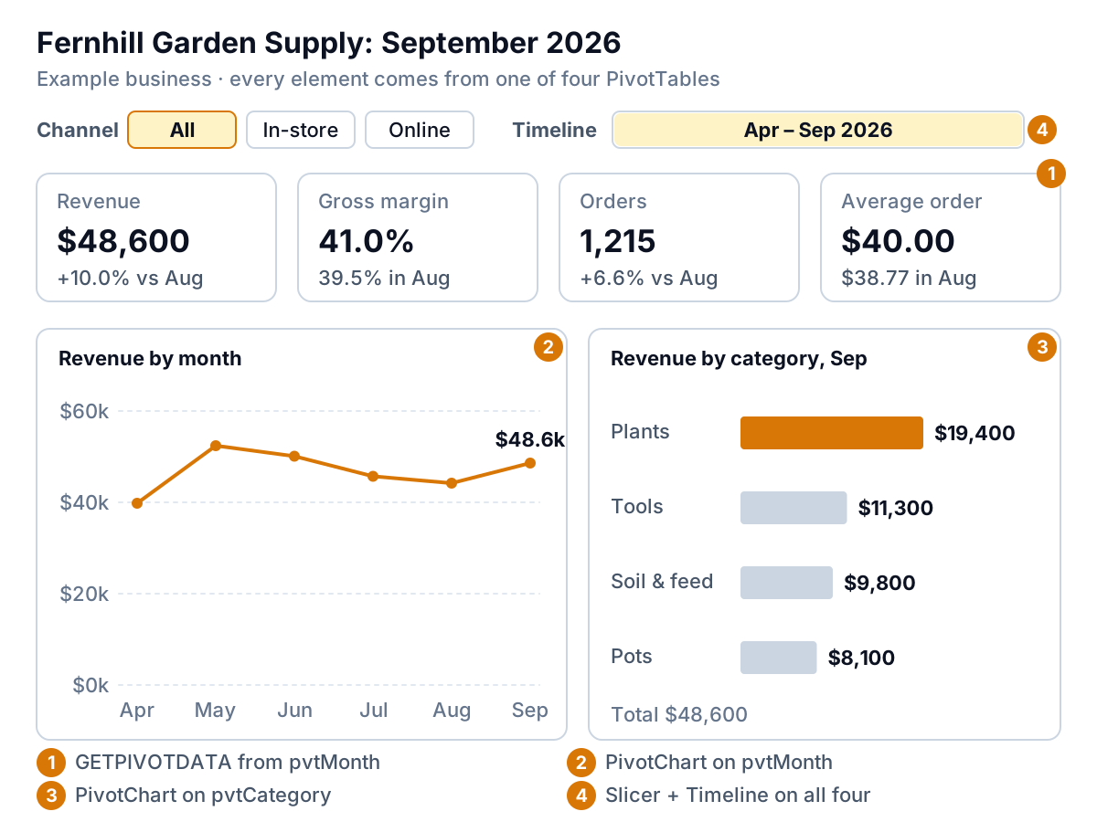
The top row of the dashboard is four tiles: Revenue, Gross margin, Orders and Average order, each with last month beside it. Don't link to a cell like =Calc!B9. When a new month arrives, the PivotTable grows and B9 holds a different month.
Use GETPIVOTDATA instead. It asks the PivotTable for a value by name, wherever it sits. The easy way to write one is to type = on the Dashboard sheet and click the value inside the pivot; Excel writes the formula for you. Then replace the hard-coded month with a cell reference so it moves on by itself:
- Latest month, in a cell named
ThisMonth:=TEXT(MAX(tblSales[Date]),"yyyy-mm") - Month before, named
LastMonth:=TEXT(EDATE(MAX(tblSales[Date]),-1),"yyyy-mm") - Revenue tile:
=GETPIVOTDATA("Revenue",pvtMonthAnchor,"Month",ThisMonth), wherepvtMonthAnchoris a name for the pivot's top-left cell (or click the cell, as above). For a pivot built on the Data Model, use the version Excel writes for you; the syntax differs. - Change:
=Revenue_this/Revenue_last-1, formatted as a percentage.
For Fernhill's September, that gives revenue of $48,600 against $44,200 in August, up 10.0%. Gross margin is profit divided by revenue: 41.0% against 39.5%. Orders are 1,215 against 1,140, and the average order is $48,600 ÷ 1,215 = $40.00 against $38.77.
#REF! when the item you ask for isn't visible in the pivot. If a slicer or Timeline hides August, the "last month" tile breaks. Either keep pvtMonth out of the slicer connections (Step 5), or wrap the tile in IFERROR(…,"–") so it shows a dash instead of an error.Step 4: Charts that update themselves
Click inside a PivotTable and choose Insert > PivotChart. Microsoft's PivotChart guide covers the dialog. Cut the chart and paste it on the Dashboard sheet; it stays linked to its pivot. Fernhill needs two:
- Revenue by month from pvtMonth, as a line. A line is for change over time.
- Revenue by category from pvtCategory, as a horizontal bar, sorted largest first. Bars are for comparing sizes.
Then strip each chart down. Delete the legend if there is only one series, delete the gridlines you don't need, and right-click the field buttons to hide them (Hide All Field Buttons on Chart). Put the takeaway in the chart title: "Plants made 40% of September" tells a reader more than "Sum of Revenue by Category". If you want a tiny trend beside each tile, sparklines (Insert > Sparklines > Line) fit a chart into one cell.
For which chart to use when, and how to use colour without making a mess, see our dashboard design rules. The short version: bars and lines for almost everything, one accent colour, no 3-D and no gauges.
Step 5: Slicers, a lock, and the monthly update
Slicers are the buttons that make an Excel dashboard feel interactive. Click inside pvtChannel, choose Insert > Slicer, and tick Channel. To make one slicer filter several pivots at once, select it and use Report Connections. Microsoft's slicer guide notes this only works for PivotTables built on the same data source, which is another reason to keep everything on one Table.
A Timeline is a slicer for dates: PivotTable Analyze > Insert Timeline, pick the Date field, and the reader can drag across months or quarters. Connect it the same way.
Three finishing touches:
- Refresh on open. In PivotTable Options, on the Data tab, tick Refresh data when opening the file. Now nobody reads stale numbers because you forgot to click Refresh.
- Add a check cell. On the Calc sheet, compare the Table with the pivot:
=SUM(tblSales[Revenue])-GETPIVOTDATA("Revenue",pvtMonthAnchor). (If pvtMonth uses the Data Model, swap in the formula Excel writes when you click its grand total.) With the slicers cleared it should be 0. If it isn't, a refresh was missed or rows sit outside the Table. - Protect the Dashboard sheet with Review > Protect Sheet, and tick "Use PivotTable reports" in the list of allowed actions. Slicers and Timelines are locked objects by default, so untick Locked in each one's Size and Properties settings first, or they stop responding. Microsoft is clear that worksheet protection is not a security feature. It stops accidents, not people.
The monthly update, start to finish
With that plumbing in place, the update is short enough to do the same morning each month:
- Paste the new rows directly under the last row of
tblSales(the Table grows), or save the new export over the old file if you used Power Query. - Data > Refresh All.
- Check the check cell says 0, and the row count looks right.
- Read the tiles. The month cells moved forward by themselves.
- Look at the charts and rewrite the two titles so they say what happened this month.
- Save a copy with the month in the file name before you send it, so last month's version still exists.
Fernhill's owner does this in about 15 minutes. If yours takes much longer, something is still typed by hand. Find it and replace it with a formula. For eight layouts built on the same plumbing, from a café's weekly sales to a contractor's job margins, see our Excel dashboard examples.
When to stop building your Excel dashboard
Excel is a fine dashboard tool for one person, one or two data sources and a monthly rhythm. It strains when any of those change. Score your workbook against these five signals:
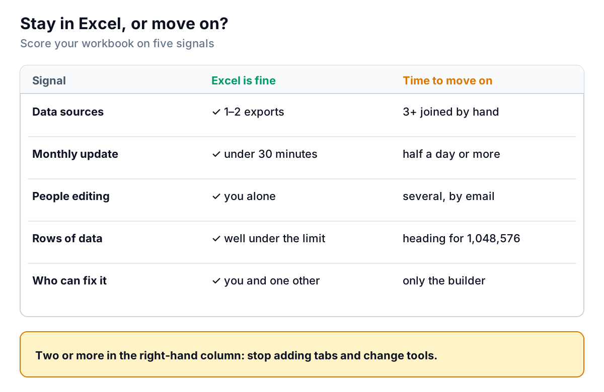
- Data sources. Joining a sales export, a QuickBooks export and a spreadsheet of targets by hand every month is where most errors creep in.
- Update time. If the refresh routine has grown to half a day, the dashboard is now a part-time job.
- Editors. Copies emailed back and forth ("dashboard_v3_FINAL_jm.xlsx") mean nobody knows which numbers are current.
- Size. A worksheet holds at most 1,048,576 rows. Long before that, refreshes get slow. Power Query and the Data Model can hold more, but by then you are running a small database inside a spreadsheet.
- Who can fix it. If only the person who built it understands the named ranges, the dashboard leaves when they do.
Moving on doesn't have to mean a big business-intelligence project. For most small businesses the job is the same as the one you just built by hand: read the data, summarise it, show the headline numbers, trends and exceptions, and keep it current. We compared the options in our guide to no-code dashboard builders, and if your source is already a spreadsheet, our post on AI tools for Excel reports goes further.
Parity is one of those options. You upload the same Excel or CSV export you would paste into tblSales, or connect QuickBooks Online, Shopify, Square, Stripe, HubSpot or Google Sheets directly. Parity builds the dashboard: headline numbers with their trends, charts, what explains them, and a table of what needs attention. Every number and chart is checked against queries on the full dataset before you see it, which is the job your check cell was doing. You refine it by chat, share a read-only link, or export it to Excel if someone still wants the workbook. Next month you update it with the newer file instead of re-pasting rows.
Upload the export you'd build your Excel dashboard from, and get a checked dashboard you can refine, share and update. Upload your Excel file free
Whichever way you go, the five steps above are worth doing once by hand. Building the Table, the pivots and the check cell yourself teaches you what your numbers are made of. That makes you a much sharper reader of any dashboard, including one you didn't build.