Search for Excel dashboard examples and you mostly find screens that look like a cockpit: twelve charts, three gauges, a map, a donut and a dark background. They look impressive in a thumbnail. Try to answer one real question with them, such as "Can I afford to hire in January?", and you're squinting at a gauge.
The eight examples below are the opposite. Each is small, does one job for one kind of small business, and gets one design decision right that's worth copying. They're sketched from made-up businesses so the numbers are easy to follow. Every one can be built in plain Excel with features you already have, and for each we name those features and the formula that does the work.
If you've never built one, start with our step-by-step Excel dashboard guide, which sets up the Table, PivotTables and slicers these examples assume. This page is the catalogue. That one is the workshop.
How to read each example
A dashboard is only as good as the question it answers. So each example below has the same four parts:
- The job: the business and the decision the screen supports.
- What it gets right: the one choice that makes it useful, which is usually something left out rather than added.
- How to build it in Excel: the features and formulas, with links to Microsoft's own instructions.
- What to steal: the idea you can apply to a different dashboard.
Sales and cash: examples 1 and 2
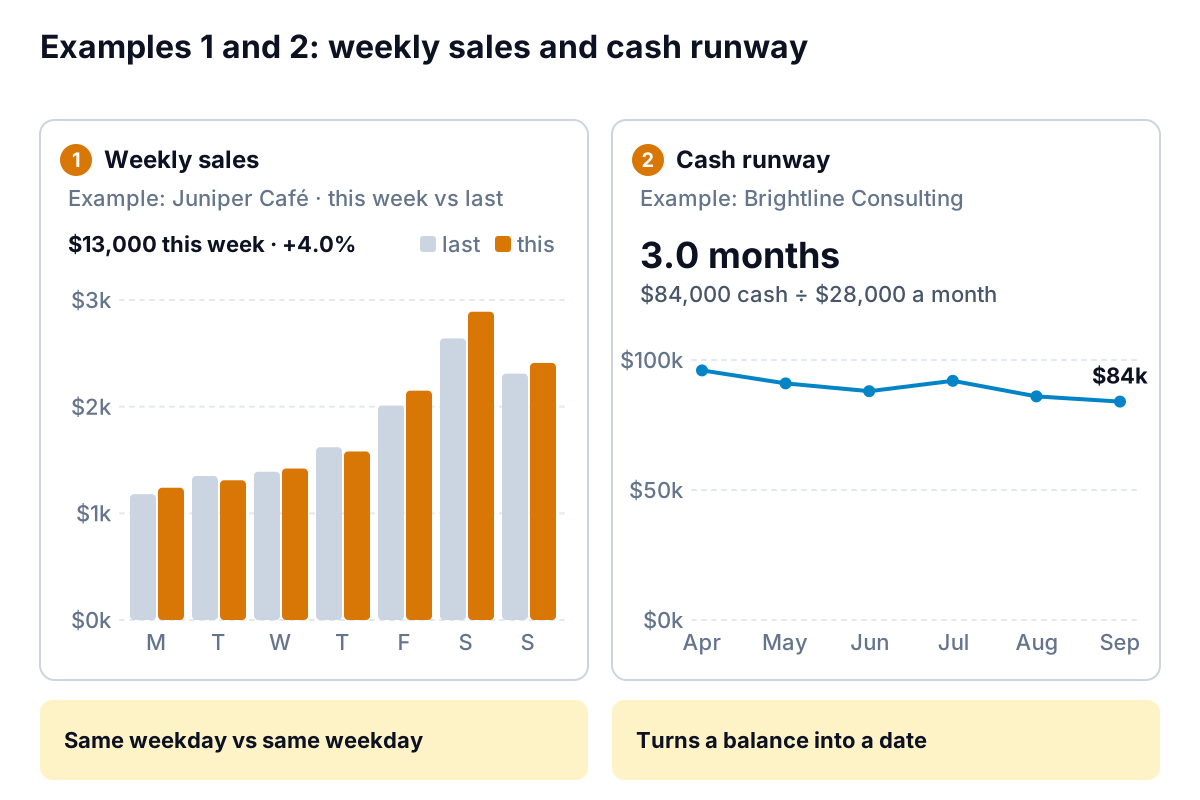
1. A café's weekly sales
The job. Juniper Café (an example) wants to know each Monday whether last week was good, and which days drove it. Sales were $13,000 against $12,500 the week before, up 4.0%.
What it gets right. It compares each day with the same day last week, not with the day before. Saturday at $2,890 isn't "up" on Friday's $2,150 in any useful sense; Saturdays are always bigger. Against last Saturday's $2,640, it's up 9.5%, and that's the comparison that tells the owner something.
How to build it. Add a Weekday column to the sales Table with =TEXT([@Date],"ddd") and a Week column with =ISOWEEKNUM([@Date]) (ISOWEEKNUM numbers weeks Monday to Sunday). In a PivotTable, put Weekday in rows and Week in columns, filter to the last two weeks, and insert a clustered column chart. Grey for last week, one colour for this week.
What to steal. Choose the comparison before the chart. Same weekday last week, same month last year, or the same period's budget: pick the one that removes the pattern you already know about.
2. A consultancy's cash runway
The job. Brightline Consulting (an example) bills in arrears and has lumpy receipts. The partners want to know how long the cash would last if receipts slowed.
What it gets right. The headline isn't the balance; it's 3.0 months. $84,000 means little on its own. Divided by $28,000 of average monthly costs, it becomes a length of time the partners can plan around. The line underneath shows the direction: down from $96,000 in April.
How to build it. Paste the monthly bank balance and monthly costs into a small Table. Runway is =LatestCash/AVERAGE(last three months of costs). Use three months rather than one so a single heavy month doesn't swing it. A plain line chart does the rest; Microsoft's guide to line charts covers the options.
What to steal. Divide a stock by a flow. Cash ÷ monthly costs, stock on hand ÷ weekly sales (example 6), pipeline ÷ monthly target: each turns a number nobody can judge into one anybody can.
Money owed and money spent: examples 3 and 4
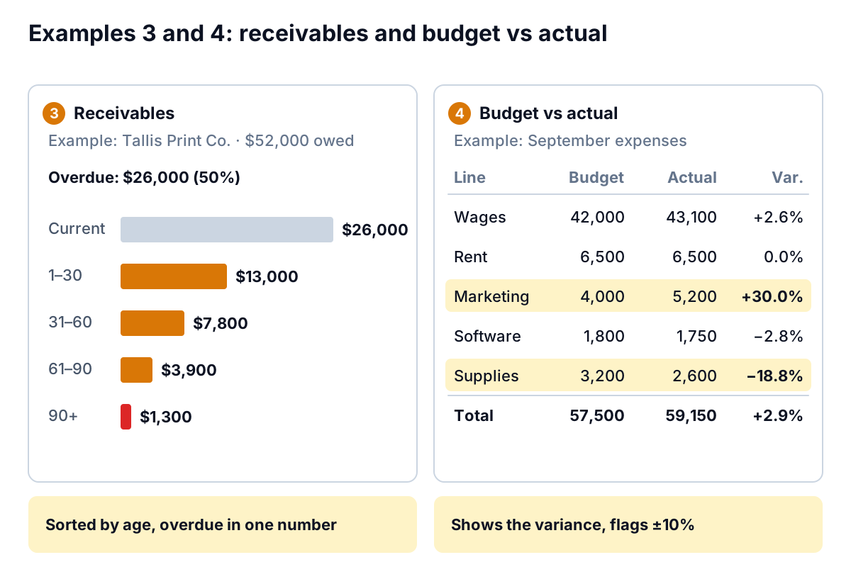
3. A print shop's receivables
The job. Tallis Print Co. (an example) is owed $52,000 and wants to know how much of it is a problem.
What it gets right. The answer sits in one sentence above the bars: overdue is $26,000, or 50%. The bars are in age order, not size order, because age is the point, and only the 90+ bar ($1,300) gets the warning colour.
How to build it. Export open invoices with due dates. Add DaysLate with =MAX(0,TODAY()-[@DueDate]) and a Bucket column with =IFS([@DaysLate]=0,"Current",[@DaysLate]<=30,"1–30",[@DaysLate]<=60,"31–60",[@DaysLate]<=90,"61–90",TRUE,"90+"). IFS needs Excel 2019 or later; in older versions, nest IF functions instead. Pivot Bucket against Sum of Amount and chart it as horizontal bars. Our guide to the accounts receivable aging report explains what each bucket should trigger.
What to steal. Write the conclusion as text above the chart. A reader who only reads one line still gets the answer.
4. Budget vs actual for expenses
The job. A small firm (an example) checks September's spending against budget: $59,150 against $57,500, 2.9% over.
What it gets right. It shows the variance as a percentage beside the two amounts, and highlights only the lines beyond a set threshold of ±10%. Marketing is 30.0% over ($5,200 against $4,000) and Supplies 18.8% under. Wages are $1,100 over, the largest dollar overrun, but only 2.6%, which is noise on a $42,000 line. Without the threshold, every line would look equally urgent.
How to build it. A Table with Budget and Actual columns and =[@Actual]/[@Budget]-1 for the variance. Then Home > Conditional Formatting > New Rule, using a formula such as =ABS($D2)>0.1 to shade the row. Microsoft's guide to conditional formatting covers formula rules. Most people set the threshold at a percentage and a dollar floor, so tiny lines don't trip it.
What to steal. Decide the threshold before you look. A rule like "flag anything over 10% and $500" stops you reacting to every wobble.
Jobs and stock: examples 5 and 6
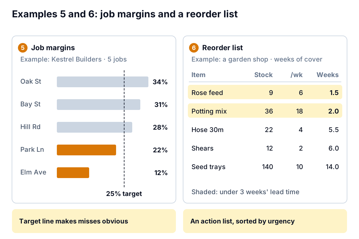
5. A contractor's job margins
The job. Kestrel Builders (an example) has five jobs finishing this quarter and a 25% gross margin target.
What it gets right. The target is drawn on the chart as a dashed line, and only the bars below it are coloured. Park Ln (22%) and Elm Ave (12%) jump out; nobody has to compare five numbers with a target held in their head. The bars are sorted, so the order itself says something.
How to build it. One row per job with revenue and cost to date, and margin as =1-[@Cost]/[@Revenue]. Excel can't colour bars by rule directly, so use two series: =IF([@Margin]>=0.25,[@Margin],NA()) and the reverse, plotted as a stacked bar so each job shows only one. Add the target as a third series drawn as a line, or simply draw it and label it.
What to steal. Put the standard on the chart. Targets, budgets, last year and break-even are all lines a reader should never have to remember.
6. A shop's reorder list
The job. A garden shop (an example) needs to know what to order this week, with suppliers taking about three weeks to deliver.
What it gets right. It isn't a chart at all. It's five rows sorted by weeks of cover, smallest first, with the two below the lead time shaded: rose feed at 1.5 weeks (9 in stock, selling 6 a week) and potting mix at 2.0 weeks. The top of the list is the order sheet.
How to build it. Weeks of cover is =[@Stock]/[@WeeklySales], where weekly sales is an average of the last four weeks from your sales pivot. Sort the Table on that column, and shade rows with a conditional formatting rule like =$D2<3.
What to steal. When the reader's next step is an action on specific items, show a sorted list. Charts are for patterns; lists are for to-dos.
Marketing and profit: examples 7 and 8
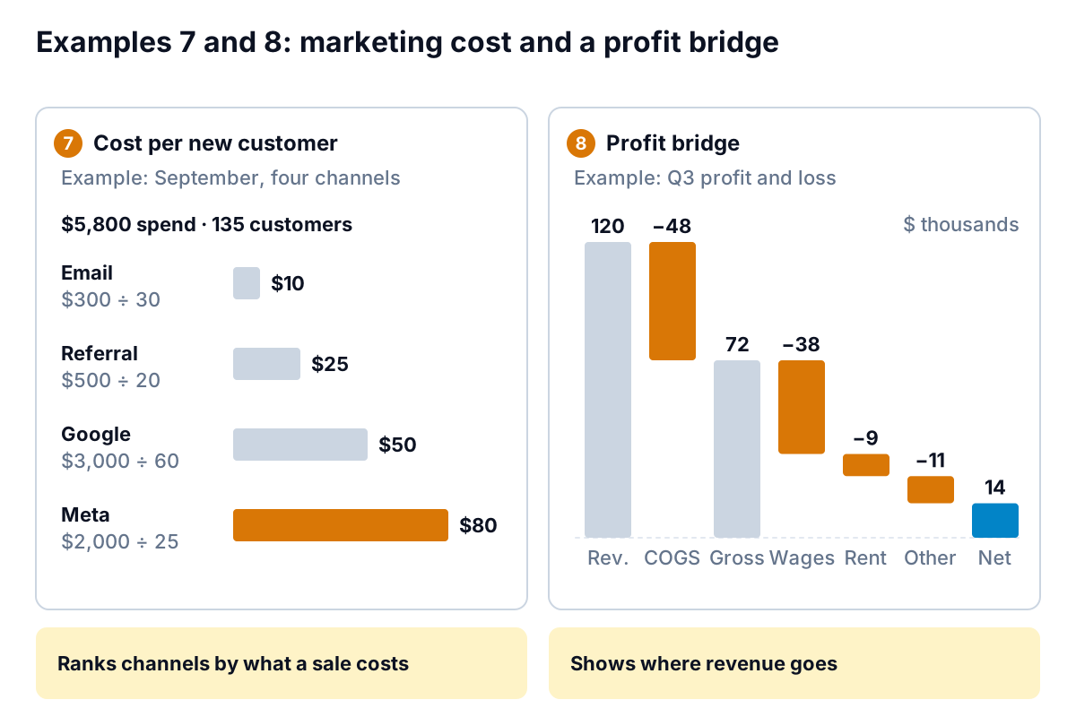
7. Cost per new customer by channel
The job. A small online business (an example) spent $5,800 on four channels in September and gained 135 new customers. Where should next month's money go?
What it gets right. It charts cost per new customer, not spend or clicks, and prints the sum under each name ($2,000 ÷ 25 = $80 for Meta). Meta looks expensive at $80; email at $10 looks cheap but is capped by the size of the list. Showing the sum lets the reader judge the inputs too.
How to build it. A four-row Table: channel, spend, new customers, and =[@Spend]/[@NewCustomers]. Sort by cost and use a bar chart. Be honest in a note about how customers were assigned to channels; first-click, last-click and "how did you hear about us?" can each give different answers.
What to steal. Show the arithmetic beside the result. When a reader can see "$2,000 ÷ 25", they trust the $80 and can argue with the 25.
8. A profit bridge
The job. An owner (an example) wants to see how $120,000 of quarterly revenue became $14,000 of profit.
What it gets right. Each step is one bar, in the order money actually leaves: cost of goods ($48k) to gross profit ($72k), then wages ($38k), rent ($9k) and other costs ($11k) to net profit ($14k). The eye follows the staircase down and the biggest step is obvious.
How to build it. Excel 2016 and later include a waterfall chart. Select a two-column list of labels and amounts (costs as negatives), then Insert > Insert Waterfall > Waterfall. Microsoft's waterfall chart guide explains the rest: right-click the Gross profit and Net profit bars and choose Set as Total so they start from zero.
What to steal. Lay out the steps in order and check they add up: 120 − 48 = 72, and 72 − 38 − 9 − 11 = 14. A bridge that doesn't reconcile is worse than none.
What the best examples have in common
Put these eight Excel dashboard examples side by side and the same habits repeat. Use them as a checklist on any dashboard, including the template you downloaded last year.
- One question per screen. Each answers something a person decides on: order stock, chase an invoice, move ad money.
- A comparison on every number. Last week, target, budget, lead time. A number with nothing beside it can't be judged.
- The conclusion in words. "Overdue: $26,000 (50%)" above the chart, not left for the reader to work out.
- Colour only for exceptions. Grey for normal; one accent for what needs attention. Our dashboard design rules explain why.
- Sorted, not alphabetical. By size, age or urgency, so the order itself carries meaning.
- Numbers that reconcile. Categories add up to the total; steps add up to the profit. Check them every time.
None of them uses a gauge, a 3-D chart or a pie with nine slices. That isn't taste. Nielsen Norman Group's research summary on dashboards and preattentive processing explains that people judge length and position on a common scale quickly and accurately, and angle and area much less well. Bars and lines use the first two.
Which of these Excel dashboard examples to build first
Don't build all eight. Pick by what keeps you up at night:
| If your worry is… | Build first | Data you need |
|---|---|---|
| Making payroll | 2. Cash runway | Monthly bank balances and costs |
| Customers paying late | 3. Receivables | Open invoice list with due dates |
| Spending creeping up | 4. Budget vs actual | A budget and your expense report |
| Busy but not profitable | 5. Job margins or 8. Profit bridge | Revenue and costs by job, or your P&L |
| Running out of stock | 6. Reorder list | Stock on hand and recent sales by item |
| Ad money disappearing | 7. Cost per new customer | Spend by channel and new-customer source |
| Not knowing if a week was good | 1. Weekly sales | Daily sales export from your till |
Once you have two or three, combine the headline from each onto one screen. That's the owner's view we describe in the one-screen small business dashboard.
If building them by hand isn't how you want to spend a Sunday, Parity can produce the same kind of screen from the same data. Upload your Excel or CSV export, or connect QuickBooks Online, Shopify, Square, Stripe, HubSpot or Google Sheets, and describe the job ("weekly sales against last week" or "budget vs actual, flag anything over 10%"). Parity builds one dashboard per request, with headline numbers and trends, charts, what explains them, and a table of what needs attention. Every number and chart is checked against queries on the full dataset before you see it. You can export it to Excel or PDF, or share a read-only link.
Upload a CSV or Excel file and describe the dashboard you need; Parity builds it and checks every number. Build a dashboard from your file free
Whichever tool you use, judge the result the way you judged these eight Excel dashboard examples: one question, a comparison on every number, the answer in words, and colour only where something needs you.