Put a dashboard on the screen in a meeting and count the seconds until someone asks, "Is that good?" If it's under ten, the dashboard has a design problem. The numbers may be right. The screen just hasn't told anyone what they mean.
Good dashboard design for a business isn't about making charts pretty. It's about three jobs: show the answer first, compare every number with something, and make the numbers believable enough that people act on them. This guide gives you rules for each, with a quick test for every rule so you can check your own screen today. They apply whether you build in Excel, Google Sheets, Looker Studio or anything else.
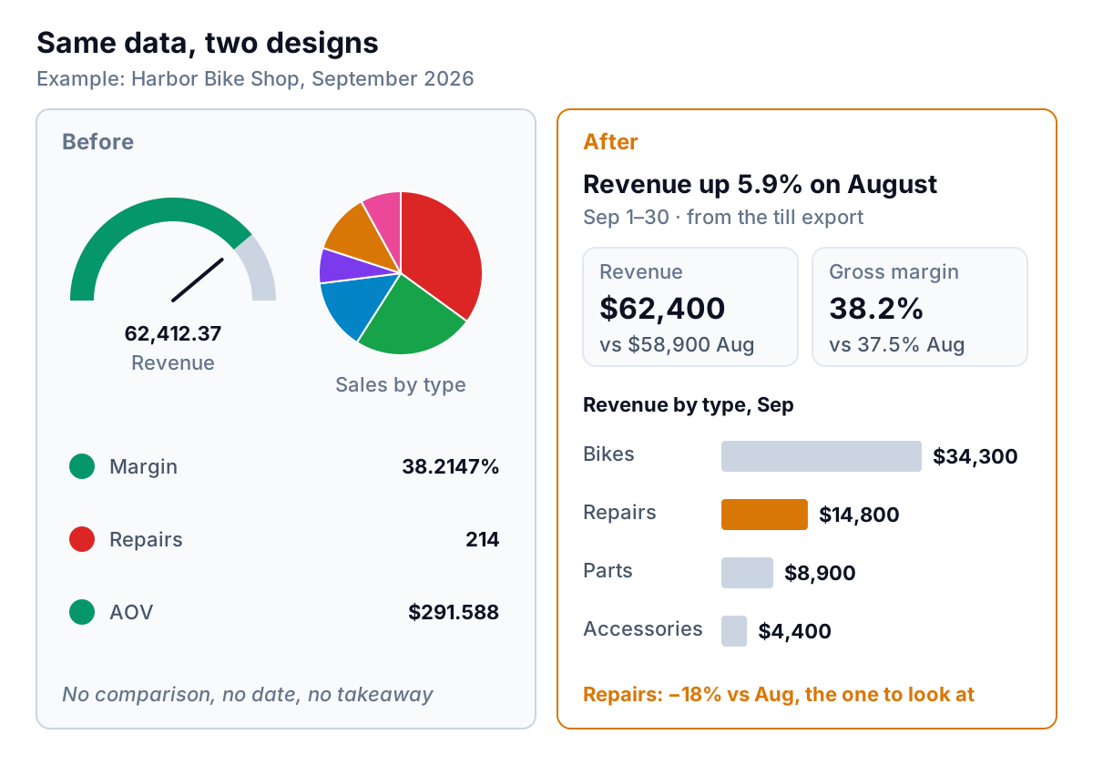
Here's what the rules do to one example: a bike shop's monthly dashboard, before and after.
Dashboard design starts with the decision
Most bad dashboards start with the data: "We have the sales export, let's chart it." Good ones start with the person and the decision. Write one sentence before you draw anything:
Every Monday, [who] uses this to decide [what].
"Every Monday, the owner uses this to decide whether to change staff hours this week." "On the 5th of each month, the partners use this to decide whether to hire." If you can't finish the sentence, you don't need a dashboard yet; you need a conversation about what you're trying to manage.
The sentence then does your editing for you. Anything that doesn't help that person make that decision moves to a second page or goes. Stephen Few's well-known paper on common pitfalls in dashboard design lists "exceeding the boundaries of a single screen" first among thirteen. If the decision needs more than one screen, it's probably two decisions.
Test: Show the screen to the person in the sentence for five seconds, then hide it. Ask what they'd do. If they say "I'd need to look again," the answer isn't on top.
Layout: put the answer where the eye lands
People read a screen roughly the way they read a page: top left first, then across, then down. Use that order for importance.
- Top: a headline in words. "Revenue up 5.9% on August" is a sentence anyone can repeat in a meeting. A title like "Sales Dashboard" tells them nothing they didn't already know.
- Then: three to five headline numbers. Each with a comparison (more on that below). More than five and none of them is a headline.
- Then: the charts that explain the numbers. If revenue is up, the chart beneath shows where from. Put each chart near the number it explains.
- Bottom: the detail and the to-do list. A sorted table of exceptions: the overdue invoices, the jobs below margin, the products about to run out.
Three smaller layout rules save a lot of squinting:
- Align to a grid. Tiles the same height, charts the same width, edges lined up. Ragged layouts look like errors even when they aren't.
- Use the same scale for things people will compare. Two bar charts side by side with different axes invite a wrong comparison.
- Leave white space. Space between groups does the work borders and boxes usually do, with less noise.
Test: Squint at the screen until you can't read the text. The most important thing should still be the biggest, darkest shape near the top left.
Chart choice: let the question pick the chart
Almost every chart on a small business dashboard answers one of six questions, and each question has a chart that suits it.
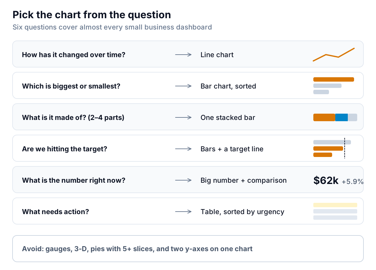
The reason bars and lines dominate isn't fashion. Nielsen Norman Group's guide to dashboards and preattentive processing ranks how quickly and accurately people read different visual encodings. Position and length come out on top; angle and area come out poorly. A bar is length. A line is position. A pie slice is angle and area. A gauge is an angle that eats a large share of the screen to show one number.
A few specific rules follow:
- Sort bars by value, largest first, unless the categories have a natural order (months, age buckets, sizes). Alphabetical order is almost never the useful one.
- Start bar axes at zero. A bar's length is the message; a cut-off axis makes a 3% difference look like 30%. Line charts can start elsewhere, as long as the axis is labelled.
- Avoid two y-axes on one chart. Readers compare the lines as if they shared a scale, and the crossing points mean nothing. Use two charts stacked with the same x-axis instead.
- Use a table when the reader needs to act on specific items. A list of six invoices to chase is a table, not a chart.
- No 3-D, ever. It distorts the very lengths and angles the reader is trying to judge.
If you're building in Excel, our Excel dashboard examples show each of these chart types doing a real job, from a weekly sales comparison to a profit bridge.
Test: For each chart, say the question it answers out loud. If two charts answer the same question, delete one.
Colour: grey by default, one accent for attention
Colour is the strongest signal on a screen, so it's the easiest to waste. When every bar has its own colour, the reader's eye jumps around looking for a meaning that isn't there.
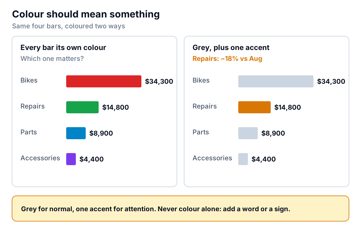
A simple system that works on nearly any dashboard:
- Grey for normal. Most bars, lines and numbers are context.
- One accent colour for "look here". The bar that dropped, the job below target, the current period on a trend line.
- Red only for real danger, such as overdue or below a hard limit. If red appears every week, people stop seeing it.
- Same colour, same meaning, everywhere. If amber means "below target" on one chart, it can't mean "online sales" on the next.
Two accessibility points matter for a business dashboard. First, don't rely on colour alone. The National Eye Institute puts colour vision deficiency at about 1 in 12 men, far more than women, and the most common type makes red and green hard to tell apart, which is exactly the traffic-light pair most dashboards lean on. Add a word, an arrow or a sign: "−18%" rather than a red dot. WCAG's guidance on use of colour makes the same point for the web. Second, keep text readable: WCAG asks for a contrast ratio of at least 4.5:1 for normal text. Pale grey labels on white often fail it.
Test: Print the dashboard in black and white, or turn on your screen's greyscale mode. Can you still tell what needs attention? If not, colour was doing a job that words should do.
Numbers people trust
A dashboard can be well laid out and well coloured and still be ignored, because nobody believes it. Usually that's because someone once found a number that didn't match the accounts, and the dashboard never recovered. Trust is a design problem too. Every headline number should carry five things:
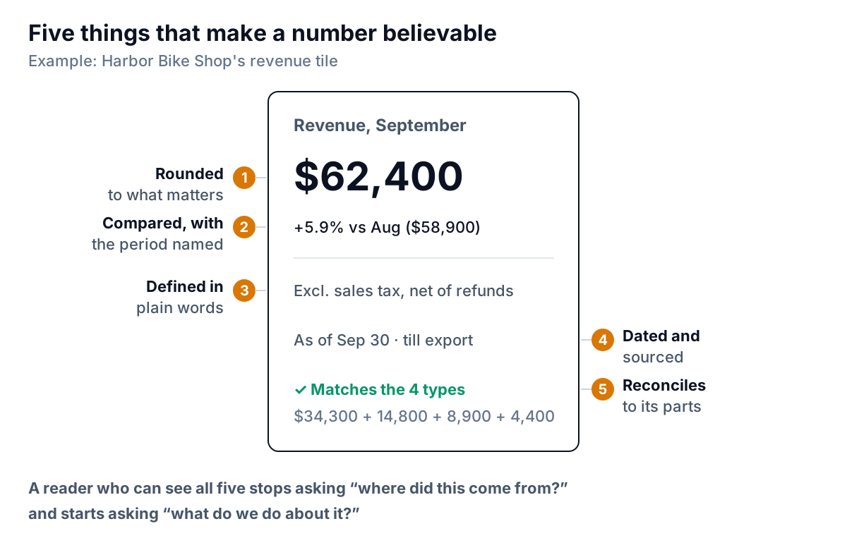
- Rounded to what matters. $62,400, not $62,412.37. Extra digits look precise and make numbers harder to compare. Few's paper lists "displaying excessive detail or precision" among the pitfalls for this reason. Keep the pennies for the detail table.
- Compared, with the period named. "+5.9% vs August ($58,900)". Not just "+5.9%", which leaves the reader guessing: on what? Last month, last year, budget? Show the comparison figure too, so they can check the arithmetic.
- Defined in plain words. Does revenue include sales tax? Refunds? Deposits not yet earned? Two people with two definitions will argue about the number instead of the business. One short line under the tile, or a definitions note at the bottom, ends that.
- Dated and sourced. "As of Sep 30, from the till export." A number with no date might be from last week or last quarter.
- Reconciles to its parts. The categories add up to the total. The dashboard total matches the accounting system's report for the same period, or the difference is explained. Check this every time the data updates, not only when you build it.
That last one is where homemade dashboards go wrong most often. A pasted range that missed the last rows, a filter left on, or a formula pointing one row too high produces a number that looks fine and is quietly wrong. If you build in Excel, a check cell that compares the dashboard total with the raw data is the cheapest insurance there is; our Excel dashboard guide shows how to add one.
Test: Pick any headline number and ask someone else to reproduce it from the source system. If they can't within ten minutes, write down the definition until they can.
A ten-point dashboard design review
Run any dashboard through this list before you share it. Each point maps to a rule above.
- Can you finish the sentence "Every [period], [who] uses this to decide [what]"?
- Does it fit on one screen without scrolling?
- Is there a headline in words at the top?
- Are there five or fewer headline numbers?
- Does every number have a named comparison?
- Does each chart answer a different question, using a bar, line or table where those fit?
- Are bars sorted and bar axes starting at zero?
- Is colour grey by default, with one accent that always means the same thing?
- Would it still make sense printed in black and white?
- Are numbers rounded, defined, dated, and checked against their source?
If you're designing for a small business owner specifically, the next question is what goes in those five headline slots. That depends on the kind of business; our guide to the one-screen small business dashboard covers it by business type, and the KPI dashboard guide goes deeper on choosing the measures themselves.
Parity follows these rules by default, which is the honest reason we wrote them down. Connect QuickBooks Online, Shopify, Square, Stripe, HubSpot or Google Sheets, or upload a CSV or Excel export, and Parity builds a dashboard with headline numbers and their trends, charts, what explains them, and a table of what needs attention. Every number and chart is checked against queries on the full dataset before you see it, so the "reconciles" point is handled for you. If you disagree with a design choice, you change it by chat ("sort by margin", "compare with last year instead"), with versions and undo.
Connect a tool or upload a file, and Parity builds a checked dashboard you can refine by chat. Build a report from your data free
Design is the part of a dashboard nobody notices when it works. People just read the headline, trust the number, and get on with the decision. That's the goal: not a beautiful screen, but a short meeting.