Brightwater Appliance Repair, an example business we'll follow through this guide, has never been busier. Its six technicians were booked into 94% of their job slots last week. The owner should be pleased. Instead, her phone is full of customers asking where the technician is, and more than one in five of last week's jobs needed a second visit.
Busy and running well are different things, and a calendar can't tell them apart. An operations dashboard can. It answers four plain questions every week: how much can we do, how much did we do, did we do it when we said we would, and did we do it right the first time. This guide shows how to build one for a small service business, with a version for businesses that make or ship a product, plus the one formula that tells you how long your customers are really waiting.
The four questions on an operations dashboard
Sales dashboards look at what comes in. Finance dashboards look at what it was worth. An operations dashboard looks at the work in between, and it needs only four numbers and one view of the queue:
- Capacity used: how much of what you could do is booked.
- Throughput: how much you actually finished.
- On time: the share finished, or started, inside the window you promised.
- Right first time: the share that didn't need a return visit, a redo or a replacement.
- The queue: how much work is waiting, and whether it's growing.
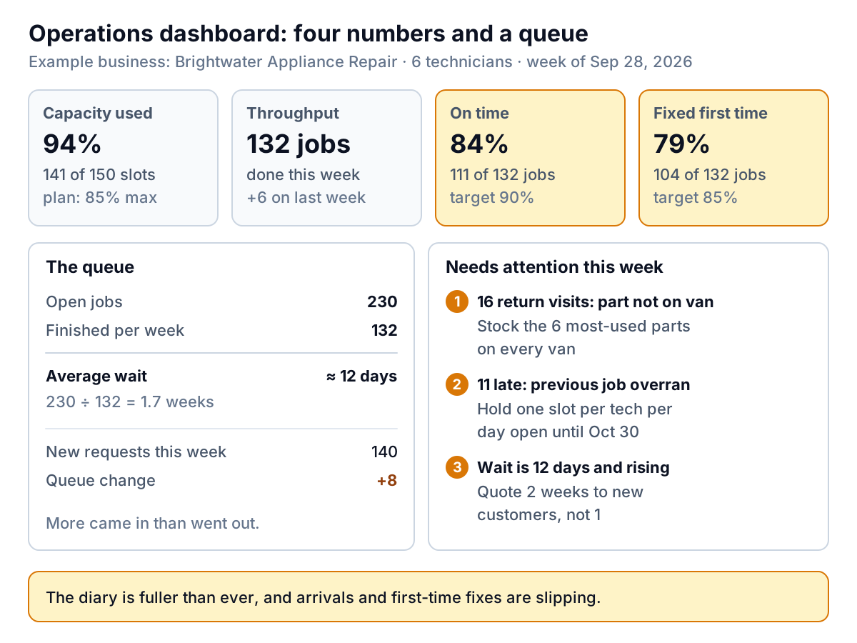
Each tile carries its count as well as its percentage ("111 of 132 jobs"), because a percentage on its own hides how many customers it's about. And each has a target written on it, so nobody has to remember what good looks like.
Capacity: plan to be less than full
Capacity is what your team could deliver in a week if everything went to plan. Count it in the unit you sell: job slots, billable hours, tables, appointments. Brightwater has 6 technicians working 5 days with 5 job slots a day: 6 × 5 × 5 = 150 slots. Last week 141 were booked, so capacity used was 94%.
The instinct is to aim for 100%. Don't. Brightwater's own last eight weeks show why:
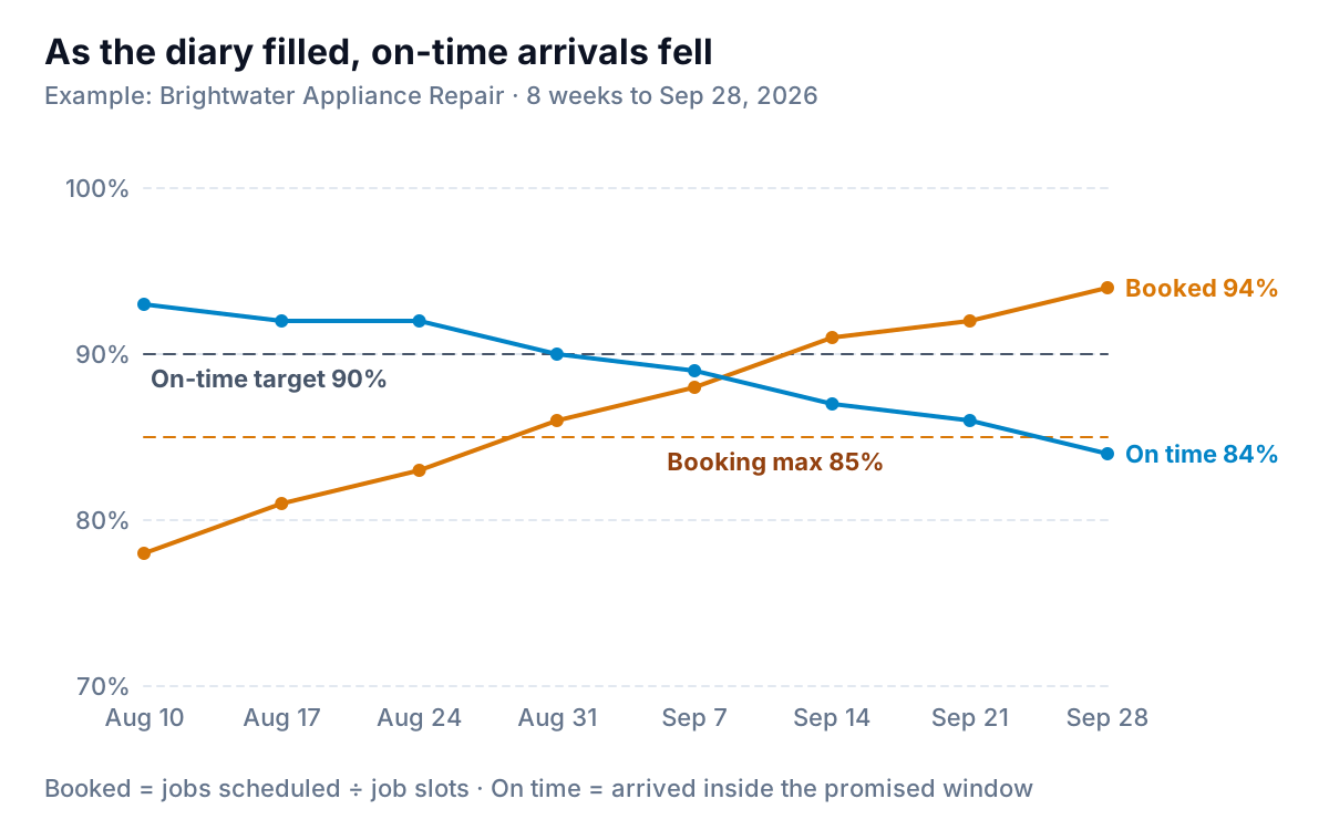
When every slot is full, a job that runs 40 minutes over pushes every later job that day back too. There's no gap to soak it up. With a few slots left open, an overrun eats the gap instead of the next customer's window. That's why Brightwater's plan says 85% maximum, and why the capacity tile shows the plan, not 100%, as its limit. The right figure for you depends on how variable your jobs are: the less predictable the work, the more slack you need. Find it in your own history by plotting capacity used against on-time rate, as above, and seeing where on-time starts to slide.
Capacity is mostly people, and people are hard to add quickly. In the Federal Reserve Banks' 2026 Report on Employer Firms, 46% of small employers named hiring or retaining qualified staff as an operational challenge in the prior 12 months. If capacity used sits above your planned maximum for a month, that's your early signal to start recruiting, raise prices, or narrow what you take on, before the on-time tile makes the decision for you.
Throughput and the queue: how long are customers waiting?
Throughput is the count of work finished: jobs completed, orders shipped, projects delivered. Brightwater finished 132 jobs last week, 6 more than the week before.
On its own, throughput looks like good news. Put it next to the queue and it tells you something more useful. Brightwater has 230 open jobs: booked, waiting for parts, or waiting for a return visit. There's a simple relationship between those numbers known as Little's Law: over time, the average number of items in a system equals the rate they flow through it multiplied by the average time each one spends inside. Turned around:
Average wait ≈ open jobs ÷ jobs finished per week
For Brightwater, 230 ÷ 132 = 1.7 weeks, or about 12 days from booking to finished job. No one had to time a single customer. The law works on long-run averages, so treat the result as a guide, not a promise for any one job, but it's a good guide and it costs nothing to work out.
Now the warning sign. Last week 140 new jobs came in and 132 were finished, so the queue grew by 8. If that carries on, the wait grows every week even though the team is working flat out. When more comes in than goes out, you only have three levers: add capacity, turn work away (or price it higher), or quote longer waits honestly. Brightwater's dashboard turns that into an action: quote two weeks to new customers, not one, until the queue stops growing.
On time and right first time: count the reasons
These two tiles measure whether the customer got what you promised.
- On time = jobs where you arrived (or delivered) inside the promised window ÷ all jobs finished. Brightwater: 111 of 132, or 84%, against a 90% target. Use the window you told the customer, not an internal one. If the customer was told "8 to 12", arriving at 12:20 is late.
- Right first time = jobs that needed no return visit, redo or replacement ÷ all jobs finished. Brightwater: 104 of 132, or 79%, against 85%. In a workshop or kitchen it might be orders not remade; in a product business, orders not returned for a fault.
A percentage tells you that something is wrong, not what. So the dashboard needs one more thing: a reason, recorded on every job that missed. Give the person closing the job a short fixed list to pick from (four or five reasons and "other"), not a free-text box. Then count them.
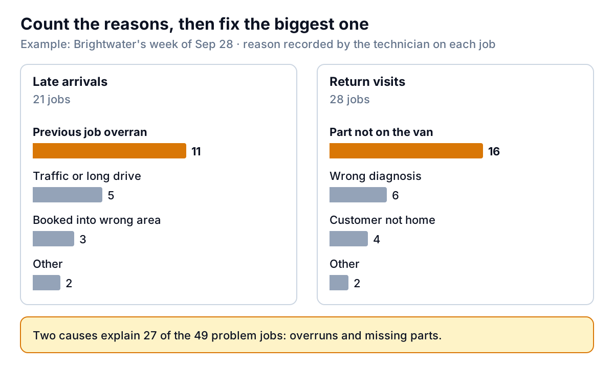
Brightwater's answer is clear. More than half its return visits (16 of 28) happened because the part wasn't on the van, and more than half its late arrivals (11 of 21) followed a job that overran. Both have practical fixes: stock the six most-used parts on every van, and keep one slot per technician per day open while bookings are above the planned maximum.
Return visits cost more than they look. Each of Brightwater's 28 uses a slot that could have been a new paying job: that's 28 of 150 slots, or about 19% of a week's capacity, spent doing jobs twice. Fixing first-time quality is often the cheapest way to add capacity, because it doesn't need a new hire.
An operations dashboard for a product business
If you make, pack or ship goods, the four questions are the same. Only the units change:
| Question | Service business | Product business |
|---|---|---|
| Capacity used | Booked slots or hours ÷ available | Production or packing hours needed ÷ hours available |
| Throughput | Jobs completed | Orders shipped, or units finished |
| On time | Arrived inside the promised window | Shipped by the promised date, complete |
| Right first time | No return visit needed | Not returned faulty, not remade or reworked |
| Queue | Open jobs ÷ jobs per week | Orders in production ÷ orders shipped per week |
Makers have one extra number worth knowing: takt time. The Lean Enterprise Institute defines takt time as available production time divided by customer demand. It's the pace you need to work at to keep up.
Take Kiln Street Ceramics, another example: three makers with 35 production hours each a week, 105 hours in total, and orders for 70 pieces a week. Takt time is 105 ÷ 70 = 1.5 hours per piece. If each piece actually takes 1.7 maker-hours, the work needs 119 hours a week and the team has 105. The shortfall of 14 hours means about 8 pieces a week join the queue, and by Little's Law the wait gets longer every week. The takt tile makes that visible before the customer emails do. For a business that holds finished stock, add the stock tiles from our inventory dashboard guide.
Running the weekly operations review
An operations dashboard is a weekly tool. Monthly is too slow: by the time a monthly report shows on-time slipping, a month of customers has felt it. A 20-minute review on the same day each week is enough:
- Capacity (3 minutes). Is capacity used above the planned maximum? For how many weeks? Is next week's booking already over it?
- Queue (3 minutes). Did more come in than went out? What's the wait now, and is it what you're telling customers?
- On time and right first time (10 minutes). Read the reason counts. Pick the single biggest reason and agree one fix, with an owner and a date.
- Last week's fix (4 minutes). Did the reason it targeted go down? If not, change the fix rather than adding a second one.
To tell whether a dip is real or just a quiet week, judge each tile against its normal range rather than last week alone; our monthly KPI report guide shows how to work out a normal range in a spreadsheet. And if you want one operations number on the owner's Monday screen rather than a whole dashboard, booked capacity for the next two weeks is the one we suggest in the one-screen small business dashboard.
Mistakes that make operations numbers mislead
- Measuring effort instead of output. Hours worked and calls made say how busy people were, not what got done. Throughput is the output.
- Averages instead of shares. "Average arrival 9 minutes late" hides the customer who waited three hours. Report the share inside the promised window.
- Quietly moving the goalposts. If the promised window widens from two hours to four, on-time will jump without anything improving. Note any change to a definition on the tile.
- Counting return visits as new jobs. They inflate throughput and hide the quality problem. Tag them, and count them separately.
- No reason codes. Without them, the weekly review becomes a debate about anecdotes.
Building the dashboard from your job data
Everything above comes from one table: one row per job, with the date booked, the promised window or date, the date and time finished, whether it needed a return visit, and a reason code if it missed. Add a small second table for capacity per week. Most job management, booking and order tools can export that as a CSV, and if yours can't, a shared Google Sheet that the team fills in at the end of each job works fine.
From there, you can build the operations dashboard in a spreadsheet with a few COUNTIFS formulas and two charts. Or Parity can build it for you. Upload the CSV or Excel export, or connect the Google Sheet, and describe what you need ("capacity used against an 85% maximum, jobs finished, on-time and first-time-fix rates with reason counts, and the queue"). Parity builds a dashboard with the headline numbers and their trends, charts, what explains them, and a table of what needs attention, and checks every number against queries on the full dataset before you see it. You refine it by chat ("count jobs waiting for parts as open", "show the last 12 weeks"), and update it each week with a newer export. When the owner or a partner wants a monthly operations summary, ask Parity to write it as a report from the same data.
Upload a job or order export and get a checked operations dashboard you can refine by chat. Build a dashboard from your file free
The test of an operations dashboard is simple. After the weekly review, can you say what you'll change, who will do it, and which tile will show whether it worked? If you can, the screen is doing its job, and your calendar can go back to being a calendar.