The owner of Ashby Bike Repair, an example shop we'll use throughout this guide, had a feeling about comebacks: the bikes that return within a fortnight because a repair didn't hold. It felt like brakes, always brakes. Then she pulled a year of job notes into a spreadsheet and counted. Brakes came third. Tubeless tyre setups that slowly lost air came first, by a distance, and nobody in the workshop had guessed it.
That's what a Pareto analysis is for. You rank the causes of a problem (or the sources of a result) from biggest to smallest, add up a running total, and find the short list that accounts for most of it. It takes about twenty minutes in a spreadsheet. This guide does it three times on one small business's real-looking records: comebacks, customers and services. Along the way it covers the formulas, the chart, the mistakes that make the answer wrong, and what to do once you have it.
What a Pareto analysis actually tells you
The idea behind it is old and simple: when many things contribute to one result, a few of them usually contribute most of it. The quality engineer Joseph Juran called this "the vital few and the trivial many" and named it after the economist Vilfredo Pareto. Juran later wrote a short piece titled "The Non-Pareto Principle; Mea Culpa" admitting he had put the wrong name on it. The name stuck anyway.
The "80/20 rule" is the popular version: 80% of effects from 20% of causes. Treat those numbers as a figure of speech, not a law. Your split might be 75/40, 60/20 or 90/10. The analysis exists to measure the split, not to confirm it. If you start out assuming 80/20, you'll stop looking at the wrong place.
Three questions a small business can answer with a Pareto analysis:
- Problems: which few causes produce most of the complaints, refunds, returns or redone jobs?
- Customers: how concentrated is revenue or profit, and how exposed are you to losing a few accounts?
- Products and services: which lines carry the business, and which take up shelf space, time or attention without paying for it?
Worked example: why do repairs come back?
Ashby redoes a repair free if the customer brings the bike back within 14 days with the same fault. Over the year to September 2026 there were 64 comebacks. Each one has a short note on the job card. Here are the steps.
- Pick one measure and one period. Here: number of comebacks, October 2025 to September 2026.
- Put each item in one category. Read the notes and give each comeback a cause from a short, fixed list. Ashby ended up with six causes plus "Other". Keep "Other" small; if it's one of your biggest bars, your categories are too narrow or too vague.
- Count per category and sort largest first.
- Add a running total and a running percentage. Each row's cumulative share is its own count plus everything above it, divided by the grand total.
- Draw the chart: bars for the counts, a line for the cumulative percentage.
- Read off the vital few: the categories you pass before the line flattens.
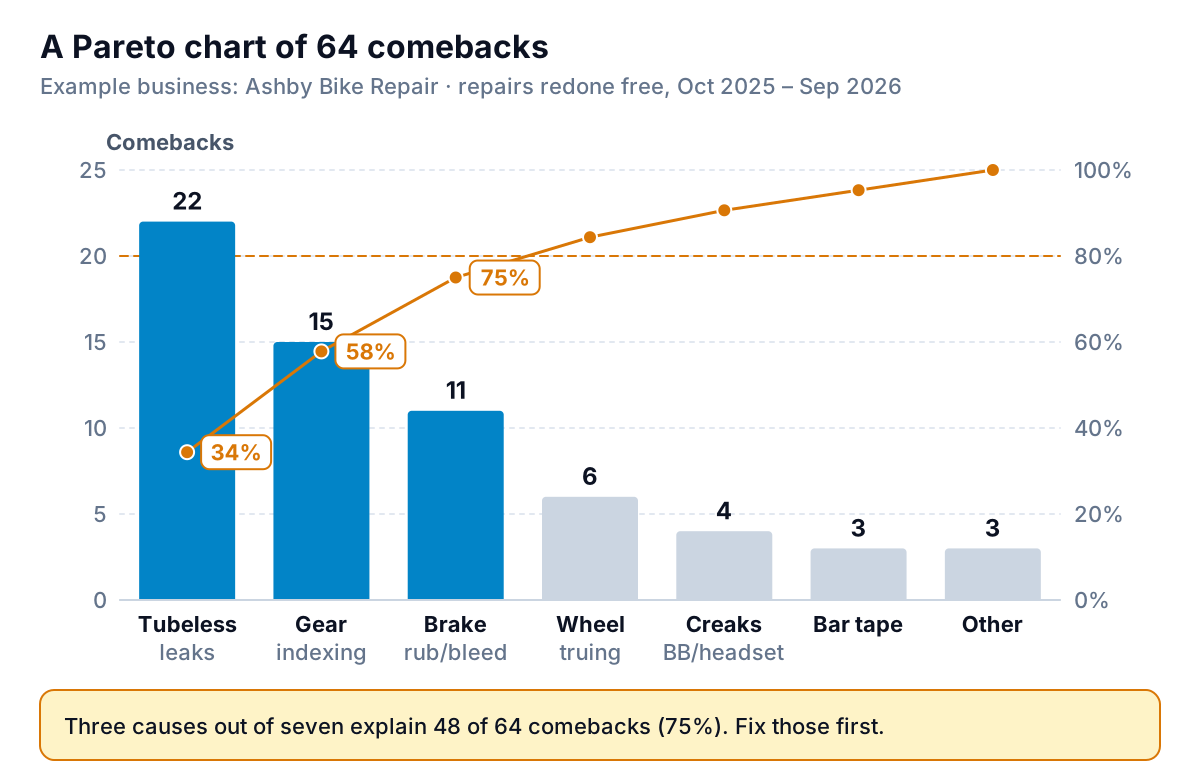
Tubeless leaks (22), gear indexing (15) and brake rub (11) add up to 48 of 64 comebacks, or 75%. The next four causes share the remaining 16. For a workshop with a limited amount of attention, that's a clear order of work: write a tubeless setup checklist (sealant amount, overnight pressure check before handover), add a test ride through all gears after every drivetrain job, and change how brake jobs are signed off.
The table behind the chart
Here's how the sheet looks. Column A holds the cause, B the count, C the running total, D the cumulative percentage.
| Cause | Comebacks | Running total | Cumulative % |
|---|---|---|---|
| Tubeless leaks | 22 | 22 | 34.4% |
| Gear indexing | 15 | 37 | 57.8% |
| Brake rub / bleed | 11 | 48 | 75.0% |
| Wheel truing | 6 | 54 | 84.4% |
| Creaks (bottom bracket, headset) | 4 | 58 | 90.6% |
| Bar tape | 3 | 61 | 95.3% |
| Other | 3 | 64 | 100.0% |
How to do a Pareto analysis in a spreadsheet
You need a list with one row per event (a comeback, an invoice line, a refund) and a column for the category. If you're working from raw rows rather than counts, start with a pivot table: categories in rows, count or sum in values, then sort the values from largest to smallest. Copy the result to a new sheet as plain values so the sort doesn't move under you.
With categories in A2:A8 and values in B2:B8, the formulas are:
- Running total in C2, filled down:
=SUM($B$2:B2) - Cumulative % in D2, filled down:
=C2/SUM($B$2:$B$8), formatted as a percentage - Class in E2, filled down:
=IF(D2-B2/SUM($B$2:$B$8)<0.8,"A",IF(D2-B2/SUM($B$2:$B$8)<0.95,"B","C")). This puts a row in class A if the total before it was still under 80%, so the row that crosses the line counts as one of the vital few.
Two chart options:
- Excel: select the categories and values (unsorted is fine), then Insert > Insert Statistic Chart > Pareto, under Histogram. Excel sorts the bars and draws the cumulative line for you. Microsoft notes that it groups identical categories and sums their values, so you can point it at raw rows.
- Google Sheets: there's no Pareto chart type, so build a combo chart from the sorted table: counts as columns, cumulative % as a line, and put the line series on the right axis under Customize > Series.
Count is not cost: weight the bars
A Pareto analysis by count answers "what happens most often?". That's not always the question that matters. Ashby's comebacks cost very different amounts of time to put right. A leaking tubeless tyre takes about 20 minutes to reseat. A brake bleed redo takes 45. A creaking bottom bracket means stripping the crank, cleaning, regreasing and refitting: an hour.
Multiply each cause's count by its average rework time, sort again, and the order changes.
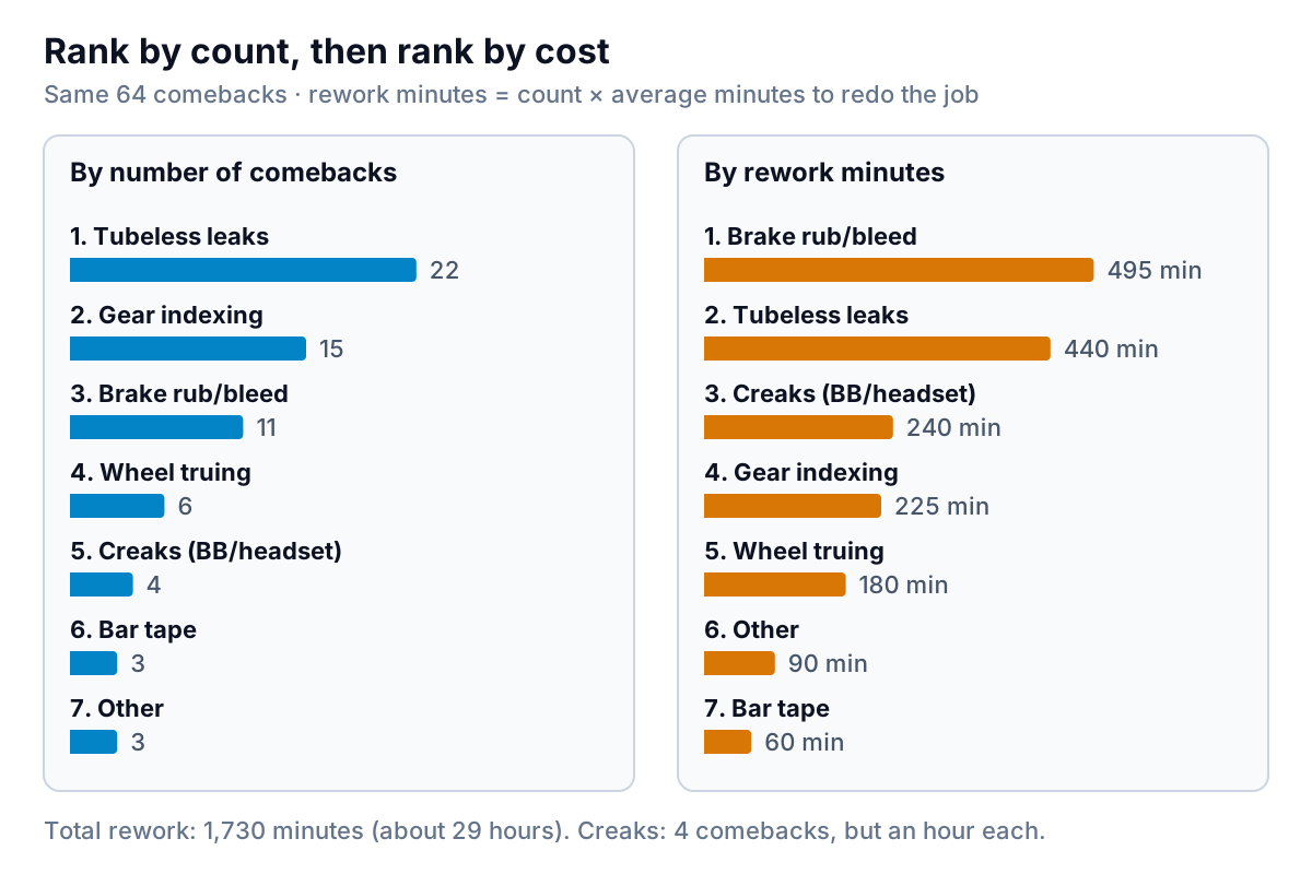
Weighted by minutes, brake comebacks (495 of 1,730 minutes) beat tubeless leaks (440). Creaks, only four of them, are third at 240 minutes. The owner's hunch about brakes wasn't wrong after all; it was about cost, not frequency. Both rankings are useful. The count tells you which fix will make the fewest customers unhappy. The weighted version tells you which fix gives the workshop the most hours back.
Weight by whatever the problem costs you: refund value for returns, labour minutes for rework, gross profit for products. If you can't get the cost exactly, an average per category is good enough to rank them.
Pareto analysis on customers: how concentrated is your revenue?
The second classic use is customer concentration. Export a year of sales by customer from your accounting or till system, sort by revenue, and split customers into ten equal groups (deciles).
Ashby had 1,240 customers and $412,000 of revenue over the year. The result:
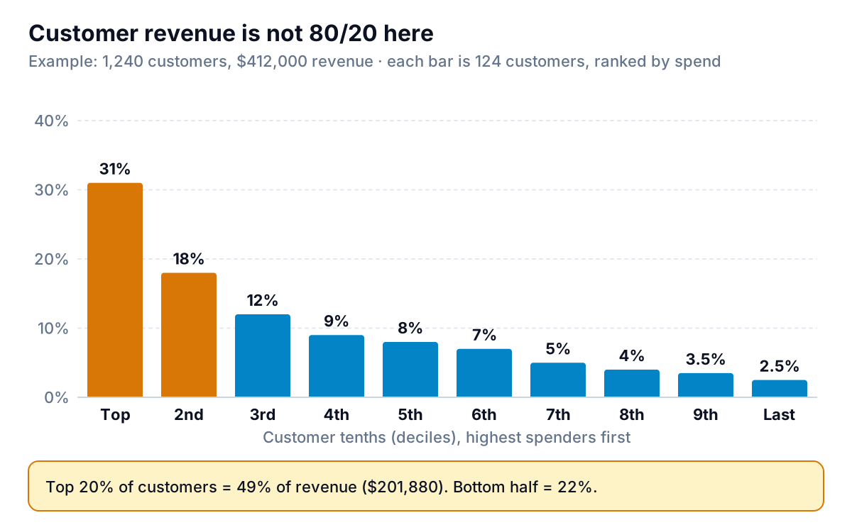
The top 248 customers brought in $201,880, or 49%. That's concentrated, but far from 80/20, and the difference matters. If the top fifth really brought 80%, a loyalty scheme for them alone might be the whole marketing plan. At 49%, the other half of revenue comes from people who visit once or twice a year, and the shop needs them too: seasonal service reminders on the website, a fair price for a basic tune-up, a quick turnaround on punctures.
Look inside the top decile before you act. At Ashby it holds two commercial accounts, a delivery company and a bike rental business, that together account for a large share of that 31%. Losing either would hurt more than any other single event in the year. That's a risk to watch, not something to fix with a discount: keep the relationship personal, invoice promptly, and know what each account earns you after parts and labour.
The same caution applies to profit. A customer who buys a lot of heavily discounted parts can rank high on revenue and low on gross profit. If your system can export cost of goods by invoice line, run the customer analysis on gross profit too.
Products and services: the third pass
Run the same steps on sales by service or product line, ideally on gross profit. At a bike shop that usually means comparing labour-heavy services (tune-ups, wheel builds) with parts and accessories. The output is an A/B/C list: A lines get the stock depth and the staff training, C lines get reviewed. For a retailer with stock, our inventory dashboard guide shows how to put the A/B/C classes next to stock levels and turnover.
Mistakes that make the answer wrong
- Categories that are too broad. "Mechanical issue" as a category will always win, and it tells you nothing. Split until each category suggests a specific fix.
- Categories that are too narrow. Thirty causes with two items each produce a flat chart with no vital few. Merge until you have roughly 5 to 10.
- A big "Other" bar. If Other is more than about 10% of the total, read through it and create the categories you're missing.
- Counting when cost matters. As above: rank by frequency and by cost, and say which one you're using.
- A period that's too short. One month of comebacks at a small shop might be six events. Use a full year, or at least a full season, so one bad week doesn't set the priorities.
- Mixing units. Don't put refunds in dollars and complaints in counts on the same chart.
- Treating the result as permanent. Once you fix the top cause, the chart reorders. That's the point. Run it again next quarter.
What to do with the result
A Pareto analysis ends with a short list and a decision for each item on it. A simple rule set:
| Class | Rule | For comebacks | For customers or products |
|---|---|---|---|
| A (up to ~80% of total) | Act now, one owner per item | Write a fix, change the checklist, retrain | Protect: stock depth, priority service, a named contact |
| B (next ~15%) | Review next quarter | Track; fix if cheap | Look for ways to grow them |
| C (last ~5%) | Don't spend management time | Leave unless they're dangerous | Review price, minimums or whether to stock them |
Apply one exception: anything involving safety goes to the top whatever its count. A single brake failure matters more than twenty slow leaks.
Then measure again. Ashby introduced the tubeless checklist in October. If it works, next year's Pareto chart will show leaks well down the ranking, and a different cause will lead. Track the top causes monthly on a simple dashboard so you can see the effect without redoing the whole analysis; our KPI dashboard guide covers how to pick and lay out those few numbers.
Getting the data without retyping it
The hardest part of a Pareto analysis is getting rows with a usable category column. Some practical sources:
- Customers and products: a sales-by-customer or sales-by-item report from QuickBooks, Square or Shopify, exported to Excel or CSV. Our sales report guide covers which report gives which view.
- Complaints, returns and rework: usually a job-management or helpdesk export, or a simple log you start today with a fixed dropdown of causes. A dropdown beats free text, because you'll never have to read 64 notes again.
- Refunds: payment processor exports include a refund reason field if staff fill it in. Make it required.
Parity does the counting and charting from those files. Connect QuickBooks Online, Square or Shopify, or upload a CSV or Excel export, and it builds a dashboard with headline numbers, charts and a table of what needs attention, with every number checked against queries on the full dataset. You can ask for the Pareto view in plain words, such as "rank comeback causes by count and by rework minutes, with a cumulative percentage", refine it by chat, and update it with next quarter's file to see whether the order has changed.
Upload a year of jobs, sales or refunds and get a checked, ranked view of what drives most of it. Build a report from your data free
Whichever tool you use, check the result against what you'd have guessed. If the Pareto analysis only confirms what everyone already believed, fine: now you have numbers to back it up. If it surprises you, as tubeless leaks surprised Ashby, that surprise is the reason to do it.