Marlow Print Studio, an example print shop that sells to local businesses, had a good September: $24,000 of sales, up 20% on August and 9% over target. That's where most sales reports would stop. But lay the customers side by side and a different picture appears. The customers who bought in both months spent $2,400 less. Two customers didn't order at all. The growth came from two new customers, and $3,800 of it came from a festival that happens once a year. Take the festival out and September was up 1%.
A sales report exists to catch that. It isn't a total with a chart; it's a short explanation of why sales moved and what you'll do about it. This guide shows how to write one: what to include in a daily, weekly and monthly sales report, the customer bridge that explains the change, and a three-sentence summary that ends with names and dates. There's a free template that builds the monthly report from a list of invoices.
Download the sales report template (.xlsx). It opens in Excel, Google Sheets and Numbers, with no macros, and comes with Marlow's two months of example invoices and a blank copy ready for yours.
Daily, weekly and monthly: what each sales report is for
A sales report gets read when it answers one question quickly. Ask it to answer everything and it gets skipped. Give each rhythm one job:
| Report | The question | What to include | Reader and time |
|---|---|---|---|
| Daily | Did anything unusual happen yesterday? | Sales and number of orders or invoices, against the same weekday last week; any order much bigger or smaller than usual | Owner, 2 minutes |
| Weekly | Are we on track for the month, and who needs a call? | Month to date against target, quotes sent and won, customers who usually order by now and haven't | Owner and sales team, 15 minutes |
| Monthly | Why did sales change, and what do we do about it? | Totals against last month and target, sales by category and salesperson, the customer bridge, a three-sentence summary | Owner, partner, lender, 30 minutes |
If you run a shop with a till, the daily report looks different: footfall, conversion and average transaction matter more. Our retail sales report guide covers that version. If you lead a sales team and want to know mid-month whether you'll hit target, the sales dashboard guide covers pacing. The rest of this guide is about the monthly sales report, because it's the one that explains the month, and the one most often reduced to a single number.
The five parts of a monthly sales report
Here's Marlow's September as the template lays it out. The four numbers across the top and the two tables fit on one page.
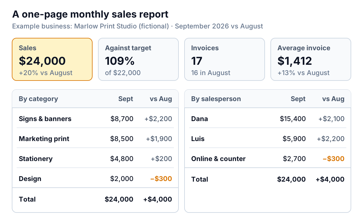
- Headline numbers. Sales before tax, number of invoices (or orders), average invoice and customers buying, each against last month, plus sales as a percentage of target. Marlow: $24,000 over 17 invoices is an average of $1,412, up from $20,000 ÷ 16 = $1,250.
- Sales by category. What you sold. Marlow's signs and banners rose $2,200 and marketing print $1,900, while design fell $300. Keep categories few (four to eight) and fixed, or month-to-month comparisons stop meaning anything.
- Sales by salesperson or channel. Who or what sold it. For a business without a sales team, use channels instead: account customers, website, counter.
- The customer bridge. How last month's total became this month's, customer by customer. This is the part most sales reports leave out, and it gets its own section below.
- The summary. Three sentences: what happened, why, and what next.
Notice what isn't there: no pie charts, no list of every invoice, no profit. Profit belongs in the monthly management accounts. A sales report that tries to be both ends up doing neither well.
The customer bridge: where the change really came from
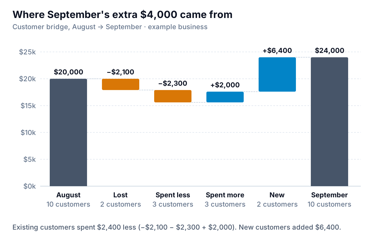
Total sales moved by $4,000. The bridge splits that change into four groups of customers, and each group calls for a different response.
The template sorts every customer into one of five types by comparing their two monthly totals:
- New: bought this month, nothing last month. Marlow: Riverside School PTA ($2,600) and City Arts Festival ($3,800).
- Lost: bought last month, nothing this month. Northgate Gym ($1,500) and Bloom Florist ($600).
- Spent less: Elm Realty (−$1,200), Greenway Landscaping (−$800) and counter and web orders (−$300).
- Spent more: Summit Builders (+$1,200), Harbor Café (+$600) and Oak & Vine Wine Bar (+$200).
- Same: Kessler Law and Maple Accounting, unchanged.
Then the bridge adds it up: $20,000 − $2,100 − $2,300 + $2,000 + $6,400 = $24,000. A check line confirms the bridge matches total sales; if it doesn't, a customer is missing from the list or spelled differently.
Turn each group into an action:
| Group | Question to ask | Typical action |
|---|---|---|
| Lost | Did they stop, or just skip a month? | Check their usual ordering gap. If they're past it, call within a week |
| Spent less | Is it one smaller job or a trend? | Act if a customer is down two months running, or down by more than a third |
| Spent more | What did they buy that they didn't before? | Offer the same thing to similar customers |
| New | One-off or likely to return? | Mark one-offs in the summary so next month's drop doesn't surprise anyone |
The thresholds in that table are rules of thumb for an example business, not benchmarks. A business with steady monthly orders can act on a single missed month; one whose customers order quarterly should compare quarters instead.
Writing the summary: three sentences
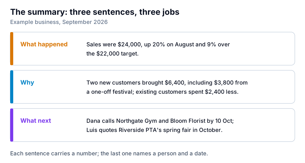
The summary is the part of a sales report that a partner, investor or lender actually reads. Write it last, in three sentences, each with a job:
Rules that keep it honest:
- Use numbers, not adjectives. "Strong month" tells the reader nothing they can check. "$24,000, up 20%" does.
- Explain with the bridge, not with the weather. "Quiet because of the holidays" might be true, but "two customers didn't order" is something you can act on.
- Make "what next" checkable. A name, an action and a date. Next month's report should be able to say whether it happened.
- Say the uncomfortable part. If growth came from a one-off, the summary says so.
For more examples of opening paragraphs for reports, including ones with bad news, see our executive summary examples.
Building the sales report template from your invoices
The template runs on one input: a list of invoices or orders with a date, invoice number, customer, category, salesperson and amount before tax. Paste at least two months into the data sheet (more is fine; the report picks the right months by date), type the first day of the month you're reporting and your target, and list your categories, salespeople and customers. Everything else is formulas:
- This month's sales =
SUMIFS(amount, date, ">="&month, date, "<"&EDATE(month,1)). SUMIFS adds up rows that meet every condition, and EDATE moves a date by whole months, so the same formula works for any month. Last month usesEDATE(month,-1)and the month itself as the two limits. Google Sheets has the same SUMIFS function, so the file behaves the same there. - Invoices = COUNTIFS with the same two date conditions. Average invoice = sales ÷ invoices.
- By category, salesperson and customer = the same SUMIFS with one more condition for the name in column A.
- Type = New if last month was zero and this month wasn't, Lost if the reverse, otherwise Up, Down or Same.
- Bridge = last month's total, minus Lost customers' last-month sales, plus the changes for Down and Up customers, plus New customers' sales.
Every breakdown has a check line that should read OK. If one doesn't, a name in the data is spelled differently from the list ("Harbor Cafe" vs "Harbor Café" is enough).
Getting the invoice list out of your system
Most accounting and payment tools export what you need. In QuickBooks Online, Intuit's help shows how to run the Transaction Detail by Account report, filtered to income accounts and grouped by customer, and export it to Excel. Our QuickBooks reports guide covers the other sales reports worth knowing. Whatever the source, tidy the export into the six columns before pasting it in.
Mistakes that make a sales report wrong
- Including sales tax. Use amounts before tax. Tax collected isn't sales.
- Mixing invoice dates and payment dates. A sales report counts sales when invoiced (or ordered). Cash received is a different report. Pick one and keep it.
- Leaving out credit notes. Enter them as negative amounts against the same customer, or a refunded job still counts as a sale.
- Renaming customers or categories mid-year. The comparison breaks silently. Keep a fixed list, and merge duplicates in the data, not in the report.
- Reporting the total only. As Marlow shows, a 20% rise can hide a 12% fall in what existing customers spent ($2,400 of $20,000).
What the template can't do
It reports sales, not profit or cash collected. It compares a month with the month before, not with the same month last year; for a seasonal business, add a column using EDATE(month,-12). And it holds 40 customers in the blank report; with more, copy the last customer row down and extend the totals, or consider a tool built for it.
When the invoice list gets long
Pasting two months of invoices into a spreadsheet takes ten minutes for a business with 30 invoices a month. With 300, keeping customer names consistent becomes the job. Parity builds the dashboard from the source instead: connect QuickBooks Online, Stripe, Shopify, Square, HubSpot or Google Sheets, or upload a CSV or Excel export from anything else. It shows the headline numbers with their trends, charts, what explains the change and a table of what needs attention, such as customers who stopped ordering, and every number is checked against queries on the full dataset before you see it.
Ask it to write the monthly sales report and it drafts one from the same data for a partner, investor or lender. You can refine it by chat ("add a customer bridge against August", "flag one-off orders over $3,000"), export it to PDF or Excel, share a read-only link, and save it as a template so next month you only update the file.
Connect your accounting tool or upload an export, and get a checked report that explains why sales moved. Build a report from your data free
However you produce it, read the bridge before the total. "Up 20%" is the headline people remember; "two customers stopped ordering" is the line that makes next month better.