Every year, millions of Americans pack up and move to another county. Most of the time, the moves cancel out: for every family leaving a suburb of Chicago, another arrives from somewhere else. What's left over, the net flow, tells you where the country is heading.
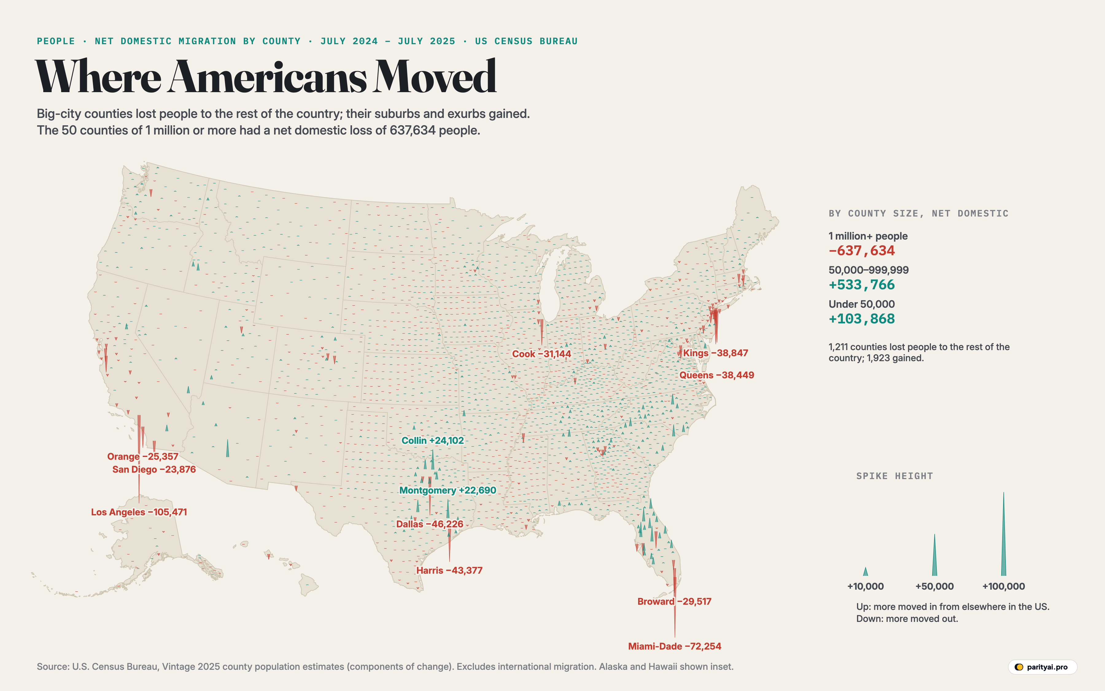
The map above draws that leftover for all 3,144 counties, from the Census Bureau's estimates for the year to July 1, 2025. Each county gets a spike. It points up, in teal, if more people moved in from elsewhere in the United States than moved out, and down, in red, if more left. The height of the spike is the size of that net flow. Moves to and from other countries aren't counted here; nor are births and deaths. This is purely Americans rearranging themselves.
The headline is in the red spikes. The longest ones on the map all hang below big-city counties. And the teal spikes cluster not far away, in the suburbs and fast-growing outer counties around those same cities. The domestic migration of 2025 was less a move from one region to another than a move outward, from the core of the big metro areas to their edges.
The 50 largest counties lost −637,634
The Census Bureau groups counties by size, and the pattern is stark. The 50 counties with a million or more people had a combined net domestic loss of −637,634 people in 2025; 41 of them lost people to the rest of the country. Counties of between 50,000 and a million people gained +533,766, and smaller counties gained +103,868.
By the Bureau's own reckoning, slowing growth hit the largest counties hardest. Overall, 1,211 counties lost residents to domestic migration and 1,923 gained.
Los Angeles and the Inland Empire
The single longest red spike belongs to Los Angeles County, California, with a net domestic loss of −105,471 people. Los Angeles still attracted people from abroad, +29,325 in net international migration, but not nearly enough to offset the outflow, and its total population fell by −53,934, the largest drop of any county in the country.
Some of those people didn't go far. Riverside County, to the east, gained 7,758 domestic migrants. But many left California altogether. The state as a whole lost −229,077 people to domestic migration, more than any other, and Silicon Valley's Santa Clara County lost nearly 20,000.
Dallas and the ring of growth
Texas shows the outward pattern most clearly. Dallas County lost −46,226 people to the rest of the country. The counties around it gained: Collin County, Texas, immediately to the north, had the biggest domestic gain in the nation, +24,102, and Denton (+11,569), Kaufman (+9,535) and Rockwall (+3,087) all grew. Tarrant County, home to Fort Worth, lost a little.
Houston follows the same shape. Harris County, Texas lost −43,377 domestic migrants, but it still had the largest total population gain of any county, +48,695, because of strong international migration (+57,225) and natural increase. North of the city, Montgomery County, Texas gained +22,690 domestic migrants, the second-most in the country; to the south-west, Fort Bend gained more than 10,000.
| # | Gained most | Net domestic | Lost most | Net domestic |
|---|---|---|---|---|
| 1 | Collin County, Texas | Los Angeles County, California | ||
| 2 | Montgomery County, Texas | Miami-Dade County, Florida | ||
| 3 | Pinal County, Arizona | Dallas County, Texas | ||
| 4 | Polk County, Florida | Harris County, Texas | ||
| 5 | Pasco County, Florida | Kings County, New York | ||
| 6 | Marion County, Florida | Queens County, New York | ||
| 7 | Williamson County, Texas | Cook County, Illinois | ||
| 8 | Horry County, South Carolina | Broward County, Florida | ||
| 9 | Wake County, North Carolina | Orange County, California | ||
| 10 | St. Johns County, Florida | San Diego County, California | ||
| 11 | Lake County, Florida | Orange County, Florida | ||
| 12 | Denton County, Texas | Santa Clara County, California | ||
| 13 | Fort Bend County, Texas | Bronx County, New York | ||
| 14 | St. Lucie County, Florida | New York County, New York | ||
| 15 | Kaufman County, Texas | Alameda County, California |
July 2024 to July 2025. Net domestic migration excludes moves to and from abroad.
Phoenix and its desert edge
In Arizona, Maricopa County, which contains Phoenix, roughly broke even on domestic migration. But Pinal County, Arizona, the county to its south-east, between Phoenix and Tucson, gained +21,315, the third-largest domestic gain in the country, on a population of just over half a million.
Florida's split
Florida has some of the longest spikes in both directions. Miami-Dade County, Florida lost −72,254 domestic migrants, the second-largest loss in the country, and Broward County, Florida lost −29,517. Both counties were largely propped up by international arrivals: Miami-Dade gained +54,204 people from abroad.
Meanwhile, central and south-west Florida grew fast. Polk County, Florida (between Tampa and Orlando) gained +18,752, Pasco County, Florida (north of Tampa) +18,078, and Marion County, Florida (Ocala) +15,971. Lee County, around Fort Myers, and St. Lucie County each gained more than 8,000.
The Carolinas
The densest field of teal spikes on the map stretches across the Carolinas, and North Carolina gained more domestic migrants than any other state. Here, unusually, the big-city counties gained too. Wake County, which contains Raleigh, added 12,790 people from elsewhere in the country, and Mecklenburg County, home to Charlotte, nearly 5,000.
Along the coast, Horry County, South Carolina, which includes Myrtle Beach, gained +14,222, the eighth-largest domestic gain in the country. That is more than any county in North Carolina, Wake included, and more than all but seven counties in the country.
The West Coast and the desert
On the Pacific coast, the spikes mostly point down. King County, which contains Seattle, lost about 9,000 people to domestic migration, though a large inflow from abroad, more than 28,000, kept its population growing. Santa Clara County, the heart of Silicon Valley, lost nearly 20,000. San Francisco was almost exactly balanced, losing just over a hundred people to the rest of the country, while still gaining several thousand from abroad.
Inland, the picture flips. Clark County, Nevada, home to Las Vegas, gained about 8,500 domestic migrants, and Arizona's fast-growing exurbs gained more. On this map, at least, the flow from the Pacific coast to the desert interior is still running, even if it is smaller in places than the outflows from Los Angeles and New York.
Small places
It isn't only the outer suburbs that gained. Counties with fewer than 50,000 people, most of them rural, together gained +103,868 people from elsewhere in the country in 2025. Spread across hundreds of counties, these flows are too small to see as individual spikes, but they show up as a fine texture of short teal marks across the South, the Mountain West and parts of the Midwest. Not every small county is growing, though. Counting births, deaths and international migration as well, 1,270 counties had fewer people in July 2025 than a year earlier, many of them rural counties in the Great Plains, Appalachia and the Mississippi Delta where deaths outnumber births.
New York and Chicago
The five boroughs of New York City together lost about 114,000 people to domestic migration. Kings County, New York (Brooklyn) lost −38,847 and Queens County, New York (Queens) −38,449; Manhattan and the Bronx lost between 16,000 and 19,000 each. New York State as a whole lost −137,586, second only to California.
Cook County, Illinois, which contains Chicago, lost −31,144 domestic migrants, yet its total population still edged up (+5,834), again because of people arriving from abroad. Illinois lost −40,017 overall.
| County | Domestic | International | Total change | Population 2025 |
|---|---|---|---|---|
| Los Angeles County, California | ▼ 105,471 | ▲ 29,325 | ▼ 53,934 | 9,694,934 |
| Miami-Dade County, Florida | ▼ 72,254 | ▲ 54,204 | ▼ 10,115 | 2,802,029 |
| Dallas County, Texas | ▼ 46,226 | ▲ 24,912 | ▼ 2,616 | 2,661,397 |
| Harris County, Texas | ▼ 43,377 | ▲ 57,225 | ▲ 48,695 | 5,045,026 |
| Kings County, New York | ▼ 38,847 | ▲ 17,564 | ▼ 4,694 | 2,653,963 |
| Queens County, New York | ▼ 38,449 | ▲ 20,672 | ▼ 8,852 | 2,358,182 |
| Cook County, Illinois | ▼ 31,144 | ▲ 27,590 | ▲ 5,834 | 5,194,625 |
| Broward County, Florida | ▼ 29,517 | ▲ 24,944 | ▼ 372 | 2,013,317 |
| Orange County, California | ▼ 25,357 | ▲ 9,161 | ▼ 8,520 | 3,149,507 |
| San Diego County, California | ▼ 23,876 | ▲ 6,132 | ▼ 5,294 | 3,282,248 |
| Orange County, Florida | ▼ 20,271 | ▲ 20,230 | ▲ 7,014 | 1,528,002 |
| Santa Clara County, California | ▼ 19,775 | ▲ 18,658 | ▲ 6,481 | 1,914,391 |
| Bronx County, New York | ▼ 18,685 | ▲ 12,760 | ▲ 280 | 1,406,332 |
| New York County, New York | ▼ 16,852 | ▲ 13,270 | ▼ 648 | 1,664,862 |
| Alameda County, California | ▼ 15,960 | ▲ 10,373 | ▲ 6 | 1,636,630 |
| Hillsborough County, Florida | ▼ 15,620 | ▲ 13,621 | ▲ 2,917 | 1,574,115 |
| Palm Beach County, Florida | ▼ 11,953 | ▲ 14,302 | ▲ 1,578 | 1,575,726 |
| Middlesex County, Massachusetts | ▼ 11,269 | ▲ 13,193 | ▲ 6,050 | 1,669,979 |
| Montgomery County, Maryland | ▼ 9,889 | ▲ 7,113 | ▲ 1,537 | 1,074,582 |
| Fairfax County, Virginia | ▼ 9,816 | ▲ 11,612 | ▲ 8,067 | 1,167,873 |
| Philadelphia County, Pennsylvania | ▼ 9,726 | ▲ 7,216 | ▲ 1,546 | 1,574,281 |
| King County, Washington | ▼ 9,079 | ▲ 28,428 | ▲ 26,980 | 2,344,939 |
| Salt Lake County, Utah | ▼ 8,024 | ▲ 4,424 | ▲ 3,462 | 1,220,916 |
| Gwinnett County, Georgia | ▼ 7,392 | ▲ 9,700 | ▲ 8,235 | 1,018,099 |
| Franklin County, Ohio | ▼ 7,191 | ▲ 9,441 | ▲ 8,880 | 1,361,536 |
| Tarrant County, Texas | ▼ 6,978 | ▲ 12,762 | ▲ 18,428 | 2,248,466 |
| Contra Costa County, California | ▼ 6,721 | ▲ 4,331 | ▲ 536 | 1,170,070 |
| Travis County, Texas | ▼ 6,590 | ▲ 11,928 | ▲ 14,749 | 1,389,670 |
| Wayne County, Michigan | ▼ 6,225 | ▲ 8,004 | ▲ 3,504 | 1,769,038 |
| Nassau County, New York | ▼ 5,219 | ▲ 3,483 | ▲ 1,156 | 1,398,939 |
| San Bernardino County, California | ▼ 4,961 | ▲ 1,222 | ▲ 5,327 | 2,224,091 |
| Fresno County, California | ▼ 4,548 | ▲ 861 | ▲ 1,758 | 1,035,456 |
| Suffolk County, New York | ▼ 4,406 | ▲ 4,332 | ▲ 2,760 | 1,546,090 |
| Cuyahoga County, Ohio | ▼ 4,235 | ▲ 4,273 | ▼ 689 | 1,232,925 |
| Sacramento County, California | ▼ 3,497 | ▲ 7,583 | ▲ 8,563 | 1,618,460 |
| Fulton County, Georgia | ▼ 3,057 | ▲ 6,463 | ▲ 8,323 | 1,098,791 |
| Allegheny County, Pennsylvania | ▼ 2,785 | ▲ 2,485 | ▼ 2,139 | 1,225,035 |
| Oakland County, Michigan | ▼ 2,684 | ▲ 7,688 | ▲ 5,788 | 1,288,337 |
| Westchester County, New York | ▼ 1,817 | ▲ 5,129 | ▲ 6,578 | 1,015,743 |
| Hennepin County, Minnesota | ▼ 703 | ▲ 4,100 | ▲ 7,700 | 1,284,784 |
| Pima County, Arizona | ▼ 350 | ▲ 3,239 | ▲ 1,229 | 1,074,685 |
| Duval County, Florida | ▲ 101 | ▲ 4,753 | ▲ 8,231 | 1,062,963 |
| Maricopa County, Arizona | ▲ 941 | ▲ 22,132 | ▲ 35,411 | 4,689,558 |
| Bexar County, Texas | ▲ 2,505 | ▲ 8,356 | ▲ 21,146 | 2,160,088 |
| Mecklenburg County, North Carolina | ▲ 4,931 | ▲ 13,347 | ▲ 26,554 | 1,233,383 |
| Riverside County, California | ▲ 7,758 | ▲ 810 | ▲ 15,804 | 2,544,916 |
| Clark County, Nevada | ▲ 8,465 | ▲ 8,890 | ▲ 21,480 | 2,407,226 |
| Denton County, Texas | ▲ 11,569 | ▲ 5,101 | ▲ 23,120 | 1,069,346 |
| Wake County, North Carolina | ▲ 12,790 | ▲ 8,602 | ▲ 27,760 | 1,257,235 |
| Collin County, Texas | ▲ 24,102 | ▲ 11,749 | ▲ 42,966 | 1,297,179 |
Total change also includes births minus deaths and a small statistical residual.
Where the states come out
Adding up counties by state gives the familiar Sun Belt picture. North Carolina gained the most from domestic migration, +84,064, followed by Texas (+67,299) and South Carolina (+66,622). The fastest-growing county by rate was Jasper County, South Carolina (54.9 per 1,000), a small county in the far south of South Carolina, near Savannah, Georgia. The Census Bureau found that counties in the South held 45 of the 50 fastest-growing spots.
But the map shows that even within growing states, the big cities lost people. Dallas, Houston, Austin's Travis County and Miami all had net domestic outflows in 2025. The winners were the places one ring further out, where land and housing are cheaper and new homes are being built.
Where international migration fits
The big-city losses would look much worse without immigration. Net international migration added about +1,262,202 people across all counties, and it went disproportionately to the same big cities that were losing Americans: Harris, Miami-Dade, Los Angeles, Cook, Queens. For many of them it was the difference between growing and shrinking.
That cushion is getting thinner. The Census Bureau estimates that net international migration to the United States fell by more than half in 2025, from 2.7 million to 1.3 million, as immigration policy tightened. The Bureau notes that 2025 spans two periods of very different immigration policy, so its figures for that year are more uncertain than usual.
Natural change is not filling the gap either. In 2,055 counties, almost two-thirds of the total, more people died than were born in 2025.
How to read the map
- Domestic only. Spikes show net moves between US counties. International migration, births and deaths are in the tables.
- One year. The figures cover July 1, 2024 to July 1, 2025. A single year can be affected by local events, such as large housing developments opening.
- Estimates. These are Census Bureau estimates built from administrative records, such as tax returns and Medicare enrollment, and are revised each year.
- Connecticut. Its nine planning regions, which replaced its counties in Census statistics, are placed at approximate centres.
The donut, again
The map shows the shape planners call a donut: hollow in the middle, growing around the edges. It is not new. Americans have been moving from cities to suburbs, and from expensive coastal metros to cheaper inland ones, for decades, and the pandemic accelerated the trend. What the 2025 figures add is that the pattern now holds even inside the booming Sun Belt metros themselves. Dallas, Houston and Miami are no longer the destinations; their outer counties are.
Sources and method
- U.S. Census Bureau, County Population Totals and Components of Change: 2020–2025 (Vintage 2025), co-est2025-alldata.csv. Released March 2026, retrieved October 12, 2026
- U.S. Census Bureau, county boundaries via us-atlas
Net domestic migration is the number of people who moved into a county from elsewhere in the United States minus the number who moved out to other parts of the country, between July 1, 2024 and July 1, 2025, as estimated by the Census Bureau. It excludes international migration and births and deaths, which are shown in the tables. Each spike starts at the county's centre; its height is proportional to net domestic migration. Connecticut's nine planning regions, which replaced its counties in Census statistics, are placed at approximate centres.
Charts like this, from your own numbers.
Connect a spreadsheet or the tools you run on, and Parity builds the dashboard and writes the report, with every number checked.
Try Parity free