Moss & Marigold, an example plant subscription we'll follow in this guide, had a very good September. It shipped boxes to 713 subscribers, up from 585 in August and 120 in April. Every chart the owners looked at pointed up and to the right. Underneath, two things were going wrong, and neither showed up in the total: the biggest group of customers they had ever signed was leaving fast, and something in August had pushed every group of customers to cancel at once.
A cohort analysis is how you see that. You group customers by when they started, then follow each group month by month to see how many are still buying. This guide builds a retention cohort table from a plain order export, step by step, in Excel or Google Sheets. Then it shows the three ways to read the table, the mistakes that distort it, and what to do when a cohort starts to slip.
Why totals hide the problem
A subscription's headline number is the sum of two flows: new subscribers coming in and existing ones leaving. When new sign-ups grow fast, they cover up any amount of leaving. Moss & Marigold's active subscriber count rose every month from April to September. Meanwhile, of the 310 people who joined in May, only 133 were still receiving a box four months later.
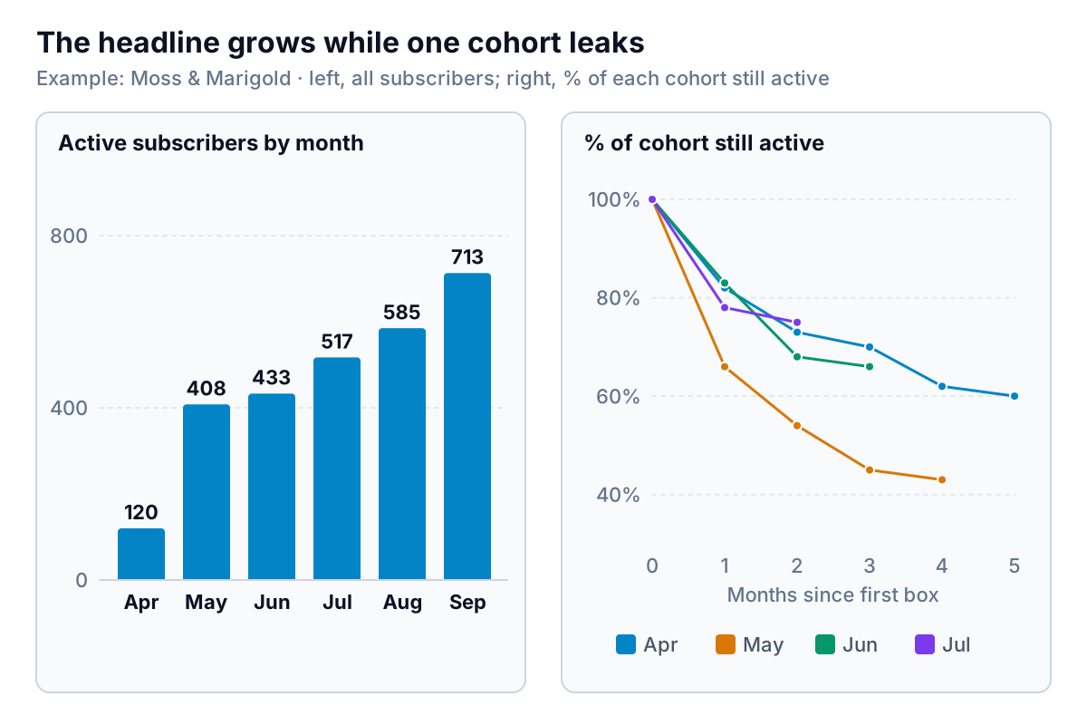
A blended monthly churn rate doesn't fix this. It mixes customers in their first month, when many leave, with customers in their fifth month, when few do. If your sign-ups shift between those groups, the blended rate moves even when nothing about your product has changed. Cohorts compare like with like: everyone in their first month, everyone in their second, and so on.
Build a cohort analysis from an order export
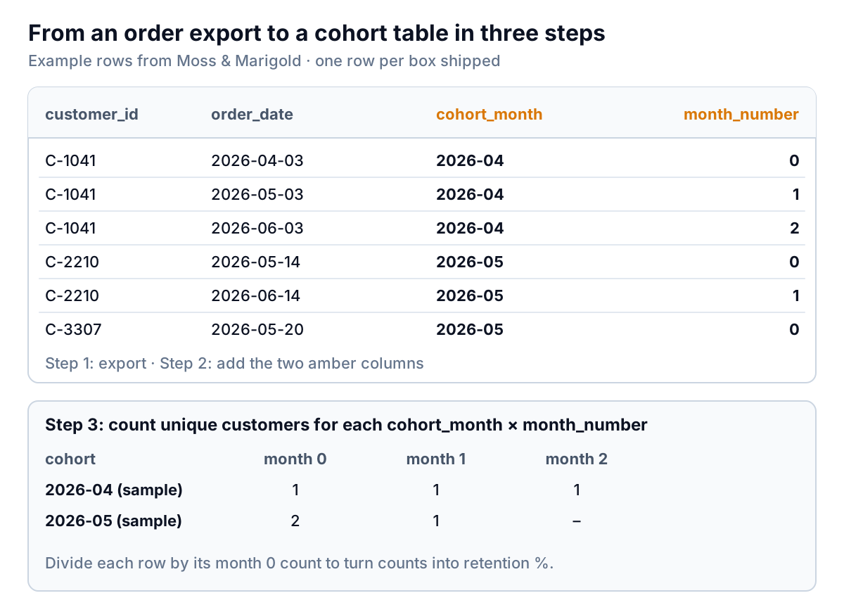
You need one file: every order (or every box shipped, or every payment) with a customer ID and a date. Your store platform, subscription app or payment processor can export it. Two columns are enough to start.
Step 1: clean the export
- Keep one row per order with
customer_idin column A andorder_datein column B. Delete test orders and staff orders. - Decide what to do with refunded orders and gift one-offs. Moss & Marigold drops fully refunded boxes, because a refunded box isn't a retained customer, and excludes one-off gift orders, because they were never meant to repeat.
- Check the customer ID. If the same person appears under two IDs (a new email address, a guest checkout), they'll look like a lost customer plus a new one. Fix the obvious duplicates by hand.
Step 2: add the cohort month and the month number
The cohort month is the month of each customer's first order. In C2, fill down:
=DATE(YEAR(MINIFS($B:$B,$A:$A,A2)),MONTH(MINIFS($B:$B,$A:$A,A2)),1)
That finds the earliest order date for the customer in that row and turns it into the first day of that month. The month number is how many months after the cohort month this order happened. In D2, fill down:
=(YEAR(B2)-YEAR(C2))*12+MONTH(B2)-MONTH(C2)
Every customer's first order gets month number 0. An order the following calendar month gets 1, and so on. This uses calendar months, not 30-day periods, which suits a business that bills or ships once a month.
Step 3: count customers, not orders
If someone orders twice in one month, they should count once. The simplest way: copy columns A, C and D to a new sheet and remove duplicates across all three (Data > Remove Duplicates in Excel, Data > Data cleanup > Remove duplicates in Google Sheets). Each row is now one customer active in one month.
Then insert a pivot table on that sheet: cohort_month in rows, month_number in columns, and count of customer_id in values. Month 0 is each cohort's size.
Step 4: turn counts into percentages
Next to the pivot, divide each cell by the month 0 cell in the same row. If the pivot's month 0 column is B and month 1 is C, then =C5/$B5, filled right and down. Format as percentages and add a colour scale (Conditional formatting > Color scale) so strong and weak cells stand out.
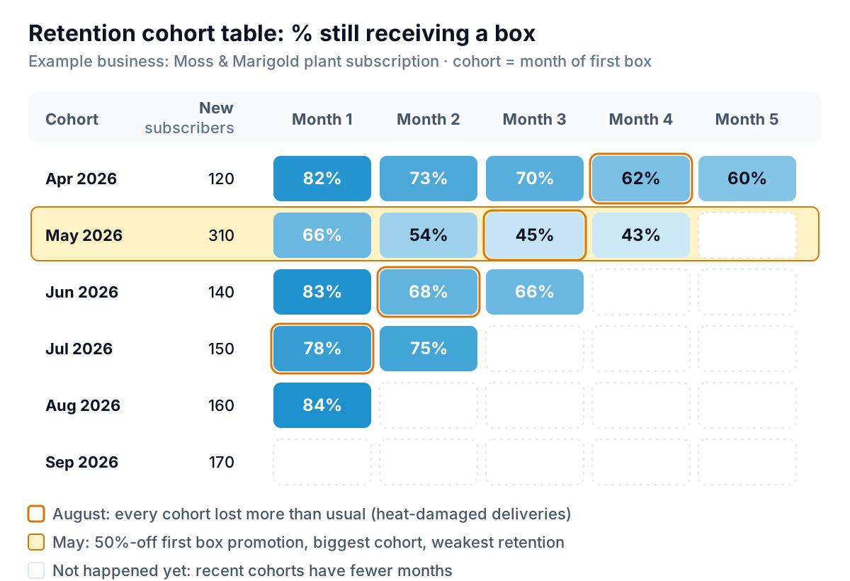
Here are the counts behind those percentages, so you can check them:
| Cohort | Month 0 | Month 1 | Month 2 | Month 3 | Month 4 | Month 5 |
|---|---|---|---|---|---|---|
| Apr 2026 | 120 | 98 | 88 | 84 | 74 | 72 |
| May 2026 | 310 | 205 | 167 | 139 | 133 | |
| Jun 2026 | 140 | 116 | 95 | 92 | ||
| Jul 2026 | 150 | 117 | 112 | |||
| Aug 2026 | 160 | 134 | ||||
| Sep 2026 | 170 |
Add up any calendar month along its diagonal and you get the active total from the first chart. September, for example, is 72 + 133 + 92 + 112 + 134 + 170 = 713.
Three ways to read a cohort table
A cohort table holds three different stories, depending on which direction you read it.
Across a row: the shape of one cohort's life
Read April from left to right: 82%, 73%, 70%, 62%, 60%. The biggest drop is the first month, then the curve flattens. A flattening curve is the shape you want. It means that past a certain point, the customers who stay tend to keep staying. The month where the curve flattens tells you how long a new subscriber is "at risk". For April, that's roughly the first two or three months, which is where onboarding effort belongs.
Down a column: are newer cohorts better or worse?
Read month 1 from top to bottom: 82%, 66%, 83%, 78%, 84%. May is the odd one out. That was the month Moss & Marigold ran a 50%-off first box promotion with an influencer. It brought in 310 people, more than twice a normal month, but a third of them left after the cheap box. By month 4, May had kept 43% against April's 62%.
That doesn't automatically make the promotion a mistake. May still has 133 subscribers in month 4, more than any other cohort. The cohort analysis lets you price it properly: the promotion's cost per subscriber who was still there after four months, not per sign-up.
Along a diagonal: something that hit everyone at once
Cells on the same diagonal happened in the same calendar month. The outlined cells are all August: April's month 4, May's month 3, June's month 2, July's month 1. Each one is a bigger drop than that cohort's usual pattern. June lost 15 points between month 1 and month 2, against April's 9 at the same age. A drop that shows up on a diagonal is a calendar event, not a cohort problem. At Moss & Marigold it was a heatwave: plants arrived scorched, and some customers cancelled rather than wait for replacements.
Diagonal patterns are easy to miss in a table and obvious once you know to look. Price rises, shipping problems, a payment processor failing renewals, a competitor's launch: all of them show up as a diagonal.
Mistakes that distort a cohort analysis
- Reading the empty corner as zero. The bottom right of the table hasn't happened yet. September's cohort has no month 1 because October isn't over. Leave those cells blank, never zero, or your averages will collapse.
- Comparing tiny cohorts. In a cohort of 120, one person is almost a percentage point. Differences of two or three points between small cohorts are mostly noise. If your monthly cohorts are under about 100 customers, group them by quarter.
- Counting orders instead of customers. A customer who orders an add-on in the same month would count twice. Remove duplicates first.
- Ignoring pauses. Many subscriptions let customers skip a month. A skip looks like churn in that month and a comeback the next, so a cohort's count can go up. Decide whether "active" means "received a box this month" or "has an active subscription", and use the same rule every time.
- Using the wrong start event. Cohort by first paid order, not account creation or first website visit. Tools like Google Analytics have a cohort exploration that groups users by when they first visited and tracks whether they came back. That's useful for website engagement, but it measures visitors, not paying subscribers.
- Looking at headcount only. If customers can upgrade, downgrade or add items, also build the same table with revenue instead of customer counts. A cohort can lose people and still keep its revenue if the people who stay spend more.
What to do when a cohort slips
Match the fix to the pattern you see:
| Pattern | Likely cause | What to try |
|---|---|---|
| One cohort weak from month 1 | How those customers were acquired: a deep discount, a new channel, a mismatched audience | Judge that channel on customers left at month 3 or 4, not on sign-ups. Shrink the discount or add a commitment |
| A diagonal of weak cells | Something that happened in that calendar month | Find the event (shipping, price change, failed payments) and contact the customers who left in that month |
| Every new cohort a little worse than the last | Product, price or competition drifting | Talk to recent cancellations; compare what new customers are offered with what old ones got |
| Steep first-month drop in every cohort | Onboarding: the first box or first experience disappoints | Improve the first box, add a welcome message with care instructions, check delivery times |
After the heatwave, Moss & Marigold added insulated packaging for summer shipments and a "hold my box" option for heat warnings. Whether that worked will show up next summer, as a diagonal that doesn't dip.
Put the table on a monthly rhythm: refresh it a few days after month end, read one column (month 1 for the newest cohort) and one diagonal (the month that just ended), and note what you see. That ten-minute check catches a problem a month or two before it shows in the total. If you track this alongside other numbers, our KPI dashboard guide covers where retention fits, and for a store the ecommerce dashboard guide shows repeat purchase rate next to sales and margin.
Keeping the cohort analysis up to date
The spreadsheet version works, but each month you have to paste in a new export, extend the formulas and fix the pivot range. That's usually where it stops getting updated.
Parity can build it from the same data. Connect Shopify or Stripe directly, or upload the order export as a CSV or Excel file, and ask for a cohort analysis in plain words: "monthly retention cohorts by first paid order, excluding refunds and gift orders". It builds a dashboard with the cohort table, the retention curves and the headline numbers, and every figure is checked against queries on the full dataset before you see it. You can refine it by chat, share a read-only link with a business partner, and update it with next month's export. Our guides to Shopify reports and Stripe reports explain which exports hold the order and subscription data.
Upload an order export and get a checked retention cohort table, with the curves and the cohorts that need attention. Build a report from your data free
However you build it, the question for each month is the same: of the people who started with us, how many are still here, and is that better or worse than the people before them? The total can't answer that. The cohort table can.