The owner of two cafés gets a text from her business partner: "Can you send me September's numbers?" She sends the link to her dashboard, the one she checks every Monday. An hour later the reply comes back: "Thanks. So… was September good or bad?"
That's the dashboard vs report problem in one exchange. Nothing on the dashboard was wrong. Sales, labour, food cost and cash were all there, each with a comparison. But the partner didn't want to watch the business. He wanted to be told what happened, why, and what was being done about it. He needed a report, and she'd sent a dashboard.
The question comes up in every small business that has more than one person who cares about the numbers. This guide gives you a simple way to decide which one a reader needs, shows the same numbers built both ways, and explains how the two work together so neither turns into a monthly chore.
The short answer: a dashboard watches, a report explains
Stephen Few, who wrote much of the standard thinking on the subject, defined a dashboard as a single-screen display of the most important information for an objective, arranged so it can be "monitored at a glance". The key word is monitored. A dashboard is for someone who comes back to it again and again to see whether anything has changed.
A report is a written account of a period, for a reader who wasn't watching. It says what happened, explains why, and says what comes next. It's read once, usually start to finish, and then filed.
Put another way: a dashboard answers "is anything wrong?" in ten seconds. A report answers "what happened, and what are we doing about it?" in five minutes. Both can use the same numbers. They do different jobs with them.
Dashboard vs report, side by side
| Dashboard | Report | |
|---|---|---|
| Its job | Spot what changed, early | Explain what happened and decide what's next |
| Typical reader | The person running the thing: owner, manager, team | Someone one step removed: partner, investor, lender, client, board |
| How often | Daily or weekly, whenever they check | Monthly or quarterly, on a schedule |
| Time frame | Now, against last week or a target | A closed period, such as September |
| Form | One screen of numbers and charts | A page or a few, mostly sentences |
| Words | Labels and short notes | A headline, causes, actions and requests |
| Ends with | A short list of what needs attention | Decisions taken, and anything needed from the reader |
| Goes wrong when | It grows to 30 tiles nobody reads | It arrives too late to matter, or never says "why" |
The most useful row is the reader. If the person reading it runs the work day to day, they need a dashboard; they'll work out the "why" themselves because they were there. If they're one step away, they need a report, because they weren't.
Why tools make the words confusing
Part of the muddle comes from software, which uses both words in its own way. In Microsoft Power BI, a dashboard is a single page of tiles pinned from reports, while a report can have many pages and lets you filter, slice and drill into the data. So in Power BI, the interactive, explore-it-yourself thing is called the report, and it has very few sentences in it.
Google's tool, renamed from Looker Studio back to Data Studio in April 2026, calls nearly everything you build a report. Its scheduled delivery emails the report as a PDF with a link to the full version. That's handy, but a PDF of a chart page is still a dashboard in the sense that matters here: a picture of numbers, with no one saying what they mean.
So don't decide by what your tool calls the file. Decide by the job the reader needs done.
Which one do you need? Two questions
Ask two things about the reader: will they come back to it repeatedly, or read it once? And do they need to spot a change, or understand it and decide something?
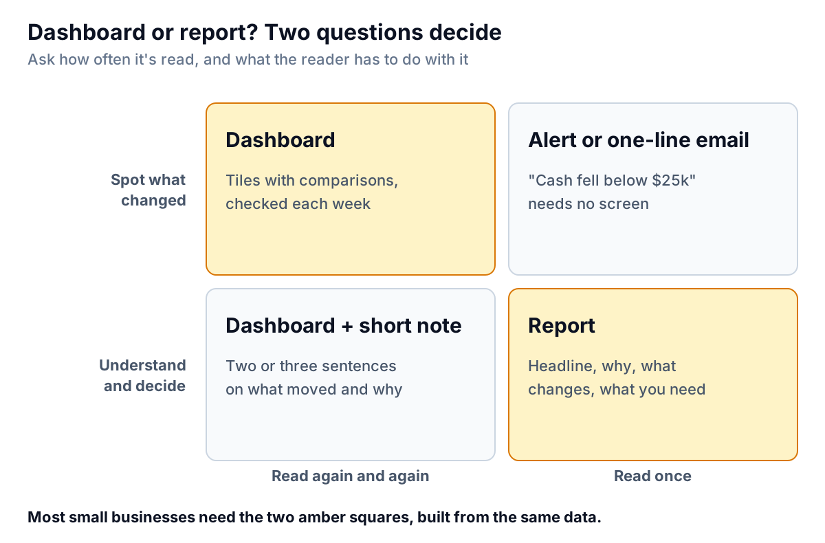
Here's how that sorts the usual cases:
- The owner, every Monday: dashboard. Our one-screen small business dashboard covers what goes on it.
- A shift manager or team lead, daily: dashboard, smaller still, about their own area.
- A business partner, investor or lender, monthly: report. They want the story and the decisions, not a login.
- A client of an agency, bookkeeper or consultant, monthly: report, with a dashboard link for anyone who wants to look closer.
- A one-off question ("Should we open on Sunday evenings?"): report. It's read once and has to reach a conclusion.
- A single threshold ("cash below $25,000", "stock of a best seller at zero"): neither. Set an alert or a one-line email; nobody needs a whole screen to learn one fact.
The fourth square, a dashboard with a short note, suits a reader who checks often but wasn't close to the work, like a manager reviewing several sites. Two or three sentences at the top saying what moved and why turn a screen into something they can act on without a meeting.
The same numbers, built both ways
Here's one café business's September (an example), first as the owner's dashboard and then as the partner's report.
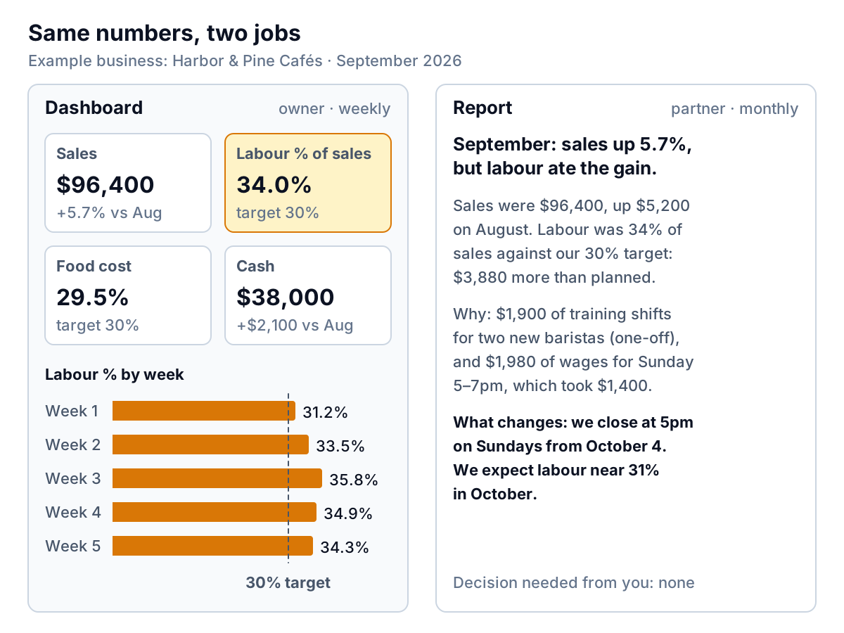
The dashboard did its job early in the month. By the second week, labour was 33.5% of sales against a 30% target, and the tile turned amber. The owner looked into it the same week. By the end of the month she knew the answer, and the report could say it in three sentences:
- What happened: sales of $96,400, up $5,200 on August, but labour of $32,800 was 34% of sales, $3,880 more than the 30% target allows (30% of $96,400 is $28,920).
- Why: $1,900 of overlapping training shifts for two new baristas, which won't repeat, and $1,980 of wages for the Sunday 5–7pm opening, which brought in only $1,400 of sales. The two add up to the $3,880.
- What changes: Sunday closing moves to 5pm from October 4, and labour should be near 31% in October.
Notice what the report leaves out. Food cost was on target, and cash was fine. The dashboard shows them every week, but the report mentions them only in passing, because they didn't change anything. A report is an edit of the dashboard, not a copy of it.
How a dashboard and a report work together
The best setup isn't one or the other. It's a loop, where each hands the other something.
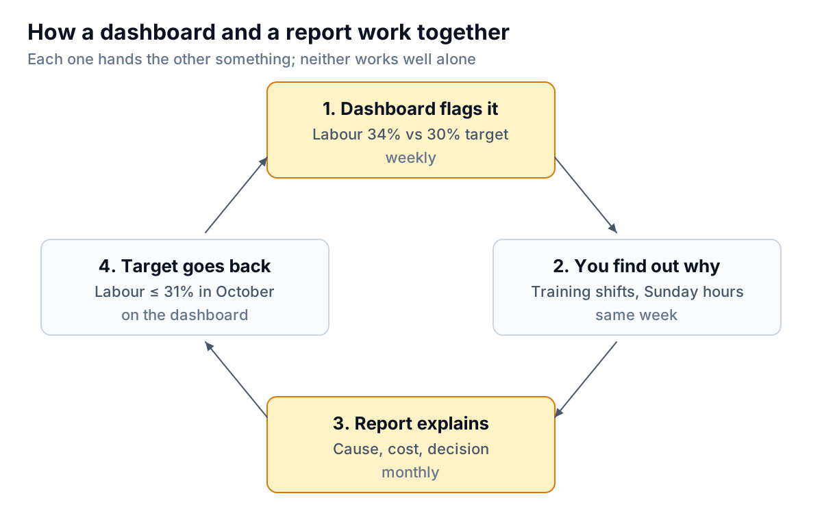
- The dashboard flags it. Weekly, against a target. Without this, you learn about a labour problem when the monthly accounts close, four to six weeks after it started.
- You find out why. The same week, while people still remember the rota.
- The report explains it. Monthly, for the people who weren't there, with the cost and the decision.
- The target goes back on the dashboard. "Labour at or below 31% in October" becomes the line the tile is judged against next month. Next month's report opens by saying whether it was met.
That last step is what most businesses miss. If decisions in the report never become targets on the dashboard, nobody checks whether they worked, and the same problem shows up in the report again three months later.
Turning a dashboard into a report in five edits
If you have a dashboard and need to send a monthly report, don't start from a blank page. Start from the screen and make five edits:
- Write the headline as a sentence. "September: sales up 5.7%, but labour ate the gain." If the reader stops there, they still know the month. Our executive summary examples show how to write that first line for good news and bad.
- Keep only the numbers that moved or missed. Three to five. Mention the rest in one line ("food cost and cash on plan").
- Explain each one with amounts that add up. "$1,900 of training and $1,980 of Sunday wages" is checkable; "higher staffing costs" is not.
- Say what changes, with a date and the number you expect.
- Say what you need from the reader, even if it's "nothing this month". A partner who knows no decision is needed reads the report in two minutes and trusts the next one more.
If you write the same report every month, a fixed structure saves time; the monthly report template has one with space for numbers, commentary and actions.
Dashboard vs report mistakes that blur the two
- Sending a dashboard as a report. A link or a PDF of a chart page leaves the reader to work out what it means, and they'll often reach a different answer from yours. Add the sentences.
- Using a report to monitor. A monthly report that's your only view of the business means every problem is at least a month old when you see it.
- Letting the dashboard grow into the report. When a partner asks for more detail, the temptation is to add tiles. Six months later the owner's screen has 30 of them and nobody can find the four that matter. Put the detail in the report and keep the dashboard small; our dashboard design rules explain why.
- Numbers that disagree. If the dashboard says labour was 34.0% and the report says 33.1%, the reader stops trusting both. Build them from the same data, with the same definitions and the same cut-off date. A common cause is the report using closed accounting figures and the dashboard using the till and payroll exports, so state which one each uses, and reconcile once a month.
- A report with no "why". A list of numbers with arrows is a dashboard printed on paper. If you can't say why a number moved, say that too, and say when you'll know.
Building both from the same data
The simplest way to keep a dashboard and a report in agreement is to build them from one dataset. In a spreadsheet, that means one data tab feeding both the dashboard tab and the numbers you quote in the report, so nothing is retyped.
Parity is set up the same way. Connect QuickBooks Online, Square, Shopify, Stripe, HubSpot or Google Sheets, or upload a CSV or Excel export, and Parity builds a dashboard with headline numbers and their trends, charts, what explains them, and a table of what needs attention. When the month closes and you need the version for your partner, ask it to write a client-ready report from the same data; it builds one dashboard or report per request. Every number and chart is checked against queries on the full dataset before you see it, so the report and the dashboard can't quietly disagree. You refine either by chat, share a read-only link (with an optional password or end date), or export to PDF.
Connect your data and get a checked dashboard, then ask for the monthly report from the same numbers. Build a report from your data free
Most of the dashboard vs report confusion ends with one habit. When someone asks for "the numbers", ask one question back: will you be checking these regularly, or do you want to know what happened? The answer tells you whether to send a dashboard or a report, and it saves you the reply that says, "So… was it good or bad?"