Most galleries of data dashboard examples are screenshots: dark backgrounds, glowing gauges, a world map for a business that sells in one county. They show what a dashboard can look like. They almost never show what it's built from, which is the part that decides whether you can have one at all.
These data dashboard examples work the other way round. It walks through seven examples from across a small business (finance, sales, marketing, operations, inventory, customer service and staffing) and starts each one with the table of data behind it. For each, you'll see the question it answers, the data you need, what it gets right, and the trap to avoid. None of it depends on a particular tool. If you work in Excel, our Excel dashboard examples cover a different eight with the formulas to build them.
Start with the table, not the chart
Every useful dashboard sits on one table where each row is one thing that happened: one invoice, one order, one job, one ticket. Data people call this the grain. Get it right and almost any chart is a few clicks away. Get it wrong (a summary someone typed up, or a report with subtotals mixed into the rows) and every chart takes an afternoon.
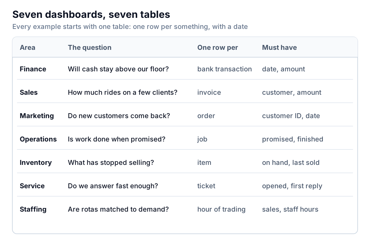
Before you build any of the examples below, check three things about your table:
- One row per event, with no total or subtotal rows mixed in.
- A real date column, not text that looks like a date. You'll group by week or month on almost every chart.
- A stable ID for anything you'll count more than once: a customer ID rather than a name typed differently each time.
Examples 1 to 3: cash, customers and repeat buyers
1. Finance: will cash stay above our floor?
The data: your bank transactions, one row each, with date and amount. Most banks and accounting tools export this as a CSV.
The example: Fairweather Studio, an example eight-person design studio, sets a cash floor of $40,000, about one month of fixed costs. Its dashboard shows weekly money in and money out as separate bars, the balance as a line, and the floor as a dashed line. Over the last four weeks, $61,200 came in and $74,800 went out, so the balance fell $13,600, from $65,900 to $52,300. At $3,400 a week, it reaches the floor in about three and a half weeks.
What it gets right: it shows money in and money out separately. A balance line alone can't tell you whether the problem is slow receipts or rising spending; two bars can. And it turns the trend into a time ("3.6 weeks to the floor"), which is what an owner acts on.
The trap: transfers between your own accounts appear as both money out and money in. Filter them out, or the bars will be inflated. This dashboard looks backwards; to look forwards, build a cash flow forecast.
2. Sales: how much rides on a few customers?
The data: invoices for the last 12 months, one row each, with customer and amount. Your accounting system's sales by customer detail is enough.
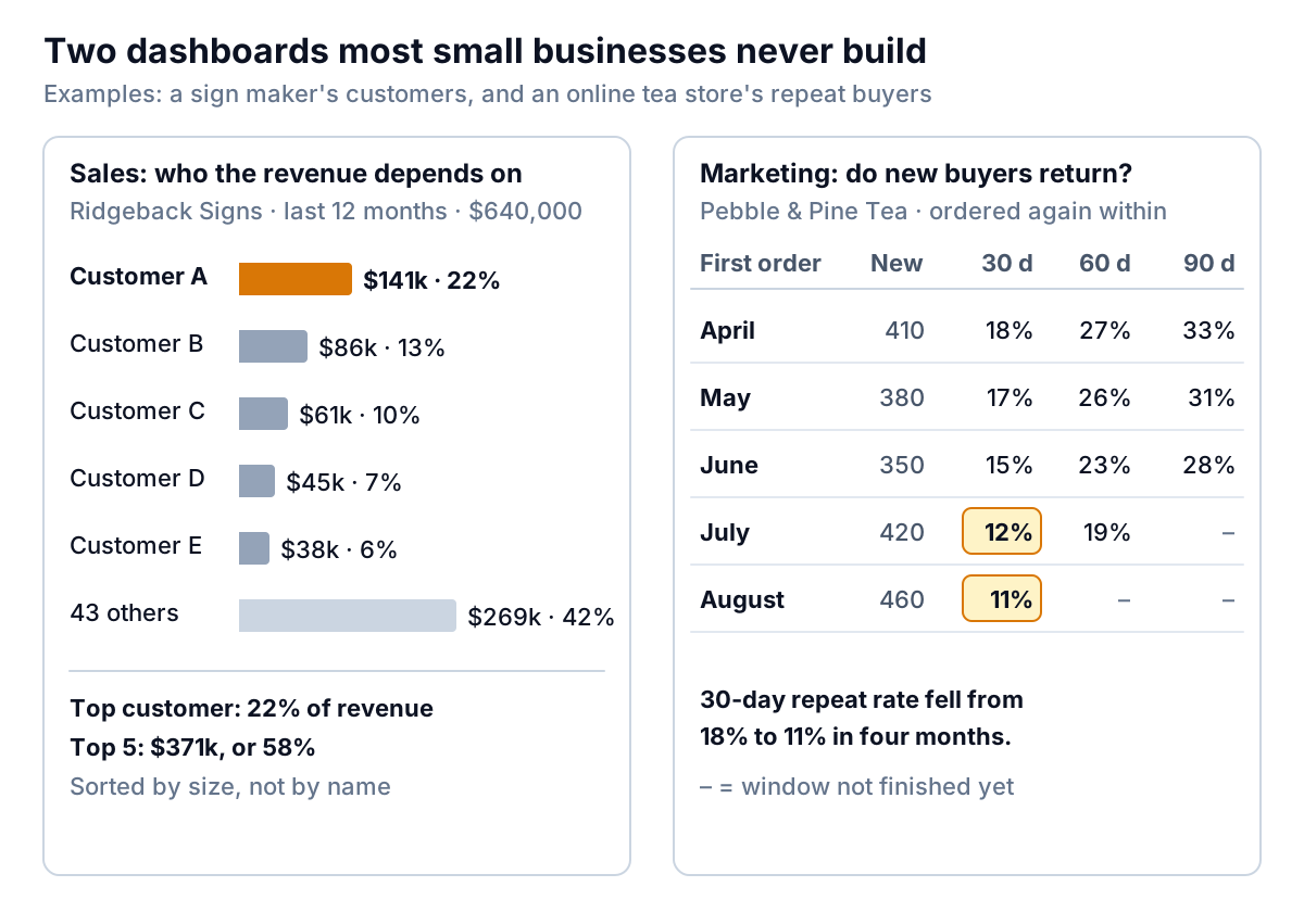
The example: Ridgeback Signs, an example sign maker, billed $640,000 over 12 months to 48 customers. Sorted by size, one customer brought in $141,000, or 22%, and the top five together $371,000, or 58%.
What it gets right: it answers a question growth charts hide. Revenue can rise for a year while the business becomes more dependent on one buyer. If Customer A moved to a competitor, Ridgeback would lose more than a fifth of its sales overnight. The chart groups the long tail into one "43 others" bar so the big names stand out.
The trap: a customer can appear under two names (a parent company and a branch, or "ABC Ltd" and "ABC Limited"). Merge them before you count, or concentration looks lower than it is. Choose your own trigger in advance, such as "talk about it when any customer passes 20%", and show it on the chart.
3. Marketing: do new customers come back?
The data: every order, one row each, with a customer ID and order date. Online stores and card terminals usually include both in their order exports.
The example: Pebble & Pine Tea, an example online store, groups customers by the month of their first order. For each group, the dashboard shows the share who ordered again within 30, 60 and 90 days. Of April's 410 new customers, 18% reordered within 30 days and 33% within 90. By August's group of 460, the 30-day figure was down to 11%.
What it gets right: it compares like with like. A simple "repeat customer rate" for the whole store mixes customers who've had a year to come back with those who've had a week, so it moves whenever new-customer numbers move. Grouping by first-order month (a cohort) and measuring each group at the same age removes that. It also leaves a cell blank until its window has fully passed, so August's 60-day figure doesn't show up looking terrible on day 40.
The trap: guest checkouts. If buyers can order without an account, the same person may appear under several IDs, and your repeat rate will look lower than it is. Match on email address where you can. And when a number falls like Pebble & Pine's, the dashboard tells you when the change started (somewhere around June), not why; check what changed then, such as a new acquisition channel, a price rise or slower delivery.
Examples 4 and 5: operations and inventory
4. Operations: is work done when we promised?
The data: one row per job or order, with the promised date (or time window), the finished date, and a reason code for anything that missed.
What it gets right: it reports the share done inside the promised window, not an average delay, and it counts the reasons. "84% on time, and 11 of the 21 late jobs followed an overrun" points straight at a fix. Our operations dashboard guide builds this in full, with capacity, the queue and a version for product businesses.
The trap: measuring against an internal target rather than what you told the customer. The customer's promise is the only one that counts.
5. Inventory: what has stopped selling?
The data: one row per item, with units on hand, cost per unit, and the date it last sold.
What it gets right: it groups stock value by days since last sale (0–90, 91–180, 181–365, over a year), so the money sitting still has a number on it. A shop can have plenty of stock and still run out of its best sellers, and this view shows the first half of that problem. The inventory dashboard guide adds turnover and a reorder list for the second half.
The trap: valuing stock at retail price. Use cost, or the dashboard tells you you're richer than you are.
Examples 6 and 7: customer service and staffing
6. Customer service: do we answer fast enough?
The data: one row per support ticket or enquiry, with the time it was opened and the time of the first reply. Help desk tools export this; for a shared inbox, a simple log in a spreadsheet works.
The example: Lantern Home, an example online furniture store, handled 640 tickets in September. Its dashboard shows the median first reply time (5.5 hours) and the 90th percentile (26 hours): half of customers heard back within 5.5 hours, and one in ten waited more than a day. Below that sits the open backlog by age: 34 tickets under a day old, 12 at one to three days, and 5 over three days, listed oldest first.
What it gets right: it uses the median and a high percentile instead of the average. The average (9.8 hours at Lantern) is pulled up by tickets that arrived on Friday night and down by quick replies, so it describes nobody's actual experience. The 90th percentile shows how bad it gets for the unlucky customers, who are the ones who leave reviews. In Google Sheets, PERCENTILE does it in one formula; Excel has the same function.
The trap: counting an automatic "we've got your message" email as the first reply. Measure the first reply from a person.
7. Staffing: are rotas matched to demand?
The data: sales by hour from your till, and hours worked by hour from your rota or time clock. Join them on date and hour.
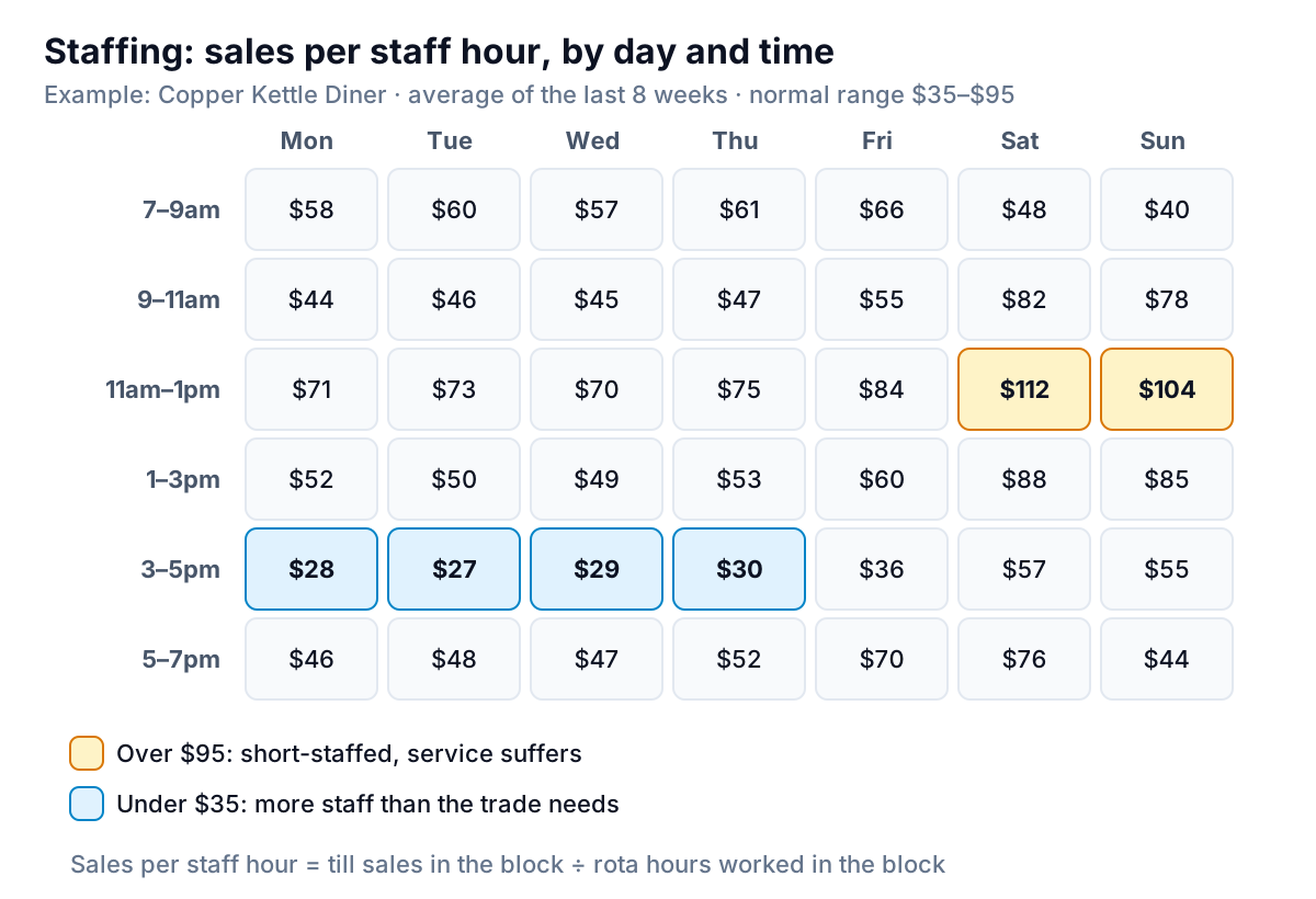
The example: Copper Kettle Diner, an example, divides till sales in each two-hour block by the staff hours worked in it, averaged over eight weeks. Its normal range is $35 to $95 of sales per staff hour, set from its own history. Weekend lunchtimes run at $104 to $112, so the team is stretched and service slows. Weekday afternoons from 3 to 5pm sit at $27 to $30, so the diner is paying people to wait for customers.
What it gets right: the grain. Weekly labour cost as a share of sales, the usual measure, can look fine while both problems hide inside it, because the overstaffed afternoons and the short-staffed lunches cancel out. A heatmap of day by time block makes both visible on one screen, and the fix (move hours from weekday afternoons to weekend lunch) falls out of it. In a spreadsheet, conditional formatting's colour scale builds the grid; keep the shading to the out-of-range cells, as here, rather than colouring every one.
The trap: mismatched clocks. If the till records the time of payment and the rota records shift start, a lunch rush that pays at 1:10pm lands in the wrong block. Two-hour blocks soften this; hourly blocks make it worse.
What public data dashboards get right
Some of the best data dashboard examples to study are public ones run by governments, because millions of people use them and complaints arrive quickly. The UK government's Analysis Function published guidance with four example dashboards in 2026, reviewing what each does well and badly. It praises the UKHSA data dashboard for being based on user need, giving clear notes about data quality, and having a known, frequent update schedule, and another tool for labelling its data with the date of last update.
Those habits cost nothing and transfer straight to a small business dashboard:
- Say when it was last updated. "Data to Sep 30" under the title stops anyone acting on last month's numbers by mistake.
- Write down what the data can't tell you. "Excludes guest checkouts" or "first reply measured from a person, not the auto-reply" saves an argument later.
- Keep a known schedule. "Updated every Monday by 9am" is a promise people can rely on, and a dashboard nobody trusts to be current gets ignored.
- Check contrast and colour. The guidance flags palettes that may be inaccessible as a weakness. Use words or signs alongside colour, so a reader who can't tell red from green still gets the message.
Which of these data dashboard examples to build first
Pick the one that matches the problem you're losing sleep over, and check you have its table:
| If you're worried about… | Build | Data you'll need |
|---|---|---|
| Running short of cash | 1. Cash against a floor | Bank transactions |
| Losing a big client | 2. Customer concentration | 12 months of invoices |
| Customers not coming back | 3. Repeat-purchase cohorts | Orders with a customer ID |
| Complaints about lateness | 4. On time, with reasons | Jobs with promised and finished dates |
| Cash tied up in stock | 5. Stock by days since last sale | Items with on-hand, cost, last sold |
| Slow replies and bad reviews | 6. Reply times and backlog | Tickets with opened and first-reply times |
| Wage bill too high, or service too slow | 7. Sales per staff hour | Hourly sales and rota hours |
Once two or three of these are running, put the headline from each on one owner's screen, so you check one page instead of seven.
Building them from your own data
Each of these can be built in a spreadsheet from a single export, and the hardest part is usually the cleaning: merging duplicate customer names, removing transfers, matching till times to shifts. Once that's done, the charts are quick.
Parity starts from the same tables. Connect QuickBooks Online, Shopify, Square, Stripe, HubSpot or Google Sheets, or upload a CSV or Excel export of anything else, such as your help desk tickets or rota hours, and describe the dashboard you need ("revenue by customer for 12 months, sorted, with the top five's share"). Parity builds a dashboard with the headline numbers and their trends, charts, what explains them, and a table of what needs attention, and every number and chart is checked against queries on the full dataset before you see it. You refine it by chat ("merge ABC Ltd and ABC Limited", "show the 90th percentile too"), share a read-only link, and update it with a newer file next month.
Upload a CSV or Excel file, describe the question, and get a checked dashboard back. Build a dashboard from your file free
Whichever data dashboard examples you borrow from, borrow the order of work too: the question first, then the table, then the chart. A dashboard built that way answers something on the first day. One built from a template's screenshot usually waits for data that never quite fits.