The owner of Linden Bakery, an example business we'll use in this guide, wants to show her accountant where September's $47,000 of costs went. She selects the nine cost lines, clicks Insert, and picks a pie. Two big slices, seven slivers, and a legend with nine colours to match against them. Nobody can tell from it whether delivery cost more than energy. The data was fine. The chart type was wrong for the question.
Excel chart types run to more than a dozen, and Microsoft's own guide to the available chart types in Office describes each one. This post sorts the Excel chart types a small business actually uses by the question they answer, gives the menu path and version limits from Microsoft's documentation for each, and lists the ones to skip. The examples use one fictional bakery's numbers throughout, so you can see the same data in different charts.
Excel chart types by the question they answer
Before you open the Insert tab, say the question out loud. "How do our product lines compare?" "What turned $51,000 of sales into $4,000 of profit?" The question picks the chart.
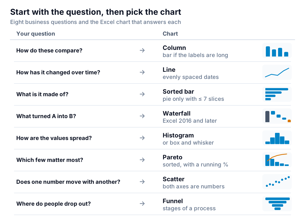
If you're unsure, select your data and use Insert > Recommended Charts. Microsoft's guide to creating a chart with recommended charts shows how Excel previews a few options suited to the data; the All Charts tab lists every type. Recommended Charts looks at the shape of your data, not at your question, so treat its suggestions as a shortlist and check them against the table above.
Here's a quick reference for the types covered below, with where to find each one:
| Chart | Where in Excel | Versions Microsoft's page lists |
|---|---|---|
| Column, bar, line, pie, scatter | Insert > Recommended Charts > All Charts | Microsoft 365, 2024, 2021 |
| Waterfall | Insert > Insert Waterfall… > Waterfall | Microsoft 365, 2016 to 2024 |
| Histogram, box and whisker | Insert > Insert Statistic Chart | Microsoft 365, 2016 to 2024 |
| Pareto | Insert > Insert Statistic Chart > Pareto | Microsoft 365, 2024, 2021 |
| Funnel | Insert > Insert Waterfall, Funnel, Stock, Surface or Radar chart > Funnel | Windows: Office 2019, 2021 or Microsoft 365 |
| Treemap | Insert > Insert Hierarchy Chart > Treemap | Microsoft 365, 2024, 2021 |
| Map | Insert > Charts > Maps > Filled Map | Microsoft 365 subscription only |
| Sparklines | Insert > Sparklines (Line, Column, Win/Loss) | Microsoft 365, 2016 to 2024 |
The newer types (waterfall, histogram, Pareto, box and whisker, funnel, treemap, map) are the ones to check if you share files with people on older versions of Excel or other spreadsheet apps. Open the file on their setup before you rely on the chart.
Comparing things and tracking them over time
Column and bar charts: "how do these compare?"
Column charts put categories along the bottom and values up the side. They're the default for comparing a handful of things: Linden's six product lines last month (bread $14,200, pastries $11,800, cakes $8,600, wholesale $7,400, coffee $5,100, catering $3,900). Microsoft's guidance is to switch to a bar chart (the same thing turned on its side) when the axis labels are long or the values are durations. Customer names, product descriptions and supplier names nearly always read better as bars, because the labels sit horizontally instead of tilting.
Two habits make them useful. Sort the bars by value, largest first, unless the categories have their own order (months, sizes, age bands). And keep the value axis starting at zero, because a bar's length is the message.
Line charts: "how has it changed over time?"
Microsoft describes line charts as ideal for showing trends at equal intervals: weekly sales, monthly cash, daily orders. Use one line for the measure and a second, lighter line for last year or the target. More than four lines and the chart turns into spaghetti; split it into small charts instead.
Watch the "equal intervals" part. A line chart's horizontal axis spaces categories evenly, whatever they are. If your dates are uneven (say, stock counts taken on the 3rd, the 10th and the 28th), the gaps get drawn as if they were the same. Excel can fix this with a date axis: Microsoft's page on changing the display of chart axes explains choosing Date axis under Axis Options, which places dates in time order at set intervals. For numbers on both axes, a scatter chart is the right tool; Microsoft's comparison of scatter and line charts sets out the difference.
Sparklines: a trend inside a table
Sparklines aren't a chart type in the gallery, but they solve a common problem: a table of 20 products where you'd like to see each one's trend. A sparkline is a tiny chart inside one cell. Select a blank cell at the end of a row, choose Insert > Sparklines (Line, Column or Win/Loss), point it at the row of values and drag it down. Twelve months of sales per product, each with its own little line, is often more useful than one big chart.
Showing what something is made of
This is where most business charts go wrong, usually with a pie.
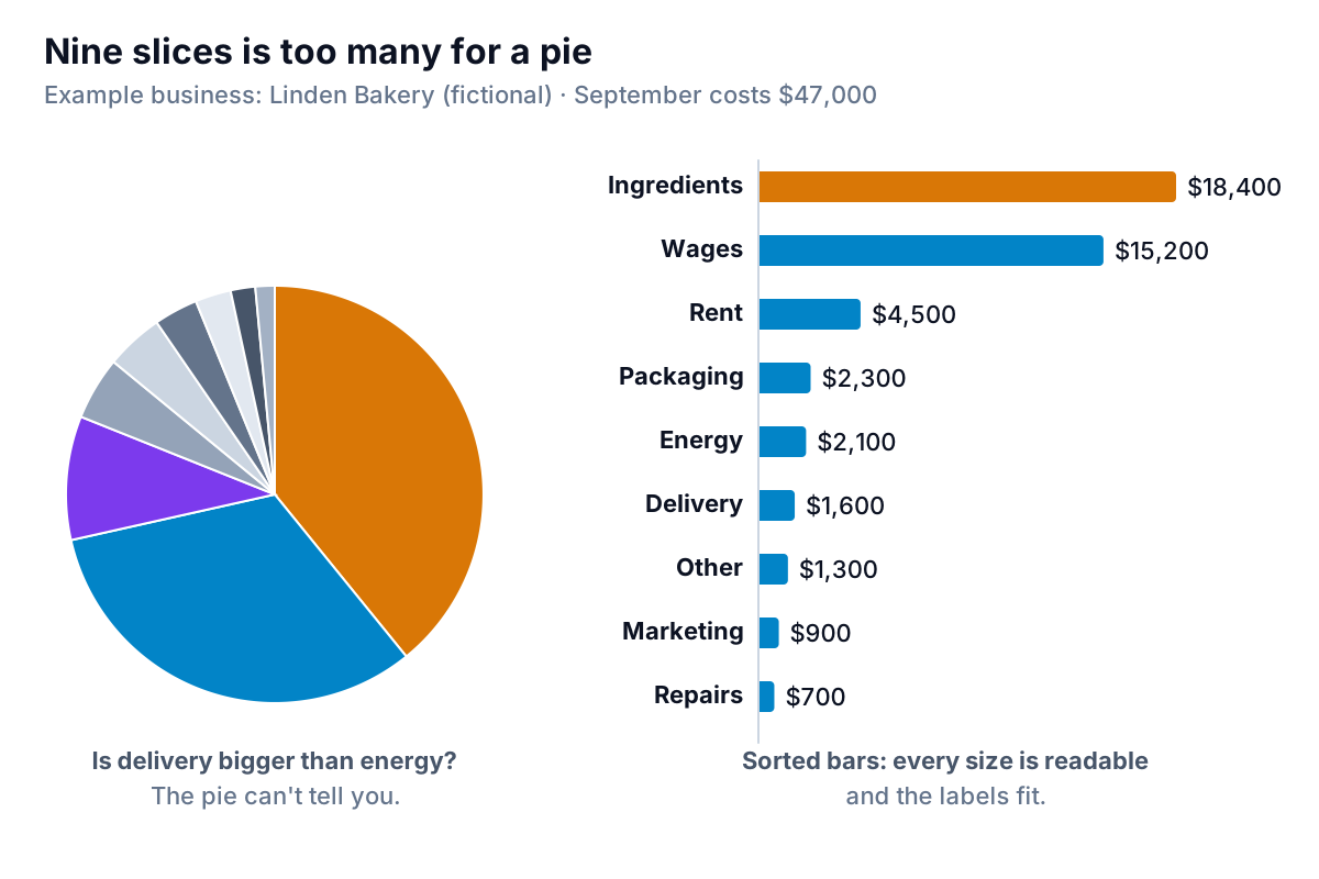
Microsoft's own guidance on when to use a pie is strict: one data series, no negative values, almost no zeros, and no more than seven categories. Linden's costs break the last rule, and the result is unreadable. A sorted bar chart shows the same "made of" story and keeps every size readable. If you must use a pie, group the small items into "Other" until you have five or fewer slices, and label each slice with its percentage.
The alternatives, by situation:
- Doughnut. A pie with a hole that can hold more than one series. Microsoft's chart guide is blunt: "Doughnut charts aren't easy to read." Skip it.
- Stacked column. Use it for "what is it made of, and how is that changing?": costs by category for each of the last six months. Keep the stack to three or four segments, with the most important one at the bottom, where it's easiest to compare.
- Treemap. For a breakdown with levels, such as sales by category and then by product. Microsoft's guide to creating a treemap chart uses Insert > Insert Hierarchy Chart > Treemap. It handles many items in a small space but makes exact comparisons hard, so use it to spot the big blocks, not to compare close values.
Explaining a change: waterfall and combo charts
Waterfall: "what turned A into B?"
A waterfall shows a starting value, the steps that add to it or take from it, and where you ended up. It's the best single chart for a profit and loss summary, a budget-versus-actual gap or a cash bridge from one month to the next.
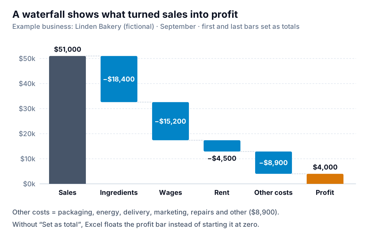
To build one, Microsoft's guide to creating a waterfall chart says: select the data, then Insert > Insert Waterfall… > Waterfall. Put the steps in a column in order, with costs as negative numbers. Then do the step most people miss: right-click the first and last bars and choose Set as total, so they start at zero rather than floating like the steps in between. Merge small items into one "other" step, as Linden does with six cost lines worth $8,900; more than seven or eight steps and the chart gets hard to follow.
Combo charts: two measures with different scales
Sometimes you want two different kinds of number on one chart: monthly sales in dollars as columns and number of orders as a line. Microsoft's article on adding a secondary axis recommends one when values vary widely between series or mix types such as price and volume. The steps: select the chart, Change Chart Type > Combo, choose Clustered Column – Line on Secondary Axis, and tick Secondary Axis for the line.
Use it carefully. Readers tend to compare the line with the columns as if they shared a scale, and the point where they cross means nothing. Label both axes clearly, or put two small charts one above the other with the same months along the bottom. Our dashboard design guide explains why the second option is usually clearer.
Spread, ranking, relationships and stages
These Excel chart types answer questions that averages hide.
- Histogram: "how are the values spread?" Say Linden's average catering order is $310. Are most orders near $310, or is it a mix of $80 orders and a few $1,500 weddings? A histogram groups values into ranges ("bins") and counts how many fall in each. Microsoft's guide to creating a histogram uses Insert > Insert Statistic Chart > Histogram; to choose the ranges yourself, right-click the horizontal axis, choose Format Axis, and set a bin width, number of bins, or overflow and underflow bins to group the extremes.
- Box and whisker: "how does the spread compare between groups?" It shows quartiles, the mean and outliers for one or several series, such as order values at each of two shops. See Microsoft's guide to creating a box and whisker chart (Insert > Insert Statistic Chart > Box and Whisker). It's powerful but unfamiliar to many readers, so add a one-line explanation under it.
- Pareto: "which few matter most?" A sorted column chart with a line showing the running percentage. Use it for unsold items by product, complaints by reason or late deliveries by supplier, where a few causes usually account for most of the total. Microsoft's guide to creating a Pareto chart shows the path: Insert > Insert Statistic Chart, then Pareto under Histogram, with a column of categories and a column of numbers.
- Scatter: "does one number move with another?" Weekly flyer spend against wholesale enquiries, or temperature against iced drink sales. Each point is one week; if the dots run upward from left to right, the two move together. That shows a relationship, not proof that one causes the other.
- Funnel: "where do people drop out?" Stages of a process where the numbers fall at each step: 40 wholesale enquiries, 18 tastings, 9 trial orders, 5 regular accounts. Microsoft's guide to creating a funnel chart says you need one column for stages and one for values, and that in Excel for Windows the chart needs Office 2019, Office 2021 or a Microsoft 365 subscription.
- Map: "where?" A filled map shades countries, states, counties or postal codes by value. According to Microsoft's guide to creating a map chart, it needs a Microsoft 365 subscription and an internet connection to create, and it doesn't map street addresses or latitude and longitude. For a local business selling in a few postcodes, a sorted bar chart by postcode is often clearer.
Excel chart types to skip, and a check before you share
Excel offers some chart types that rarely help a small business report:
| Chart type | Why to skip it | Use instead |
|---|---|---|
| Any 3-D chart | Perspective distorts the lengths and angles the reader is judging | The 2-D version |
| Doughnut | Harder to read than a pie, which is already hard | Sorted bar |
| Radar | Comparing areas and angles is unreliable for most readers | Grouped bar |
| Surface | Built for engineering data, not sales or costs | A table with colour scales |
| Bubble | Bubble sizes are hard to compare | Scatter, with the third value as a label |
| Stock | Needs price data in a fixed column order | Line chart |
Before any chart goes into a report, run five checks:
- Can you say its question in one sentence? If two charts answer the same question, delete one.
- Is the title the answer? "Ingredients and wages were 72% of costs" beats "Costs by category". Linden: ($18,400 + $15,200) ÷ $47,000 = 71.5%.
- Do bars start at zero, and are they sorted?
- Does colour mean something? One accent colour for the bar that matters; grey or one colour for the rest.
- Do the numbers match the table? A chart built on a range that missed the last row is the most common error in a spreadsheet report.
If you're building a whole page of these, our Excel dashboard guide covers how to lay them out so they update when the data changes, and the Excel dashboard examples show several of these chart types doing real jobs.
When choosing the chart isn't the hard part
Picking the chart takes a minute once you know the question. The slow part is everything before it: exporting the data, cleaning it, building the summary table and checking the totals every month. Parity does that part from your own data. Connect QuickBooks Online, Stripe, Shopify, HubSpot, Square or Google Sheets, or upload a CSV or Excel file, and it builds a dashboard with headline numbers and their trends, charts chosen for each question, what explains them and a table of what needs attention. Every number and chart is checked against queries on the full dataset before you see it.
You can change any chart by asking ("show costs as a sorted bar, not a pie", "add a waterfall from sales to profit"), with versions and undo, and export the result to PDF or Excel, or share it as a read-only link.
Upload a spreadsheet or connect your accounts and get a checked dashboard in minutes. Build a report from your data free
Whatever you use, start where Linden's owner should have: with the question her accountant will ask. "Where did the money go?" is a sorted bar. "How did $51,000 become $4,000?" is a waterfall. The chart follows.