To make a waterfall chart in Excel, put labels in one column and signed values in the next (increases positive, decreases negative), select both, and choose Insert > Insert Waterfall… > Waterfall. Then right-click the first bar, choose Format Data Point, and tick Set as total; do the same for the last bar and any subtotal. The chart type is built into Excel 2016 and later, including Microsoft 365.
Those are the clicks. Whether the chart explains anything depends on the table behind it, and that's what this guide is mostly about. Our guide to Excel chart types shows a basic waterfall from sales down to profit. Here we go further with Quarry Lane Architects, an example design practice: a bridge from last year's profit to this year's, a profit and loss walk with a subtotal in the middle, and the stacked-column method for anyone still on Excel 2013 or earlier.
Download the practice workbook (.xlsx). It has Quarry Lane's figures, a Practice sheet with the formulas blank, and a Solution sheet with every formula plus the older stacked-column version already charted.
What a waterfall chart in Excel answers
Quarry Lane's fee revenue rose from $600,000 in FY2025 to $742,000 in FY2026, up 24%. Operating profit fell from $96,000 to $83,000. Both numbers are on the profit and loss statement, but the statement doesn't say why. A waterfall chart (also called a bridge chart) does: start with one number, show each thing that pushed it up or down, and end at the other number.
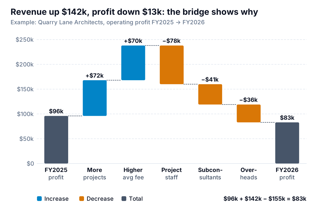
Now the story is visible. The firm did more projects (28, up from 25) and charged more per project ($26,500 on average, up from $24,000). Both helped. Project staff costs rose $78,000, more than either gain, and subconsultants and overheads took the rest. That's a conversation about hiring and pricing, not a vague "costs went up".
Use a waterfall when your question is "what turned A into B?". Profit this year against last, budget against actual, cash at the start of the month against cash at the end, or revenue down to profit. For "how do these compare?" or "how has it changed month by month?", a column or line chart is clearer.
Lay out the data before you insert anything
A waterfall chart in Excel draws exactly what's in the cells, in order. Three rules make it come out right:
- One column of labels, one column of values. No blank rows in between.
- Signed values. Increases are positive, decreases negative. Enter costs as positive numbers and every bar goes up.
- Total rows hold the total itself, not a change. The start and end rows hold $96,000 and $83,000.
Here's Quarry Lane's bridge table, as it appears in the Solution sheet (rows 14–20), with the formulas that calculate each step from the inputs above it:
| Label | Value | Formula |
|---|---|---|
| FY2025 operating profit | 96,000 | =B10 (FY2025 fees − staff − subconsultants − overheads) |
| More projects (25 to 28) | 72,000 | =(C4-B4)*B5: 3 extra projects × last year's $24,000 fee |
| Higher average fee | 70,000 | =(C5-B5)*C4: $2,500 more × this year's 28 projects |
| Project staff | −78,000 | =-(C7-B7): $286,000 against $208,000 |
| Subconsultants | −41,000 | =-(C8-B8): $96,000 against $55,000 |
| Overheads | −36,000 | =-(C9-B9): $277,000 against $241,000 |
| FY2026 operating profit | 83,000 | =C14+SUM(C15:C19) |
Two details are worth copying. First, the cost steps are the change in each cost with the sign flipped: a cost that rises reduces profit. Second, the revenue change is split into volume (more projects at the old fee) and price (the fee increase across this year's projects). The two parts add up to the whole change: $72,000 + $70,000 = $142,000 = $742,000 − $600,000. That split is a common convention, not the only one; whichever you use, check that the parts add up.
Then add one check you never delete: =C20=C10, which should say TRUE. If the bridge's end doesn't equal the profit on your P&L, a step is missing or has the wrong sign, and the chart will look right while telling the wrong story.
How to make a waterfall chart in Excel, step by step
Microsoft's guide to creating a waterfall chart lists it for Microsoft 365 and Excel 2016, 2019, 2021 and 2024, on Windows and Mac. With the table ready:
- Select the labels and the values. In the workbook, select A13:A20, then hold Ctrl and select C13:C20, so the Type column in between is left out.
- Choose Insert > Insert Waterfall… (the icon in the Charts group) > Waterfall. You can also find it under Recommended Charts > All Charts.
- Click the first bar once to select the series, then again so only that bar is selected. Right-click it, choose Format Data Point, and tick Set as total. The bar now starts at zero instead of floating.
- Do the same for the last bar.
- Add a title that states the answer: "Revenue up $142k, profit down $13k" tells the reader more than "Profit bridge FY2025–FY2026".
Excel colours the bars by type and shows three legend entries: Increase, Decrease and Total. Microsoft notes that clicking a legend entry selects all bars of that type, which is the quick way to recolour them. The thin lines joining each bar to the next are connector lines; turn them off under Format Data Series > Show connector lines if the chart looks busy.
Data labels on a bridge are long ("-78000"). Format them in thousands with a custom number format such as $#,##0,"k". Microsoft's guidelines for customizing a number format explain that a comma after a digit placeholder scales the number by 1,000. Negatives show with a minus sign, which on a bridge is exactly what you want.
Subtotals: bars that are totals in the middle
A profit and loss walk usually wants a stop in the middle. For an architecture practice, the natural one is project margin: fees minus the costs of delivering projects, before office overheads. Quarry Lane's FY2026 walk:
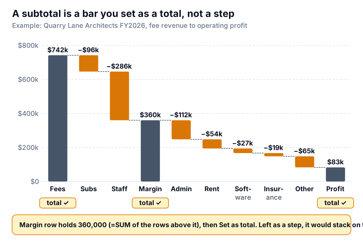
The subtotal row holds the subtotal, calculated: =SUM(C24:C26) gives $742,000 − $96,000 − $286,000 = $360,000. Then set that bar as a total, just like the first and last. If you forget, Excel treats $360,000 as another increase and stacks it on top of the running total, so the margin bar floats up to $720,000. The end row works the same way: =C27+SUM(C28:C32) gives $83,000, the same profit as the bridge. The workbook checks both against the inputs.
The overheads here are five lines: admin salaries $112,000, rent $54,000, software $27,000, insurance $19,000 and other $65,000, which together make the $277,000 in the bridge. Five small steps are about the limit. Past seven or eight bars a waterfall gets hard to read, so group small items into "Other", as Quarry Lane does. Our profit and loss statement template uses similar groupings if you need somewhere to start.
Waterfall charts in Excel 2013 and earlier
Older versions don't have the waterfall chart type, so files shared with people on those versions need another approach. The classic workaround is a stacked column chart with an invisible bottom series. It needs four helper columns:
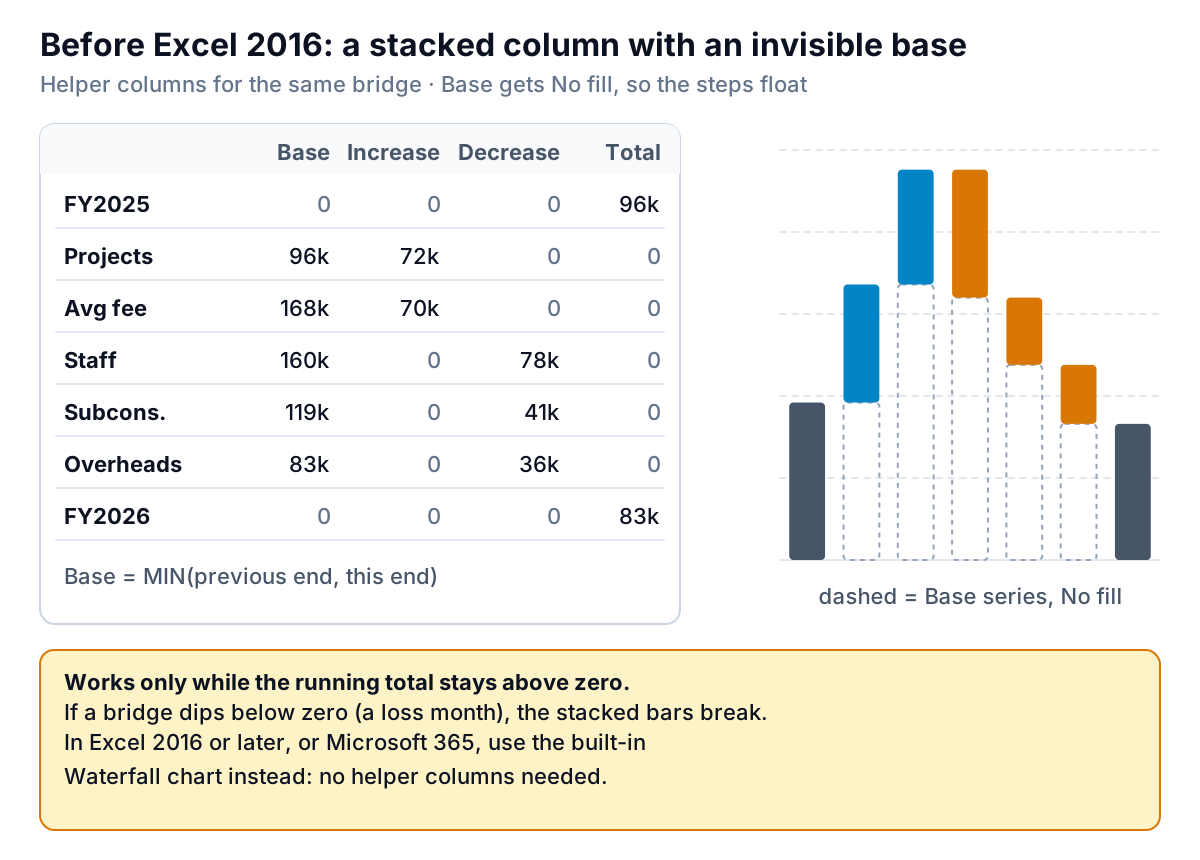
Add a Type column ("Total" or "Step") and a running end (column D), then four series. In the workbook, for row 15 onwards:
D15: =IF(B15="Total",C15,D14+C15)— where this bar ends
E15: =IF(B15="Total",0,MIN(D14,D15))— Base, the invisible part
F15: =IF(B15="Total",0,MAX(C15,0))— Increase
G15: =IF(B15="Total",0,MAX(-C15,0))— Decrease
H15: =IF(B15="Total",C15,0)— Total
Select the labels and columns E to H, insert a Stacked Column chart, then select the Base series and set Fill > No fill and Border > No line. Colour Increase, Decrease and Total as you like and set the gap width to around 50% so the bars look like a bridge. The Solution sheet has this chart already built.
The limitation: it only works while the running total stays above zero. If a step takes the total below zero (a loss-making month, say), the Base series would need to be negative and the stacked bars no longer line up. In Excel 2016 or later, use the built-in chart instead. If you're sharing a file, open it on the other person's version before you rely on the chart.
Waterfall mistakes that mislead
| What you see | Cause | Fix |
|---|---|---|
| Every bar goes up | Costs entered as positive numbers | Make decreases negative, e.g. =-(C7-B7) |
| Last bar floats in mid-air | End bar not set as a total | Format Data Point > Set as total |
| Subtotal bar shoots up | Subtotal treated as a step | Set it as a total too |
| End bar doesn't match the P&L | A missing step or a wrong sign | Keep a TRUE/FALSE check against the reported figure |
| Fifteen thin bars | Every account line charted | Group into 5–7 steps plus "Other" |
| Small steps look huge | Vertical axis doesn't start at zero | Reset the axis minimum to 0, or say clearly that it's cut |
| Totals wrong after adding a row | Totals are set bar by bar, by hand | Check which bars are set as totals after inserting or deleting rows |
The order of the steps is a choice. A P&L walk follows the statement's order. A bridge reads best with the drivers grouped (revenue effects, then cost effects), so the reader sees gains, then what ate them. Avoid sorting by size alone; it scatters related items.
From a one-off chart to a monthly bridge
A profit bridge is most useful when it's routine: the same chart in every monthly or quarterly pack, so a partner or investor sees at a glance what moved. Building it means pulling two periods of figures, working out the steps, checking they reconcile and redrawing the chart. If your books are in QuickBooks Online, our QuickBooks reports guide shows which reports to export for the inputs.
Parity can do that part from your own data. Connect QuickBooks Online, or upload a CSV or Excel export from any accounting tool, and it builds a dashboard with headline numbers and their trends, charts, what explains them and a table of what needs attention. Ask, and it writes a client-ready report from the same data, such as the monthly report you send a partner. Every number and chart is checked against queries on the full dataset before you see it, and you can ask for "a waterfall from last year's profit to this year's" by chat, with versions and undo.
Connect your books or upload an export and ask for the chart in plain words. Build a report from your data free
In Excel or anywhere else, the chart is the last step. Get the table right first: signed values, totals that are totals, and a check that the end matches the books.