To add conditional formatting in Excel, select the cells, go to Home › Conditional Formatting, pick a rule (for example Highlight Cells Rules › Less Than), type the value or click the cell that holds it, choose a format and click OK. For anything the menu doesn't offer, such as shading a whole row when an invoice is overdue, choose New Rule › Use a formula to determine which cells to format and enter a formula like =$J2>0.
That's the mechanics. The harder part is deciding what deserves colour. A sheet where half the cells are green, amber or red is no easier to read than a plain one. This guide uses one example business, Ironbark Fencing, a fictional fencing contractor with twelve open and recent invoices, and builds four rules that each answer one question: what's overdue, which jobs made too little, which invoices are big, and how late the late ones are. Then it covers the part most tutorials skip: managing the rules once you have them.
Download the practice workbook (.xlsx). The Practice sheet has the data with no rules; the Solution sheet has all four rules in place.
The example: twelve invoices, four questions
Ironbark's invoice sheet has one row per invoice: number, customer, fence type, invoice date, due date (invoice date plus 30 days), amount, job cost, margin, paid date and days overdue. Two settings sit off to the side: the as-of date in M1 (30 September 2026) and the margin floor in M2 (25%).
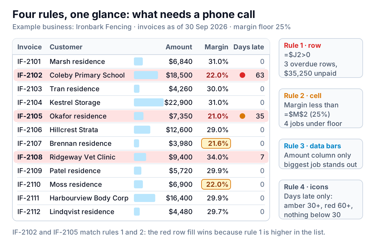
Across the twelve invoices, Ironbark billed $119,330. Three invoices are past due and unpaid, worth $35,250 between them. Four jobs came in under the 25% margin floor. Nobody should have to read 120 cells to find those seven facts, and with four rules nobody has to.
Two helper formulas feed the rules. Margin in H2 is =(F2-G2)/F2, the gross margin on the job (our guide to calculating gross margin explains why it's divided by the price, not the cost). Days overdue in J2 is:
=IF(I2="",MAX(0,$M$1-E2),0)In words: if there's no paid date, count the days from the due date to the as-of date, and never go below zero; if it's paid, it's zero. In the practice file the as-of date is typed in M1 so your numbers match this article. In your own sheet, put =TODAY() in M1 and the whole sheet updates itself each morning.
Rule 1: shade the whole row when an invoice is overdue
A red number in a "days overdue" column is easy to miss when your eye is reading customer names. Shading the whole row fixes that. The built-in menu rules only format the cell they test, so this one needs a formula.
- Select A2:J13, starting from A2 so that A2 is the active cell.
- Go to Home › Conditional Formatting › New Rule.
- Choose Use a formula to determine which cells to format.
- In Format values where this formula is true, type
=$J2>0. - Click Format, set a light red fill and dark red text, and click OK twice.
Three rows light up: IF-2102 for Coleby Primary School (63 days), IF-2105 for the Okafor residence (35 days) and IF-2108 for Ridgeway Vet Clinic (7 days). Change M1 to a later date and more rows join them.
The dollar sign in $J2 is doing the work. It locks the column, so every cell in the row looks at column J, while the row number moves so row 5 looks at J5. Microsoft's guidance is that the formula must start with an equal sign and return TRUE or FALSE, and that you use relative references when you want Excel to adjust them for each cell. Anchoring is where most formula rules go wrong, so it has its own guide: conditional formatting based on another cell covers $ placement, whole rows and rules that read another sheet.
On a Mac the steps are the same, with one extra click: in the New Rule dialog, set Style to Classic before you can pick the formula option, as Microsoft's Excel for Mac instructions show.
Rule 2: compare against a target that lives in a cell
Margin below 25% is a threshold rule, and the menu handles it:
- Select H2:H13.
- Go to Home › Conditional Formatting › Highlight Cells Rules › Less Than.
- In the box, click cell M2 (Excel writes
=$M$2) instead of typing 25%. - Pick a format. Ironbark uses amber fill with bold dark text.
Four jobs are under the floor: Coleby (22.0%), Okafor (21.0%), Brennan (21.6%) and Moss (22.0%). Pointing the rule at M2 instead of typing the number matters more than it looks. When the owner decides the floor should be 28%, she changes one cell and the sheet re-reads itself. A typed 25% would have to be found and edited inside the rule, and in a workbook with several sheets someone always misses one.
The other built-in rules worth knowing
The Highlight Cells Rules menu also has Greater Than, Between, Equal To, Text that Contains, A Date Occurring and Duplicate Values. The Top/Bottom Rules menu offers top or bottom 10 items, top or bottom 10%, and above or below average (Microsoft lists them all). Two earn a place on business sheets:
- Duplicate Values on the invoice number column. It catches the invoice that got keyed in twice, before it inflates your totals.
- A Date Occurring › Next week on the due date column. It shows what's about to fall due, so you can send statements before invoices go late. It moves with the real calendar, so it's useful in a live sheet and confusing in a frozen example.
Above Average is less useful than it sounds. On a list of invoices, half of them will usually be above average; that's what an average is. Highlight against a number you chose, not one the data chose for you.
Data bars and icon sets: one column each, or none
Data bars, colour scales and icon sets are the eye-catching part of conditional formatting in Excel, and the easiest to overdo.
Data bars draw a bar inside each cell in proportion to its value. On the Amount column (F2:F13, Home › Conditional Formatting › Data Bars › Solid Fill) they make the two big commercial jobs, Kestrel Storage at $22,900 and Coleby at $18,500, stand out from the $4,000 to $7,000 residential fences without anyone reading a number. Use them on one money column. On three columns side by side, the bars compete and nothing stands out.
Icon sets sort values into three to five bands with a symbol for each. Ironbark puts three traffic lights on Days overdue only, reversed so that more days means worse: 60 or more is red, 30 or more is amber. To set the bands, edit the rule and change Type to Number with values 60 and 30; Microsoft's guide explains the Reverse Icon Order and Show Icon Only options.
Out of the box, the bottom band gets a green light, which puts ten cheerful green dots next to invoices that are paid, not yet due or only a few days late. That's noise. In the Edit Formatting Rule dialog, set the bottom icon to No Cell Icon (it's one of the icons Excel offers for each band) so only the two invoices that need a phone call carry a symbol. The practice workbook ships the standard reversed set so you can make that change yourself.
Colour scales shade every cell on a gradient. They suit a grid where every cell is the same kind of number, like sales by weekday and hour. On a list of invoices they paint every row, so nothing stands out.
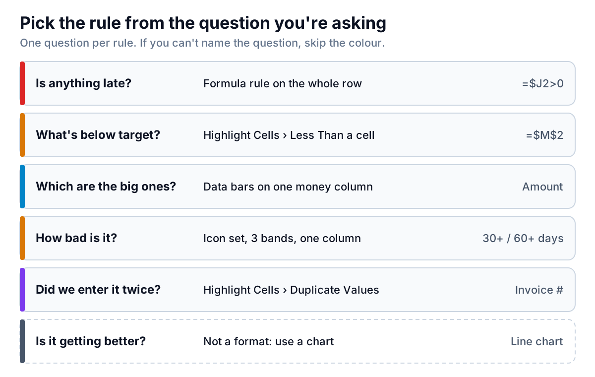
The last row of that guide matters. Conditional formatting describes each cell on its own. It can't tell you whether overdue invoices are rising month over month. For that, chart the monthly totals; our guide to Excel chart types covers which chart fits which question.
Managing conditional formatting rules in Excel
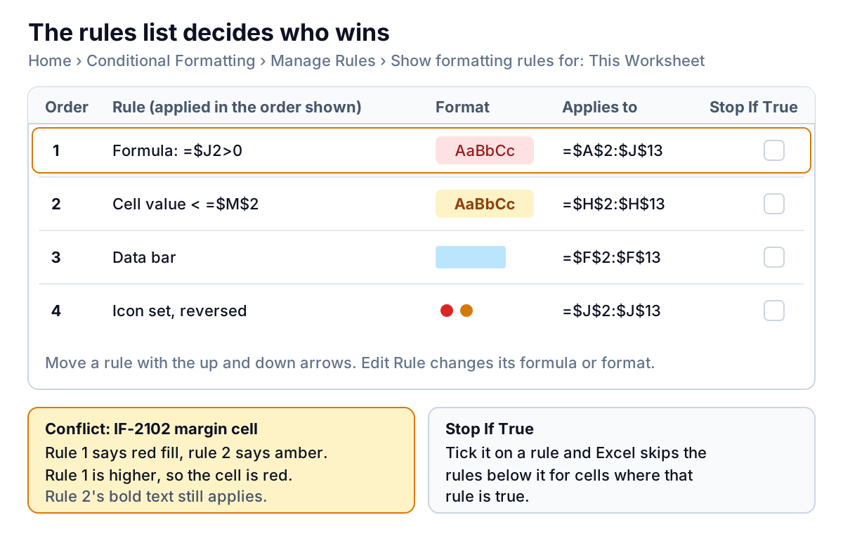
Every rule you add goes into one list. To see it, go to Home › Conditional Formatting › Manage Rules and change Show formatting rules for from Current Selection to This Worksheet. The default only shows rules touching the cells you happened to have selected, which is why people think rules have gone missing.
Four things to know about the list:
- Order decides conflicts. Microsoft's rule: when two rules set the same thing, such as fill colour, the one higher in the list applies. When they set different things, such as bold from one and a colour from another, both apply. At Ironbark, Coleby's margin cell meets rules 1 and 2. Rule 1 is higher, so the cell gets the red row fill; rule 2's bold text still shows.
- Stop If True tells Excel not to apply the rules below for cells where this rule is true. Ticked on the overdue rule, it would stop the margin warning on overdue rows. It would also stop the data bars and icons below it on those rows, which is why Ironbark leaves it unticked. Use it only when everything below the rule is noise for the cells it flags.
- Applies to is editable. When the sheet grows from row 13 to row 40, change
=$A$2:$J$13to=$A$2:$J$40here instead of creating a new rule. Better still, format the data as a Table (Insert › Table) so new rows usually pick up the formatting as you add them. - Copying cells copies rules. Microsoft notes that pasting formatted cells creates a new rule for the destination cells. After months of copying rows around, one rule can turn into dozens of fragments covering odd ranges. If the list looks like that, delete the fragments and fix the Applies to range on one clean rule.
To start over, Home › Conditional Formatting › Clear Rules offers Clear Rules from Selected Cells or from Entire Sheet.
When a rule doesn't do what you expect
| What you see | Likely cause | Fix |
|---|---|---|
| A threshold rule ignores cells that clearly qualify | The numbers are stored as text, common in exports from accounting or ecommerce tools | Convert them: select the cells, use the warning icon's Convert to Number, or =VALUE() in a helper column (Microsoft's steps) |
| Only the first column of each row is shaded | The formula has J2 without the $, so each column reads a different column | Lock the column: =$J2>0 |
| Every row is shaded, or none are | Excel wrote =$J$2 when you clicked a cell, locking the row too | Delete the second $ so the row can move |
| The highlight lands one row off | The formula was written for row 1 but the selection starts at row 2 | Write the formula for the first selected row |
| A rule that reads another workbook won't save | Excel doesn't allow conditional formatting on external references to another workbook | Copy the values into a sheet in the same workbook and point the rule there |
| The file is slow and the rules list is long | Rules fragmented by copying and pasting | Merge them back into one rule per question |
Five habits that keep a formatted sheet readable
- One rule per question. If you can't say what a rule is asking, delete it.
- Thresholds in cells, not in rules. Label them (Margin floor, As of) and put them where people can see them.
- Red means act now. Save it for overdue money or real problems, and use amber for "look at this".
- Bars and icons on one column each. More than that and they cancel each other out.
- Check the rules list monthly. Set it to This Worksheet and clear the fragments.
When the sheet becomes a monthly report
Conditional formatting works well for a list you look at every day. It works less well when the same sheet has to become a monthly summary: overdue totals by customer, margin by fence type, the trend since June. That's when people start copying ranges, which is how rules fragment, and pasting values into a second workbook, which is how numbers drift. Our Excel dashboard guide shows how to build that summary page in Excel if you'd rather stay in the spreadsheet.
If you'd rather not, Parity builds it from the data. Connect QuickBooks Online, or upload the invoice export as a CSV or Excel file, and it builds a dashboard with the headline numbers and their trends, charts, what explains them, and a table of what needs attention, such as the overdue invoices. Every number is checked against queries on the full dataset before you see it. You can refine it by chat, share a read-only link, or export it to Excel. Ask it to and it writes the month-end report from the same data.
Upload your invoice export and get a dashboard with overdue invoices and low-margin jobs already flagged. Build a report from your data free
Whichever way you go, the practice workbook is a good place to try each rule safely. Open the Solution sheet, change the as-of date in M1 to 31 October, and watch which rows turn red. If you understand why each one changed, you understand conditional formatting in Excel well enough to use it on your own numbers.