To make a pivot chart in Excel for Windows, click any cell in your data, choose Insert > PivotChart, pick where it goes, click OK, and tick the fields you want. If you already have a PivotTable, click inside it and choose PivotTable Analyze > PivotChart instead.
That gets you a chart in under a minute. What makes a pivot chart worth using is what comes next: you can change the question without rebuilding anything. Fieldstone Farm Stand, an example business we'll use here, sells vegetables, fruit, eggs and flowers from a stand at the farm and a stall at a Saturday market. Its owner wanted to see sales by month. Then she wanted to know whether the market was worth the stall fee. With a pivot chart and one slicer, that second question took one click. This guide covers creating, filtering and refreshing a pivot chart, and when a normal chart is the better choice.
Download the practice workbook (.xlsx). It has Fieldstone's 64 rows of sales, so you can build the pivot chart yourself, plus a Solution sheet with the totals your chart should show and a normal-chart alternative.
How to create a pivot chart, step by step
Fieldstone's data is a plain list with four columns: Date, Channel (Farm stand or Saturday market), Category and Amount. It has 64 rows covering June to September 2026, $53,300 in total. One row per sale or per day is the right shape. A pivot chart summarises the list for you, so don't summarise it first.
Before you start, turn the list into a table (Home > Format as Table, or Ctrl+T). Microsoft's guide to creating a PivotTable recommends a table as the source because new rows are included when you refresh. Then follow Microsoft's steps for creating a PivotChart:
- Click a cell in the table.
- Choose Insert > PivotChart.
- Choose where the chart goes (a new worksheet keeps things tidy) and click OK. Excel creates a PivotTable and a linked chart together.
- In the field list, drag Date to Axis (Categories), Category to Legend (Series) and Amount to Values.
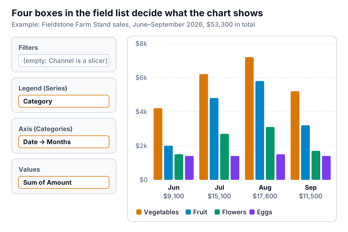
Excel usually groups the dates into months for you. Microsoft's page on grouping data in a PivotTable says time fields are detected and grouped automatically when you add them to the rows, in Excel 2016 and later. If yours shows one bar per date, right-click a date in the PivotTable, choose Group, and select Months (add Years if your data covers more than one year, or January 2026 and January 2027 land in the same bar). If Group is greyed out, at least one "date" is text or blank; fix the source column first.
Check the result against something you know. Fieldstone's chart should show $9,100 for June, $15,100 for July, $17,600 for August and $11,500 for September. The Solution sheet in the workbook calculates the same numbers with SUMIFS, so you can compare.
On a Mac or in Excel for the web
Microsoft's instructions differ by platform. On a Mac, create the PivotTable first, click inside it, and insert a column, line, pie or radar chart from the Insert tab; Microsoft notes that other types, such as treemap, statistical and combo charts, don't work with PivotTables. In Excel for the web, create the PivotTable first, then use Insert > Insert Chart.
Change the pivot chart by changing the field list
A pivot chart and its PivotTable are two views of one thing. Microsoft's overview of PivotTables and PivotCharts says changes to the layout or data in one are reflected immediately in the other. In practice:
- Axis (Categories) holds the PivotTable's row fields. Whatever is here runs along the horizontal axis.
- Legend (Series) holds the column fields. Each item gets its own colour.
- Values is what's measured. If you see "Count of Amount" instead of "Sum of Amount", Excel thinks the column holds text; Microsoft's PivotTable guide says text data is shown as a COUNT. Fix the numbers in the source, or change it in Value Field Settings.
- Filters limits the whole chart to some items. Slicers do the same job and are easier to see (more below).
To flip the chart (categories along the bottom, months as colours), drag Category to Axis and Date to Legend. Microsoft points out that you can't do this with Switch Row/Column in the Select Data Source dialog the way you would on a normal chart; you pivot the fields instead.
To change the chart type, select the chart and choose Change Chart Type. Pick by question, as our guide to Excel chart types explains: line for a trend over months, sorted bar for comparing categories. Microsoft's overview lists the limits: a PivotChart can be any type except scatter (xy), stock or bubble.
Filter it: field buttons, slicers and a timeline
A new pivot chart shows grey field buttons on the chart itself, one for each field. Click the arrow on the Category button and untick Eggs, and the chart redraws without them. They're handy while you explore and cluttered when you share. To hide them, select the chart and use Field Buttons > Hide All on the Analyze tab (the command Microsoft's ShowAllFieldButtons reference describes).
Slicers are better for anyone else reading the chart, because they show what's filtered. Microsoft's guide to using slicers to filter data gives the steps: click the PivotTable, choose Insert > Slicer, tick the field (Fieldstone ticks Channel) and click OK. Click a button to filter, hold Ctrl to pick more than one, and use Clear Filter to reset. The slicer filters the PivotTable, so the chart follows.
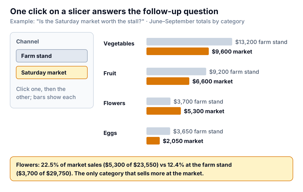
Fieldstone's answer: the market sold $23,550 over the four months against $29,750 at the stand. Every category sells less at the market except flowers, which take $5,300 there against $3,700 at home: 22.5% of market sales compared with 12.4% at the stand. If the market stall stays, flowers should get more of the table.
For dates, a timeline is a slider instead of buttons. Microsoft's guide to creating a PivotTable timeline uses Analyze > Insert Timeline, then lets you filter by years, quarters, months or days and drag across a range, such as July to August.
One slicer can drive several pivot charts, for example a by-month chart and a by-category chart on one dashboard sheet. Select the slicer, choose Report Connections on the Slicer tab, and tick the other PivotTables. Microsoft notes that slicers can only connect PivotTables that share the same data source. If a slicer ignores one of your charts, that chart was built from a different range or a copy of the data.
When the data changes
A pivot chart doesn't update on its own when you add rows. Right-click the PivotTable and choose Refresh, or use PivotTable Analyze > Refresh > Refresh All to update every PivotTable in the file, as Microsoft's PivotTable guide describes. If your source is a table, October's rows are included automatically. If it's a fixed range like A1:D65, they're left out until you change the source. Our guide to refreshing a pivot table covers refresh on open and changing the source range.
Refreshing can also undo some formatting. Microsoft's overview says most formatting, including chart elements you add, layout and style, is kept on refresh, but trendlines, data labels, error bars and other changes to data sets are not. If you've spent ten minutes labelling bars for a board pack, a refresh can strip the labels.
When a normal chart is the better choice
A pivot chart is built for asking questions. A normal chart is built for presenting an answer. Most problems come from using one for the other's job.
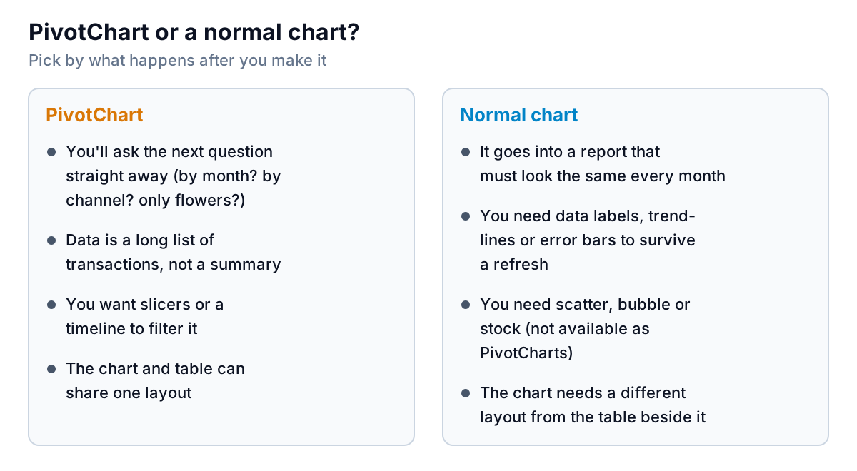
Choose a normal chart when:
- The chart goes into a report that must look the same each month. Labels and trendlines survive, and nobody can accidentally rearrange it by dragging a field in the table.
- You need scatter, bubble or stock, which PivotCharts don't offer.
- You need the chart and the table to differ. Because the two are linked, sorting or rearranging the PivotTable for a printout also changes the chart. Build a second PivotTable for the chart, or use a normal chart.
- The data is already a small summary. Twelve monthly totals don't need a pivot.
You can still keep a normal chart live. The Solution sheet in the practice workbook has a month-by-category grid built with SUMIFS and a channel dropdown in cell B1:
=SUMIFS(Sales!$D$2:$D$65,Sales!$A$2:$A$65,">="&$A4,Sales!$A$2:$A$65,"<"&DATE(YEAR($A4),MONTH($A4)+1,1),Sales!$C$2:$C$65,B$3,Sales!$B$2:$B$65,IF($B$1="All","*",$B$1))Column A holds the first day of each month, row 3 holds the categories, and the "*" wildcard matches any channel when B1 says All. A normal clustered column chart sits on that grid. Change B1 to Saturday market and the chart redraws, with $23,550 in total, the same as the slicer. It takes longer to set up than a pivot chart but behaves like any other chart. Our Excel dashboard guide uses the same pattern for a whole page.
Pivot chart problems and fixes
| What you see | Likely cause | Fix |
|---|---|---|
| "Count of Amount" instead of a sum | Amounts stored as text, or blanks in the column | Convert the column to numbers; then Value Field Settings > Sum |
| One bar per day | Dates not grouped, or some dates are text | Right-click a date > Group > Months; fix text dates |
| A "(blank)" category | Empty cells or a blank row in the source | Fill or delete them, then refresh |
| New rows missing | Source is a fixed range, or not refreshed | Use a table as the source; Refresh All |
| Data labels vanished | Refresh drops data labels and trendlines | Re-add after refresh, or use a normal chart |
| Slicer doesn't filter a second chart | Different data source, or not connected | Report Connections; build both from one table |
| Chart type you want isn't offered | Scatter, stock and bubble aren't available | Use a normal chart on a SUMIFS grid |
If the table underneath has to change shape a lot first, start with our pivot table guide; every pivot chart is one of those underneath.
When you build the same pivot chart every month
For a farm stand, a shop or a small wholesaler, the monthly routine is usually the same: export sales from the till or online store, paste them into the table, refresh, check the slicers still work, and copy the chart into a report. If that's your month, Parity can take the export directly, as a CSV or Excel file, or connect Square, Shopify, Stripe, QuickBooks Online, HubSpot or Google Sheets, and build a dashboard with headline numbers and their trends, charts, what explains them, and a table of what needs attention. Every number and chart is checked against queries on the full dataset before you see it. Ask a follow-up in plain words ("split this by channel", "show flowers only"), with versions and undo, and update it with next month's file.
Upload your sales export and get a checked dashboard you can question in plain words. Build a report from your data free
In Excel, the rule is the same: use a pivot chart while you're still asking questions, and a normal chart once you know the answer and need to show it the same way every month.