Take three months of orders from an example wholesale bakery, 36 lines in all, and ask which customers are growing. Thirty seconds later you know: Corner Café went from $536 in August to $834 in September, and Bluebird Hotel dropped from $632 to $490. The tool that does it is a pivot table, a summary Excel builds for you from a list of transactions: you pick which column becomes the row labels, which becomes the column headings and which gets added up, and Excel does the totals. To create one, click any cell in your data, choose Insert > PivotTable, pick New Worksheet, select OK, then tick fields in the PivotTable Fields pane or drag them into Rows, Columns, Values and Filters.
That's the whole mechanism. The rest of this guide is about using it well on real business data: which field goes where, how to change Sum to Count or a percentage, how to group dates into months, and the handful of source-data habits that decide whether your pivot table is right or quietly wrong. We'll use that bakery throughout, and you can follow along in the same file.
Download the practice workbook (.xlsx). It has the 36 order lines on a Practice sheet and a Solution sheet with the answers worked out using SUMIFS. File generators can't create real PivotTables, so you build the pivot yourself on the Practice data. That's the exercise, and the Solution sheet lets you check every cell.
What a pivot table does, in one picture
Maple & Rye Wholesale Bakery is an example business that sells loaves, croissants and bagels to four local customers: a café, a deli, a grocer and a hotel. Its order export has one row per product per invoice: date, invoice number, customer, product, category, quantity, unit price and amount. July to September is 36 lines.
The owner wants to know one thing before she plans October's bake: which customers are growing and which are slipping. The raw list can't tell her that at a glance. A pivot table can.
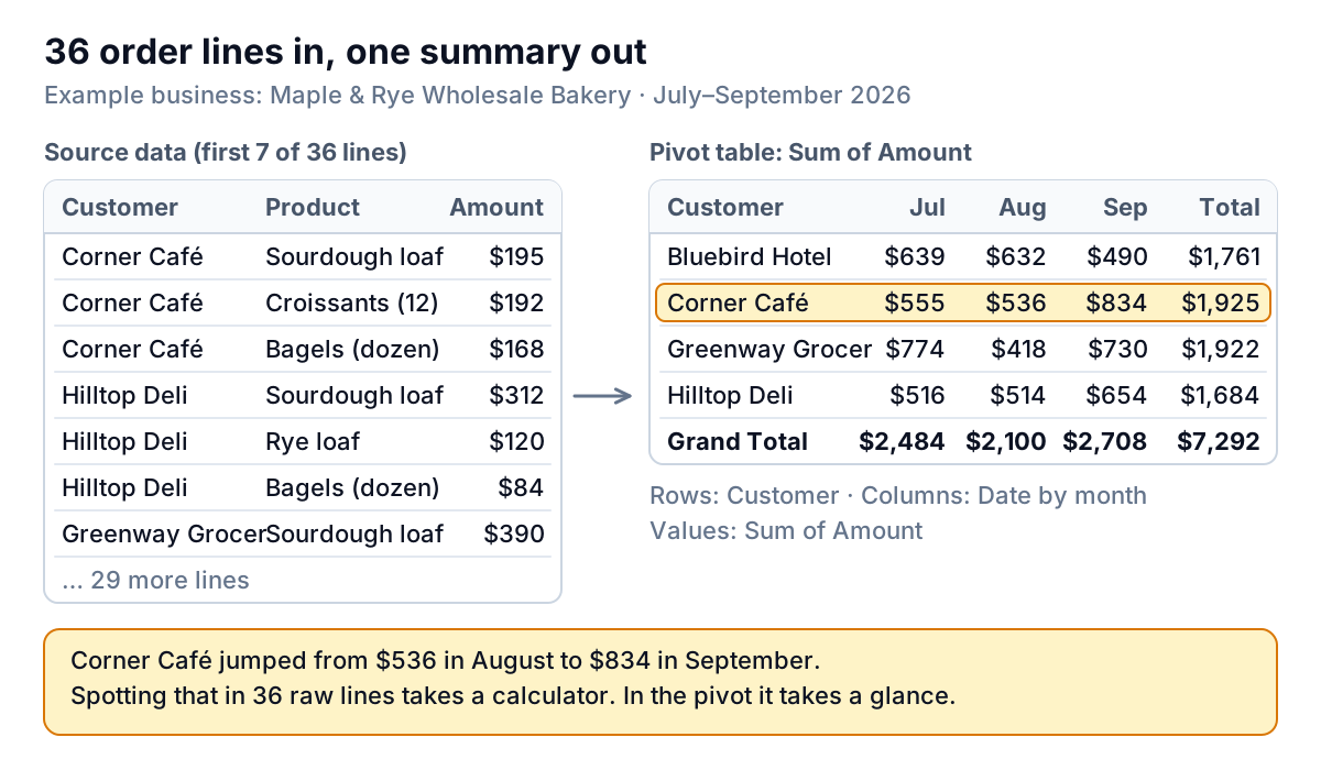
The pivot reads the 36 lines, finds four distinct customers and three distinct months, and adds up the Amount for each combination. Corner Café went from $536 in August to $834 in September. Bluebird Hotel dropped from $632 to $490. Those are two phone calls worth making, and the table took about thirty seconds to build.
Three things make a pivot different from typing SUMIFS formulas into a grid:
- It finds the labels for you. Add a fifth customer to the data and refresh, and a fifth row appears. With formulas you'd have to add the row yourself.
- You can rearrange it in seconds. Swap Customer for Product and you have a different report from the same data.
- It never changes your data. The pivot is a separate summary. Delete it and the order list is untouched.
The trade-off: a pivot doesn't update by itself when the data changes in most versions of Excel. You refresh it. More on that below.
How to create a pivot table in Excel, step by step
These steps follow Microsoft's guide to creating a PivotTable and match Excel for Microsoft 365 on Windows. Excel for Mac and Excel for the web use the same Insert > PivotTable command; the panes look slightly different.
- Check the data shape. One header row, one row per transaction, no blank rows or columns, and each column holding one kind of value. The next section covers what breaks.
- Turn it into a table. Click any cell in the data, press
Ctrl+T, make sure My table has headers is ticked and select OK. Microsoft recommends this because an Excel table grows when you add rows, so the pivot picks up new orders on refresh. The practice file already has the data as a table called Orders. - Insert the pivot. With a cell in the table selected, choose Insert > PivotTable. Excel fills in the table name as the source. Choose New Worksheet and select OK.
- Add the row labels. In the PivotTable Fields pane, drag Customer to the Rows box.
- Add the numbers. Drag Amount to Values. It shows as "Sum of Amount" and the Grand Total reads $7,292.
- Add the column headings. Drag Date to Columns. Recent versions of Excel group dates automatically, so you get months; if you see every single date instead, right-click a date in the pivot, choose Group, pick Months and select OK, as described in Microsoft's grouping guide.
- Format the numbers. Right-click any value, choose Number Format and pick Currency. Formatting the cells directly works too, but the pivot's own number format survives rearranging.
Check your result against the Solution sheet. Bluebird Hotel should read $639, $632 and $490; the Grand Total row should read $2,484, $2,100, $2,708 and $7,292.
The four boxes: Rows, Columns, Values and Filters
Everything you do in a pivot comes down to which field sits in which of the four areas at the bottom of the Fields pane.
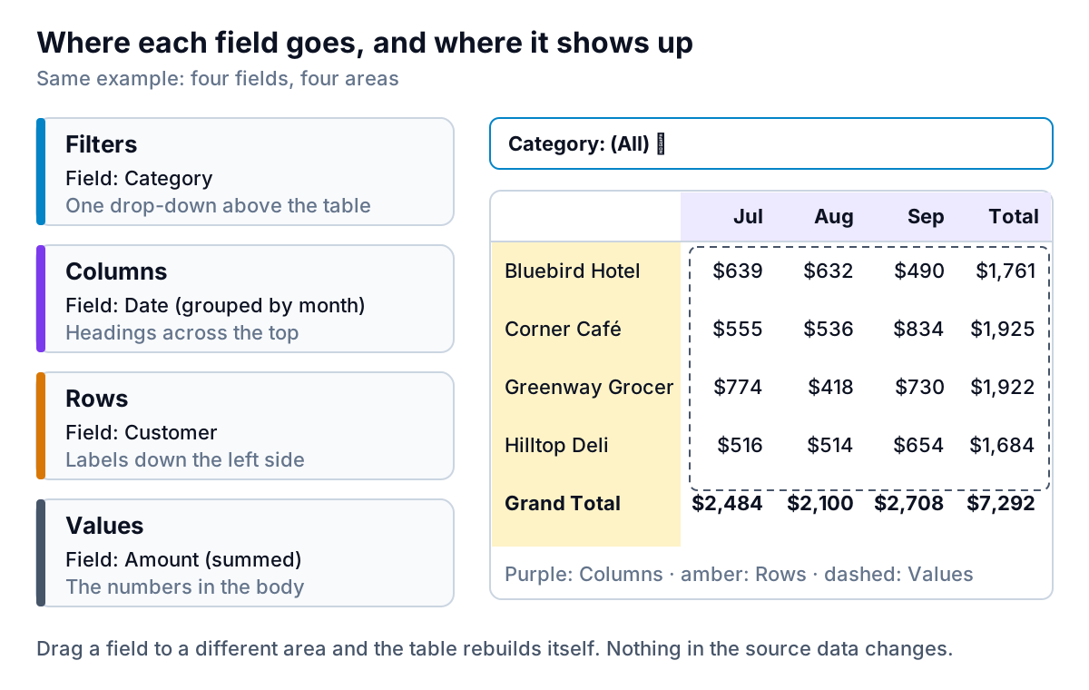
- Rows: the things you want to compare, one per line. Customers, products, sales reps, jobs. Put the field with the most items here, because rows are easier to read than a very wide table.
- Columns: usually time. Months across the top is the layout most business readers expect. Keep it to a dozen or so columns.
- Values: the numbers to summarise. Excel sums number fields and counts text fields by default.
- Filters: a drop-down above the table that limits everything below it. Put Category here and pick Bread, and the croissant sales disappear from every total.
You can put more than one field in an area. Drag Product into Rows under Customer and each customer expands into the products they buy, with a subtotal per customer. Drag Qty into Values next to Amount and you get two number columns side by side.
A good test of whether a layout works: say the question out loud. "Amount by customer by month" is Values, Rows, Columns. "Quantity of each product, bread only" is Values, Rows, Filters. If you can't say the question, the pivot won't answer it either.
Changing what the numbers mean
Sum is only one of the jobs a value field can do. Right-click any number in the pivot and choose Value Field Settings.
Summarize Values By switches between Sum, Count, Average, Max, Min and a few others. For the bakery:
- Sum of Amount answers "how much did they buy?"
- Count of Invoice answers "how many order lines?" Note that it counts lines, not distinct invoices: the 36 lines come from 12 invoices.
- Average of Amount answers "how big is a typical line?" Across the quarter that's $7,292 ÷ 36 = $202.56.
Show Values As turns the same sums into comparisons. Microsoft lists the options, and three are worth knowing first: % of Grand Total, % of Column Total, and % Difference From (for month-on-month change). Put Product in Rows, add Amount to Values twice, and set the second copy to % of Grand Total:
| Product | Sum of Qty | Sum of Amount | % of Grand Total |
|---|---|---|---|
| Bagels (dozen) | 77 | $1,078 | 14.8% |
| Croissants (12) | 91 | $2,184 | 30.0% |
| Rye loaf | 208 | $1,248 | 17.1% |
| Sourdough loaf | 428 | $2,782 | 38.2% |
| Grand Total | 804 | $7,292 | 100.0% |
Sourdough is more than a third of revenue. Croissants sell fewer units than rye but bring in almost twice the money. That's the kind of thing worth knowing before you plan the oven schedule.
If you need a number the source data doesn't have, such as margin from revenue and cost columns, that's a calculated field. Our guide to pivot table calculated fields covers how they work and the trap with percentages.
Filters, slicers and grouping
The Filters area gives you one drop-down. Slicers give you buttons, which are easier for someone else to use. Click inside the pivot, then choose PivotTable Analyze > Insert Slicer, tick Category and select OK. Microsoft's page on filtering PivotTable data covers slicers, label filters and value filters.
Value filters are the useful ones for business questions. Click the arrow on Row Labels, choose Value Filters > Top 10, and change 10 to 3 to show only the three biggest customers. The Grand Total then shows only those three, which is right for "how much did our top three spend?" and wrong if you meant to show their share of everything. If you need the share, use Show Values As before you filter.
Grouping works on dates and numbers. Dates group by days, months, quarters or years. Numbers group into bands: right-click an Amount label in Rows, choose Group, and set "By" to 100 to see how many order lines fall between $0 and $99, $100 and $199, and so on.
Five things in the data that make a pivot wrong
Most pivot problems start in the source data, not in the pivot itself. Check these before you build.
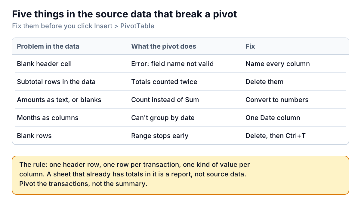
- A blank header. Every column needs a name. If one is empty, Excel stops with a message that the PivotTable field name is not valid.
- Subtotal rows inside the data. An export with "Total for Corner Café" rows mixed in gets those rows added again. The pivot makes its own subtotals, so delete these.
- Numbers stored as text, or blank cells in a number column. If Excel sees anything that isn't a number, it offers Count instead of Sum. Look for green triangles in the corner of cells, convert them, then change the value field back to Sum. Accounting exports with "$" or "," in the cell text are the usual cause.
- Months as columns. A sheet with July, August and September as separate columns is already a summary. A pivot can't group those into quarters or filter by date. You need one Date column and one row per sale.
- Blank rows. If you select the data by clicking a cell, Excel stops at the first blank row, and the orders below it never make it into the pivot. Delete blank rows, then make the data a table.
Two problems happen after you build. First, the pivot is a snapshot: edit an amount or add new orders and nothing changes until you refresh. Right-click the pivot and choose Refresh, or press Alt+F5, as described on Microsoft's refresh page. Our guide to how to refresh a pivot table covers Refresh All, refresh on open and why new rows sometimes don't show up. Second, the default row order is alphabetical, which is rarely the order you want. See how to sort a pivot table for sorting by value, custom orders and why some sorts don't stick.
When a pivot table isn't the right tool
A pivot table is the fastest way to explore data you haven't looked at before. It's less good at three things:
- Fixed report layouts. If you need a report where row 12 is always "Corner Café, September" so another sheet can point at it, SUMIFS formulas are safer. A pivot moves cells around when the data changes.
- Charts for other people. You can turn any pivot into a chart, and our guide to pivot charts covers when that works. For a monthly pack that goes to a partner, a normal chart from a small summary range is often easier to control.
- Data from several systems. A pivot reads one table. If the orders are in one export and the costs in another, you have to join them first, with XLOOKUP or Power Query, before the pivot can use both.
If you're doing that join every month, from a QuickBooks export on one side and a Shopify export on the other, it's worth asking whether the spreadsheet is the right home for it. Parity takes the files (or connects to QuickBooks Online, Shopify and the others directly) and builds a dashboard: headline numbers with their trends, charts, what explains them and a table of what needs attention. Every number is checked against queries on the full dataset before you see it, and you can export it to Excel if you still want to pivot the result yourself. Our Excel dashboard guide shows the spreadsheet route if you'd rather stay in Excel.
Upload the order export you'd pivot and get a checked dashboard of who's buying more and who's buying less. Build a report from your data free
Whichever way you go, start with the question, not the tool. "Which customers grew last month?" is a pivot with Customer in Rows and months in Columns. Build that first, check one number by hand, and then start dragging fields around.