Here's how to sort a pivot table by its numbers: right-click any value in the column you want to sort by, choose Sort, then Sort Largest to Smallest. To sort by the labels instead, click the arrow on Row Labels and choose Sort A to Z or Sort Z to A.
Those two clicks cover most cases. The rest of this guide is for the cases they don't: days of the week in the wrong order, a product list that has to match your price board, a top-three view, sorting inside groups, and the sort that undoes itself every time you refresh. The example is a climbing gym's September revenue, small enough to check by hand.
Download the practice workbook (.xlsx). The Practice sheet has 42 rows of revenue (one per weekday per product) in a table called Sales. Build a pivot from it yourself (file generators can't create real PivotTables) and compare each sort with the Solution sheet, where the expected order and totals are worked out with SUMIFS and RANK.
How to sort a pivot table by value, biggest first
Basalt Climbing Gym, an example business, sells six things: day passes, 10-visit cards, monthly memberships, gear rental, intro classes and a youth team. The owner wants to see what actually pays the rent. She puts Product in Rows and Revenue in Values, and Excel lists the products alphabetically.
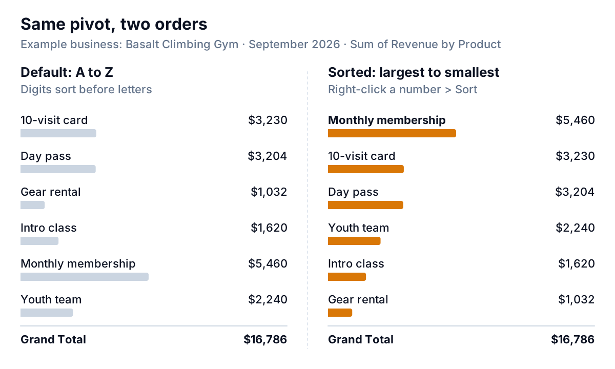
Alphabetical order hides the answer: memberships, the biggest line at $5,460, sit fifth, and "10-visit card" comes first only because digits sort before letters. To fix it:
- Right-click any number in the Sum of Revenue column.
- Choose Sort > Sort Largest to Smallest.
Microsoft's guide to sorting PivotTable data notes that this kind of sort "applies to all the cells at the same level in the column". In plain terms, Excel sorts the products, not individual cells, so each product's row moves as a whole.
Check yours against Solution table A: Monthly membership $5,460, 10-visit card $3,230, Day pass $3,204, Youth team $2,240, Intro class $1,620, Gear rental $1,032.
Which column you click decides the order
With months across the top, a pivot has a column per month plus a Grand Total. Right-click a number in the September column and the rows sort by September only. Right-click a number in Grand Total and they sort by the total for the period. Both are valid. They answer different questions ("what sold most last month?" versus "what sells most overall?"), so pick on purpose and say which one in the report.
For more control, click the Row Labels arrow and choose More Sort Options. Pick Descending (Z to A) by and choose Sum of Revenue from the list. The same dialog lets you sort columns left to right (to put the biggest month first, for example) when you open it from a right-click on a value.
Sort by label, and when A to Z isn't the order you want
Label sorting is the default: text A to Z, numbers smallest to largest, dates oldest to newest. That's right for customer names. It's wrong for anything with a natural order of its own, and two kinds come up all the time in business data: days of the week and lists that follow how your business works.
Days of the week
Swap Product for Weekday in Rows. Excel ships with built-in custom lists for day and month names, and when "Use Custom Lists when sorting" is ticked in PivotTable Options (Microsoft's options reference describes the setting), the pivot orders full day names by that list. The built-in list starts on Sunday.
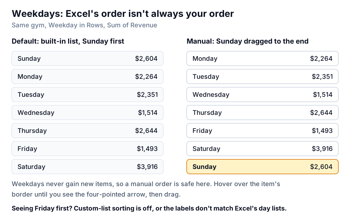
For a Monday-first week, drag. Click the Sunday label, hover over its border until the pointer becomes a four-headed arrow, and drag it below Saturday. Microsoft documents this as the Manual sort option. It's safe here because the set of weekdays never changes. If you see Friday first instead, the pivot is sorting alphabetically: either custom-list sorting is switched off, or the labels aren't spelled like Excel's lists (a trailing space is enough).
Your own order: a custom list
The gym's price board lists products in a fixed order: Day pass, 10-visit card, Monthly membership, Intro class, Youth team, Gear rental. To make the pivot follow it, create a custom list once and Excel will use it in every workbook on that computer:
- Type the items in order in a column (Solution table E in the practice file has them).
- Go to File > Options > Advanced, scroll to General and click Edit Custom Lists.
- Select the cells in the Import box, click Import, then OK twice. Exceljet's walkthrough shows the same steps with screenshots.
- Back in the pivot, click the Row Labels arrow and choose Sort A to Z. With custom lists switched on, the products fall into price-board order.
One catch, straight from Microsoft's sorting page: "A custom list sort order is not retained when you update (refresh) data in your PivotTable." If the order matters, re-sort after each refresh.
Show only the top three
Sorting puts the biggest items first. Filtering hides the rest. When a pivot has forty products and the reader cares about five, filter.
- Click the Row Labels arrow (make sure the field selected at the top is Product).
- Choose Value Filters > Top 10.
- Change 10 to 3, keep Items and Sum of Revenue, and select OK.
The dialog, described on Microsoft's PivotTable filtering page, can also keep items by Percent, or by Sum: "show the products that make up the first $10,000". A Top 10 filter doesn't sort, so sort largest to smallest as well.
Watch the Grand Total. With the filter on, it drops to $11,894, the three visible products only. That's the right number for "what do our top three bring in?" and the wrong one if a reader assumes it's the whole month. Add a note, or use Show Values As > % of Grand Total before filtering if you want each product's share of all revenue: the top three are 70.9% of the gym's $16,786.
Sorting with two fields in Rows
Put Category above Product in Rows and the pivot nests them: Entry, Programs and Rentals, each with its products underneath and a subtotal. Sort largest to smallest by right-clicking a product's number and two things happen at once. Categories sort by their subtotals, and products sort within each category.
| Category / Product | Sum of Revenue |
|---|---|
| Entry | $11,894 |
| Monthly membership | $5,460 |
| 10-visit card | $3,230 |
| Day pass | $3,204 |
| Programs | $3,860 |
| Youth team | $2,240 |
| Intro class | $1,620 |
| Rentals | $1,032 |
| Gear rental | $1,032 |
A product never jumps out of its category. If Youth team outsold Day pass next month, it would still sit under Programs, below the whole Entry block. If you want one flat ranking across all products, take Category out of Rows or move it to Filters. Microsoft's page puts it simply: you can sort on individual values or on subtotals, and the level you click is the level that sorts.
In this example the three Entry products also happen to be the three biggest products overall, so the nested and flat rankings agree. In your data, expect the nested ranking and the flat ranking to differ, and choose the one that answers the question you were asked.
Quick reference: how to sort a pivot table for each job
Every sort above, in one place, with the clicks for Excel for Microsoft 365 on Windows. Excel for Mac uses the same menus; Control-click wherever this table says right-click.
| You want | Do this | Survives refresh? |
|---|---|---|
| Biggest items first | Right-click a value > Sort > Sort Largest to Smallest | Yes, with AutoSort on |
| Rank by one month, not the total | Right-click a value in that month's column > Sort | Yes, but by that month only |
| Names A to Z | Row Labels arrow > Sort A to Z | Yes |
| Monday-first week | Drag Sunday below Saturday | Yes (no new items appear) |
| Your business's own order | Custom list, then Sort A to Z | No: re-sort after refresh |
| Only the top 3 | Value Filters > Top 10, set to 3, then sort | Yes, re-picks the top 3 |
| Biggest month first, left to right | Right-click a value in the row > Sort > More Sort Options > Left to right | Yes, with AutoSort on |
Calculated values sort like any other. Add margin as a pivot table calculated field, right-click one of its numbers and sort largest to smallest to rank products by margin rather than by revenue.
If you're unsure which to use, ask what the reader does next. If they'll act on the biggest items, sort by value. If they'll look something up, sort by label. If they'll compare with a document that has its own order, like a price list or a budget, match that order.
Why a pivot table sort doesn't stick
"I sorted it, refreshed, and it went back" is the most common sorting complaint. It almost always comes down to which kind of sort you used.
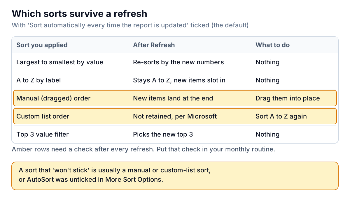
- AutoSort is off. In More Sort Options, click More Options and make sure Sort automatically every time the report is updated is ticked. Without it, a value sort is a one-off arrangement and the next refresh won't re-sort by the new numbers.
- It was a manual sort. Dragged orders are kept, but new items (a new product next month) appear at the end. Fine for weekdays, risky for products.
- It was a custom list sort. Not retained on refresh, as Microsoft says. Sort A to Z again after refreshing.
- The labels have leading spaces or odd text. Microsoft warns that leading spaces affect sort results; " Day pass" sorts before "10-visit card". Clean the source with TRIM. Numbers stored as text also sort as text, so "100" lands before "20".
- You tried to sort by colour or icon. Pivot tables can't sort by cell colour, font colour or conditional formatting icons. Sort by the number that drives the colour instead.
Refreshing is where most of these show up, so pair this with our guide to how to refresh a pivot table. If you're building your first pivot, start with what a pivot table is and how to create one, and if the sorted table is heading into a chart, see our guide to pivot charts; the chart follows the pivot's sort.
Sorting is also where a pivot turns into a decision. The sorted gym table says memberships carry the business, and the weekday view says Saturday carries the week. That's the start of a Pareto analysis: which few items make most of the money. If you'd rather get that from your sales export without building and re-sorting pivots each month, Parity takes the file (or connects to Square, Stripe or Shopify directly) and builds a dashboard with the headline numbers, their trends, charts and a table of what needs attention, with every number checked against the full dataset.
Upload your sales export and get a checked dashboard of your biggest products and busiest days. Build a report from your data free
In the spreadsheet, the rule of thumb for how to sort a pivot table is short: sort by value for decisions, by label for lookups, and by custom order only where the business already has one. Then refresh, and check the order before you send it.