To make a pivot table in Google Sheets, select your data with its header row, click Insert > Pivot table, pick New sheet and click Create. In the editor panel that opens, click Add next to Rows (what you want to group by) and next to Values (what you want to add up), and the table builds itself as you go.
That's the whole mechanism, and Google's own Create and use pivot tables page covers it in six steps. What it doesn't cover is the part that decides whether your pivot table tells the truth: how the data has to be shaped first, how to group dates without merging two years together, and why a calculated margin can come out at 7,714%. This guide walks through all of it on one real-looking sales log.
The example business is Sable Coffee Cart, a fictional cart that sells coffee, tea and pastries at three spots: a farmers market on Saturdays, an office park on Mondays and a university campus on Wednesdays. Its log for July to September 2026 has 114 rows: one per selling day, location and category, with orders, revenue and ingredient cost. Download the practice workbook (.xlsx). It opens in Google Sheets: upload it to Drive and open it, or use File > Import, as Google describes in Switch from Excel to Sheets. A pivot table built in Sheets can't be stored in this kind of file, so the workbook holds the data, the exercises and a Solution sheet that reaches the same answers with formulas. You build the pivot table yourself in about two minutes.
Shape the data before you click Insert
A pivot table can only group what's in separate columns, and it can only add up what's stored as a number. Before you build anything, check four things:
- One header row, every column named. Google says it outright: each column needs a header. No merged title rows above it, no blank header cells.
- One row per record. Sable's log has one row per day, location and category. A sheet with months across the top (July in column B, August in C) has already been summarised by hand; a pivot table can't regroup it properly.
- No subtotal or blank rows inside the data. A "July total" row in the middle gets counted as if it were a sale, and you double your July revenue.
- Real dates and real numbers. Dates typed as text won't group by month, and numbers stored as text (often pasted from a bank or point-of-sale export) won't add up. A quick test: select the column and look at the sum in the bottom-right corner of Sheets. If it shows only a count, those values are text.
Build a pivot table in Google Sheets, step by step
Sable's owner wants one thing first: revenue for each location, month by month. Here's the exact sequence.
- Open the "Sales log" sheet and select columns A to F. Selecting whole columns (A:F rather than A1:F115) means rows you add next month are picked up without editing the range.
- Click Insert > Pivot table, keep New sheet, and click Create. A blank pivot table and the editor panel appear.
- Next to Rows, click Add and choose Location.
- Next to Columns, click Add and choose Date. You'll get one column per selling day, which is far too many. That's fine for a moment.
- Next to Values, click Add and choose Revenue. It defaults to Summarize by SUM.
- Right-click any date in the pivot table's header row and choose Create pivot date group, then Year-Month. The columns collapse to Jul 2026, Aug 2026 and Sep 2026.
Choose Year-Month rather than Month. Month groups by month name only, so once your log runs past a year, July 2026 and July 2027 land in the same column and the total looks like a record month. Google lists the grouping options, including date groups and number ranges, on Customize a pivot table.
If you used whole columns, you'll also see an empty row label for the blank rows below your data. Remove it with a filter (next section) or by selecting the exact range instead.
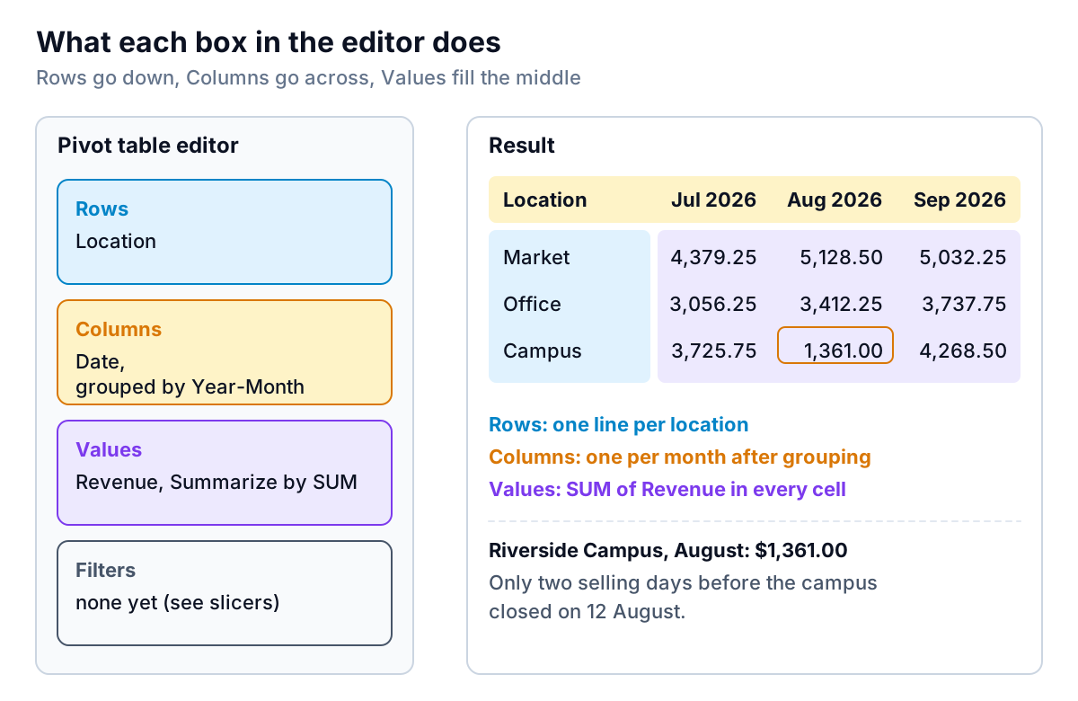
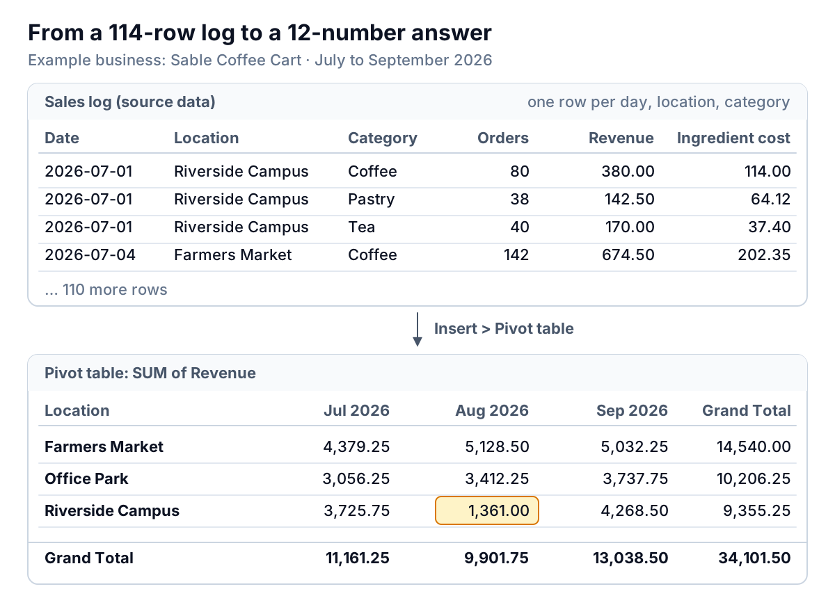
Here's what the finished table says. Totals are July $11,161.25, August $9,901.75 and September $13,038.50, or $34,101.50 for the quarter. The row that jumps out is Riverside Campus: $3,725.75 in July, $1,361.00 in August, $4,268.50 in September. The campus closed after 12 August, so the cart only sold there on two Wednesdays that month. Nothing went wrong with demand, but a quarterly total would never have told you that. Breaking one column down by another is the reason to use a pivot table at all.
Turn amounts into shares with Show as
Under Values, the Show as drop-down starts at Default. Switch it to % of column and each month's column adds up to 100%. In September the market brought in 38.6% of revenue, the campus 32.7% and the office park 28.7%. Use % of row to see how one location's revenue spreads across the three months, and % of grand total for each cell's share of the whole quarter.
Calculated fields: the Summarize by setting that changes the answer
Revenue is only half the story for a cart. The owner wants margin by category: what's left of each dollar after beans, milk, tea and pastries. That isn't a column in the data, so you add it as a calculated field: next to Values, click Add > Calculated field, name it Margin, and type a formula using the column names. Google's help shows the pattern with =sum(Price)/counta(Product), and notes that field names with spaces need quotation marks around them.
Below the formula box is a Summarize by setting, and this is where pivot tables quietly go wrong. It offers SUM and the other usual summaries, plus Custom:
- With SUM, Sheets works your formula out on each source row and then adds the results together.
- With Custom, Sheets works your formula out once per group, on the totals, so you write the SUMs yourself.
For a margin, only Custom gives a meaningful answer. Write the field as:
=(SUM(Revenue)-SUM('Ingredient cost'))/SUM(Revenue)Set Summarize by to Custom and format the column as a percentage. If you instead type =(Revenue-'Ingredient cost')/Revenue and leave it on SUM, Sheets calculates a margin for each of the 114 rows and adds them up. Coffee has 38 rows at a 70% margin each, so its "margin" comes out as 2,660%, and the grand total as 7,714%.
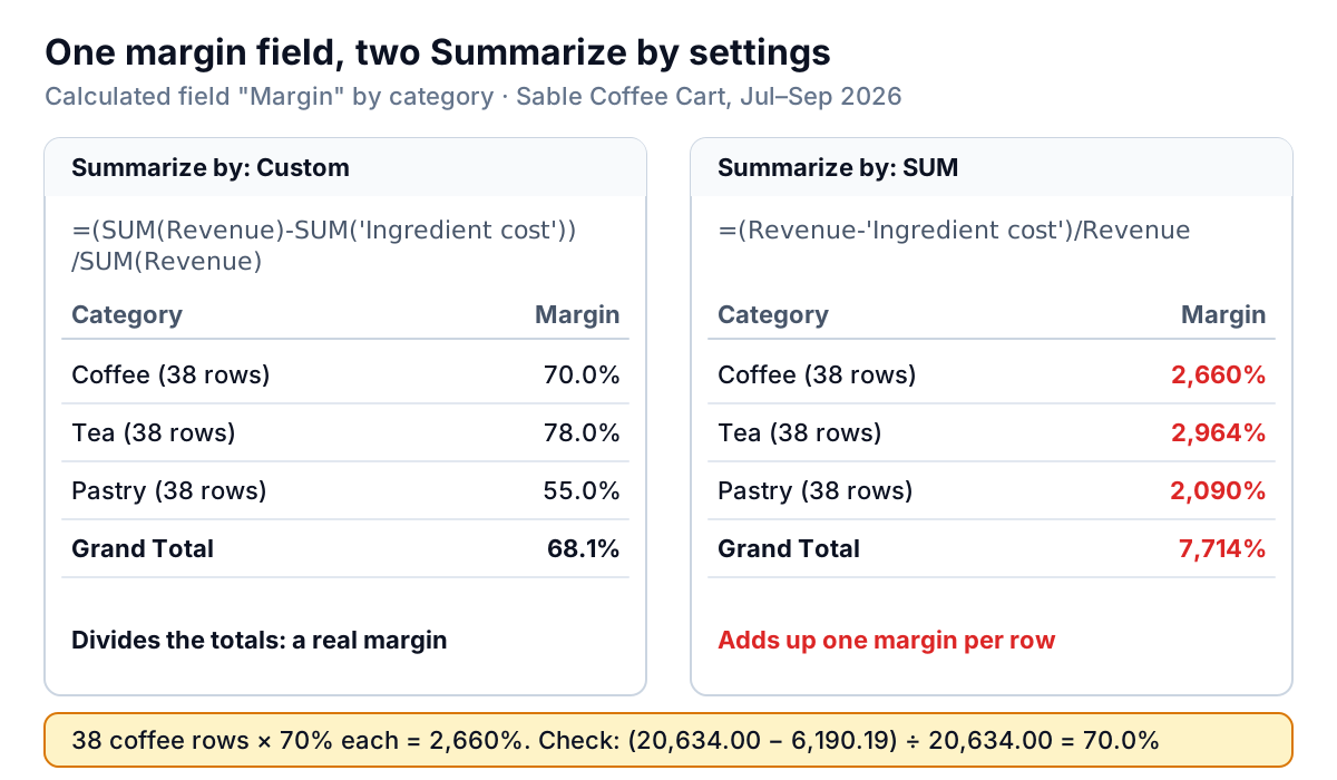
The right version reads clearly. Coffee: $20,634.00 of revenue, $6,190.19 of ingredient cost, 70.0% margin. Tea: $6,035.00 and $1,327.72, 78.0%. Pastry: $7,432.50 and $3,344.61, 55.0%. Overall, 68.1%. Pastry sells well but keeps the least of each dollar, which is worth knowing before the owner adds a second pastry line. If margin itself is new to you, our guide on how to calculate gross margin explains why you divide by revenue and not by cost.
The same rule covers any ratio. Average ticket is =SUM(Revenue)/SUM(Orders) with Summarize by Custom: $4.37 at the market, $4.46 at the office park, $4.39 on campus and $4.40 overall. Averaging each row's ticket would weight a quiet Wednesday the same as a busy Saturday.
Filters and slicers: hide rows without deleting them
A pivot table has two ways to narrow what it counts, and they behave differently when you share the file.
Filters live in the editor. Next to Filters, click Add, pick a column, then choose Filter by values (untick what to hide) or Filter by condition (for example, Revenue greater than 500, or Location text contains "Campus"). Google notes that a condition can refer to a cell, and that the filter saves its list of visible values. That second point has a catch: if you filter Location to two values and a fourth location appears in next month's data, it stays hidden until you tick it.
Slicers sit on the sheet like a button. Click the pivot table, then Data > Add a slicer, and choose a column such as Category. Per Google's slicers help page, three details matter for a small team:
- A slicer filters every chart and pivot table on that sheet that uses the same data range, so one Category slicer can drive a whole dashboard tab.
- When an editor or a viewer changes a slicer, the change is only for them, unless an editor clicks More > Set current filters as default. That's handy for a business partner who wants to look at Coffee alone without changing your view.
- Slicers don't touch formulas. A SUMIFS total next to the pivot table keeps showing the unfiltered figure, which can make a sheet look as if it disagrees with itself.
Try it in the workbook: add a Category slicer, keep only Coffee, and the pivot table's grand total should read $20,634.00.
Getting numbers out of a pivot table
Two features make a pivot table more than a summary to look at.
Double-click any value and Sheets opens a new sheet with the source rows behind it. Double-click Riverside Campus in August and you get six rows: two days times three categories. It's the fastest way to check an odd number before you act on it.
GETPIVOTDATA pulls one value from a pivot table into another cell, so a summary page can quote it without breaking when the table changes shape. The syntax is GETPIVOTDATA(value_name, any_pivot_table_cell, [original_column, ...], [pivot_item, ...]). For the cart's market revenue it would be =GETPIVOTDATA("SUM of Revenue", 'Pivot Table 1'!A1, "Location", "Farmers Market"). Google's GETPIVOTDATA page points out that the value must appear in the pivot table for the function to return it, and that if you rename a heading, you use the new name.
You don't need to refresh a Google Sheets pivot table. It updates whenever the source cells change, which is a real difference from Excel, where you click Refresh (our Excel pivot table guide covers that side). What doesn't update is the range: if you selected A1:F115 and paste in October below row 115, the new rows are left out. Click Edit under the pivot table, then the range box at the top of the editor, and widen it, or use whole columns from the start.
Common pivot table problems and the fix for each
| What you see | Usual cause | Fix |
|---|---|---|
| "Create pivot date group" isn't offered | The dates are text, not dates | Select the column, Format > Number > Date; if they don't change, rebuild them with DATEVALUE or Data > Split text to columns |
| Values show COUNTA instead of SUM, or a SUM of 0 | The numbers are stored as text | Format > Number > Number, or multiply the column by 1 in a helper column |
| Two rows for what should be one location | Different spellings or a trailing space ("Office Park ") | Clean the source with TRIM, or Data > Data cleanup > Trim whitespace |
| Last week's sales are missing | The data range stops above the new rows | Widen the range in the editor, or use whole columns |
| A margin of 2,660% | Calculated field summarised by SUM | Use aggregate functions in the formula and set Summarize by to Custom |
| Calculated field shows a red exclamation mark | A field name with spaces lacks quotation marks | Write 'Ingredient cost', not Ingredient cost |
| July of two years in one column | Grouped by Month instead of Year-Month | Right-click a date, Create pivot date group, Year-Month |
| A new location never appears | A Filter by values saved the old list | Open the filter and tick the new value, or filter by condition instead |
One more limit to know: Google notes that if you rename a column header in the source after building the pivot table, the editor shows the old and new names joined together. Settle your headers before you build.
When the pivot table becomes a monthly chore
For a one-off question, a pivot table in Google Sheets is hard to beat: it's free, it's quick, and nothing in the source data changes. Pair it with a chart and a slicer and you have the start of a Google Sheets dashboard. If you'd rather keep everything as formulas, SUMIFS in Google Sheets gets you the same totals in cells you control, which is how the workbook's Solution sheet checks every number.
The trouble starts when it becomes a monthly habit: export, paste, check the range, fix the text dates, rebuild the margin field, write a note for your partner. Every step is a chance to drop a row.
Parity is built for that version of the job. Connect Google Sheets, Square or Shopify directly, or upload the CSV or Excel export, and it builds a dashboard: headline numbers with their trends, charts, what explains them, and a table of what needs attention. Every number is checked against queries on the full dataset before you see it, so a margin can't quietly come out at 2,660%. You refine it by chat ("split revenue by location and month", "show margin by category"), and update it with next month's file. If you ask, it writes the monthly report for your partner from the same data.
Bring your sales log and get a checked dashboard of revenue and margin by location, category and month. Build a report from your data free
Whichever way you go, add up one row of the pivot table by hand each month. If it matches, trust the rest; if not, check the data before the editor.