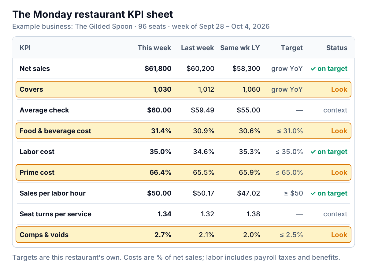
Net sales at The Gilded Spoon, a 96-seat full-service restaurant we'll use as an example, came in at $61,800 last week, up 6.0% on the same week last year. Each line on the Monday sheet where that number sits is a restaurant KPI: a figure tracked every week against a target, such as average check (net sales ÷ covers) or prime cost ((food cost + labor cost) ÷ net sales). A good week, by the look of it, until the general manager reads the next line. Covers were down 2.8%, for the third week in a row.
That's what a weekly restaurant KPI sheet is for: a handful of numbers, the same ones every week, set out so that a good headline can't hide a bad trend. This guide gives you the nine KPIs worth that Monday slot, the formula for each, where each one lives in your systems, and what to do when it moves. It doesn't try to list every metric a restaurant could track. The cost ratios get their own guides, linked below, so here they get a paragraph each.
The weekly restaurant KPI sheet: nine numbers on one page
A restaurant KPI earns its place on the sheet if it changes what you do this week. Ratings, social followers and average review length can wait for the monthly review. These nine can't:
| KPI | Formula | Where it comes from |
|---|---|---|
| Net sales | Gross sales − discounts, comps and refunds, before tax and tips | POS sales summary |
| Covers | Guests served (or checks, for counter service) | POS guest count or reservation system |
| Average check | Net sales ÷ covers | Calculated |
| Food and beverage cost % | (Opening inventory + purchases − closing inventory) ÷ food and beverage sales | Inventory counts and supplier invoices |
| Labor cost % | Wages + payroll taxes + benefits ÷ net sales | Payroll or scheduling tool |
| Prime cost % | Food and beverage cost + labor cost ÷ net sales | Calculated |
| Sales per labor hour | Net sales ÷ hours worked by hourly staff | POS plus time clock |
| Seat turns per service | Covers ÷ (seats × services) | Calculated |
| Comps and voids % | (Comps + voids) ÷ net sales | POS exception report |
Each number sits in four columns: this week, last week, the same week last year, and your target. Last week catches sudden breaks. The same week last year removes seasonality, which matters more than most owners expect: the week after Labor Day or before Thanksgiving is never comparable with the week before it.
Sales: always split it into covers and check
Net sales is the line everyone reads first and the one that explains least. Sales can only grow two ways: more guests, or more spent per guest. Split every change into those two parts.
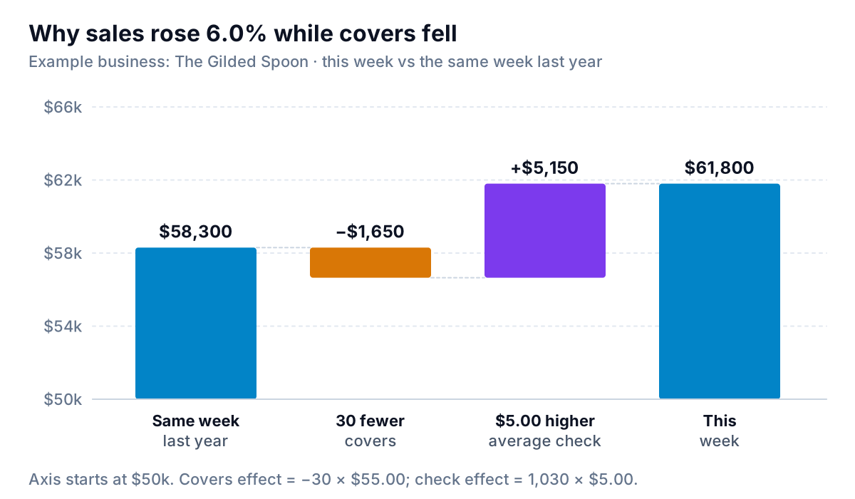
The arithmetic is simple enough to do on the back of the sheet. Last year, 1,060 covers spent $55.00 each, for $58,300. This year 1,030 covers spent $60.00. The lost covers cost 30 × $55.00 = $1,650. The higher check added 1,030 × $5.00 = $5,150. Together, +$3,500.
At The Gilded Spoon, the check rose 9.1% because menu prices went up in the spring and more tables are ordering wine. That's fine on its own. The problem is that higher prices can hide falling traffic for months, and traffic is the harder one to win back. The decision rules:
- Check up, covers up: healthy. Keep going.
- Check up, covers flat or down: you're living on price. Watch covers weekly and look at which days and services are losing guests.
- Check down, covers up: usually a promotion or a menu mix shift to cheaper dishes. Fine if it was the plan; check that food cost didn't rise with it.
- Both down: act this week. Look at reviews, wait times and what changed on the menu or the schedule.
Cost KPIs: food, labor and prime cost
Three cost ratios sit on the sheet. They have their own guides, so here's just what each one tells you on a Monday.
Food and beverage cost %
The share of sales you spent on what you sold, calculated from counts rather than purchases. A weekly count of your highest-value items (proteins, dairy, wine, spirits) is usually enough for a weekly figure, with a full count at month end. Our food cost percentage guide covers the formula, plate cost and the theoretical-versus-actual gap, and the restaurant inventory template gives you the count sheet. The National Restaurant Association's 2025 data abstract put food and non-alcohol beverage cost at a median of 32.0% of sales for full-service restaurants in 2024. Check whether your own figure includes alcohol before you compare.
Labor cost %
Wages plus payroll taxes and benefits, as a share of sales. Hourly labor moves week to week; salaries don't, so a slow week always shows a higher ratio. The same Association data put salaries, wages and benefits at a median of 36.5% of sales at full-service restaurants in 2024. Our guide to restaurant labor cost percentage splits it into front and back of house.
Prime cost %
The two added together. Because it's about two-thirds of a full-service restaurant's costs, it's the single number most worth a target. The Gilded Spoon's is 65.0%; our prime cost guide explains how to set yours from your own P&L.
This week, The Gilded Spoon's food cost rose to 31.4% from 30.9%. Labor held at 35.0%. So prime cost moved because of food, and the comps line, which also jumped, points at why.
Productivity and leakage: sales per labor hour, seat turns, comps and voids
Sales per labor hour
Net sales divided by hours worked by hourly staff. It's a cleaner scheduling measure than labor cost %, because a pay rise changes labor cost without changing how well you scheduled. The Gilded Spoon worked 1,236 hourly hours for $61,800 in sales: $50.00 an hour. A year ago it was $47.02, from 1,240 hours and $58,300. Same hours, more sales per hour, mostly because of the higher check.
Break it down by day and service once a month. A Tuesday lunch at $28 an hour next to a Saturday dinner at $70 tells you where to cut a shift, which a weekly average never will. We haven't found a current, published survey figure for sales per labor hour that defines it the same way, so set your target from your own best quarter.
Seat turns per service
Covers divided by seats times services. The Gilded Spoon ran six dinners and two brunches: 1,030 ÷ (96 × 8) = 1.34. It's context more than a target, because a turn means something different at a tasting-menu dinner and a breakfast counter. It's useful for one question: if covers are falling, is it because the room is emptier, or because you opened fewer services?
Comps and voids
Comps are items given away on purpose: a manager's apology, a staff meal, a regular's dessert. Voids are items rung in and cancelled. Both cost food without bringing in a sale, and voids after an item has been sent to the kitchen are a classic leak. Most POS systems have an exception or void report by server and reason.
At The Gilded Spoon, comps and voids reached 2.7% of sales, against a target of 2.5%. The void report showed the cause in a minute: a new braised short rib had been sent back nine times, mostly for being undercooked at the bone, and each one was comped. That's also most of the food cost increase. The fix is a recipe and timing change, not a cost-cutting meeting.
Read restaurant KPIs as trends, then act
A single week is noisy. Weather, a local event or one large party can move any number by a few percent. What deserves action is a run in the same direction.
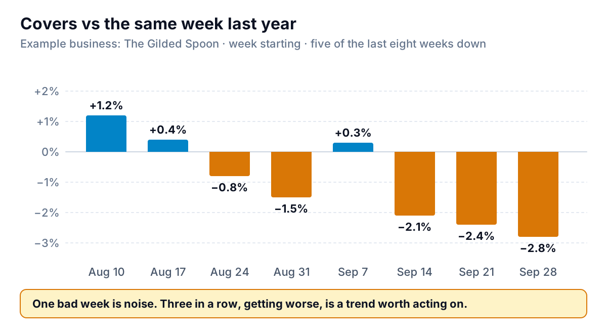
Here are rules The Gilded Spoon uses, which you can adapt:
| Signal | First check | Typical action |
|---|---|---|
| Covers down vs last year three weeks running | Which days and services lost guests; reviews; reservation no-shows | Fix the weakest service first; test a weeknight offer |
| Food cost above target two weeks running | Comps and voids; price changes on top ten ingredients; count errors | Recount, re-cost the menu, fix the dish being sent back |
| Labor % up, sales per labor hour down | Hours by day versus covers by day | Cut or shorten the slowest shifts in next week's schedule |
| Labor % up, sales per labor hour flat | Overtime, pay rises, salaried staff in a slow week | Check overtime first; otherwise it's a pricing question |
| Comps and voids above target | Exception report by reason and server | Fix the dish, the training or the POS workflow behind the top reason |
The targets in the sheet are The Gilded Spoon's own, set from its best recent quarter and its P&L. Yours will differ with concept, prices and rent. A target you can hit in a good week, and miss in a bad one, is the right kind.
Once a month, take these weekly numbers into the bigger picture. Our restaurant profit margin guide shows how they flow through to the bottom line.
Building the sheet from your own systems
Nothing on the sheet needs new software. It needs four exports and twenty minutes:
- POS: a sales summary for the week (net sales, covers or checks, discounts) and the comps and voids report.
- Inventory: opening and closing counts for your key items, plus the week's supplier invoices.
- Payroll or scheduling: hours and gross pay by employee, plus the employer's taxes and benefits.
- Last year: the same exports for the matching week, saved once and kept.
A spreadsheet with one tab per export and a summary tab works. It tends to break on the week someone forgets to paste in the new files, or when a POS export changes its column order. If you use Square, our guide to Square reports shows which ones hold these numbers.
Parity connects Square and QuickBooks Online directly, or takes a CSV or Excel export from any other POS, inventory or payroll tool, and builds a dashboard from it: the headline numbers with their trends, charts, what explains the changes, and a table of what needs attention, such as the four lines flagged on The Gilded Spoon's sheet. Every number is checked against queries on the full dataset before you see it. You can ask for changes by chat ("split covers by service", "add sales per labor hour by day"), save it as a template, and update it with next week's files. If you want a written summary for a partner or owner, ask and it writes the report from the same data.
Connect Square or upload your POS, inventory and payroll exports for a checked weekly dashboard. Build a report from your data free
However you build it, keep the sheet short and the same every week. When the manager at The Gilded Spoon reads it on Monday, she should know in two minutes what went well, what needs a look, and who's fixing it. This week that's the short rib and the weeknight covers, and that's a better Monday than one that stopped at "sales up 6%".